HIPAA-Compliant Dental Practice Security Website Template
Shield is a bento grid landing page template built for dental practices that need to communicate data security and HIPAA compliance with authority. The design uses a dark Carbon Fiber palette, stats-first messaging, and a side-by-side compliance comparison grid. It targets practice managers, solo dentists, and office administrators who need to show patients and regulators that their records are protected.
by Rocket studio
Quick summary
Shield is a single-page bento grid landing page template designed for dental practices focused on patient data security and HIPAA compliance. It leads with verified credentials, hard numbers, and a direct comparison engine. The dark Data Command visual theme and signal-green indicators make every protected element instantly visible. Two conversion paths capture both ready buyers and cautious researchers.
Who this template is for
This template is built for dental practice professionals who need to demonstrate data security in a credible, no-nonsense way. It speaks directly to the people who feel the weight of compliance responsibility every day.
- Practice managers comparing compliance vendors after receiving a notice from their state dental board
- Solo dentists who recently moved to a cloud-based electronic health record system and need to reassure patients and staff
- Office administrators researching HIPAA violation penalties and looking for a trustworthy security solution to present to leadership
What problem this template solves
Most dental practice privacy pages are walls of legal text that do nothing to build trust. Visitors arrive already anxious about breach penalties or audit failures, and a dense paragraph of policy language only deepens that anxiety.
- The template replaces passive legal copy with active proof: real numbers, verified credentials, and a direct penalty comparison that shows the cost of doing nothing
- It gives two conversion paths so researchers who are not ready to commit can still be captured through a gated PDF download
- The bento grid layout prevents information overload by containing each data point in its own visual cell, making the page easy to scan under pressure
What you get with this template
You get a fully structured bento grid landing page built around one goal: making a dental practice's data security credentials feel undeniable. Every section is pre-designed and pre-sequenced for maximum trust impact.
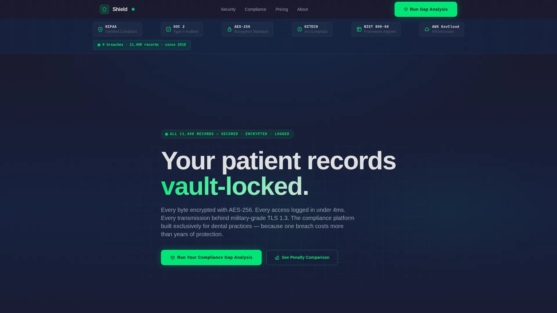
- A logo bar header displaying recognized compliance authority marks, a stats-first bento grid with pre-built cells for encryption specs and audit results, and a central versus comparison grid
- A three-field intake form for the compliance gap analysis call to action, plus a secondary email-gated PDF download path
- A complete Carbon Fiber color system with signal-green active-state indicators, cool silver-white body text, and a dark carbon-to-graphite background range
Feature list
This section covers the core built-in components and design capabilities delivered with the Shield template.
Stats-First Bento Grid Layout
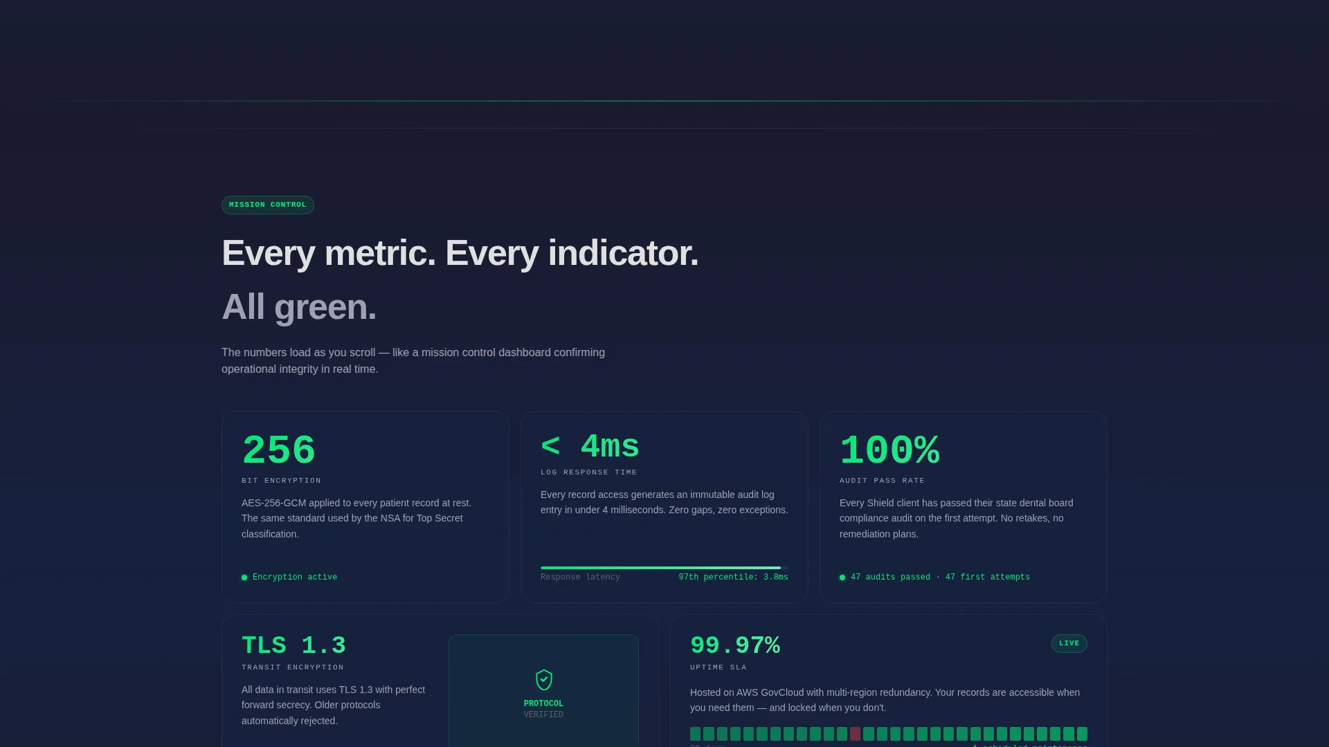
Each bento cell leads with a number before any explanatory text appears. Metrics like encryption standard, access log response time, and audit pass rate are displayed as large primary values. This structure makes compliance credentials scannable in seconds.
Compliance Authority Logo Bar
The header opens with a horizontal strip of recognized compliance and security credential marks displayed on a matte carbon background. The bar is designed with subtle backlighting to suggest dashboard instrument panels, giving credentials a quiet, institutional weight without animation.
Side-by-Side Comparison Engine
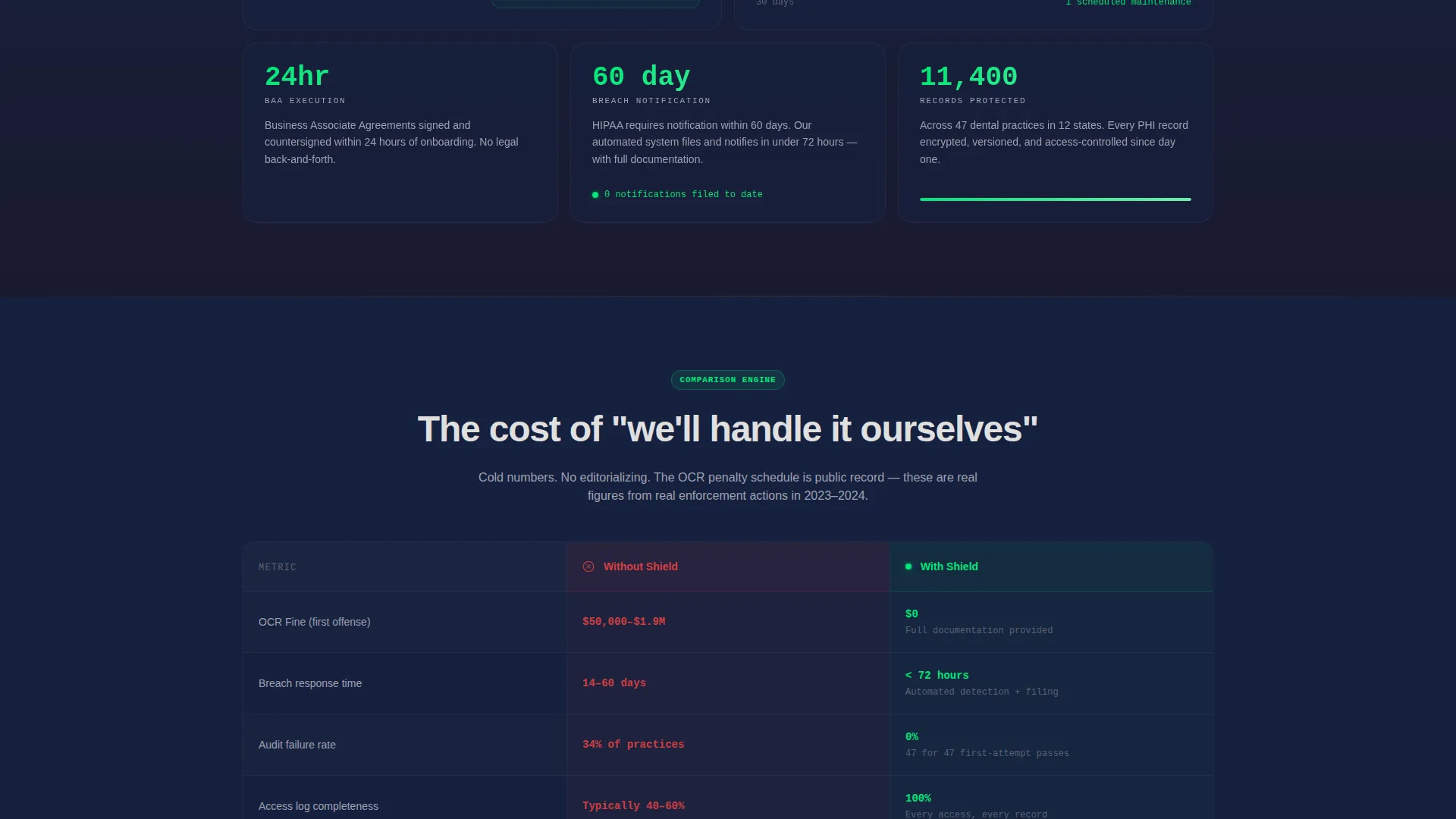
A wide bento cell divides into "Without Shield" and "With Shield" columns. It displays real penalty dollar amounts, breach response timelines, and audit failure rates side by side. No editorial framing is added; the numbers do the work.
Dual Conversion Path Design
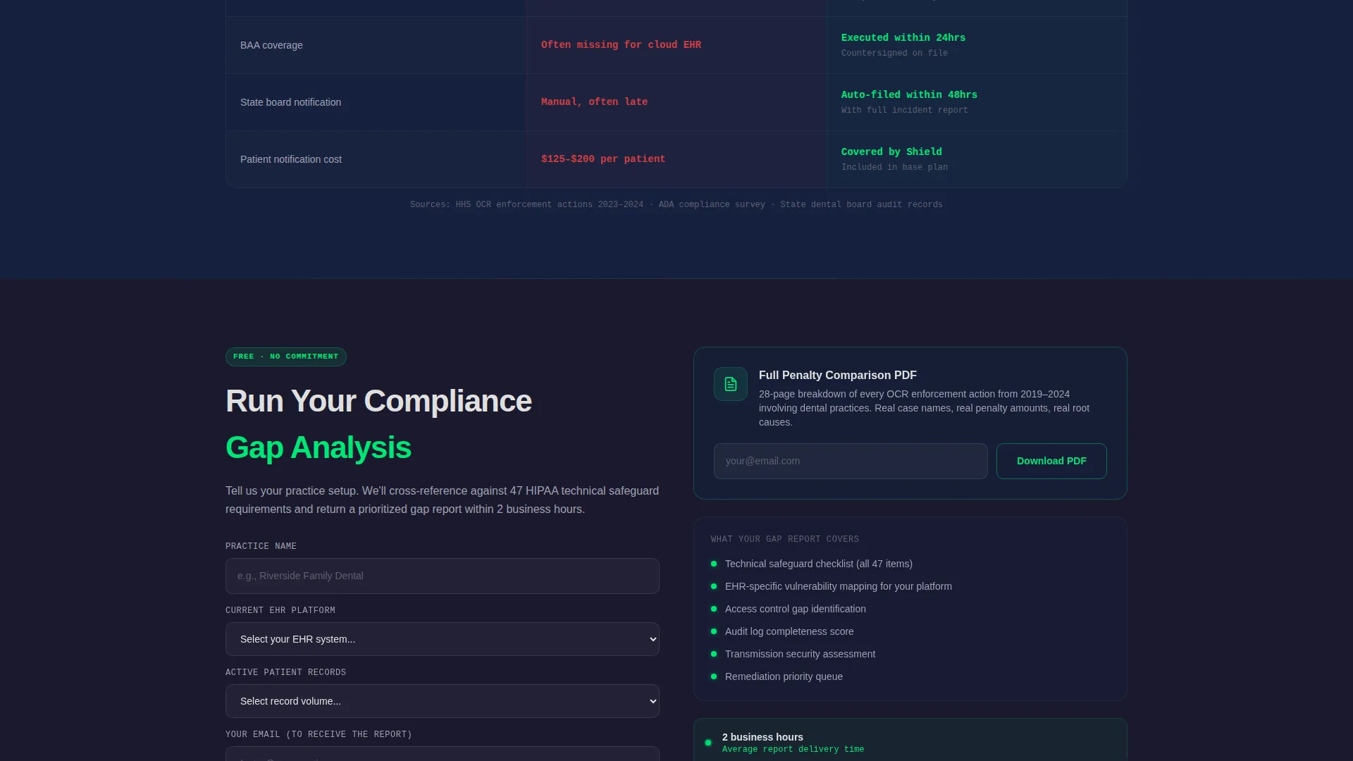
The primary call to action reads "Run Your Compliance Gap Analysis" and sits directly below the comparison grid. A secondary path offers a downloadable penalty comparison document gated behind email capture only, targeting visitors who are researching but not yet ready to speak with anyone.
Three-Field Gap Analysis Form
The intake form collects practice name, current electronic health record platform via a dropdown of the ten most common dental systems, and number of active patient records. This keeps the form short enough to complete quickly while gathering meaningful qualification data.
Data Command Visual Theme
The full design follows a Data Command theme. Every background, border, and surface reinforces the sense of a secured, monitored environment. Signal green appears exclusively on active-state indicators and compliance checkmarks, so each green element reads as a verified pass rather than decoration.
Page sections overview
| Section | Purpose |
|---|---|
| Compliance Logo Bar | Establishes credential authority at first glance |
| Opening Stat Callout | Anchors trust with a single breach record stat |
| Encryption Spec Cells | Shows 256-bit standard and access log response time |
| Audit Pass Rate Cell | Displays 100% audit pass rate as a standalone metric |
| Versus Comparison Grid | Contrasts penalty costs and timelines with and without Shield |
| Gap Analysis Form | Captures qualified leads with three-field intake |
| PDF Download Gate | Captures researchers via email-only secondary path |
Design & branding system
The Carbon Fiber color system is built to feel like the interior of a secured server environment. Every color decision reinforces the idea that something serious is protecting sensitive information.
- Backgrounds use deep carbon black (#1A1A2E) and woven graphite (#16213E); structural accents use titanium highlight (#0F3460) to create depth without distraction
- Body text renders in cool silver-white (#E0E0E0) for clean legibility against dark surfaces; signal green (#00E676) appears only on verified, active, or compliant indicators
- The overall palette avoids decorative color entirely, ensuring that every green element reads as a meaningful compliance signal rather than a visual flourish
Mobile & speed optimization
The bento grid structure is designed to reflow cleanly across screen sizes, keeping each data cell legible on smaller displays without losing the dashboard aesthetic.
- Each bento cell is self-contained, which means cells can stack vertically on mobile without breaking the visual logic of the page
- The dark background palette reduces the visual complexity that often causes mobile layouts to feel cluttered when scaled down
- The two conversion paths remain accessible at all viewport sizes, ensuring neither the form nor the PDF download gate is hidden or obscured on smaller screens
How this template helps you convert
Shield is built around the moment of highest anxiety for its audience. Visitors arrive already worried. The template is structured to meet that worry with evidence and then make action feel easy.
- The logo bar and opening breach statistic establish credibility within the first visible screen, before a visitor has scrolled at all, which reduces early bounce from skeptical or stressed readers
- The versus comparison grid places the cost of inaction in direct numerical terms next to the benefits of compliance, making the primary call to action feel like a logical next step rather than a sales pitch
- The dual conversion paths mean no visitor leaves empty-handed; the gap analysis form captures decision-ready leads while the gated PDF captures researchers who need more time, extending the reach of a single page visit
Other information about this template
Shield is part of the Dental Practice Website Templates category under the Technology section of the marketplace. It is built specifically for the dental practice privacy policy page niche, meaning the layout decisions, messaging hierarchy, and conversion paths are all calibrated for compliance-focused healthcare contexts rather than general business use.
- The template style is Bento Grid, and the intersection match with the Data Command theme, Stats-First Impact creative direction, Carbon Fiber color system, and Comparison/Versus landing-page direction makes it a purpose-built fit for dental data security pages
- The header concept is a Logo Bar, which is specifically suited to industries where third-party credential marks carry more persuasive weight than branded photography or hero imagery
- This template does not require any pre-existing design system; all color values, spacing logic, and component styles are included as part of the template package
Theme
Data Command
Creative direction
Stats-First Impact
Color system
Carbon Fiber
Style
Bento Grid
Direction
Comparison/Versus
Page Sections
Stats-first Bento Grid Layout
Compliance Authority Logo Bar
Side-by-side Comparison Engine
Dual Conversion Path Design
Three-field Gap Analysis Form
Data Command Visual Theme
Related questions
Who is this landing page template designed for?
Does this template support two different conversion paths?
Can I replace the bento grid stats with my own compliance figures?
What data does the versus comparison grid display?
Is the signal green color used throughout the entire design?



