Young Professional Insurance Specialist Professional Website Template
Shield is a fintech-styled renters insurance landing page built for first-time apartment renters. It opens with a live Coverage Estimator, flows into a side-by-side comparison table, and closes with a sticky "Get Covered in 90 Seconds" call to action. Deep navy, signal teal, and clean white create a dashboard feel that builds trust fast and keeps conversion rates high.
by Rocket studio
Quick summary
Shield is a single-page insurance landing page designed for young renters who want clarity before commitment. The page leads with an interactive Coverage Estimator, not a hero image or a tagline. Three sliders, a real-time premium readout, and a plan comparison table do the selling. The result is a good insurance landing page that earns trust through utility before asking for anything.
Who this template is for
This template is designed specifically for insurtech and direct-to-consumer insurance brands targeting first-time renters. It suits any insurance company or insurance business that wants to create professional, conversion-focused landing pages for a younger audience.
- Twenty-two to twenty-eight year olds signing their first lease who own a laptop, bike, or camera gear
- Roommates splitting a two-bedroom apartment who need a clear, side-by-side view of coverage options
- Relocators and early-career renters who expect a fintech-quality experience and want transparent pricing with no hidden fees
What problem this template solves
Most insurance landing pages overwhelm visitors with dense text, industry jargon, and forms that ask for too much too soon. First-time renters do not know what coverage they need, and decision fatigue sets in before they ever reach a call to action. This template replaces that friction with a tool-first flow that answers objections at every scroll step.
- Visitors interact with a live estimator before reading a single paragraph of policy text
- The comparison table removes complexity by presenting coverage side by side in plain language
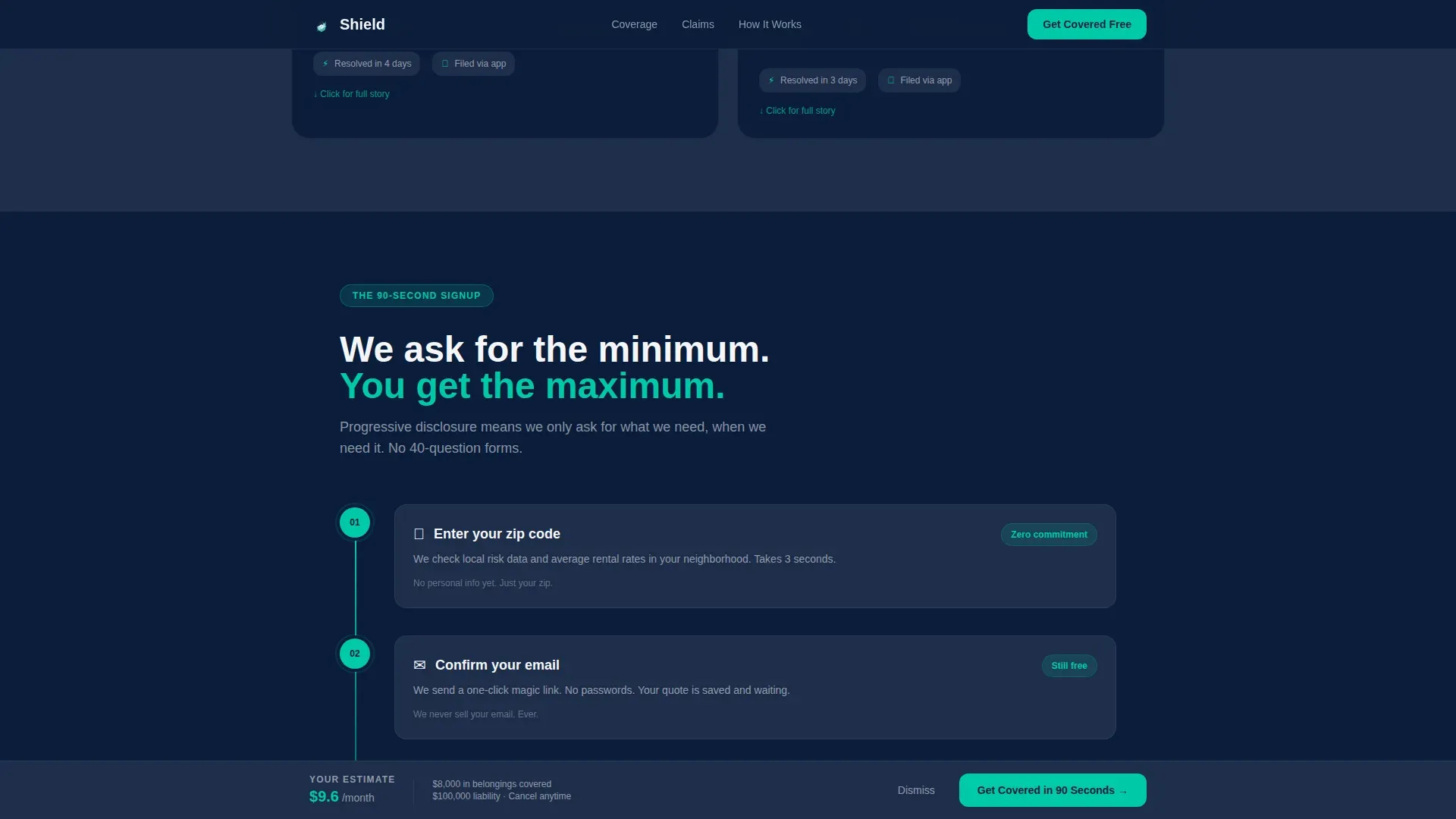
- Progressive-disclosure forms collect zip code, then email, then belongings value, reducing the perceived effort of signing up
What you get with this template
You get a complete, single-page insurance landing page layout with every section mapped to a buyer's decision journey. Every element is grounded in best practices for good insurance landing pages that convert. The template is built mobile-first, keeping users engaged on the same device they used to sign their lease.
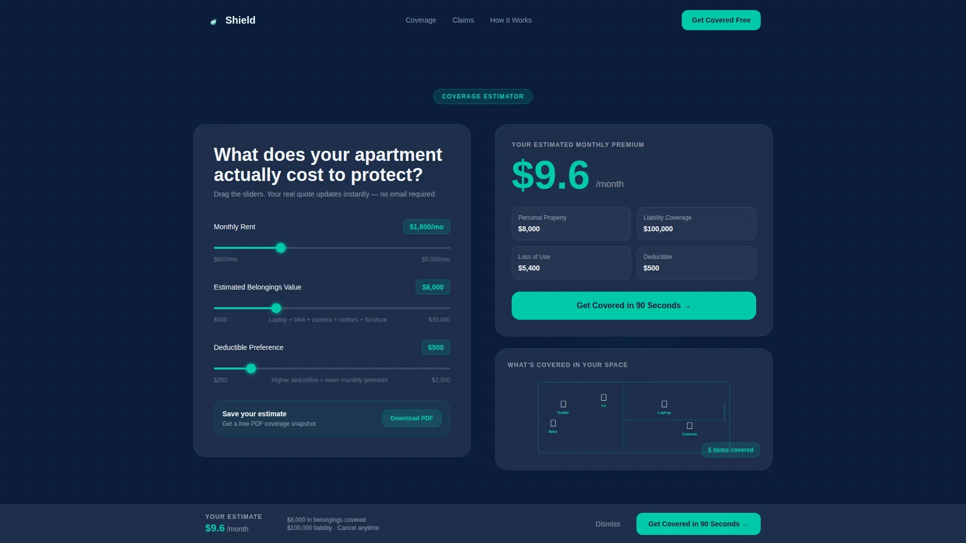
- A live Coverage Estimator header with three sliders and an animated results panel that updates in real time
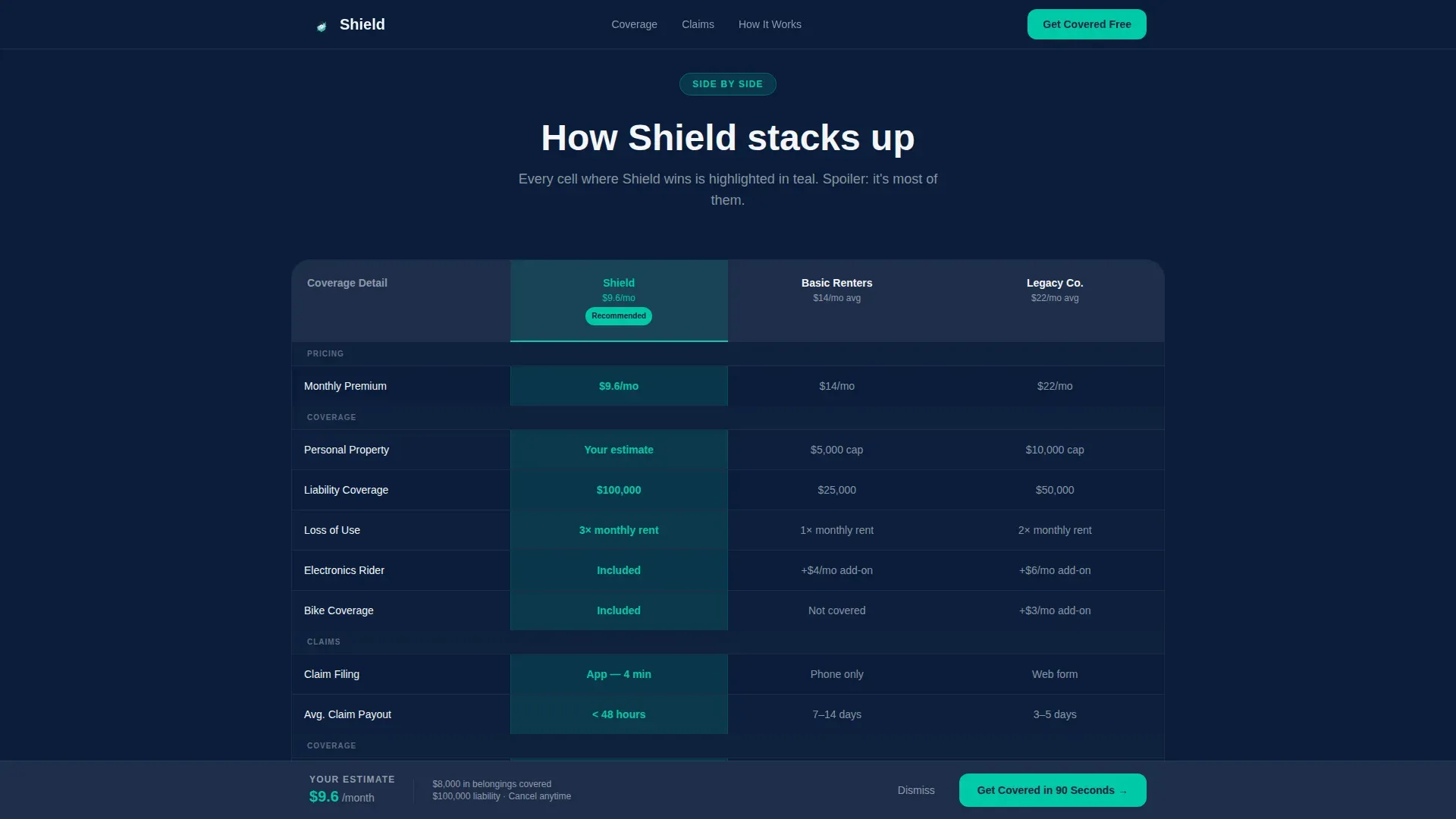
- A full-page comparison table section with teal-highlighted winning cells and row-by-row breakdowns of liability limits, personal property caps, loss-of-use coverage, and deductible tiers
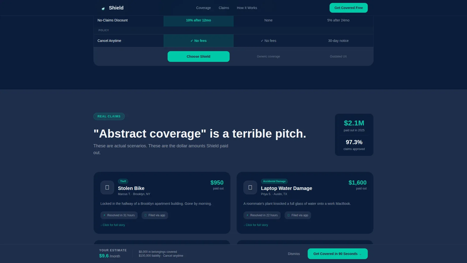
- Micro-case claim scenario cards showing dollar amounts paid out for real-world events like a stolen bike, kitchen fire, or laptop water damage
Feature list
This template includes a focused set of features that work together to guide visitors from curiosity to conversion. Each feature is grounded in what makes a good insurance landing page perform well.
Live Coverage Estimator Header
Three interactive sliders let visitors set monthly rent, estimated belongings value, and deductible preference. A real-time monthly premium updates in large teal numerals beside a coverage summary card. An apartment floor-plan illustration fills in furniture icons as the belongings value increases, making the tool feel immediate and personal.
Side-by-Side Comparison Table
A detailed, scannable comparison table stacks the visitor's calculated plan against two alternative coverage tiers. Row-by-row breakdowns cover liability limits, personal property caps, loss-of-use coverage, and deductible tiers. Cells highlight in teal wherever the recommended plan wins, so customers can make informed decisions at a glance without wading through fine print.
Claim Scenario Micro-Cards
Three claim scenario cards show real-world outcomes: a stolen bike, a kitchen fire, and laptop water damage, each with actual dollar amounts paid out. These visual elements replace abstract policy language with concrete proof. They answer the most common buyer question before it is even asked.
Sticky Conversion Bar
After the estimator interaction, a sticky bottom bar pins "Get Covered in 90 Seconds" to the screen as visitors scroll. The bar arrives pre-filled with their slider selections, saving time and removing the need to re-enter information. This single element is one of the most compelling reasons conversion rates stay high on this layout.
Progressive-Disclosure Signup Flow
The multi-step form opens with zip code, then email, then belongings estimate, and no credit card until the final step. This approach reduces bounce rates by lowering the perceived cost of starting. It mirrors how good insurance landing pages should manage data collection: minimal fields, maximum momentum.
Coverage Snapshot Download
A secondary call-to-action offers a free PDF summary of the visitor's estimate. It gives undecided customers a helpful resource to review later while capturing email for follow-up. This dual-path approach keeps potential customers moving even when they are not ready to commit immediately.
Page sections overview
| Section | Purpose |
|---|---|
| Coverage Estimator Header | Live three-slider tool with real-time premium and animated floor-plan results panel |
| Plan Comparison Table | Side-by-side breakdown of three coverage tiers with teal-highlighted winning cells |
| Claim Scenario Cards | Dollar-amount micro-cards for stolen bike, kitchen fire, and laptop water damage |
| How It Works | Four-step progressive flow: zip, email, belongings, covered |
| Social Proof Strip | Renter testimonials with specific claim outcomes and aggregate trust stats |
| Sticky Conversion Bar | Pinned "Get Covered in 90 Seconds" bar pre-filled with estimator data |
| Footer | Linear single-row pattern with links and secondary navigation |
Design & branding system
The visual identity follows a Dashboard Pro theme built on a Navy Authority color system. Every color has a specific role, so the site never feels cluttered. The result is a clean layout that feels like a fintech app customers already trust.
- Deep command navy (#0B1D3A) dominates backgrounds and header bands; interface slate (#1E2D4A) structures card surfaces; clean panel white (#F4F6F9) opens breathing room in data-dense sections
- Signal teal (#00C9A7) fires exclusively on interactive elements including buttons, slider thumbs, selected plan borders, and active-state toggles, so every clickable element is instantly identifiable
- Typography pairs Manrope for headings with DM Sans for body copy, keeping the tone professional but approachable without relying on a catchy headline alone to carry the first impression
Mobile & speed optimization
This template is built mobile-first because most insurance searches start on a phone. First impressions happen in seconds, so the layout prioritizes fast loading and clean visual hierarchy from the top of the page. The estimator, comparison table, and forms are all optimized for small screens.
- The Coverage Estimator adapts to a stacked single-column layout on mobile, keeping sliders and results easy to use with one thumb
- The comparison table scrolls horizontally on narrow screens so no coverage detail is hidden or truncated
- Client-side components handle the live calculator and sticky bar while static sections use server rendering, helping the site loads fast without sacrificing interactivity
How this template helps you convert
Insurance landing pages are designed to convert visitors into leads by focusing on a single action. This template earns that conversion by building trust before making any ask. The structure follows how informed decisions actually happen: understand, compare, then commit.
- The Coverage Estimator creates immediate personal relevance, making the insurance landing page feel like a tool built for the visitor rather than a generic brochure
- The comparison table and claim scenario cards remove the last objections by showing coverage value in plain language with real dollar amounts, building the trust signals that every good insurance landing page relies on
- The sticky conversion bar and secondary PDF download path create two routes to capture intent, lifting conversion rates without overwhelming visitors or forcing a single high-friction moment
Other information about this template
This template sits within the Finance and Insurance category, targeting the Young Professional Renters Insurance niche. It is a great example of how high converting landing pages can replace traditional insurance sales flows with utility-led design. The creation process is straightforward: customize colors, swap in your own coverage tiers and claim scenarios, and publish.
- The shield smart coverage comparison landing page template is suited to any insurance company offering renters coverage to a digitally native target audience
- While this template focuses on renters insurance, its comparison table structure and estimator layout can support other insurance products including life insurance, auto insurance, pet insurance, travel insurance, car insurance, health insurance, and business insurance with content updates
- The comparison table format is equally useful for any insurance business that needs to present multiple plan tiers to a target market that values transparency, from a health insurance landing page to a broader insurance website serving multiple lines
- Insurance providers who want to create professional landing pages that compete in organic insurance searches will find the clean layout and clear messaging well-suited for seo optimized content strategies, since search engines favor pages that guide visitors clearly and keep users engaged
- The social proof integration section supports testimonials from verified customers alongside aggregate claim stats, giving the insurance company credibility signals equivalent to industry awards without relying on jargon
- Helpful resources like the Coverage Snapshot PDF download add a lead-nurture path beyond the primary call to action, supporting a complete insurance landing page funnel from first visit to policy start
- The design system avoids overwhelming visitors with too many choices at once, using white space strategically so the right coverage details stand out at every scroll step
- Pages like this are a great example of how a value proposition can be communicated through a tool rather than a headline, keeping the best deal visible throughout without needing to repeat it in copy
Theme
Dashboard Pro
Creative direction
Calculator/Tool First
Color system
Navy Authority
Style
Comparison Table
Direction
Freemium/Trial
Page Sections
Live Coverage Estimator with Real-time Results
Side-by-side Plan Comparison Table
Claim Scenario Micro-cards
Sticky Conversion Bar with Pre-fill
Progressive-disclosure Multi-step Form
Coverage Snapshot PDF Download
Related questions
Who is this landing page template designed for?
Can the comparison table be adapted for other types of insurance?
How does the progressive-disclosure form reduce bounce rates?
What trust signals are built into this template?
Does this template work on mobile devices?



