Single Parent Auto Insurance Landing Page Template
Shield is a sidebar companion landing page template built for single parent auto insurance quoting services. It opens with a live three-slider calculator, pre-set to single-parent defaults, and guides visitors through a Problem-to-Solution scroll arc. The teal-and-navy Dashboard Pro design keeps every element legible and calm, helping potential clients go from curious to committed without friction.
by Rocket studio
Quick summary
Shield is a focused insurance landing page template designed for single parent auto insurance quoting. It uses a persistent sidebar, a real-time premium calculator, and a structured scroll arc to move visitors from anxiety to action. Every section resolves a specific concern before introducing the next, making the case that getting a quote is easier than staying on the wrong plan.
Who this template is for
This template is built for insurance agency teams and marketers who serve single-parent households. It speaks directly to a target audience that is budget-conscious, mobile-first, and short on time. If your insurance business specializes in car insurance for single-income families, Shield gives you a purpose-built starting point that matches their specific needs.
- Single parent auto insurance providers and brokers who want a dedicated quoting landing page
- Insurance agency owners looking to drive conversions from mobile-first visitors comparing car insurance rates
- Marketers building high converting landing pages for price-sensitive, time-poor potential clients
What problem this template solves
Most general insurance landing page designs treat every visitor the same. They present too many insurance options at once, risk overwhelming visitors before the form even loads, and fail to address the emotional reality of managing car insurance on a single income. Shield was built to close that gap.
- Single parents comparing car insurance at a red light need a page that loads fast, answers their core question immediately, and does not waste their time
- Generic insurance landing pages bury the quote form and scatter trust signals across disconnected sections, reducing conversion rate
- Pages that ignore the single-parent context miss the specific needs of this audience: one vehicle, one income, and real urgency around monthly costs
What you get with this template
Shield delivers a complete, ready-to-customize insurance landing page with a sidebar companion layout. Every element on the page works toward one goal: getting a single parent to fill out a quote request with confidence. The template files include all sections, interactive components, and the full design system described below.
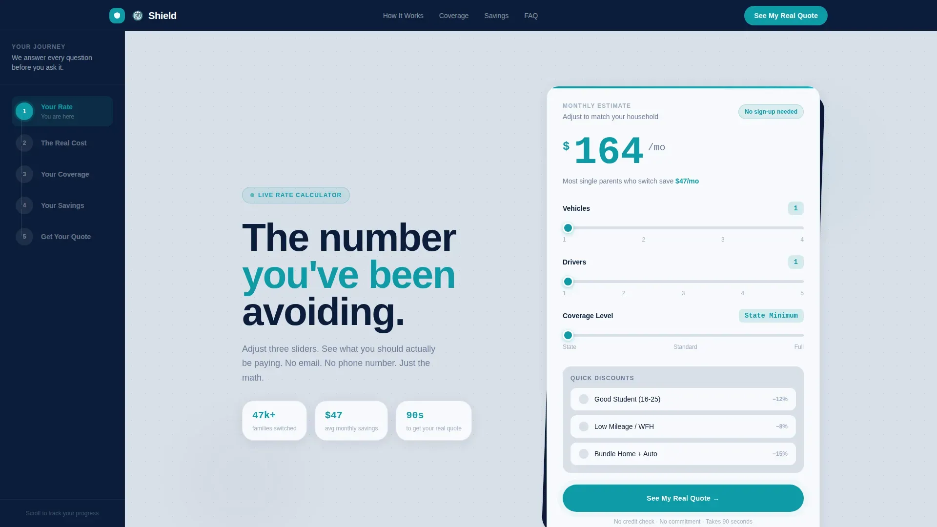
- A live three-slider calculator above the fold that updates the estimated monthly premium in real time, pre-set to single-parent defaults: one vehicle, one driver, state-minimum coverage
- A persistent left-rail sidebar that tracks scroll progress through three chapters: Your Rate, Your Coverage, and Your Savings
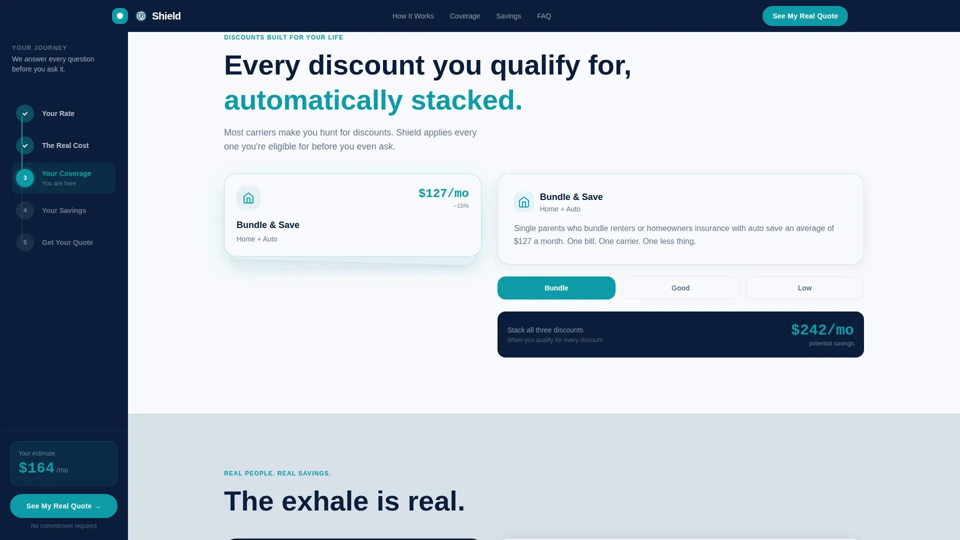
- Stacking discount card modules for bundling, good-student teen driver credits, and low-mileage adjustments, plus a social proof section with testimonial slots and carrier trust logo placement
Feature list
This section covers the key features included in the Shield template. Each feature is grounded in the template brief and designed to support a clear, high-performing insurance landing page experience.
Live Premium Calculator with Single-Parent Defaults
The above-the-fold calculator includes three sliders pre-configured for single-parent use: one vehicle, one driver, and state-minimum coverage. The estimated monthly premium updates in real time using large teal numerals styled in JetBrains Mono. A supporting line reads "Most single parents who switch save $47/mo," grounding the tool in immediate, tangible value. Visitors can adjust the sliders before entering any personal information.
Persistent Sidebar Progress Rail
The left-rail sidebar stays visible as visitors scroll. It tracks their position through the three-chapter arc: Your Rate, Your Coverage, and Your Savings. This structure helps guide visitors through the page without overwhelming them, keeping the conversion goal visible at all times. The sidebar also locks the primary call-to-action button in place so it is always reachable.
Problem-to-Solution Scroll Arc with Animated Counter
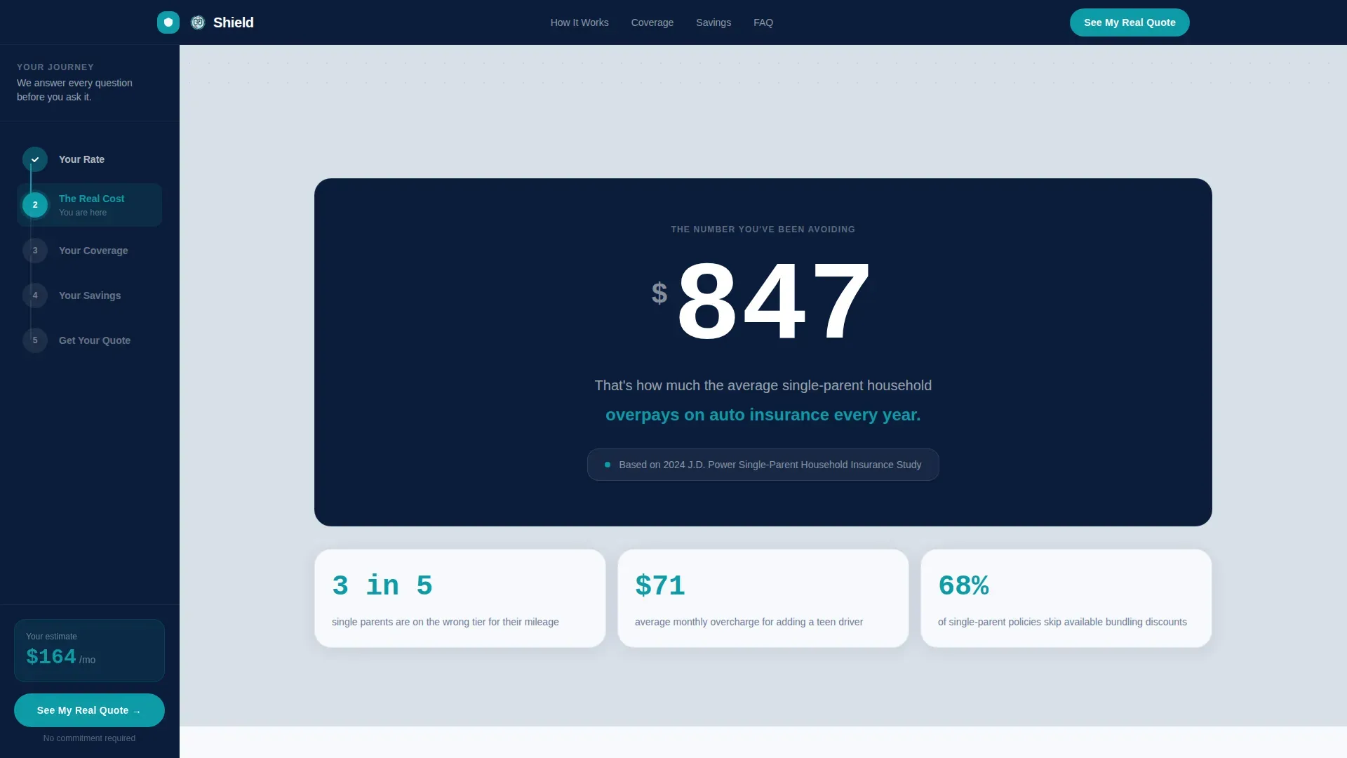
The main content panel opens with an animated count-up counter showing how much the average single-parent household overpays annually on car insurance. The scroll arc then moves through solution modules in sequence: discount stacking cards, a good-student teen driver credit section, and a low-mileage adjustment panel for work-from-home parents. Each section resolves one anxiety before the next appears, building a compounding case for action.
Stacking Discount Card Modules
Discount benefits are visualized as stacking card components that reveal on scroll. Cards cover bundling discounts, good-student credits for teen drivers, and low-mileage savings for parents who work from home. This format lets visitors see exactly how their specific situation could reduce their premium, making the value proposition concrete rather than abstract.
Click-Through Funnel with Pre-Fill Routing
The primary call-to-action, "See My Real Quote," appears first inside the calculator and then locks into the sidebar as visitors scroll. Clicking it routes to the carrier's full application form with pre-filled data from the sliders. A secondary text link, "Compare All Plans Side-by-Side," opens a modal displaying three tiered insurance options. The funnel earns the click before asking for personal information.
Social Proof and Trust Signal Section
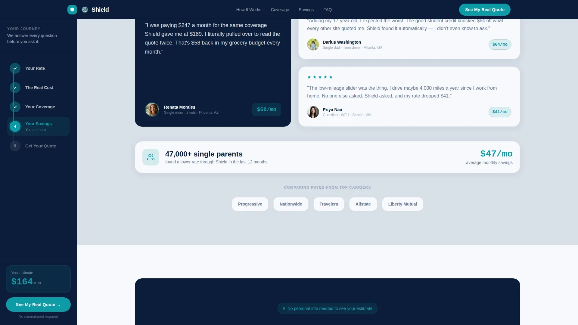
The page includes a dedicated section for named single-parent testimonials with savings amounts, carrier partner logo placement, and an aggregate savings statistic. Trust signals like these help build credibility with potential clients who are cautious about sharing personal data. Displaying real customer outcomes alongside carrier logos helps the insurance agency establish authority and reassure visitors about security.
Page sections overview
| Section | Purpose |
|---|---|
| Hero Calculator | Live slider estimator with real-time teal premium display and single-parent defaults |
| Sidebar Progress Rail | Persistent chapter tracker linking Your Rate, Your Coverage, and Your Savings |
| Pain Counter | Animated count-up showing average annual overpayment to frame the problem emotionally |
| Discount Stack | Stacking card reveals for bundling, good-student, and low-mileage savings |
| Social Proof | Named testimonials, carrier logos, and aggregate savings stat to build trust |
| Final Call to Action | "See My Real Quote" with transparency reassurance before routing to application |
| Footer | Linear single-row footer with minimal links |
Design & branding system
Shield uses a Dashboard Pro visual theme built around the Navy Authority color system. The palette is described as the interior of a reliable sedan at night: instruments legible, everything steady. No stock photography of smiling families appears anywhere on the page. Images and visuals are replaced by live data, numbers, and interactive tools, so the math does the persuading.
- Color system: deep command navy (#0B1D3A) for the sidebar and header, cool policy-gray (#D8DFE8) for the main content background, trust-white (#F7F9FC) for card surfaces and input fields, and decisive teal (#0E9AA7) for every button, toggle, and interactive accent
- Typography: DM Sans in bold and black weights for headings, and JetBrains Mono for the live premium number display, creating clear visual contrast between narrative and data
- White space is used deliberately throughout the layout so visitors can focus on one section at a time without feeling rushed or lost
Mobile & speed optimization
Most people are not comparing car insurance from a desktop. They are scrolling on their phones between school drop-offs and grocery runs. Shield is built mobile-first, with large tap targets, a streamlined form structure, and a layout that stays legible on any screen size. A high-performing insurance landing page should not make visitors work hard to get their question answered.
- The calculator sliders, discount toggles, and call-to-action buttons are all sized for easy one-thumb use on a small screen, so visitors can fill out the form without pinching or zooming
- The multi-step approach to the quote flow breaks the process into manageable steps so visitors do not feel overwhelmed before they reach the form
- Fast load times matter here: if a page is clunky on mobile, potential clients will not stick around, and this template prioritizes a clean, lightweight structure for every device
How this template helps you convert
Shield is designed to drive conversions by letting visitors interact with their own numbers before asking for anything in return. The page earns trust progressively. Each scroll section resolves a concern. By the time a visitor reaches the final call to action, doing nothing feels more expensive than clicking. That is the logic the whole template is built on.
- The live calculator creates immediate engagement by showing a real estimated premium before a single piece of personal data is entered, turning curiosity into commitment one slider at a time and keeping users engaged throughout the experience
- The sidebar call-to-action button stays locked in view as visitors scroll, providing a seamless experience where the path to conversion is never more than one tap away on any device
Other information about this template
Shield is a great example of how a focused insurance landing page template can serve a niche audience without losing conversion discipline. The template files are provided in a format that marketers and insurance agency teams can customize to match their company branding, coverage language, and carrier partnerships. The page is scoped to a single landing flow, so there are no external navigation links to distract visitors from the quote goal.
- This template supports insurance business goals beyond just auto insurance: the sidebar layout and calculator pattern can be adapted for life insurance, life insurance policies for single parents, or even travel insurance quoting flows where simplicity and speed are priorities
- A health insurance landing page variant is also a natural fit for this layout, since health insurance landing needs share the same pattern: a budget-anxious parent, a need for fast answers, and a form that should ask only for the essentials
- The Shield trusted single parent auto insurance landing page template is built to help insurance companies, insurance agency teams, and solo marketers launch a purpose-built quoting page quickly, without rebuilding every component from scratch
- Displaying industry awards, relevant accreditations, and certification badges in the social proof section can turn skepticism into confidence for potential clients who are new to the company
- Companies that use dedicated landing pages generate significantly more leads than those that rely on general website pages alone, making a focused template like this a practical tool for any insurance business looking to grow
Theme
Dashboard Pro
Creative direction
Problem→Solution Arc
Color system
Navy Authority
Style
Sidebar Companion
Direction
Click-Through
Page Sections
Live Premium Calculator with Real-time Display
Persistent Sidebar Progress Rail
Problem-to-solution Animated Scroll Arc
Click-through Funnel with Modal Comparison
Social Proof and Trust Signal Section
Dashboard Pro Navy Authority Design System
Related questions
Can I customize the calculator slider defaults for my own coverage tiers?
Does this template work for insurance products beyond auto insurance?
How does the sidebar call-to-action stay visible as visitors scroll?
What trust signals does the template include out of the box?
Is this template suitable for mobile users comparing car insurance on the go?



