Military Service Member Insurance FAQ & Common Questions Website Template
Shield is a single-column landing page built for military umbrella insurance providers targeting servicemembers with complex liability profiles. It combines a threat-brief FAQ flow, an inline four-question coverage gap quiz, and a persistent call-to-action bar to move E-6-and-above servicemembers toward requesting a personalized coverage assessment. No images, no fluff, just precise, mission-ready design.
by Rocket studio
Quick summary
Shield is a focused, single-column landing page template built for military specialty umbrella insurance. It speaks directly to servicemembers carrying layered liability across rental properties, personal vehicles on post, and dependent-operated businesses. The page runs a FAQ-driven threat brief and an inline risk-tier quiz to earn trust before asking for any contact detail.
Who this template is for
This template is built for insurance providers and brokers who serve an active-duty or retiring military audience. It works especially well when your offer requires more explanation than a standard policy page can provide.
- Providers offering umbrella liability coverage to E-6 through O-6 servicemembers with growing assets
- Brokers targeting retiring senior non-commissioned officers with VA disability income and Thrift Savings Plan rollovers
- Financial services firms reaching off-post rental property owners and families with dependents running independent activities
What problem this template solves
Most insurance landing pages treat servicemembers like standard civilian prospects. That mismatch costs conversions. Shield addresses the specific liability gaps that career military families actually face, framing them in language that feels like a direct counseling session rather than a sales pitch.
- Servicemembers don't know which policy responds when a PCS-related rental claim surfaces
- Standard umbrella pages never address dependent spouse liability, on-post business activity, or personally owned vehicle exposure at the motor pool
- Visitors leave without acting because the page never demonstrates it understands their actual situation
What you get with this template
You get a fully structured single-column landing page with five distinct functional sections, a sequential inline quiz, and a sticky conversion bar. Every element is coded for performance with no external images and pure CSS and JavaScript animations.
- A dark full-bleed hero with a radar-pulse ambient glow, condensed headline typography, and a primary call-to-action button
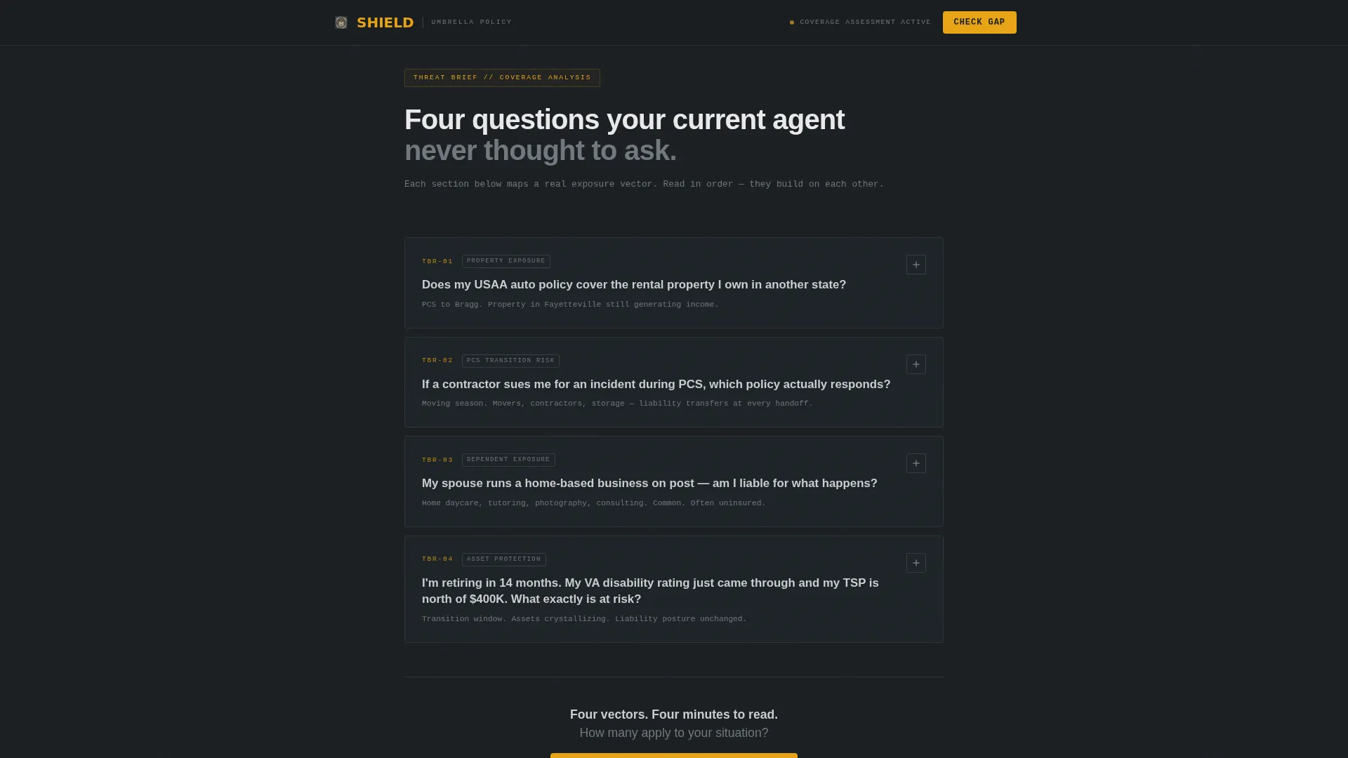
- Four expanding FAQ panels framed as a threat brief, each surfacing a real servicemember liability question with a plain-language answer
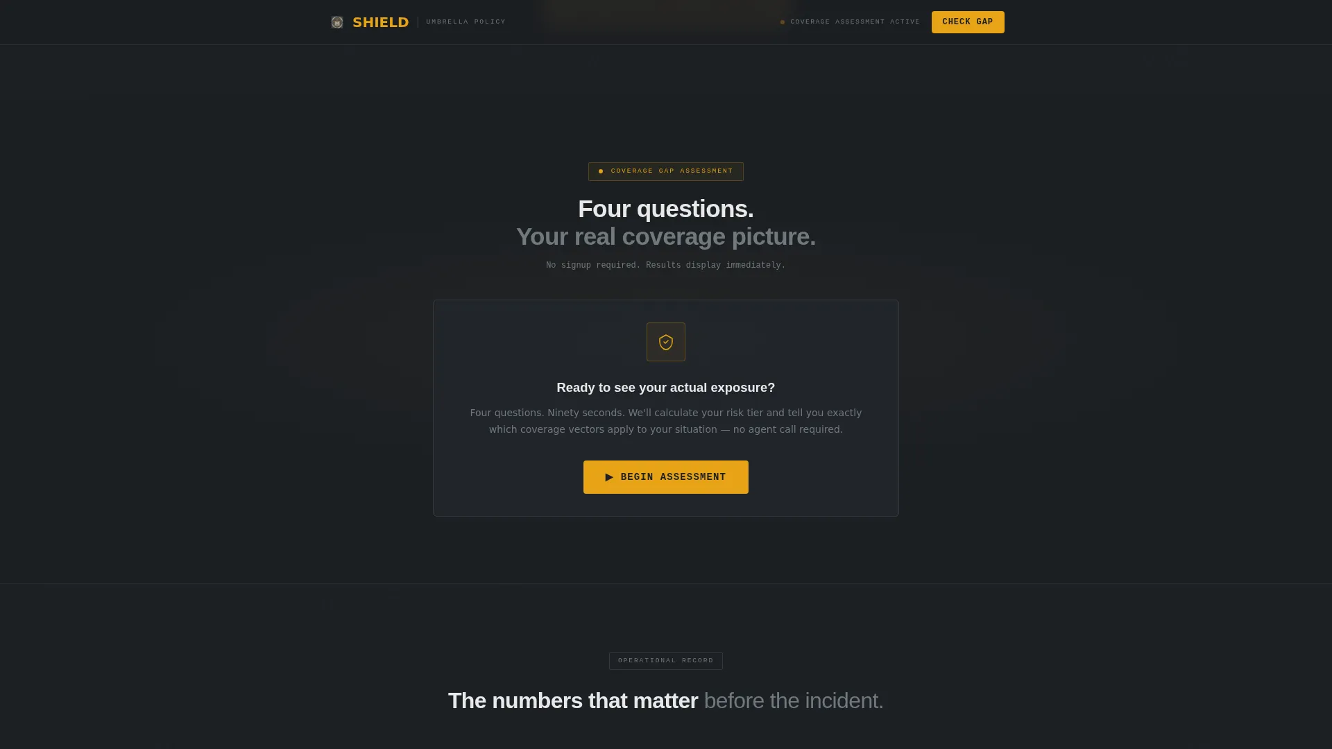
- An inline four-question quiz delivering an instant risk tier result in green, amber, or red, followed by a single email capture field
Feature list
This template is built around five core capabilities drawn directly from its design brief and functional scope.
Radar Pulse Hero Section
The hero uses a full-bleed gunmetal background with a radial amber glow that pulses from center screen. A condensed titanium headline fades in on load. The primary call-to-action button sits immediately below the subheadline, giving the visitor a clear action before any scroll.
Threat Brief FAQ Panels
Four expanding answer panels are structured as an unfolding liability brief rather than a standard help section. Each panel opens on click to reveal a plain-language answer written in the tone of a senior rater counseling session. The sequence is ordered so each answer raises the stakes and surfaces the next concern naturally.
Inline Sequential Quiz
The coverage gap assessment runs directly on the page without a modal or redirect. Four questions appear in order: branch and pay grade, number of properties owned or rented out, whether a spouse or dependent operates a vehicle or business independently, and current umbrella coverage status. Results display immediately as a color-coded risk tier.
Persistent Conversion Bar
After the visitor passes the third FAQ panel, a sticky bottom bar appears and remains visible during continued scrolling. It carries the same primary call-to-action label used in the hero, reinforcing the action without interrupting the reading flow.
Credibility Metrics Bar
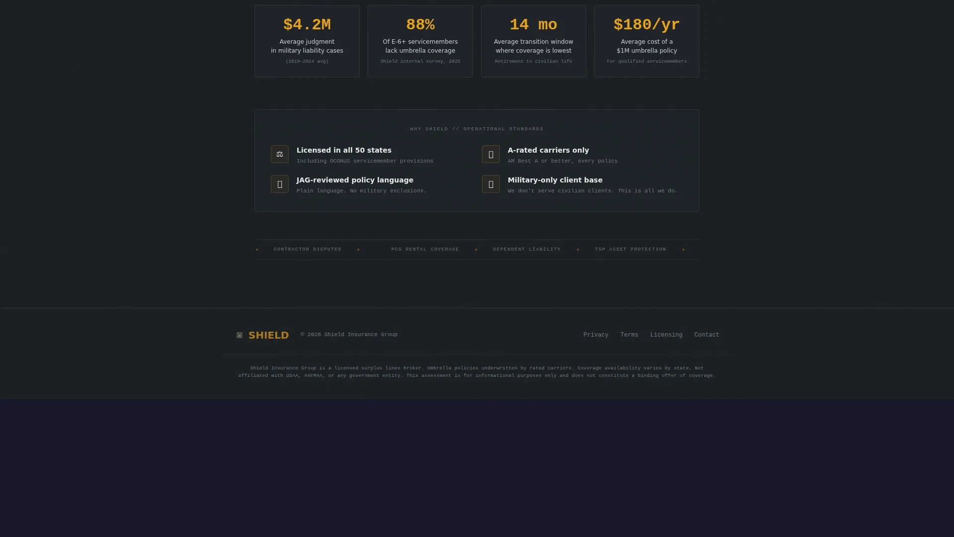
A dedicated section presents specific coverage statistics and trust signals. It is intentionally structured around hard numbers rather than generic testimonials, matching the data-forward tone that a military audience expects.
Corporate Precision Typography System
Headlines use DM Sans in a condensed weight that reads like a briefing slide. Data labels and quiz inputs use IBM Plex Mono, giving the assessment section a tactical, instrument-panel feel that reinforces the template's visual identity.
Page sections overview
| Section | Purpose |
|---|---|
| Hero with call to action | Establish stakes and prompt the first click |
| Threat Brief FAQs | Surface real liability gaps through four expanding panels |
| Inline Quiz Assessment | Deliver a personalized risk tier result in four questions |
| Credibility Metrics Bar | Build trust with specific coverage stats and signals |
| Persistent call to action Bar | Keep the primary action visible after the third FAQ |
| Footer | Single-row linear layout with essential links |
Design & branding system
The visual language is Corporate Precision, every element serves a function, and decoration is removed entirely. The palette is built around a Monochrome Steel system with one active accent.
- Gunmetal black (#1B1F23) fills the primary background; brushed steel (#71797E) handles secondary text and divider lines; matte titanium (#C9CCD0) surfaces card panels and quiz answer areas
- Tactical amber (#E8A317) appears exclusively on call-to-action buttons and active-state highlights, functioning like a single status indicator on a tactical operations center display
- DM Sans condensed weight drives all headline typography; IBM Plex Mono handles data labels, quiz inputs, and risk tier readouts for a clean instrument-panel contrast
Mobile & speed optimization
The template is built desktop-first with a layout that adapts cleanly to mobile viewports, which matters because servicemembers frequently access financial content from personal phones.
- No external images are used anywhere; all visual depth comes from CSS gradients, the radar pulse animation, and typographic contrast
- The inline quiz, expanding FAQ panels, and sticky conversion bar are all handled in pure CSS and JavaScript with no third-party dependencies
- Scroll-reveal animations and the sequential quiz flow are tuned for medium-to-high interactivity without adding render-blocking resources
How this template helps you convert
Shield earns the conversion by demonstrating expertise before asking for anything. The page structure is designed to move a skeptical, liability-aware servicemember from arrival to email submission through a logical progression of credibility moments.
- The hero immediately frames the visitor's problem in plain military language and offers a clear, low-commitment action: a four-question coverage check that takes roughly 90 seconds
- The threat brief FAQ sequence builds a quiet case that the visitor's current coverage has seams, so by the time the quiz appears the visitor is motivated to find out their risk tier rather than being sold to
- The risk tier result, displayed in green, amber, or red, makes the abstract concept of a coverage gap concrete and personal, and the single email field that follows asks for the minimum needed to deliver a personalized coverage brief
Other information about this template
Shield is a single-column flow landing page, meaning all content runs in one vertical sequence with no sidebar navigation or internal page links. This keeps the visitor's attention directed toward the quiz result and email capture without competing paths.
- The footer follows a Pattern 1 linear single-row layout, keeping the bottom of the page clean and consistent with the overall no-distraction design philosophy
- All animations, including the radar pulse, scroll reveals, and expanding FAQ panels, are set to medium-to-high intensity, giving the page energy without sacrificing load discipline
- The template is localized for a United States audience using USD references and military rank and branch terminology throughout the quiz and FAQ copy
- The quiz result screen intentionally avoids pricing and hard-sell language; the assessment earns the email address by proving the page already understands the visitor's risk profile better than a generic agent would

Theme
Corporate Precision
Creative direction
FAQ-Driven
Color system
Monochrome Steel
Style
Single Column Flow
Direction
Quiz/Assessment
Page Sections
Radar Pulse Hero with Call to Action
Threat Brief FAQ Panels
Inline Four-question Quiz
Persistent Sticky Conversion Bar
Credibility Metrics Bar
Corporate Precision Typography System
Related questions
What sections are included in this landing page template?
How does the inline coverage gap quiz work?
Is this template designed specifically for military insurance?
Does the template work well on mobile devices?
Does this template include testimonials or social proof elements?



