Specialist Military Service Member Insurance Comparison Website Template
Shield is a dashboard-style military travel insurance landing page built for active-duty and Guard/Reserve service members. It uses a dark Data Command visual theme with teal and amber data grids to expose coverage gaps in standard policies. A free coverage scan drives conversion, while comparison grids, mission scenario blocks, and a gap counter build a compelling, data-driven case for signing up.
by Rocket studio
Quick summary
Shield is a single-page military travel insurance landing page template designed around a Data Command aesthetic. It combines live comparison grids, mission scenario blocks, and a three-field coverage scan intake to help active-duty and Guard/Reserve service members see exactly where standard travel policies fall short, and why Shield fills those gaps.
Who this template is for
This template is purpose-built for insurance providers, insurtech startups, and specialty carriers serving the United States military community. It fits teams that need a high-trust, data-forward landing page to reach service members with a specific and urgent coverage need.
- Active-duty personnel at the E-4 through O-5 pay grades booking rest-and-recreation or leave travel
- Guard and Reserve members managing nonrefundable civilian bookings around drill weekends
- Military families coordinating block leave or permanent change-of-station moves across multiple time zones
What problem this template solves
Standard travel insurance policies are written for civilian travelers. They systematically exclude the exact situations military personnel face: orders-based cancellations, medevac from overseas locations that commercial carriers will not touch, and gear loss on military transit routes. Service members often discover these gaps only after a claim is denied.
- No standard comparison tool exists that maps military-specific exclusions against a specialty plan side by side
- Guard and Reserve members booking nonrefundable travel have no easy way to assess their real exposure before purchasing
- The persuasion problem is real: service members are skeptical of sales copy and respond to data, not marketing language
What you get with this template
This template delivers a fully structured, single-page layout that leads visitors through a structured intelligence brief, building evidence before asking for a conversion. Every section has a defined purpose and a clear visual hierarchy.
- A stacked-type hero section, live coverage comparison data grid, mission scenario bento grid, cumulative gap counter, and a three-field coverage scan intake form
- A Teal Catalyst color system with operational black, command-screen teal, gunmetal grid lines, and alert amber reserved for calls to action and coverage gap flags
- High-interactivity components including animated cell reveals, amber pulse effects, live grid filtering, a FAQ accordion, and hover states throughout
Feature list
This template is built around a set of purpose-designed components that work together to make the coverage gap argument visible and actionable.
Stacked Type Tower Hero
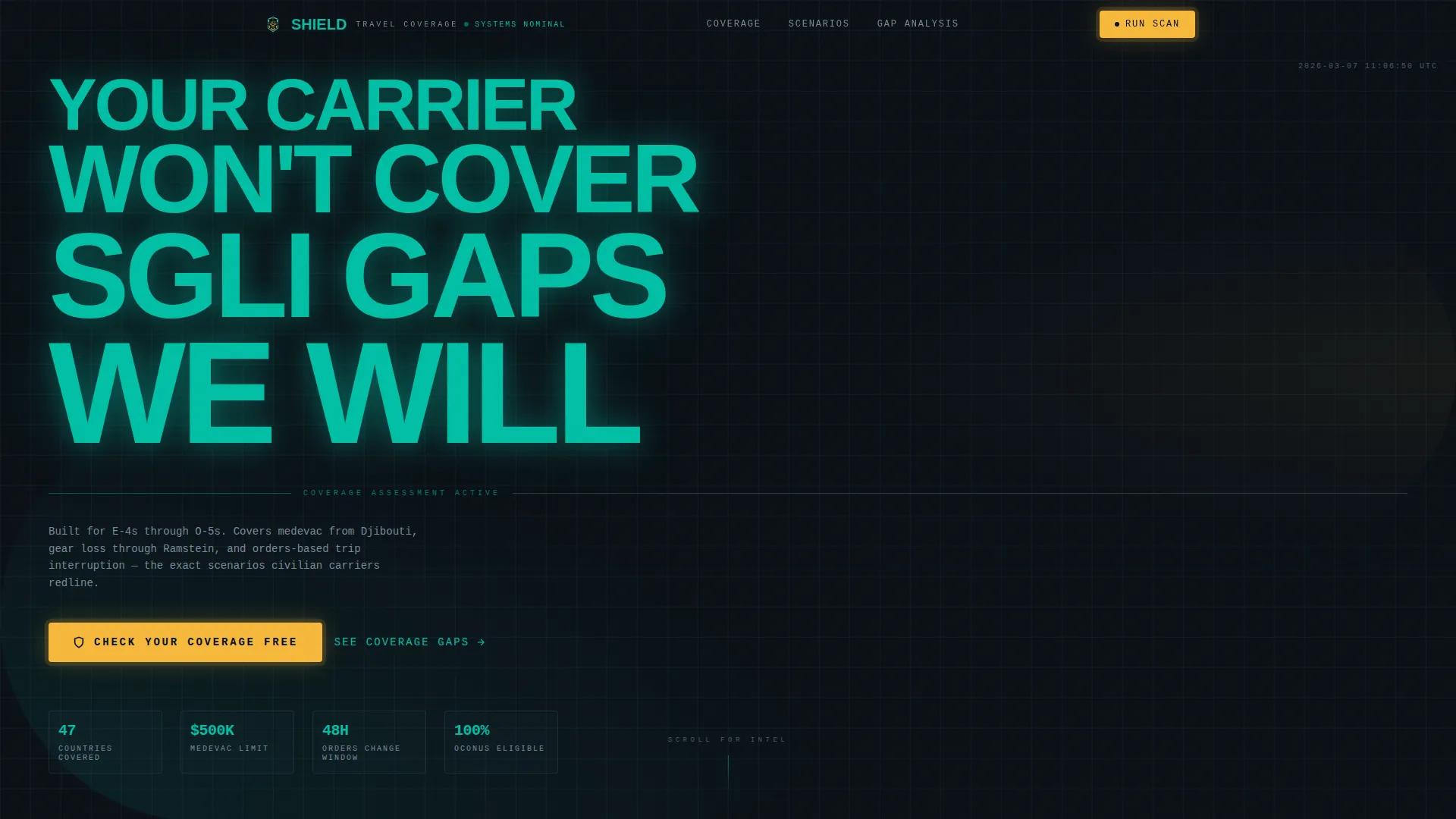
The hero fills the viewport with a monolithic column of condensed type reading "YOUR CARRIER / WON'T COVER / SGLI GAPS / WE WILL." Each line grows slightly larger than the one above it. A single amber pill button pulses beneath the stack, prompting visitors to check their coverage free. No imagery is used; the typography carries all authority.
Live Coverage Comparison Grid
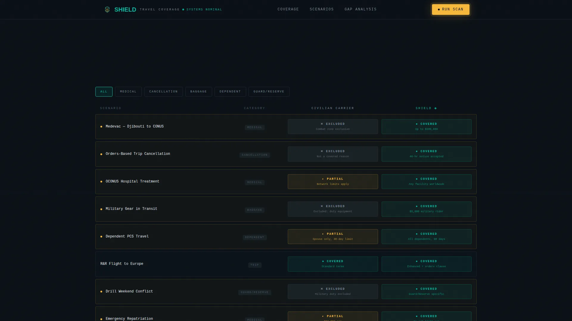
A structured data grid compares standard travel insurance exclusions against Shield's coverage across multiple categories. Grid cells animate teal for covered items and fade to gunmetal for excluded ones as the visitor scrolls. Coverage gaps are flagged in alert amber, building a cumulative case with each new comparison layer revealed.
Mission Scenario Bento Grid
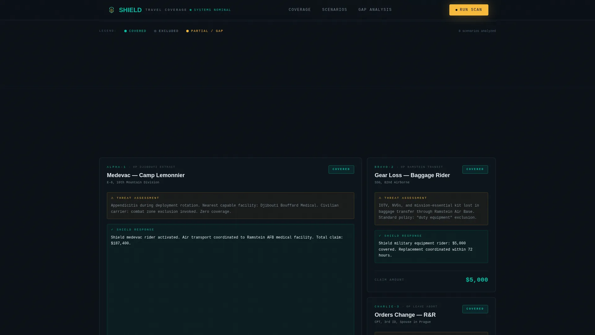
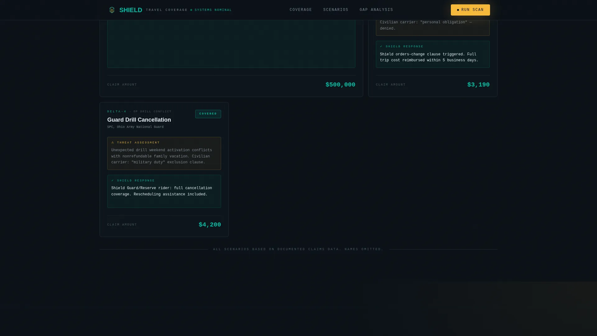
Three mission scenario cards present concrete real-world situations: medevac from an overseas location, gear loss in transit through a military hub, and trip interruption when orders change within forty-eight hours of scheduled leave. Each card is a self-contained data block that reinforces the coverage comparison argument with specific, recognizable scenarios.
Cumulative Gap Counter
As visitors scroll through the comparison grids, a running amber gap counter accumulates the number of coverage gaps identified. Social proof elements including specific dollar-amount limits and branch coverage counts appear alongside the counter, grounding the data in verifiable numbers rather than generic claims.
Three-Field Coverage Scan Intake
The primary conversion element is a lightweight intake form asking for branch of service, next travel destination, and a dot-mil email address. Submitting the form generates a personalized gap analysis comparing the visitor's current coverage against Shield's base plan. A secondary conversion offers a downloadable PDF comparison chart gated behind rank and duty station inputs.
Page sections overview
| Section | Purpose |
|---|---|
| Hero: Stacked Type Tower | Establishes authority with full-viewport condensed type and amber call to action |
| Coverage Comparison Grid | Animates teal/amber/gunmetal cells to reveal exclusion gaps versus Shield coverage |
| Mission Scenarios Bento | Presents three concrete real-world coverage situations service members recognize |
| Gap Counter Block | Accumulates amber gap flags with social proof numbers to build urgency |
| Coverage Scan Form | Captures branch, destination, and dot-mil email for a personalized gap analysis |
| Footer: Linear Single-Row | Closes the page with a clean, minimal single-row footer pattern |
Design & branding system
The template follows a Data Command visual theme that references a heads-up display in a darkened operations center. Every color has a defined role, and no element is decorative without purpose.
- Color system uses four values: operational black (#0B1117) for backgrounds, command-screen teal (#00BFA6) for confirmed coverage and active states, grid-line gunmetal (#2C3A47) for excluded or inactive cells, and alert amber (#F6B93B) strictly for calls to action and coverage gap warnings
- Typography pairs DM Mono for data labels and grid values with Manrope for body copy, while the hero uses a massive condensed typeface stack that fills the viewport
Mobile & speed optimization
The template is designed desktop-first to deliver the full operations-center terminal experience on larger screens. Mobile support is built in so the data grids and intake form remain fully usable on smaller devices.
- GSAP ScrollTrigger handles staggered cell reveal animations and the amber pulse effect, with IntersectionObserver managing performance-aware triggering
- Static sections use Server Components while animated and interactive sections use Client Components, keeping the rendered output lean where motion is not required
How this template helps you convert
Shield earns the conversion by showing visitors their own data before asking for anything. By the time a visitor reaches the intake form, they have already seen their coverage gaps flagged across three grids.
- The stacked hero immediately frames the problem in terms the audience recognizes, using military-cadence language and a single amber call to action that stands out against the dark background
- The scrolling comparison grid and gap counter do the persuasive work progressively, so visitors feel informed rather than sold to by the time they reach the coverage scan form
- The freemium model lowers the entry barrier: a free personalized gap analysis requires only three fields, while the gated PDF comparison chart provides a secondary conversion path for visitors who want more detail before committing
Other information about this template
This template is built specifically for the military travel insurance niche, where trust and data credibility matter more than visual style. A few additional details are worth noting for teams evaluating it.
- The template uses United States dollar amounts and United States military terminology throughout, including pay grade references, branch names, and location names consistent with active-duty travel patterns
- Animation intensity is high by design; teams deploying this template should review motion settings for audiences that may prefer reduced motion experiences
- The landing page direction follows a freemium and trial conversion model, making it suitable for insurance providers offering a no-cost entry point before a paid plan purchase
- The template style is Dashboard/Data Grid, and the creative direction is a Comparison Journey, meaning the entire scroll experience is structured to escalate awareness of coverage gaps before the conversion ask
Theme
Data Command
Creative direction
Comparison Journey
Color system
Teal Catalyst
Style
Dashboard/Data Grid
Direction
Freemium/Trial
Page Sections
Stacked Type Tower Hero
Animated Coverage Comparison Grid
Mission Scenario Bento Grid
Cumulative Gap Counter with Social Proof
Three-field Coverage Scan Form
Related questions
Who is the target audience for this template?
What conversion model does this template use?
Does the template include animated components?
Can the coverage comparison grid content be updated?
Is this template suitable for both active-duty and Guard or Reserve audiences?



