Consumer Protection Government Landing Page Template
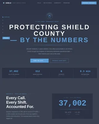
Shield is a hub-and-spoke anchor-nav landing page built for a consumer protection state department. It leads with an interactive topographic state map, animates a $4.7M recovery counter, and guides visitors through four focused spokes: reporting complaints, accessing educational resources, registering for workshops, and tracking case progress. The design feels calm, clear, and competent from the first scroll.
by Rocket studio
Quick summary
Shield is a single-page, anchor-nav landing page designed for a government consumer protection department. It opens with an interactive state map and an animated recovery stat, then flows into four spoke sections: Report, Learn, Attend, and Track. Every section leads with a data point before the explanation. The result is a page that feels organized, trustworthy, and easy to act on.
Who this template is for
This template is built for state-level consumer protection offices and government bureaus that handle public-facing complaint intake, education, and outreach. It suits teams that run regular workshops and need a central hub residents can return to.
- Government communications and public affairs staff publishing consumer guidance
- Department staff coordinating workshop registrations and complaint intake across counties
- State agencies that want a clean, unified page replacing scattered PDF links and email addresses
What problem this template solves
Many government consumer protection pages bury the most important actions under layers of navigation. A resident who just discovered a billing error or predatory loan clause needs to act immediately, not dig through menus. This template removes that friction.
- Visitors land and immediately see what the department has recovered and what complaints are most common in their county
- The anchor nav keeps Report, Learn, Attend, and Track one click away at all times, no matter how far down the visitor has scrolled
- The persistent wildflower-gold complaint badge means a distressed visitor never loses the intake path while reading educational content
What you get with this template
You get a fully structured, single-page hub with five major content zones, a sticky anchor nav, and a design system built around institutional trust and warmth. Every section is pre-organized so your team fills in content, not structure.
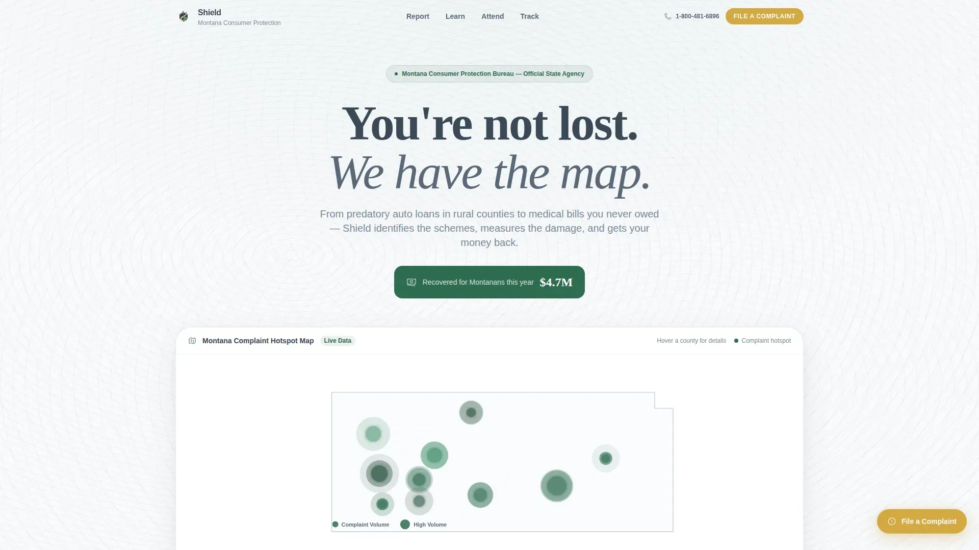
- Interactive SVG topographic state map with county hover tooltips and pulsing complaint-hotspot indicators
- A four-spoke content layout covering complaint filing, educational resources, event registration, and case tracking
- A persistent floating call-to-action badge and an inline event registration form with county and complaint fields
Feature list
This template ships with the following built-in components and interaction patterns.
Interactive Topographic State Map
The hero section renders a soft SVG topographic map with county boundaries drawn in granite slate. Evergreen pulsing dots mark complaint hotspots, sized by volume. Hovering a county reveals its top complaint category and gently zooms the view. An animated counter climbs to $4.7M recovered as the page loads.
Sticky Anchor Navigation Bar
A single-line nav bar locks to the top of the viewport on scroll. It shows four anchors: Report, Learn, Attend, and Track. Active indicators use evergreen to show which spoke the visitor is currently viewing. This keeps orientation clear on a long scrolling page.
Stats-First Spoke Sections
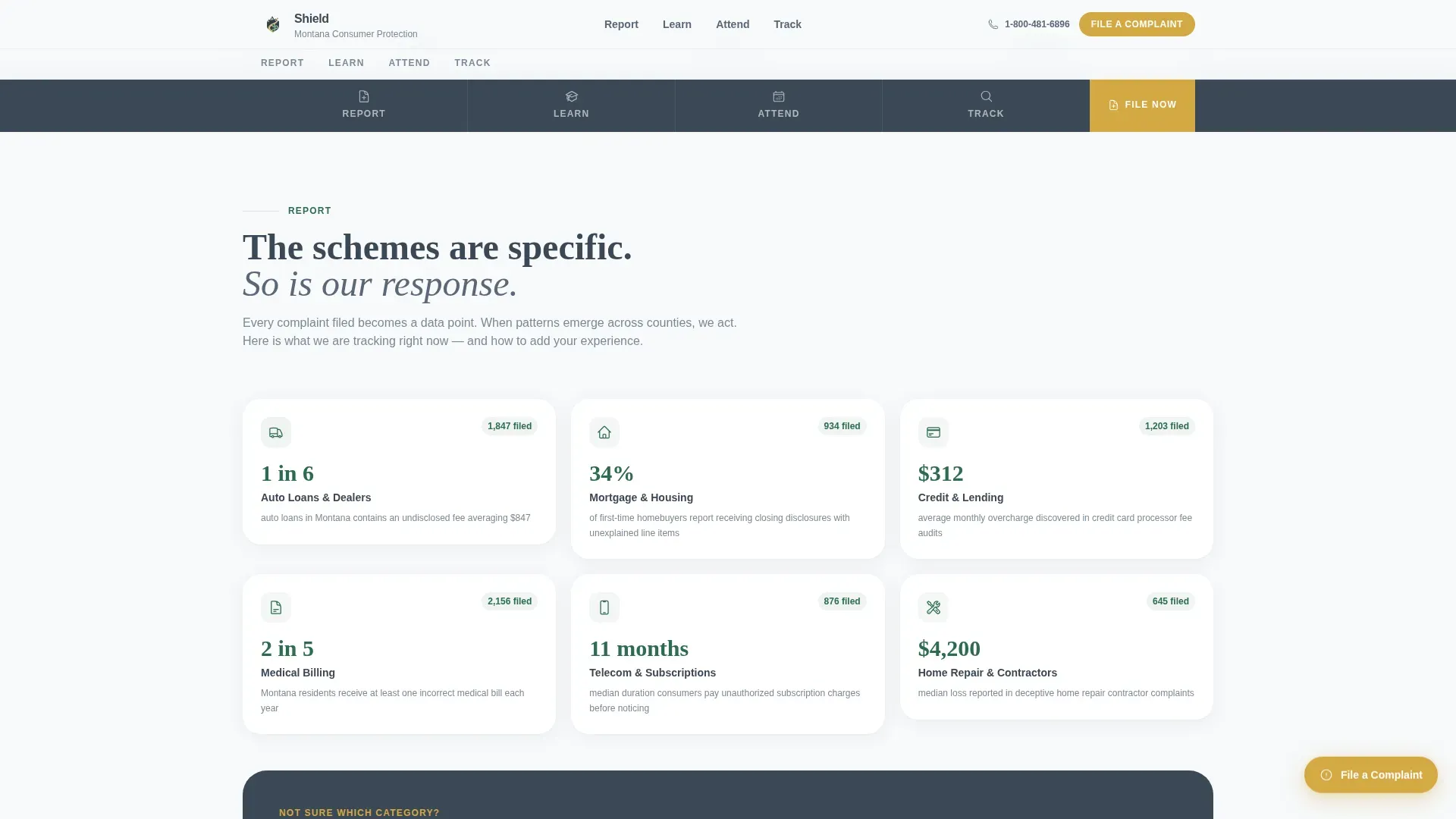
Each spoke opens with a bold statistic before any explanatory copy. The numbers grow more local and personal as the visitor scrolls. This pattern builds cumulative trust and gives each section a clear entry point that stops the scroll.
Event Registration Card Grid
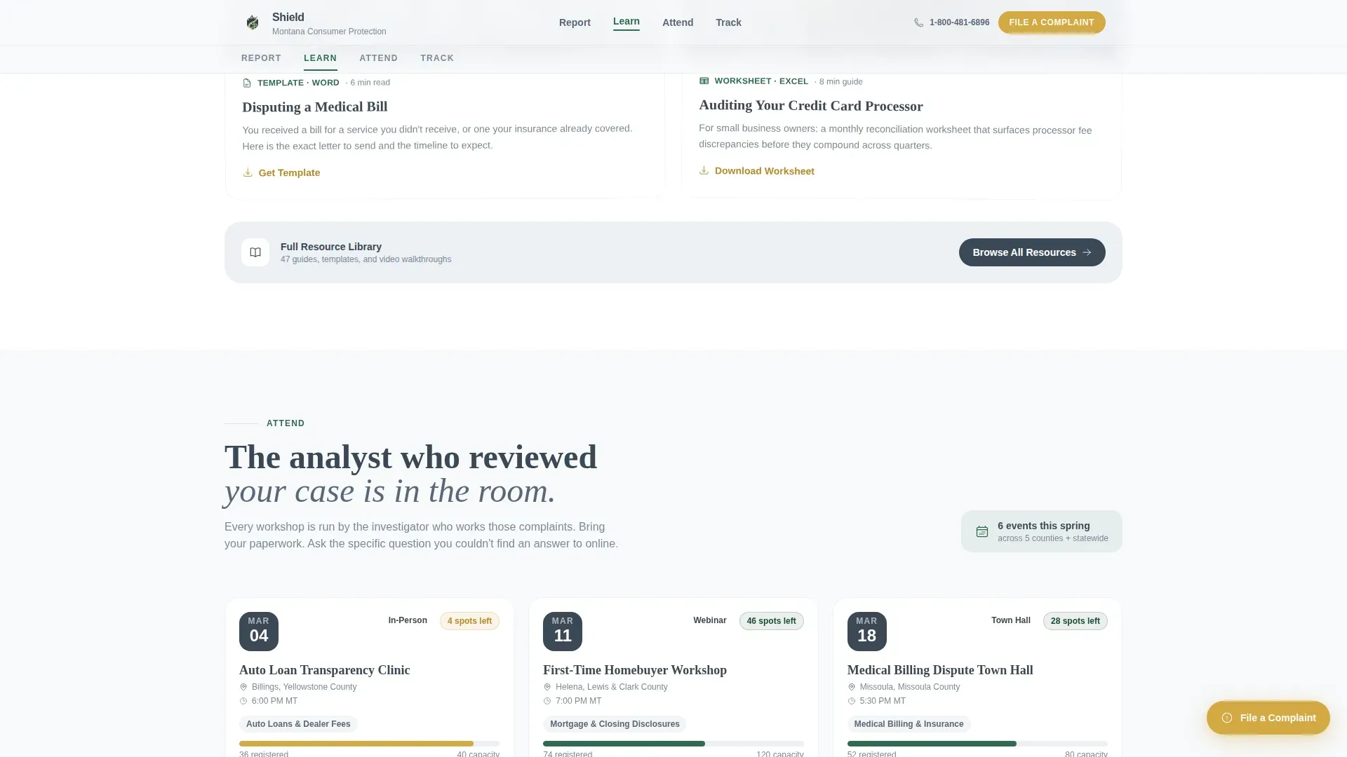
The Attend spoke displays upcoming workshops, town halls, and webinar clinics in a chronological card grid. Each card shows date, county, topic, and remaining seat capacity. Clicking a card opens an inline registration form with fields for name, email, county of residence, and an optional complaint checkbox.
Persistent Floating Complaint Badge
A wildflower-gold floating badge sits in the lower-right corner throughout the entire page. It links directly to the complaint intake form. Visitors who arrived with urgency never need to scroll back up or search for the filing path.
Educational Resource Spoke
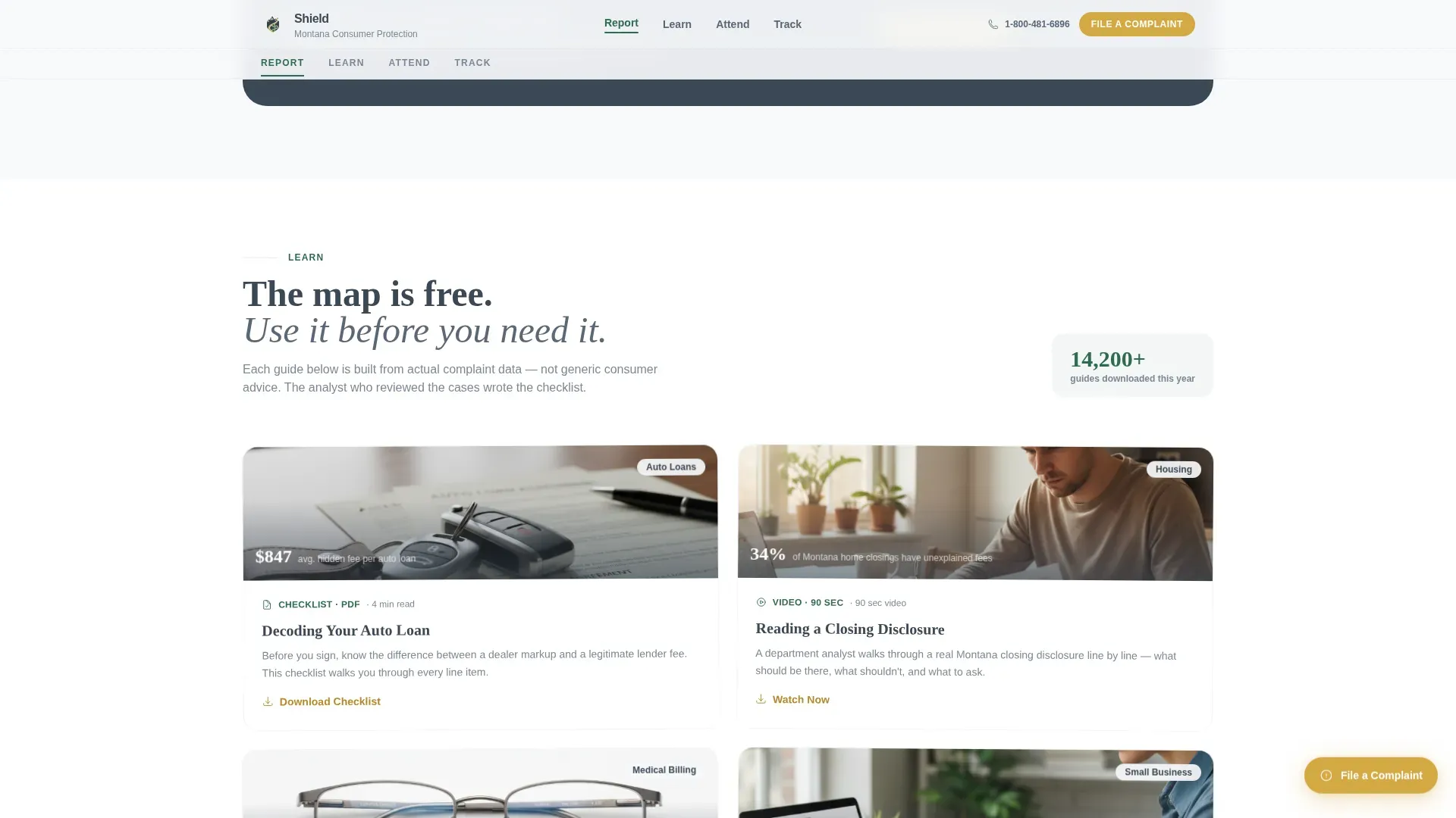
The Learn spoke holds downloadable checklists, short topic explainers, and embedded 90-second analyst videos. Content is organized by complaint category so a first-time homebuyer and a small business owner each find relevant guidance quickly.
Page sections overview
| Section | Purpose |
|---|---|
| Hero Map | Topographic state map with animated recovery counter and county complaint hotspots |
| Sticky Anchor Nav | Persistent Report, Learn, Attend, Track navigation that locks on scroll |
| Report Spoke | Stats-first complaint filing entry point with local data and intake path |
| Learn Spoke | Checklists, explainers, and short analyst videos by complaint category |
| Attend Spoke | Chronological event card grid with inline RSVP and capacity indicators |
| Track Spoke | Case tracking interface and cumulative department impact statistics |
| Floating Badge | Persistent wildflower-gold complaint filing shortcut fixed to viewport |
| Footer | Linear single-row footer with department links and contact information |
Design & branding system
The visual identity follows an Educational Guide theme built on the Alpine Fresh color system. Typography pairs DM Sans for navigation and body text with Fraunces serif display headings. The overall feeling is a clear September morning above the treeline: high visibility, no clutter, every marker exactly where it should be.
- Granite slate (#3B4856) for primary text, nav anchors, and county map boundaries; snow basin white (#F7F9FB) for section backgrounds
- Evergreen (#2E6B4F) on stat callouts, active nav indicators, and data visualizations to signal credibility
- Wildflower gold (#D4A843) reserved exclusively for buttons, alert badges, and the floating complaint shortcut so action items are unmissable
Mobile & speed optimization
The template is built desktop-first to match how most government users access department pages, with full mobile responsiveness carried through every spoke section. The map, card grid, and floating badge all adapt gracefully to smaller screens.
- Server Components handle all static spoke sections, reducing the initial load payload for returning visitors on slower connections
- The SVG map and inline registration form run as Client Components, keeping interactive elements isolated without affecting the static content around them
- Scroll-triggered reveals and staggered card animations are scoped to viewport entry, so they do not fire until the visitor reaches that section
How this template helps you convert
Shield is structured around two conversion paths working in parallel. The primary path captures residents ready to attend a workshop or clinic. The secondary path captures residents with an active complaint who need to act now.
- The "Reserve Your Seat" event cards give workshop registration a clear, low-friction entry point. Each card shows remaining capacity, creating a natural prompt to act before seats fill.
- The persistent floating complaint badge stays visible at every scroll depth, so a visitor reading the Learn spoke never has to interrupt their session to find the filing path. Both paths move toward the same outcome: a resident who takes action instead of leaving.
Other information about this template
Shield is specifically tailored to the government and public service category, with localization details appropriate for a Montana-based bureau: USD currency, MM/DD/YYYY date format, and Mountain Time for event listings. The template is part of the Consumer Protection Government subcategory within the broader Government and Public niche.
- Template style: Hub and Spoke with anchor navigation, designed for long-page department hubs that need clear wayfinding
- Animation level is set to high, covering the SVG map pulse, counter animation, scroll-triggered section reveals, and staggered event card appearances
- The footer follows a linear single-row pattern, keeping the page bottom clean and consistent with institutional design conventions
Theme
Educational Guide
Creative direction
Stats-First Impact
Color system
Alpine Fresh
Style
Hub & Spoke (Anchor Nav)
Direction
Event Registration
Page Sections
Interactive Topographic State Map
Sticky Four-spoke Anchor Nav
Stats-first Spoke Layout
Event Registration Card Grid
Persistent Floating Complaint Badge
Educational Resource Spoke
Related questions
Can I update the map data and complaint statistics without rebuilding the page?
How does the inline event registration form work?
Is the floating complaint badge visible on mobile devices?
Can I add or remove spoke sections from the anchor nav?
What typography does this template use?