Trusted Coverage Gap Landing Page Template
Shield is a single-column flow landing page built for growing family umbrella insurance providers. It uses a Problem to Solution Arc to show dual-income households exactly where their auto and home insurance falls short. A five-question interactive quiz, a live coverage gap meter, and trust-forward social proof work together to convert visitors before they ever fill in a form field.
by Rocket studio
Quick summary
Shield is a focused insurance landing page built for umbrella insurance providers serving dual-income families with growing assets. The page opens with credibility badges, moves through a scenario calculator that visualizes real lawsuit gaps, and resolves into a personalized quiz. Every section is designed to guide visitors from awareness to confidence to action, without overwhelming visitors with too many choices at once.
Who this template is for
This template is built for insurance providers, insurance agency teams, and financial planning firms that want to convert asset-rich families into umbrella policy holders. It works especially well for providers who serve a specific target audience: households earning $150,000 or more, with a new home, multiple cars, or a rental property that has pushed their net worth past their current liability ceiling.
- Umbrella insurance providers targeting dual-income parents aged 35 to 55
- Insurance agency teams running paid ads to a warm, financially aware audience
- Wealth advisors and financial planners recommending umbrella insurance products to existing clients
What problem this template solves
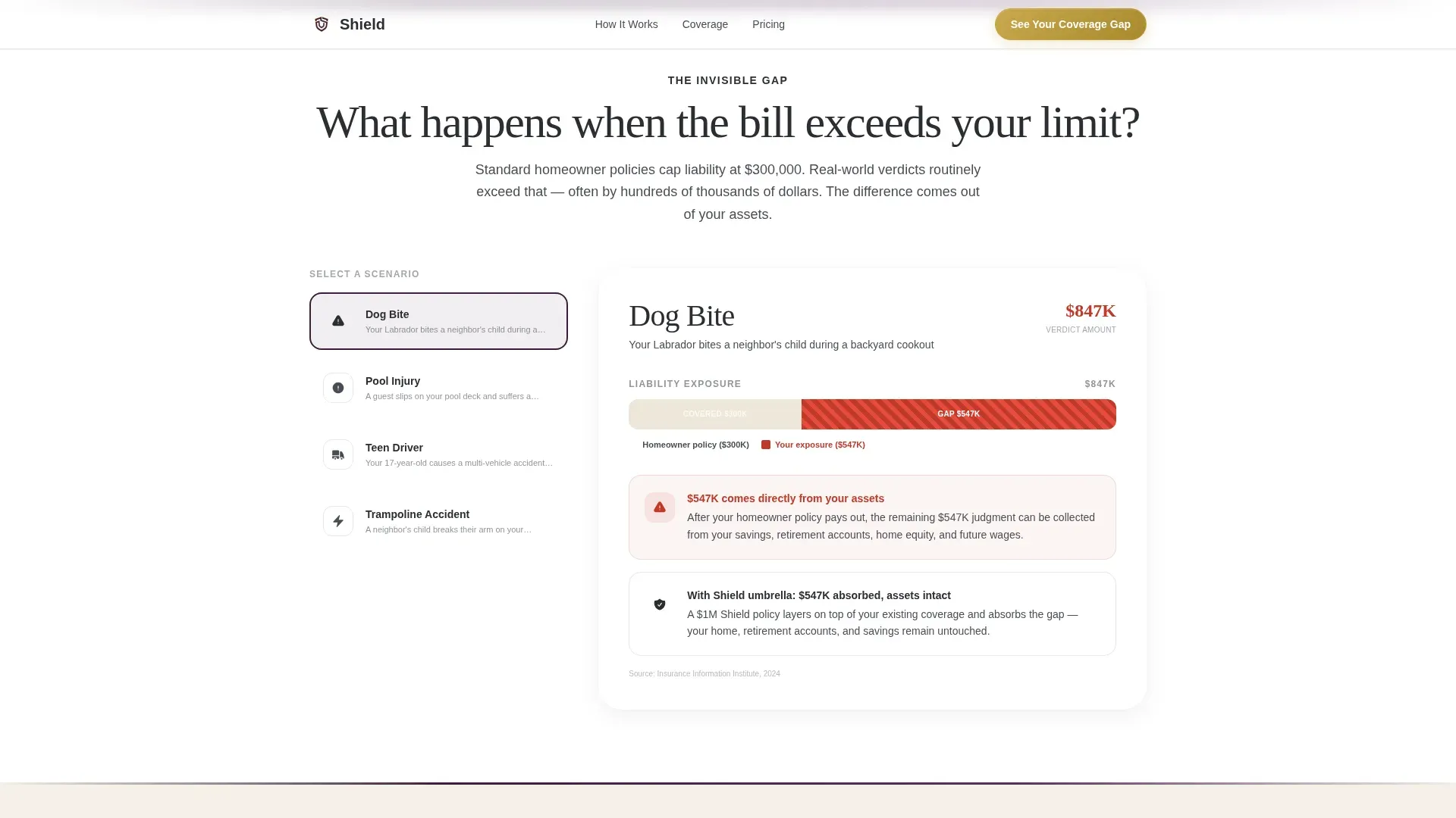
Standard auto insurance and home insurance policies leave six-figure gaps. A single dog bite lawsuit, a pool injury verdict, or a teen driver accident can exceed a typical homeowner limit by hundreds of thousands of dollars. Most families do not realize they have this exposure until it is too late. The landing page must bridge the gap between identifying a financial risk and offering a credible solution, and that is exactly what Shield is structured to do.
- Families underestimate how quickly a lawsuit can exceed a standard home insurance limit
- Insurance providers struggle to convince visitors that umbrella coverage is urgent, not optional
- Generic insurance landing pages fail to personalize the risk, so visitors leave without acting
What you get with this template
Shield delivers a complete, single-column flow landing page built around a Problem to Solution Arc. Every section connects to the next in a logical scroll that guide visitors from fear of exposure toward confidence in coverage. The page answers key questions upfront so visitors feel clear about what the offer is and what to do next.
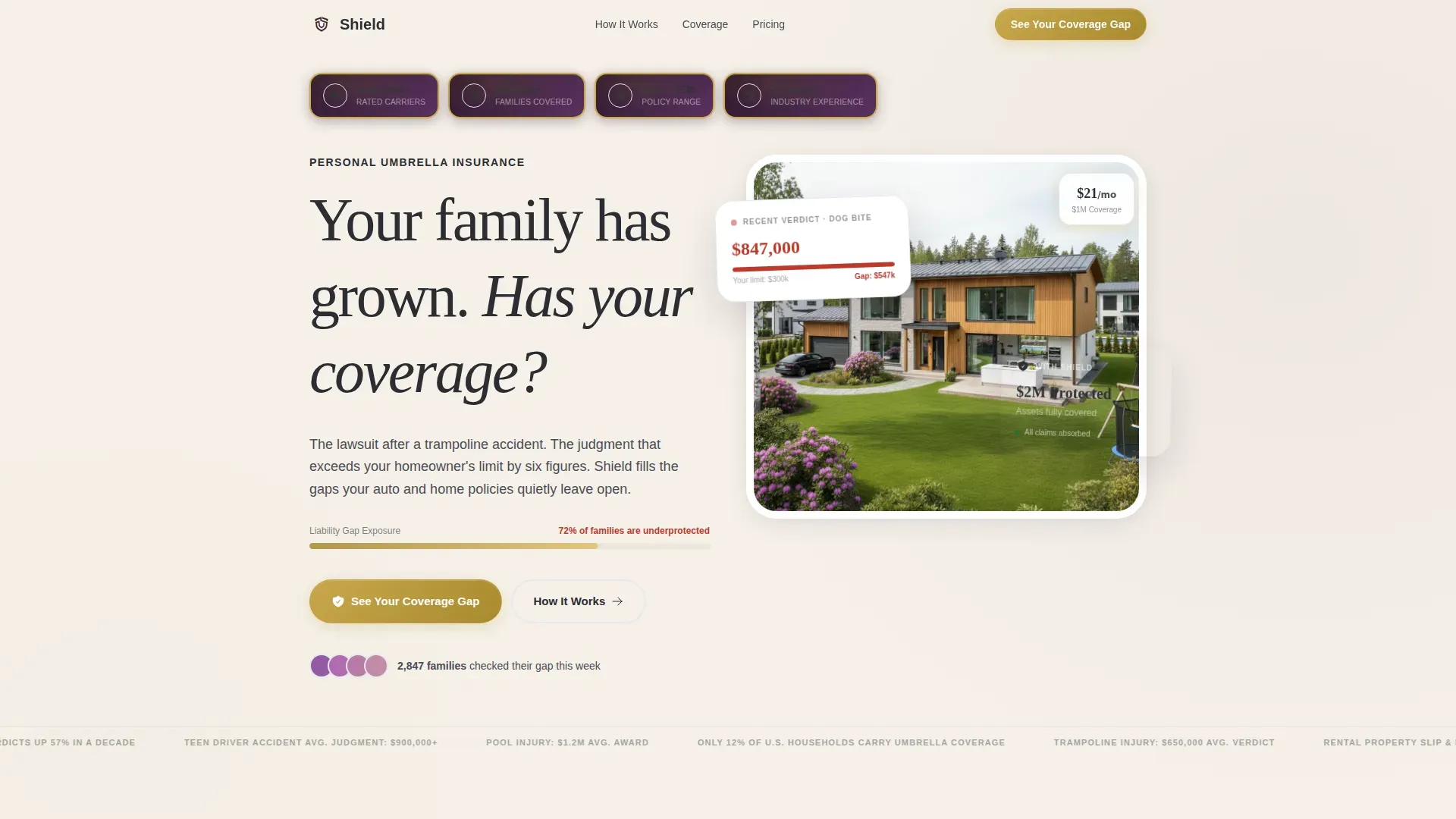
- A hero section with embossed trust badges, a serif headline, an animated progress bar, and bento-style gap stat cards
- A five-question progressive quiz with a live gap meter, a personalized risk snapshot, and a calendar scheduler call to action
- Scenario calculator, coverage layer explainer, cost reality section, and anonymized family profile cards throughout the page
Feature list
This template includes a focused set of key features that work together to build trust, communicate value, and convert visitors into leads. Each component is grounded in best practices for high converting landing pages in the insurance space.
Embossed Award Badge Hero
The header opens with three to four gold-foil-on-plum medallion badges: carrier ratings, families covered, and policy range. These trust signals are placed immediately above the headline so visitors register credibility before reading a single word of body copy. A strong headline sits below in a confident serif font, paired with a thin animated progress bar that invites the first scroll or click.
Scenario Calculator with Gap Visualization
This interactive section displays real verdict amounts from categories like dog bite, pool injury, and car accident. Each amount stacks visually against a standard $300,000 homeowner limit. The gap glows in exposed red, making the pain points concrete and personal. Visitors see their actual risk in dollar terms, which is far more persuasive than any written statistic.
Five-Step Progressive Quiz
The primary call to action launches a five-question assessment covering household size, number of vehicles, property types, estimated net worth, and whether the family employs household help or hosts frequent guests. Each answer updates a live coverage gap meter in real time. The result screen delivers a recommended umbrella tier and a secondary call to action to schedule a conversation with an advisor.
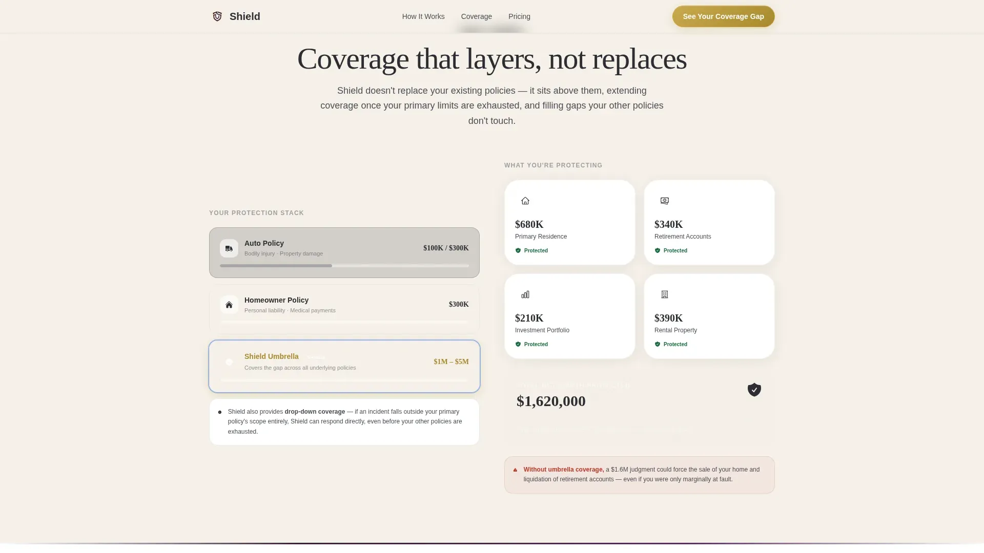
Coverage Layer Explainer
A dedicated section shows how umbrella insurance stacks on top of existing auto insurance and home insurance policies. This visual arc moves the page from problem territory into solution territory. It explains the asset protection logic clearly, without jargon, so visitors feel informed rather than sold to.
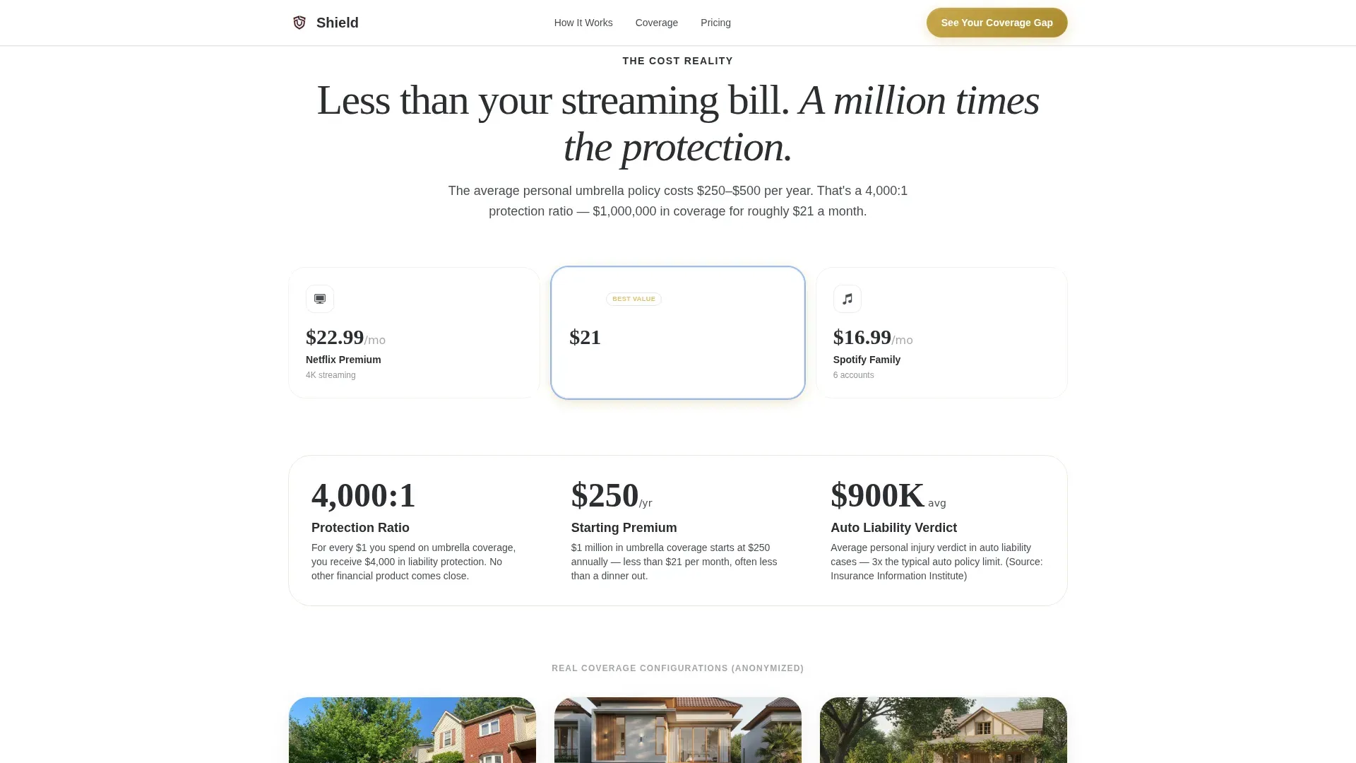
Cost Reality Section with Family Profiles
This section frames the monthly cost of umbrella insurance against the cost of a streaming subscription. Anonymized family profile cards show real coverage configurations, which act as case studies that help potential customers see themselves in the product. Social proof through recognizable scenarios builds trust more effectively than abstract statistics alone.
Quiz Result and Calendar call to action
After completing the quiz, visitors receive a personalized risk snapshot with a recommended policy range. A clear call to action button invites them to talk to an advisor, opening a calendar scheduler directly. This flow earns the click by showing each visitor their own exposure before ever asking for contact information, keeping form fields minimal and friction low.
Page sections overview
| Section | Purpose |
|---|---|
| Hero Badge Row | Establish carrier trust immediately |
| Headline and Bar | Hook attention with urgency |
| Gap Stat Cards | Surface exposure in numbers |
| Scenario Calculator | Visualize lawsuit verdict gaps |
| Coverage Layer Arc | Explain how umbrella stacks |
| Cost Reality Frame | Reframe price as protection value |
| Family Profile Cards | Provide social proof through examples |
| Quiz Assessment | Personalize risk and capture intent |
| Quiz Result Screen | Deliver snapshot and schedule call to action |
| Footer Row | Close with clear navigation links |
Design & branding system
Shield follows a Dashboard Pro theme built on the Plum Executive color system. The palette feels authoritative without being cold. Deep plum anchors headers and section dividers. Warm parchment breathes across backgrounds, giving the layout generous white space that keeps the page readable. Gold appears only where the eye needs to land: badges, progress indicators, and the call to action button border. Charcoal slate carries body text cleanly. Typography pairs Fraunces, a confident serif display font, with DM Sans for all interface and body text.
- Deep plum (#3D1F3E) for headers, dividers, and section anchors
- Warm parchment (#F5F0E8) for backgrounds with polished gold (#C9A84C) reserved for badges and call to action elements
- Fraunces serif for display headlines, DM Sans for body and quiz interface copy
Mobile & speed optimization
Shield is built desktop-first to match the wealth advisor demographic that skews toward larger screens, but it carries full mobile support throughout. The quiz, calculator, and all interactive components are built as client-side components so they respond without page reloads. Static sections use server-side rendering to keep the initial load fast.
- Quiz steps, gap meter animations, and scroll reveal effects are handled as client components for smooth interactivity
- Buttons and form fields are sized for thumb-friendly use on mobile, ensuring a seamless experience across devices
- The single-column layout adapts cleanly to small screens without restructuring the Problem to Solution Arc flow
How this template helps you convert
Shield is a great example of a landing page designed around one conversion goal: getting visitors to start the quiz. Every design and content decision supports that single action. The page does not scatter focus across multiple insurance options or overwhelm visitors with navigation choices. It keeps users engaged through scroll-triggered tension and resolves that tension through personalization.
- The scenario calculator and gap visualization create emotional urgency before the quiz call to action appears, so visitors arrive at the quiz already motivated to see their own numbers.
- The quiz itself acts as a quick form surrogate, collecting household context across five steps without asking for contact details upfront, which removes the biggest friction point in most insurance landing pages and lifts conversion rates meaningfully.
- The result screen delivers a personalized snapshot and places the secondary call to action to schedule an advisor meeting next to a social proof reference, using trust signals at the exact moment visitors are most ready to act.
Other information about this template
Shield is a purpose-built template for the growing family umbrella insurance niche. It reflects established best practices across insurance landing pages and landing page examples from the finance and protection category. The following details give additional context for teams evaluating this template for their insurance business or insurance agency.
- This is the Shield trusted coverage gap landing page template, designed for a single focused insurance landing use case
- The page is equally effective when used for paid ads traffic and organic referral traffic from financial planning content
- Insurance providers can use the scenario calculator section to reference real verdict data, for example from sources like the Insurance Information Institute, to make the gap visualization credible
- The quiz result screen supports health insurance landing page adaptations with minor copy edits, making it useful beyond umbrella alone; a health insurance landing variation follows the same five-step logic
- The template works well for any insurance company or insurance agency that wants to move beyond a generic free quote form and offer visitors something that feels more like a personalized service
- Travel insurance and other specialty insurance products can adapt the scenario calculator section by swapping verdict categories for relevant risk examples
- The cost reality section is a proven pattern across landing page examples in the insurance space: framing monthly cost against a familiar subscription reframes the value proposition immediately
- Visual elements throughout the page, including security-adjacent badge design and industry awards styling, enhance the perception of credibility without making technical claims the template cannot support
- The footer uses Pattern 1, a linear single-row layout, to close the page with clear navigation without pulling attention away from the primary conversion path
Theme
Dashboard Pro
Creative direction
Problem→Solution Arc
Color system
Plum Executive
Style
Single Column Flow
Direction
Quiz/Assessment
Page Sections
Embossed Award Badge Hero Section
Scenario Calculator with Red Gap Visualization
Five-step Progressive Quiz with Live Gap Meter
Coverage Layer and Cost Reality Sections
Quiz Result Screen with Calendar Scheduler Call to Action
Dashboard Pro Single-column Layout
Related questions
Who is this landing page template built for?
Does the quiz collect contact information before showing results?
Can this template be adapted for other insurance products?
What trust signals does the template include?
How does the page handle visitors who are not ready to book a call?



