College Student Insurance FAQ Website Template
Shield is a dashboard-style college student disability insurance landing page built to generate leads before a diagnosis or injury closes the coverage window. It pairs a live-styled metrics wall with FAQ-driven scroll sections, a progressive three-step form, and a dual-lead capture path, all wrapped in a clinical Arctic White and urgent teal palette.
by Rocket studio
Quick summary
Shield is a single-page lead generation template for college student disability insurance. It opens with a data-driven metrics header, moves through FAQ scroll cards that dismantle objections one by one, and closes with a pinned "Check My Insurability" form. The design feels clinical and precise, built for students, athletes, and parents who treat insurability as a time-sensitive financial decision.
Who this template is for
This template is built for insurance advisors, brokers, and agencies targeting college-age clients and their families. It speaks directly to the urgency of locking in coverage while a student is still medically clean.
- Pre-med students and student athletes who need disability coverage before a career-altering injury or diagnosis
- Parents of engineering or professional-track students who understand that insurability is a closing window
- Insurance professionals who want a conversion-focused page that leads with data instead of emotion
What problem this template solves
Most students believe disability insurance is something you buy later, after graduation, after the first job, after something goes wrong. That belief is the core problem. By the time many students look into coverage, a single ER visit, a prescription, or a sports injury has already made them uninsurable or unaffordable.
- Students and parents lack a clear, data-backed reason to act now rather than later
- Generic insurance pages rely on trust language instead of concrete numbers that make the cost of waiting visible
- Advisors have no structured tool to capture two leads from one visit, the student and the parent, in a single page flow
What you get with this template
You get a complete, ready-to-customize lead generation landing page built around data visualization and FAQ-driven persuasion. Every section is designed to reduce friction and move a visitor from curiosity to form submission.
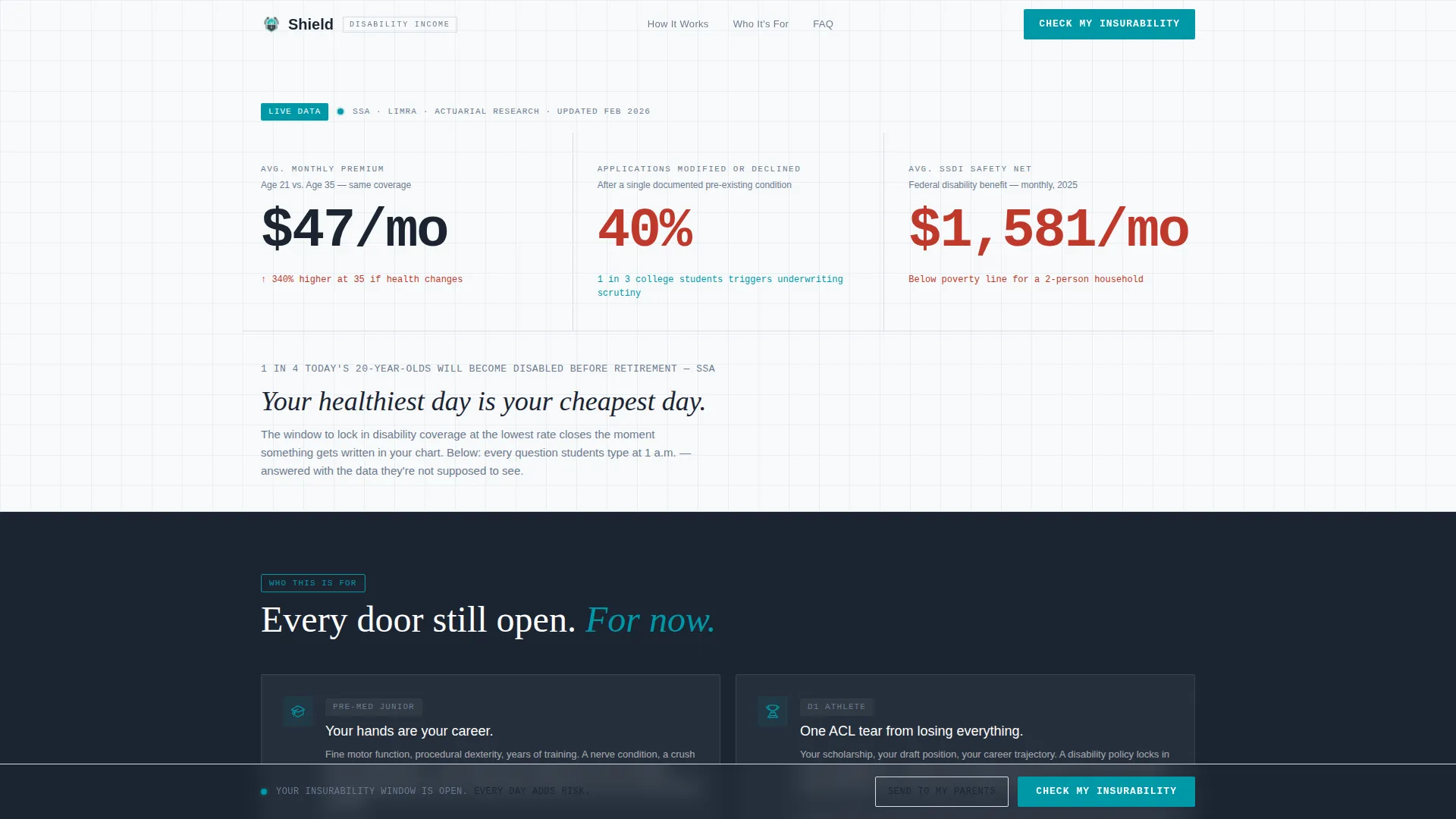
- A live-styled stats header with three animated counters showing premium cost at age 21 versus 35, applicant decline rates, and lifetime earning loss
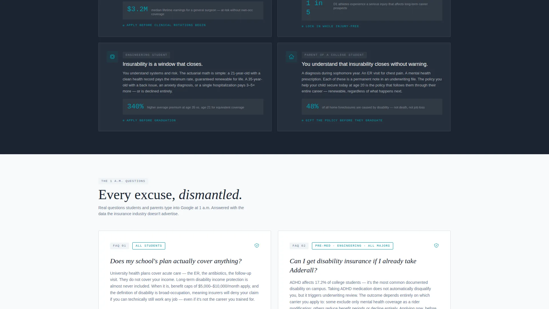
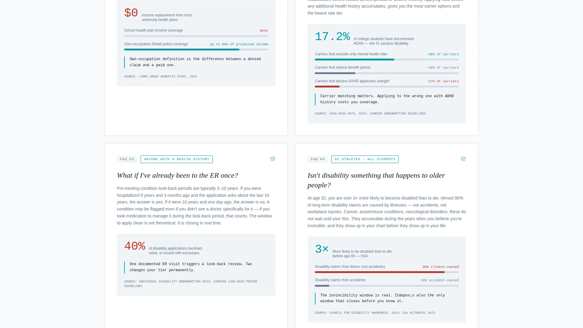
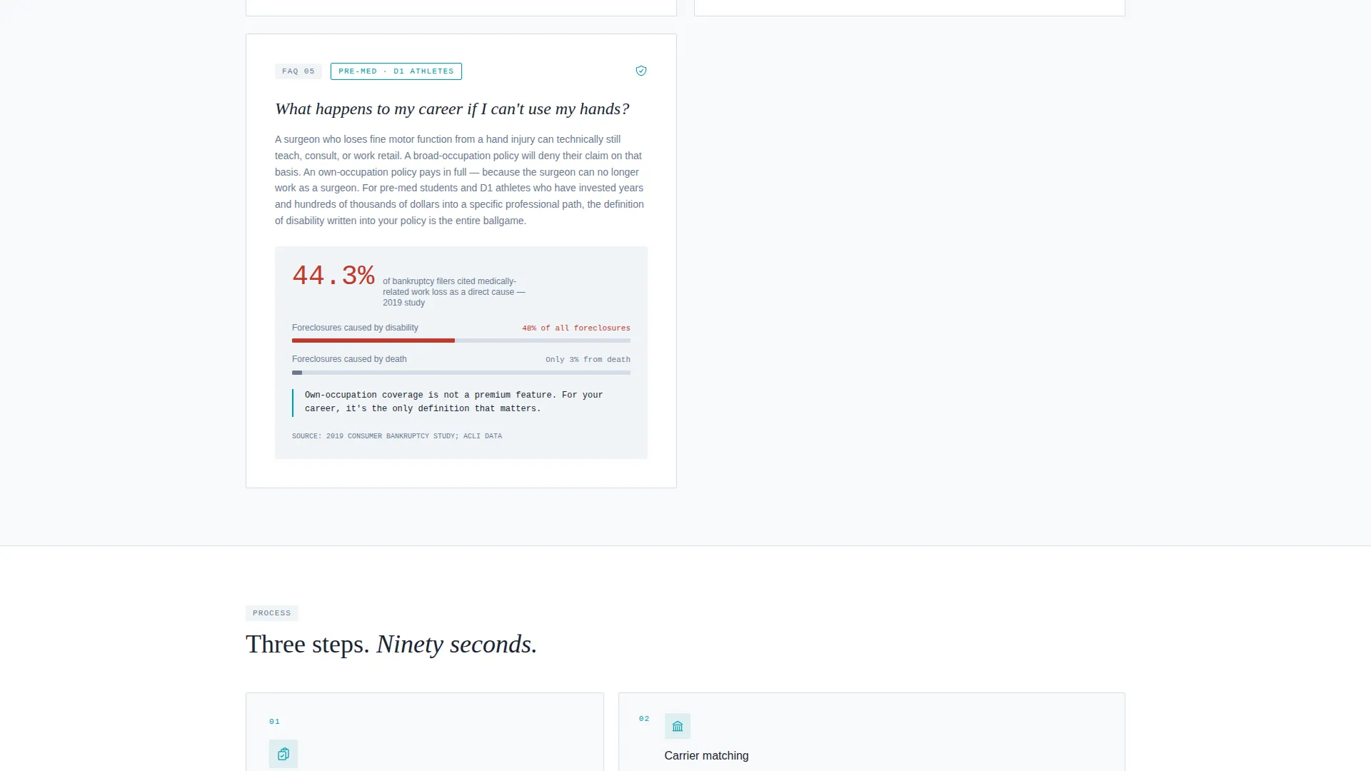
- A scrollable FAQ section where each card answers a real late-night search question with a supporting metric or comparison chart
- A progressive three-screen lead form and a secondary "Send This to My Parents" email path that captures two leads per visit
Feature list
This section covers the core functional components built into the Shield template.
Animated Stats Header Wall
Three large monospaced counters animate upward on page load, mimicking a stock ticker running in the wrong direction. They display average monthly premium at age 21 versus age 35, the percentage of applicants declined after a single emergency room visit, and the median lifetime earning loss from an uninsured disability. No hero image is used. The data itself is the visual anchor.
FAQ-Driven Scroll Sections
Each scroll section surfaces a real question a student or parent has typed into a search engine late at night. Questions like "Can I get disability insurance if I already take Adderall?" or "Does my school's plan actually cover anything?" appear as section headers. Each is answered with a short data card, one paragraph paired with a supporting metric or comparison chart.
Progressive Three-Step Lead Form
The primary call to action, "Check My Insurability," is pinned to the bottom of the viewport after the second FAQ card. The form runs across three screens: the first asks for age and college major, the second presents one yes/no health question, and the third collects email and phone. This staged approach reduces drop-off by lowering the commitment required at each step.
Dual Lead Capture Path
A secondary call to action, "Send This to My Parents", allows a visitor to email a PDF summary of the page's key statistics to a second address. This captures a parent lead alongside the student lead, doubling the lead potential from a single page visit without requiring a second campaign.
Data Command Visual Theme
The entire layout uses a clinical Arctic White color system. Clinical white (#F8FAFB) and pale steel (#D7DDE8) form the background layers. Charcoal data ink (#1B2432) handles all body text and grid lines. A single urgent teal (#0097A7) is reserved for calls to action, active metric highlights, and interactive graph nodes. The palette is deliberately sterile and precise.
Page sections overview
| Section | Purpose |
|---|---|
| Animated Stats Header | Opens with three ticking data counters and the headline "Your healthiest day is your cheapest day" |
| FAQ Card One | Addresses coverage eligibility questions with a data card and supporting metric |
| FAQ Card Two | Addresses school plan adequacy with a comparison chart |
| FAQ Card Three | Handles prescription and medical history objections with a stat-backed answer |
| Pinned call to action Bar | Keeps "Check My Insurability" fixed to the viewport bottom after the second FAQ card |
| Progressive Lead Form | Collects age, major, health question, email, and phone across three screens |
| Parent Email Path | Secondary action sends a PDF stats summary to a parent's email address |
Design & branding system
The Shield template uses a Data Command visual identity that feels like a hospital intake form crossed with a financial data terminal. Every color and typographic choice reinforces trust through precision rather than warmth.
- Arctic White palette: clinical white (#F8FAFB) and pale steel (#D7DDE8) for backgrounds and grid surfaces, charcoal (#1B2432) for all data ink and body text
- Urgent teal (#0097A7) used exclusively for calls to action, active metric highlights, and interactive graph nodes, never decorative
- Monospaced typography for all counter figures to reinforce the data-terminal aesthetic and keep numbers legible at large sizes
Mobile & speed optimization
The template is structured for clean rendering across screen sizes, with the pinned call-to-action bar and progressive form designed to work within mobile viewport constraints.
- The pinned "Check My Insurability" bar stays fixed to the bottom of the viewport on both desktop and mobile, keeping the primary action always visible
- The three-step form is split into short screens so each step fits comfortably on a phone display without scrolling
- FAQ data cards are laid out as single-column stacks on smaller screens, keeping metrics and comparison charts readable without horizontal overflow
How this template helps you convert
Shield is built around a single conversion philosophy: remove every reason to wait. The design does not rely on testimonials or brand trust. It uses numbers that make the cost of delay concrete and unavoidable.
- The animated counter header establishes urgency in the first three seconds by showing exactly how much more a 35-year-old pays versus a 21-year-old, before a visitor reads a single word of body copy.
- The FAQ scroll structure meets visitors where their doubts already live, answering the exact questions they searched for, which means each section feels personally relevant rather than generic.
- The pinned form and dual lead path ensure that whether the student or the parent is reading, the template captures both contacts from the same visit without requiring a second landing page or campaign.
Other information about this template
Shield is categorized under Finance and Insurance, specifically in the College Student Insurance subcategory with a focus on the college student disability insurance niche. It was designed with a high intersection match score, reflecting strong alignment between the template style, header concept, creative direction, and lead generation objective.
- Template style is Dashboard/Data Grid, making it suitable for advisors who want a data-forward presentation rather than a traditional insurance brochure layout
- The FAQ-driven creative direction is intentionally search-aware, structuring content around the questions real students and parents type into search engines before they ever speak to an advisor
- The "Send This to My Parents" secondary path is a built-in referral mechanism that extends the reach of a single page visit into a two-contact lead without any additional outreach effort
Theme
Data Command
Creative direction
FAQ-Driven
Color system
Arctic White
Style
Dashboard/Data Grid
Direction
Lead Generation
Page Sections
Animated Metrics Header Wall
Faq-driven Scroll Cards
Progressive Three-step Lead Form
Dual Lead Capture Path
Data Command Color System
Related questions
What kind of insurance professional is this template designed for?
How does the dual lead capture path work?
Can I update the FAQ questions and data metrics for my market?
Does the pinned call-to-action bar work on mobile devices?
Is Shield a single landing page or a multi-page website?



