Infant (0-1) Products & Professional Website Template
Shield is a hero-dominant infant safety landing page template built to register parents in a free baby proofing workshop. It guides visitors through a room-by-room hazard audit, real safety statistics, and expert credentials, then closes with a three-field registration form. The Citrus Burst color system and Hero's Journey layout turn parental anxiety into confident, actionable steps.
by Rocket studio
Quick summary
Shield is a single-page, hero-dominant landing page template for an infant safety product line. It follows a Hero's Journey scroll flow, moving visitors from danger awareness to confident preparation. The page drives workshop registrations and email leads through a focused three-field form, a sticky call-to-action bar, and a secondary PDF checklist download.
Who this template is for
This template is built for infant safety brands, pediatric product companies, and baby proofing educators who need to convert anxious parents into registered workshop attendees or product leads.
- First-time parents of babies aged 0 to 12 months who are actively researching how to baby proof their home
- Grandparents updating older homes to meet modern infant safety standards
- Daycare directors preparing for annual licensing inspections and needing a credible, organized resource
What problem this template solves
New parents feel overwhelmed by infant safety information. They search for baby proofing checklists but land on scattered, fear-heavy content that offers no clear next step. This template solves that gap.
- It replaces vague danger warnings with a structured, room-by-room hazard audit that shows parents exactly what to address
- It raises stakes responsibly using real statistics and pediatrician quotes, without triggering panic
- It channels that awareness into a single, low-friction action: registering for a free live workshop or downloading an instant PDF checklist
What you get with this template
You get a complete, ready-to-customize infant safety landing page with every section pre-built and purposefully sequenced. The layout is designed to carry a first-time visitor from the hero photo all the way to form submission without confusion.
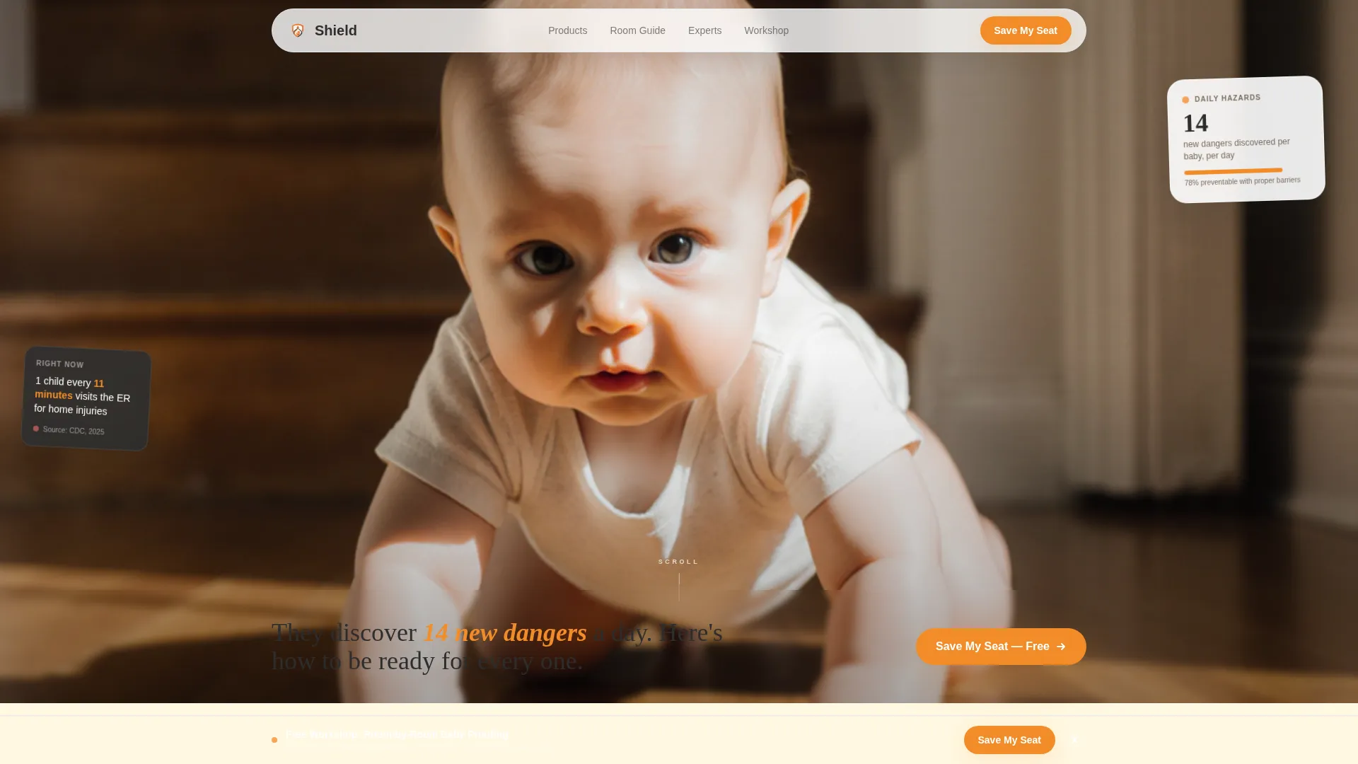
- A full-bleed hero section occupying 90 percent of the viewport, with a lemon cream headline strip and a floating stat card
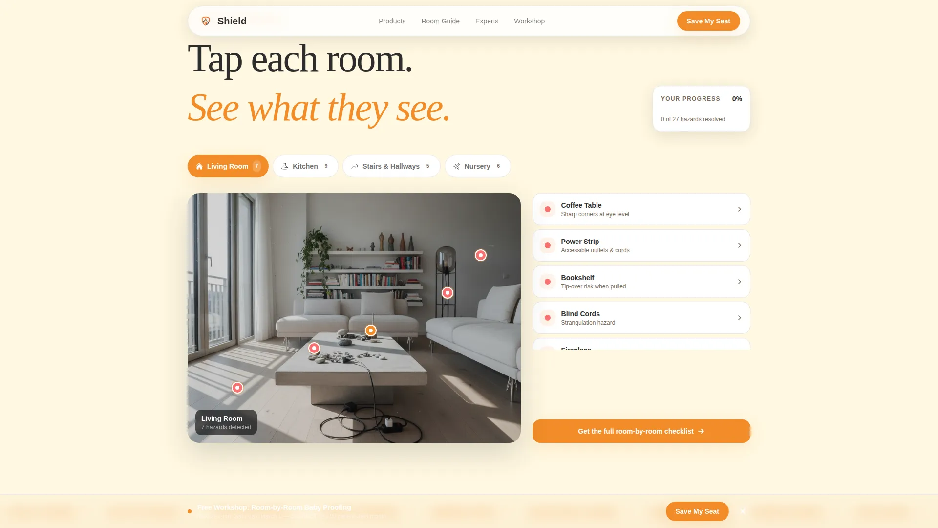
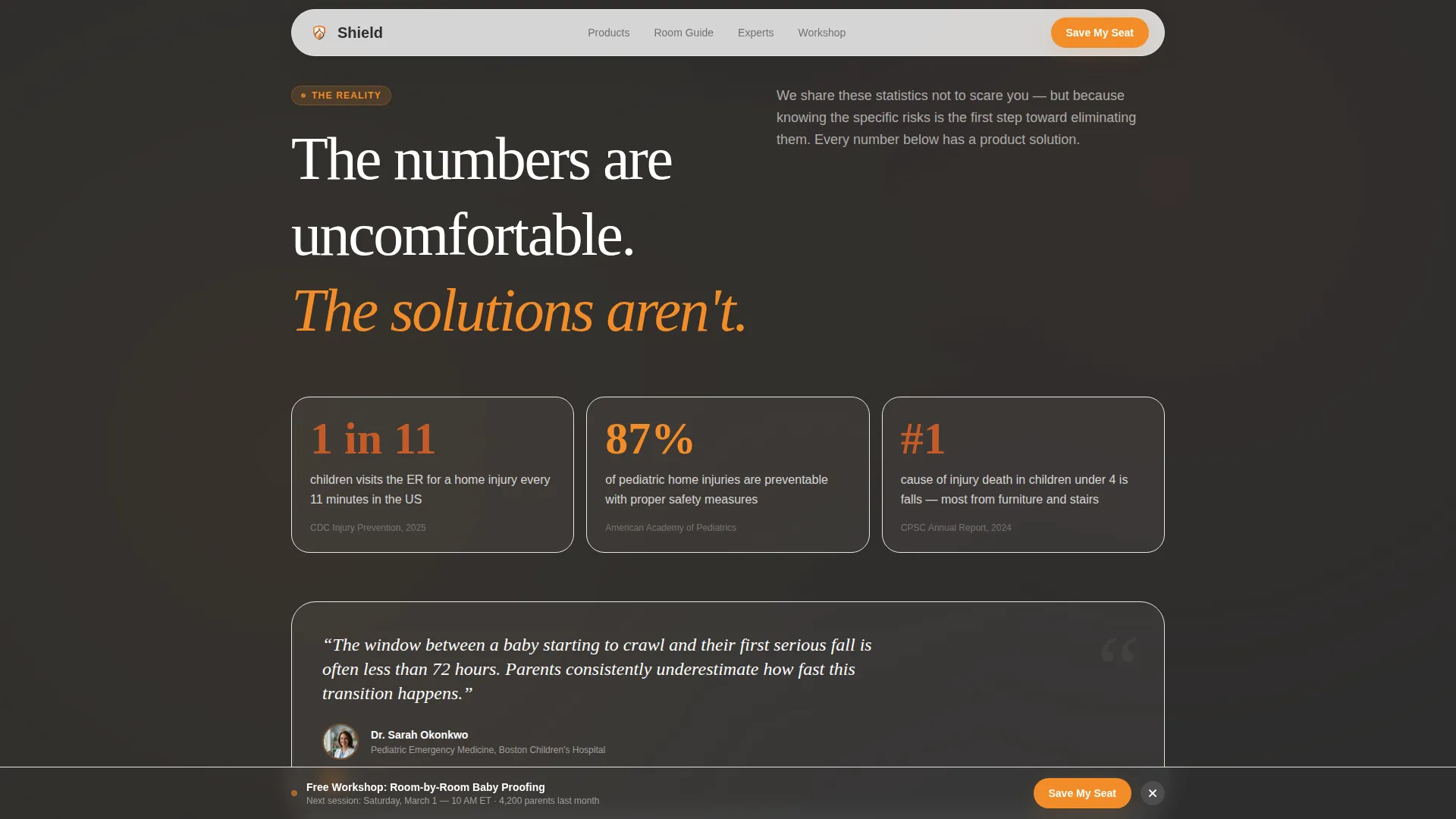
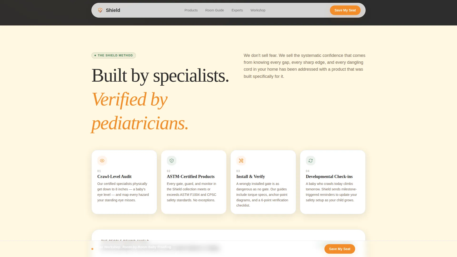
- An interactive room-by-room hazard map with tap-to-reveal hazard zones, an ER statistics section with pediatrician quote blocks, and a brand methodology and safety expert credentials section
- A full-width workshop registration block with a three-field form, a sticky bottom call-to-action bar, a secondary PDF checklist lead capture path, and a single-row linear footer
Feature list
This template packages a specific set of visual and interactive components designed around the infant safety use case.
Full-Bleed Hero with Headline Strip
The hero fills 90 percent of the viewport with a ground-level crawling baby photo. A lemon cream strip at the bottom carries the headline, and a floating stat card adds immediate social proof without cluttering the image.
Interactive Room-by-Room Hazard Map
The danger audit section includes an illustrated hazard map where visitors tap or click to reveal hazard zones room by room. Each interaction lights up a danger area, making the audit feel personal and hands-on rather than passive.
GSAP Scroll Reveal Animations
Section reveals are powered by GSAP scroll animations throughout the page. As visitors scroll deeper, content fades and slides in smoothly, reinforcing the journey from overwhelmed to prepared.
Progress Checklist with Visual Fill
A visual checklist fills in as the visitor scrolls through the page. Warning tones shift to confirmation tones progressively, so the experience itself communicates that each danger has been addressed by the time the visitor reaches the registration form.
Three-Field Workshop Registration Form
The registration block collects only first name, baby's age in months via a dropdown with four ranges, and email address. Below the submit button, a live social proof line displays last month's attendance count and the next session date and time.
Sticky Bottom Call-to-Action Bar
After the danger audit section, a slim bar pins to the bottom of the screen carrying the primary "Save My Seat" call to action. It remains visible as visitors continue scrolling, reducing drop-off before they reach the full registration block.
Page sections overview
| Section | Purpose |
|---|---|
| Hero Photo Strip | Opens with full-bleed crawling baby image and lemon cream headline |
| Room Danger Audit | Interactive hazard map lets visitors tap to reveal danger zones |
| ER Statistics Block | Real statistics and pediatrician quotes raise stakes calmly |
| Expert Mentor Section | Brand methodology and safety expert credentials build trust |
| Workshop Registration | Full-width form block drives event sign-ups and PDF lead capture |
| Sticky call to action Bar | Pinned bottom bar keeps primary call to action visible on scroll |
| Linear Footer | Single-row footer closes the page with minimal distraction |
Design & branding system
The template uses a Citrus Burst color system that feels warm, urgent, and calm at the same time. The palette was chosen specifically to signal importance without triggering the kind of alarm that makes parents close a tab.
- Tangerine (#F28C28) is the primary color applied to call-to-action buttons and progress markers; deep clementine (#C45B28) activates on hover states and warning callouts; soft lemon cream (#FFF8E1) fills section backgrounds; and charcoal slate (#2D2D2D) handles all body text and instructional diagram labels
- Typography pairs Fraunces serif headlines with DM Sans body text, giving the page an editorial, trustworthy feel that suits an educational guide format
- The visual mood shifts as visitors scroll: red-adjacent warning tones in the early hazard sections gradually give way to green confirmation tones as the checklist fills, so the design itself carries the emotional arc of the Hero's Journey
Mobile & speed optimization
The template is built mobile-first, reflecting how most parents actually search for baby proofing information. Searches for infant safety content peak on phones at late hours, so the layout prioritizes thumb-friendly tap targets and readable text at small sizes.
- The hero image uses priority loading so the above-the-fold experience is immediate, while lower sections use lazy loading to keep the initial render fast
- The interactive hazard map and sticky call-to-action bar are both designed for touch interaction, ensuring the tap-to-reveal mechanic works reliably on mobile screens
How this template helps you convert
Every section is sequenced to move a doubtful visitor toward registration. The page does not push a sale. It earns a sign-up by building trust first and reducing friction at every step.
- The Hero's Journey scroll structure trades anxiety for agency section by section, so visitors arrive at the registration form already feeling capable rather than panicked
- The three-field form removes every unnecessary barrier to sign-up, and the social proof line beneath the button ("4,200 parents attended last month") provides immediate reassurance
- The secondary PDF checklist path captures leads from visitors who prefer instant value over a calendar commitment, so the page converts two distinct buyer mindsets without competing with itself
Other information about this template
This template is part of the Kids and Family category, specifically targeting the Infant (0 to 12 months) Safety Products niche. It is configured for a United States audience with dates formatted as MM/DD/YYYY and event times displayed in Eastern Time.
- The page is localized for direct-to-consumer (D2C) infant safety brands in the USA and is suited for e-commerce and lead generation use cases simultaneously
- Animation is set to high intensity using GSAP for scroll reveals and hazard zone interactions; interactivity is high with the room map, sticky bar, and live form all active
- The template style is Hero-Dominant at a 90 to 10 ratio, meaning the hero section commands the vast majority of the first screen, with supporting content structured beneath it
Theme
Educational Guide
Creative direction
Hero's Journey
Color system
Citrus Burst
Style
Hero-Dominant (90/10)
Direction
Event Registration
Page Sections
Full-bleed Hero with Headline Strip
Interactive Room-by-room Hazard Map
GSAP Scroll Reveal Animations
Progress Checklist with Visual Fill
Three-field Workshop Registration Form
Sticky Bottom Call-to-action Bar
Related questions
What type of page is this template designed for?
Who is the primary audience this landing page is built to reach?
What does the registration form collect from visitors?
Can this template capture leads who are not ready to register for the workshop?
What interactive features are included in this template?