Life Insurance Landing Page Template for Young Professionals
Shield is a single-page life insurance landing page built for young professionals with real financial obligations. It uses a zigzag FAQ-driven layout to move skeptical visitors from "do I even need this?" to a personalized quote in minutes. The design is clinical, confident, and conversion-focused, with a three-step inline estimator and a secondary email capture path.
by Rocket studio
Quick summary
Shield is a term life insurance landing page template built for young professionals, engineers, consultants, and junior partners who carry mortgages, student debt, and new dependents. The FAQ-driven zigzag layout disarms resistance one honest question at a time. A three-step inline estimator and a secondary lead capture path work together to turn cautious readers into qualified quote leads.
Who this template is for
This template is built for insurance brands and financial product teams targeting high-earning adults in their late twenties and early thirties. It suits direct-to-consumer life insurance offers where the buyer is smart, skeptical, and time-poor.
- Life insurance providers or insurtechs selling term coverage to young professionals
- Financial product teams who need a lead generation page with a built-in estimator
- Consultants or agencies building conversion-focused pages for the finance and insurance category
What problem this template solves
Most life insurance pages feel like they were designed for retirees. Young professionals bounce because nothing on the page speaks to a co-signed mortgage, a second child, or six figures of inherited student debt. Shield closes that gap.
- Generic insurance pages fail to address the specific fears of buyers aged 28 to 35
- Visitors who are not ready to quote have no soft conversion path and leave without engaging
- Long-form product pages bury the call to action instead of earning it through progressive disclosure
What you get with this template
You get a complete, single-page lead generation layout designed around a specific buyer and a specific moment in their financial life. Every section is purposeful and sequenced to reduce resistance before asking for anything.
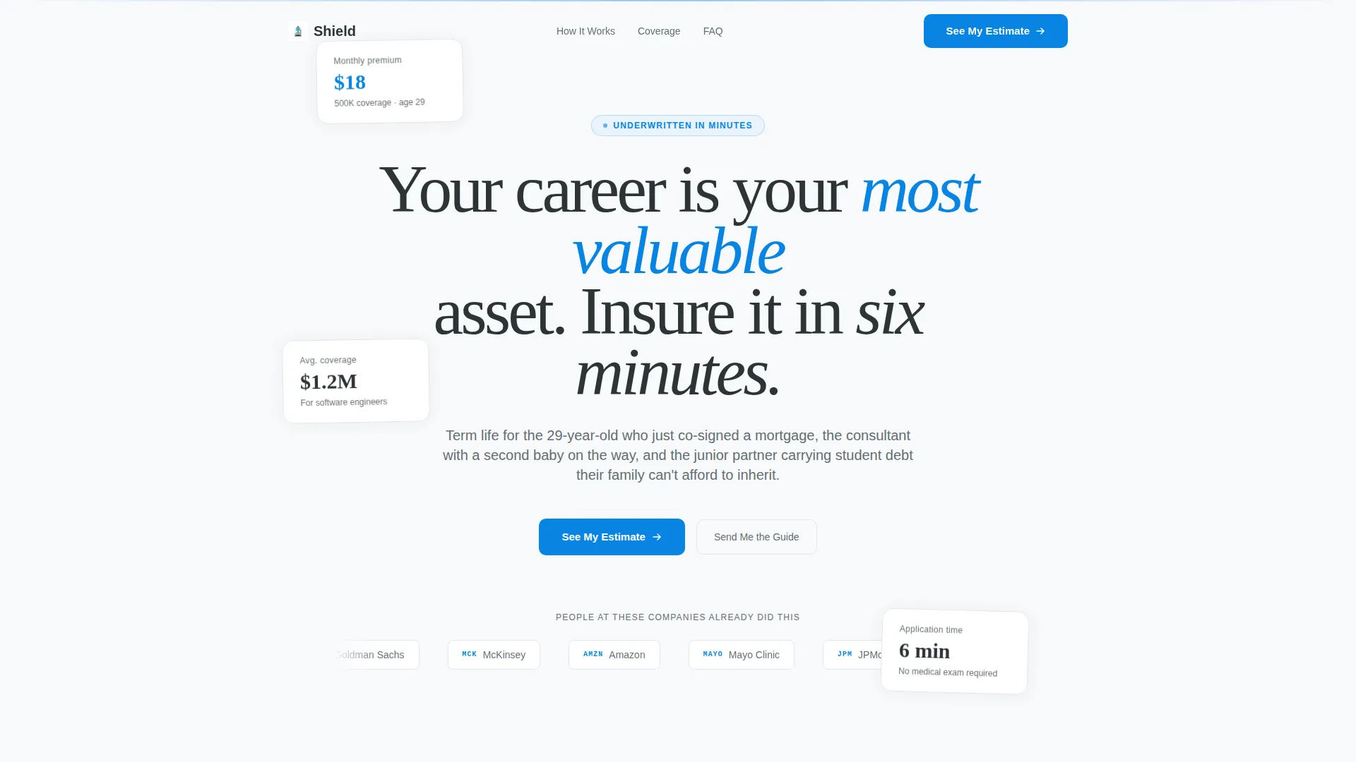
- A hero section with a logo bar, a centered editorial headline, and floating social proof cards
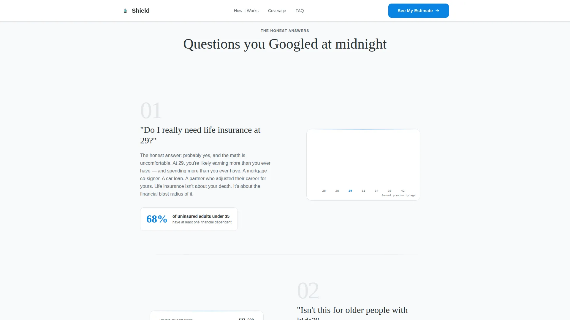
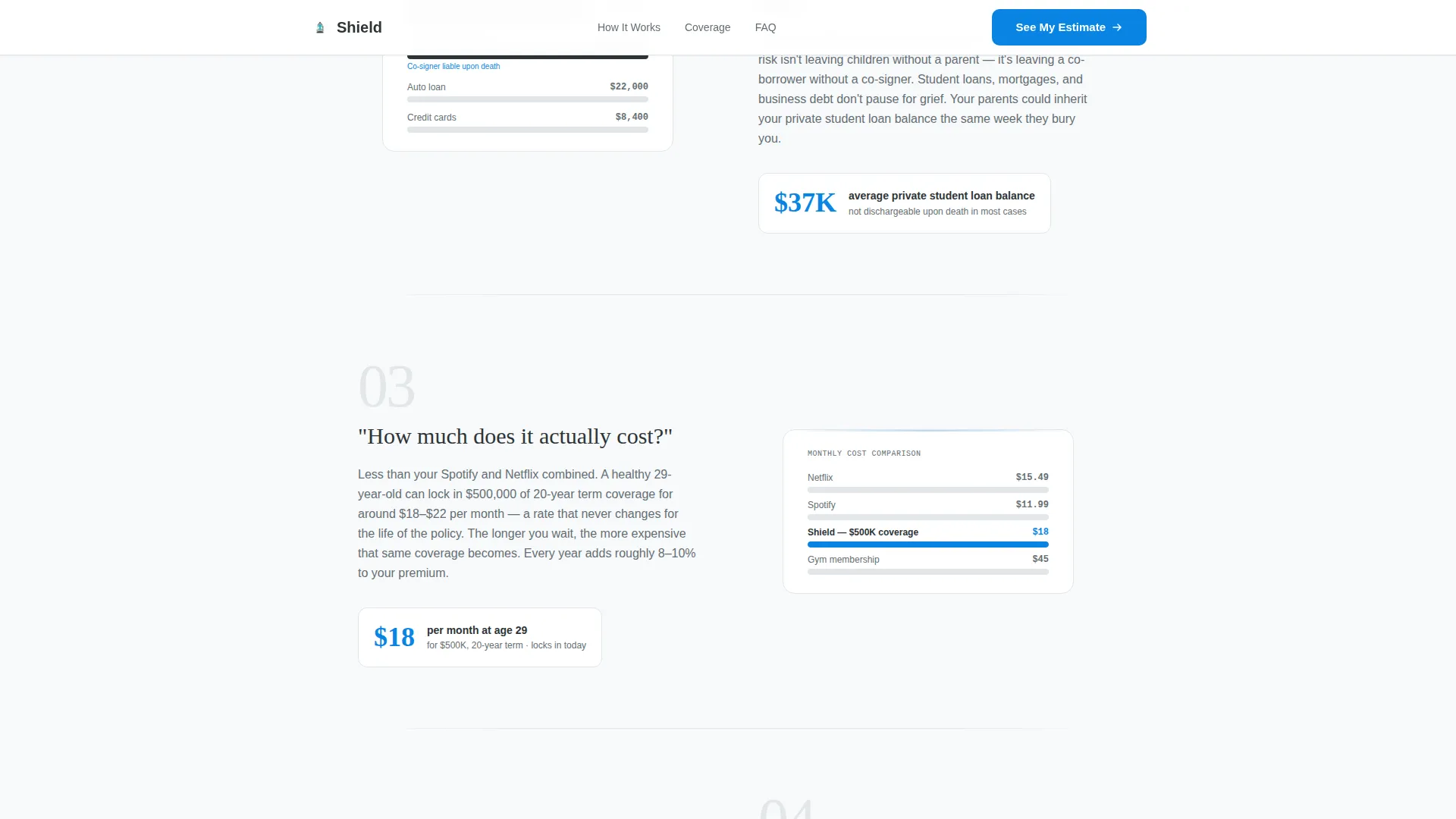
- Four zigzag FAQ blocks that move from skepticism through logistics to emotional conviction
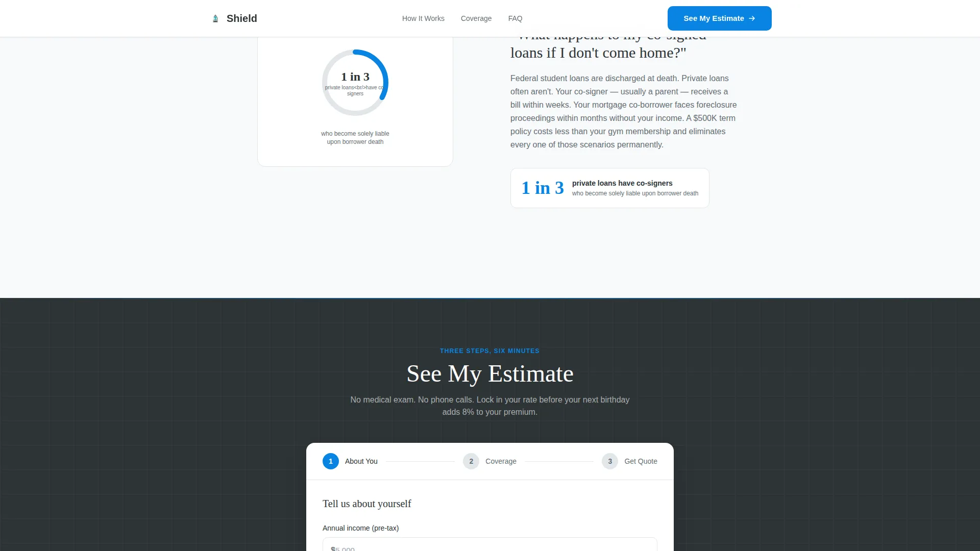
- A three-step inline estimator form and a secondary email capture modal for the PDF guide
Feature list
This template includes purpose-built components that work together to qualify, educate, and convert a specific type of visitor.
FAQ-Driven Zigzag Layout
Each section of the page is anchored by a real question a young professional might search at midnight. Questions alternate left and right with illustrated data points on the opposite side. The scroll path moves from broad skepticism to specific emotional stakes, dissolving resistance one answer at a time.
Three-Step Inline Estimator Form
After the third FAQ block, a progressive disclosure form appears inline. Step one collects annual income and age. Step two presents a draggable coverage slider with real-time monthly cost updating. Step three captures email and phone to deliver the personalized quote.
Secondary Email Capture Path
Visitors who are not ready to quote can choose "Send Me the Guide" instead. This action opens a lightweight modal that collects an email address in exchange for a downloadable PDF comparing term life and whole life coverage options.
Logo Bar Social Proof Header
The hero opens with a horizontal strip of recognizable employer and partner logo placeholders representing Fortune 500 tech firms, Big Four consultancies, and major hospital networks. The logos signal peer adoption before the visitor reads a single paragraph.
Floating Social Proof Cards
Animated coverage stat cards float alongside the hero headline, giving visitors immediate data points about what real coverage looks like for people in their income bracket. Scroll-reveal animations bring each card into view at the right moment.
Real-Time Coverage Slider
The draggable slider in step two of the estimator updates the displayed monthly premium in real time as the visitor adjusts their desired coverage amount. This interaction makes the cost of protection feel concrete and manageable rather than abstract.
Page sections overview
| Section | Purpose |
|---|---|
| Hero Logo Bar | Establishes peer social proof before any copy is read |
| FAQ Block One | Addresses core skepticism: "Do I really need this at 29?" |
| FAQ Block Two | Handles logistics: age objections and cost concerns |
| FAQ Block Three | Coverage sizing with inline estimator call to action |
| FAQ Block Four | Emotional gut-punch: co-signed loan risk and lead capture |
| Footer Strip | Single-row linear footer with links and secondary trust signals |
Design & branding system
The visual identity follows a Corporate Precision theme. Every color and type decision is intentional. Nothing is decorative. The palette reads like a freshly printed bank statement, cool, authoritative, and completely free of visual noise.
- Color system uses clinical white (#F8F9FB) as the background, slate charcoal (#2D3436) for foreground text, soft graphite (#636E72) for secondary copy, and confident teal (#0984E3) reserved exclusively for call-to-action buttons and active states
- Typography pairs Fraunces serif for editorial headlines with DM Sans for body copy and interface elements
- Layout uses a strict zigzag alternating structure with generous white space to keep each FAQ block readable and visually distinct
Mobile & speed optimization
The template is built desktop-first to match where the target demographic actually reads and converts. It is fully responsive so the layout adapts cleanly to smaller screens without losing its structure.
- Interactive components such as the coverage slider and the three-step form are isolated as client-side components to keep the static hero fast on initial load
- Scroll-reveal animations and floating card effects are applied at medium intensity, present enough to feel polished, light enough not to slow the page down
- The single-row footer keeps the page bottom clean and load-light on every device size
How this template helps you convert
Shield is engineered around two conversion paths, not one. Visitors who are ready to quote move through the estimator. Visitors who are not ready still leave their email. Both paths are valuable.
- The FAQ sequence earns trust before asking for anything. By the time the "See My Estimate" call to action appears after the third FAQ block, the visitor has already answered their own objections.
- The three-step inline estimator uses real-time pricing feedback to make the decision feel low-risk and personally relevant, which increases the likelihood that a visitor completes the form.
- The secondary "Send Me the Guide" path ensures that visitors at an earlier stage of consideration are captured rather than lost, giving the business a second opportunity to convert them later.
Other information about this template
Shield is categorized under Finance and Insurance, with a specific focus on the young professional life insurance niche. It is designed for the InsurTech and direct-to-consumer financial product space.
- Template style is Zigzag/Alternating, making it visually distinctive from standard stacked layouts
- The creative direction is FAQ-Driven, which is well-suited to insurance products where buyer hesitation is the primary conversion barrier
- The header concept is a Logo Bar, a pattern that converts social proof into peer pressure without requiring testimonial copy
- Localization is set for the United States market, with USD pricing, English language, and American naming conventions throughout
- The lead generation direction supports two distinct conversion funnels from a single page, maximizing the value of each visit
Theme
Corporate Precision
Creative direction
FAQ-Driven
Color system
Arctic White
Style
Zigzag/Alternating
Direction
Lead Generation
Page Sections
Faq-driven Zigzag Layout
Three-step Inline Estimator Form
Real-time Coverage Slider
Logo Bar Social Proof Header
Secondary Email Capture Modal
Floating Social Proof Cards
Related questions
What type of insurance product is this template designed for?
Can I adapt this template for a different financial product?
Does the coverage slider calculate real premiums?
What happens to visitors who are not ready to request a quote?
Is this template responsive for mobile users?



