Insurance Agent Landing Page Template
Shield is a storybook-style landing page template built for independent insurance agents. It uses a Manifesto creative direction and a Photo Grid Mosaic header to tell a compelling story of protection and trust. The Void and Violet color system, full-bleed sections, and two conversion paths work together to turn a portfolio page into a genuine client acquisition tool.
by Rocket studio
Quick summary
Shield is a full-page, storybook-style landing page template designed for independent insurance agents. It opens with a nine-photo mosaic header and unfolds as a personal manifesto of belief and evidence. The design builds trust progressively, then converts visitors through a downloadable checklist and a calendar-based booking path.
Who this template is for
This template is built for independent insurance agents who work directly with real people navigating real coverage decisions. It suits professionals who want their online presence to feel authoritative, personal, and story-driven rather than generic or corporate.
- Independent agents serving home buyers, small business owners, and retirees
- Insurance professionals who want to lead with philosophy before pitching services
- Agents ready to offer a lead magnet and a direct booking path on the same page
What problem this template solves
Most insurance agent pages look like brochures. They list products, show a headshot, and stop. Visitors leave without understanding why this agent is different or what working with them actually feels like. Shield solves that gap by giving agents a structured narrative that earns trust before asking for anything.
- Visitors struggle to understand what makes one agent different from another
- Generic layouts fail to communicate the depth of an agent's expertise and client focus
- There is no clear path from "I'm curious" to "I'm ready to book"
What you get with this template
Shield delivers a complete, ready-to-customize landing page built around a clear story arc. Every section serves a purpose: open with impact, build conviction, show proof, then convert.
- A nine-image Photo Grid Mosaic header with a typewriter-effect headline
- A full manifesto scroll of alternating bold statements and lilac mist story panels
- Two conversion paths: a downloadable checklist and a calendar booking embed
Feature list
The feature list below describes each core capability delivered by the Shield template as defined in the source brief.
Photo Grid Mosaic Header
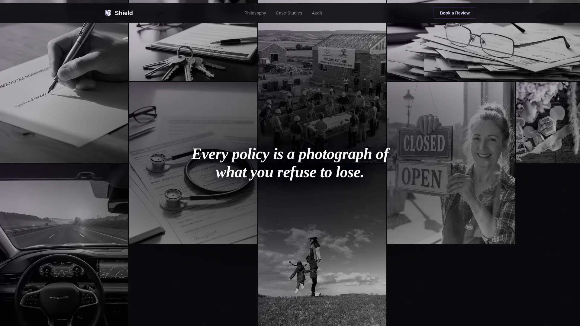
Nine tightly cropped, high-contrast black-and-white photographs fill the viewport in an asymmetric grid. Each image is bordered by a thin violet rule. Together they form a mosaic of the moments insurance protects, from house keys on a closing table to a parent lifting a child. A typewriter-effect headline types itself letter by letter across the center of the grid.
Manifesto Scroll Layout
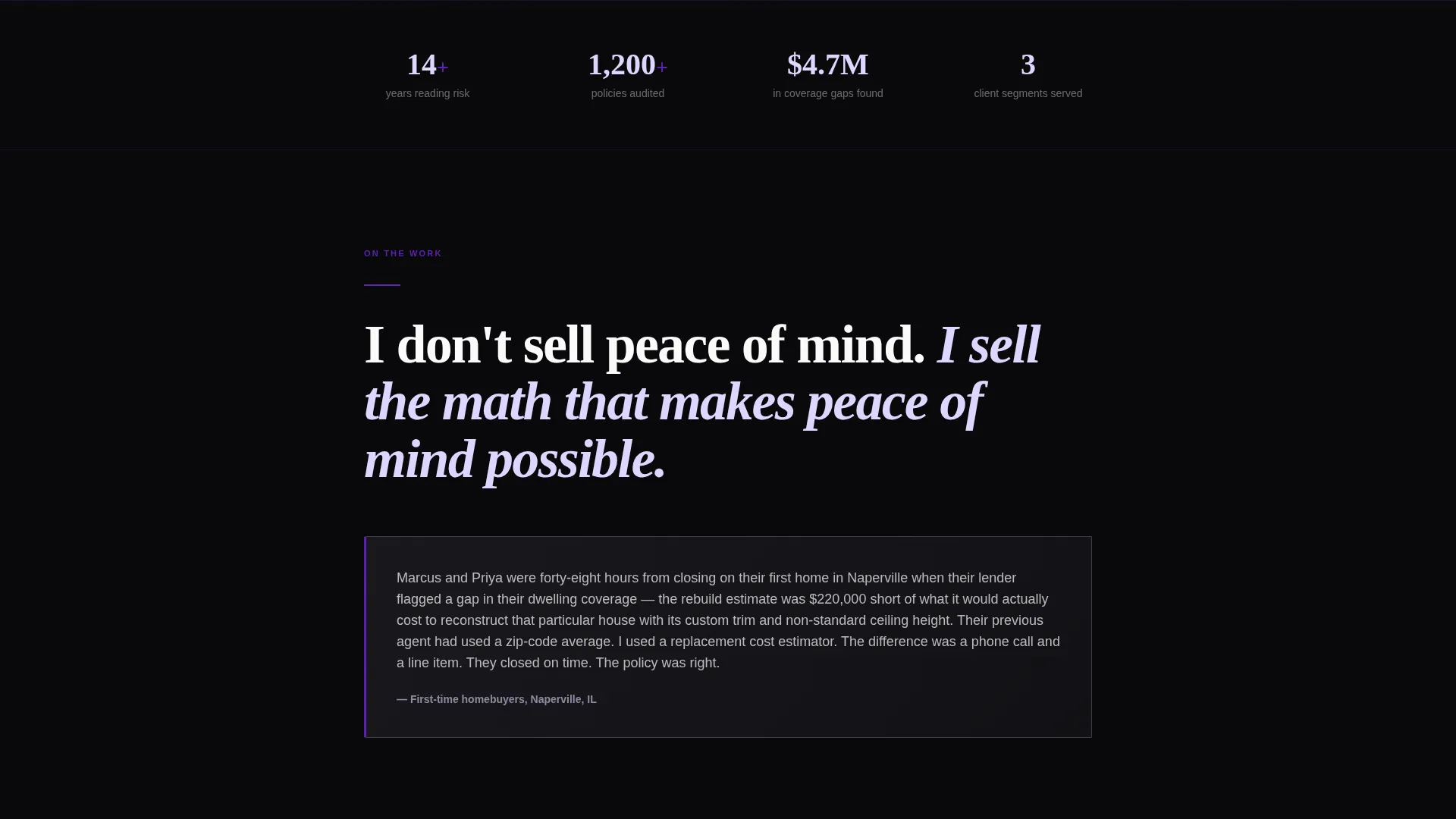
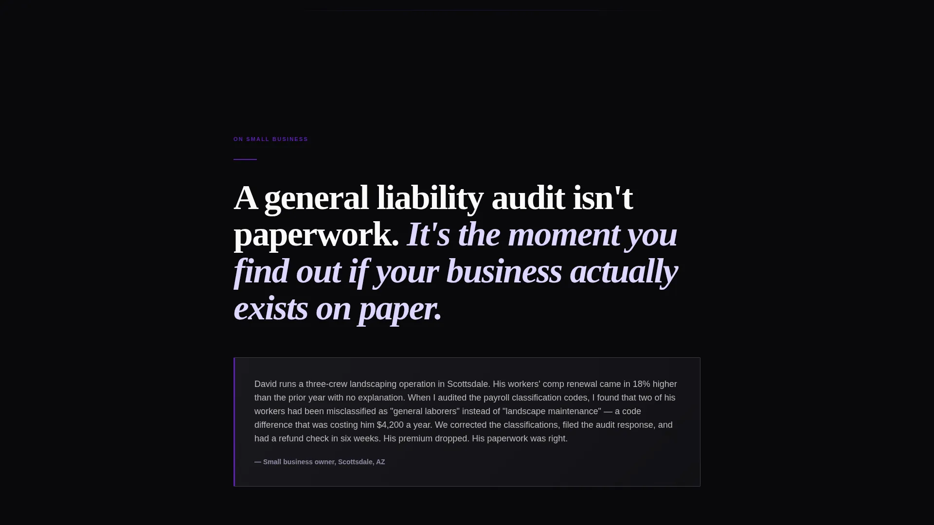
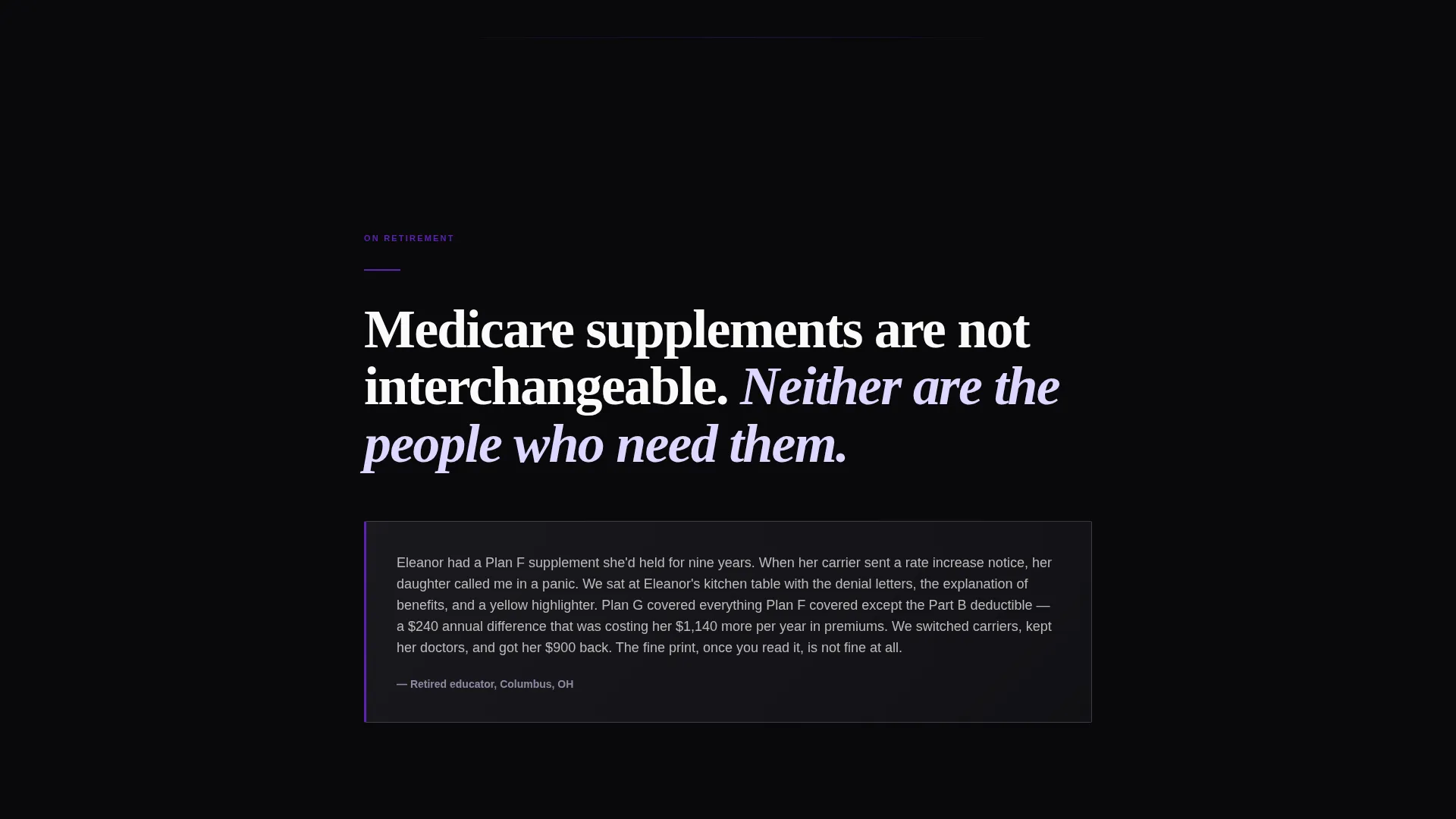
The page unrolls as a personal declaration of belief. Each full-page section opens with an oversized bold statement in white type on void black. A story paragraph follows in a lilac mist panel, grounding the statement in a real client scenario. The rhythm of conviction then proof repeats down the page, building a layered argument for trust.
Before-and-After Case Study Blocks
Midway through the page, the tone shifts from belief to evidence. Case studies are framed as before-and-after narratives. Each one tells a mini-story of a coverage gap found and closed. Violet-highlighted dollar figures show what was saved or recovered, giving abstract claims a concrete and specific form.
Downloadable Checklist Conversion Path
After the third manifesto section, a primary call to action invites visitors to download a Coverage Audit Checklist. The form requests only a first name and email address. The checklist itself is designed as a genuinely useful resource that walks readers through their own coverage gaps, creating informed urgency that brings them back to book a call.
Calendar Booking Embed
A secondary conversion path appears at the bottom of the page. A "Book a 15-Minute Policy Review" section includes a calendar embed showing real availability. This path catches visitors who have read the full page and are ready to act but prefer a direct conversation over a download.
Void and Violet Branding System
The entire page is built on a four-color palette: absolute void black, deep iris violet, soft lilac mist, and sharp optical white. Violet anchors every interactive element including hover states, progress indicators, and highlighted policy terms. The palette creates a darkroom-like atmosphere where every detail feels deliberate and trustworthy.
Page sections overview
| Section | Purpose |
|---|---|
| Photo Grid Mosaic Header | Opens with nine black-and-white photographs and a typewriter headline |
| First Manifesto Statement | Establishes the agent's core philosophy in oversized white type |
| Story Panel One | Grounds the first statement in a real client scenario using lilac mist |
| Second Manifesto Statement | Advances the philosophical narrative with a second bold conviction |
| Story Panel Two | Pairs a second real-scenario paragraph with the second statement |
| Third Manifesto Statement | Completes the belief arc and sets up the first conversion moment |
| Story Panel Three | Closes the manifesto with a client-grounded proof paragraph |
| Checklist Download call to action | Primary conversion block with a first-name-and-email lead form |
| Case Study Blocks | Before-and-after narratives with violet-highlighted dollar figures |
| Calendar Booking Section | Secondary path for booking a 15-minute policy review call |
Design & branding system
The visual identity follows a Lens and Frame theme. Every design decision reinforces the idea of clarity: seeing what was previously hidden, reading fine print that finally makes sense. The palette and layout work together to make white body text feel projected and cinematic.
- Four-color Void and Violet system: void black (#09090B), deep iris violet (#5B21B6), lilac mist (#DDD6FE), and optical white (#FAFAFA)
- Violet is used exclusively for interactive states, dividers, pull-quote backgrounds, and highlighted policy terms
- Full-bleed void black sections make white typography feel projected, while lilac mist panels create visual breathing room
Mobile & speed optimization
The storybook layout is designed to translate cleanly across screen sizes. The mosaic grid, full-bleed sections, and embedded calendar are all built with responsive behavior in mind so the story reads just as powerfully on a phone as it does on a desktop.
- The asymmetric photo grid adapts to narrower viewports without losing its visual impact
- Full-bleed manifesto sections stack vertically on mobile, preserving the conviction-then-proof rhythm
- The calendar booking embed and lead capture form are touch-friendly and easy to complete on small screens
How this template helps you convert
Shield is built around two distinct conversion paths, both earned through narrative credibility before the ask is made. The page does not rush to convert. It builds a case first, then offers a clear next step at exactly the right moment.
- The downloadable Coverage Audit Checklist appears after the third manifesto section, when the agent's credibility is at its peak. It asks only for a first name and email, lowering the barrier to entry while delivering genuine value.
- The calendar booking embed at the bottom of the page catches visitors who have read everything and are ready for a direct conversation. Showing real availability removes friction and makes booking feel immediate rather than bureaucratic.
Other information about this template
Shield sits in the Personal and Resume category under the Insurance Agent Profile subcategory. It is designed specifically for the insurance agent portfolio website niche. A few additional details are worth noting for anyone evaluating this template.
- The template style is Storybook and Full-Page, meaning every section is designed to feel like a chapter, not a module
- The creative direction is Manifesto, so the copy framework is declaration followed by proof, not feature list followed by price
- The header concept is Photo Grid Mosaic, which requires nine high-contrast black-and-white photographs to be sourced and placed by the user
- The lead magnet framework assumes the agent will create or provide a real Coverage Audit Checklist PDF as the downloadable resource
- This template is part of the Lens and Frame theme family and uses the Void and Violet color system throughout
Theme
Lens & Frame
Creative direction
Manifesto
Color system
Void & Violet
Style
Storybook/Full-Page
Direction
Content/Resource
Page Sections
Photo Grid Mosaic Header
Manifesto Scroll Sections
Before-and-after Case Study Blocks
Downloadable Checklist Lead Capture
Calendar Booking Embed
Void and Violet Color System
Related questions
Who is this landing page template designed for?
What are the two conversion paths included in this template?
Do I need to provide my own photos for the header mosaic?
Can I customize the manifesto copy to reflect my own voice?
Is the calendar booking section connected to a specific scheduling tool?



