Retail Loss Prevention Landing Page Template
Shield is a modular card-grid landing page built for retail loss prevention firms. It opens with a logo bar of protected retail brands, walks prospects through a four-step deployment process, and drives two conversion paths: a shrink assessment request form and a downloadable organized retail crime playbook. The design uses a slate-and-sky color palette that feels as dependable as a pressed uniform.
by Rocket studio
Quick summary
Shield is a single-page landing page template designed for retail loss prevention companies. It leads with recognizable retail brand logos, guides visitors through a numbered four-step service process, and closes with a primary call to action requesting a shrink assessment. Every design choice signals calm authority and operational credibility.
Who this template is for
This template is built for security firms and loss prevention service providers that sell directly to retail businesses. It works best when your prospect is a procurement decision-maker, not a consumer.
- Regional grocery chains dealing with significant inventory shrink each quarter
- Big-box district managers frustrated by exception-based reporting with no clear outcome
- Mall management groups handling tenant complaints about walkouts and organized grab-and-run incidents
What problem this template solves
Retail loss prevention services are complex to explain. Prospects arrive skeptical and time-poor. A wall of security jargon drives them away before they see the value.
- The step-by-step card structure breaks a complex deployment into four legible phases
- Stat blocks between card rows give rhythm to the scroll, pairing process with proof
- Two conversion paths capture both ready buyers and early-stage researchers who need more information before committing
What you get with this template
You get a complete, conversion-focused landing page layout ready for a retail security firm. Every section has a clear job to do, and nothing is filler.
- A logo bar header featuring grayscale retail brand logos on a deep slate background with a single headline stat
- A four-step modular card grid covering Assessment, Design, Deployment, and Optimization
- A primary contact form and a secondary gated downloadable resource for dual-path lead capture
Feature list
This template packages several purpose-built layout components, all grounded in the brief's creative and structural direction.
Logo Bar Header with Headline Stat
The page opens with a horizontal band of grayscale retail brand logos evenly spaced on a deep charcoal slate field. Below the logo row sits a single bold headline: "Protecting $2.3B in retail inventory across 1,400 locations." No hero image, no stock photography. The restraint builds immediate credibility.
Sequential Four-Step Card Grid
Four modular cards reveal as the visitor scrolls, each numbered and representing one deployment phase. The phases are Assessment, Design, Deployment, and Optimization. This step-by-step structure turns a complex security operation into a process any retail decision-maker can follow and trust.
Stat Blocks Between Card Rows
Between card rows, single-stat punctuation blocks display key proof points such as apprehension rates, shrink reduction percentages, and average return-on-investment timelines. These blocks give the scroll a deliberate rhythm: process, then proof, process, then proof.
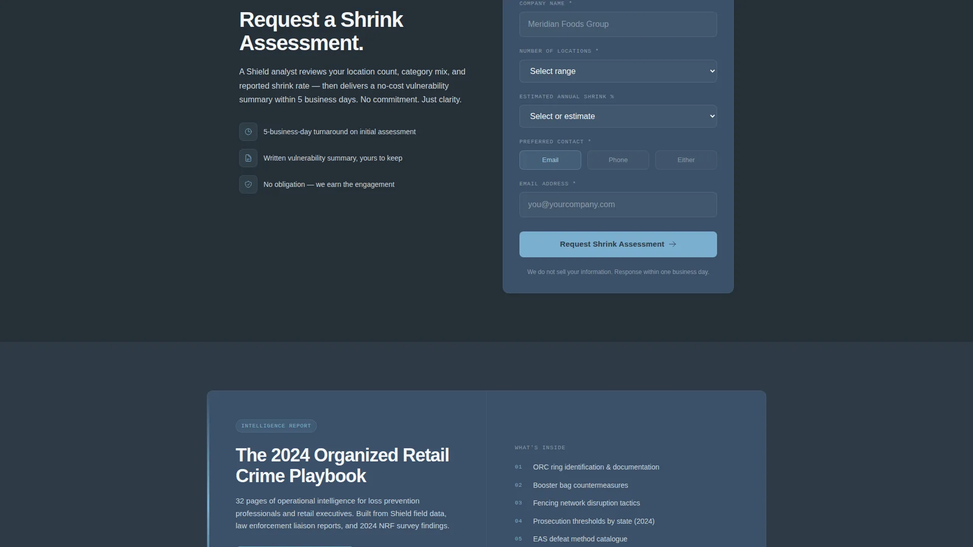
Primary Shrink Assessment Form
A contact form placed after the fourth step card captures high-intent leads. Fields include company name, number of locations, estimated annual shrink percentage with a "not sure" option to reduce friction, and preferred contact method. A sticky bottom bar repeats the call to action for persistent visibility.
Gated Downloadable Resource Path
A secondary conversion path offers a downloadable PDF titled "The 2024 Organized Retail Crime Playbook." This resource is gated behind email address and job title only, catching prospects who are not yet ready to speak with sales but are invested enough in the problem to want intelligence.
Sticky Bottom Call-to-Action Bar
A sticky bar anchored to the bottom of the viewport repeats the primary "Request a Shrink Assessment" call to action throughout the scroll. This ensures the conversion prompt is always accessible regardless of where the visitor pauses on the page.
Page sections overview
| Section | Purpose |
|---|---|
| Logo Bar Header | Displays retail brand logos and anchor headline stat to establish credibility instantly |
| Step One: Assessment | Describes shrink audit and vulnerability mapping as the first deployment phase |
| Stat Block One | Delivers a proof data point between the first and second step cards |
| Step Two: Design | Covers camera placement, electronic article surveillance configuration, and staffing model |
| Stat Block Two | Reinforces progress with a shrink reduction or apprehension metric |
| Step Three: Deployment | Explains officer onboarding and point-of-sale exception monitoring activation |
| Stat Block Three | Supplies return-on-investment timeline proof between steps three and four |
| Step Four: Optimization | Details monthly reporting, apprehension metrics review, and ROI analysis |
| Shrink Assessment Form | Captures primary leads with a low-friction multi-field contact form |
| Downloadable Resource | Gated secondary path for mid-funnel prospects wanting the ORC playbook |
| Sticky call to action Bar | Persistent bottom-bar call to action visible throughout the full page scroll |
Design & branding system
The visual identity follows a Civic Service theme built on a Slate and Sky color system. Every color choice reinforces the feel of a professional security operation: authoritative without being aggressive, calm without being cold.
- Deep charcoal slate (#2E3A45) for primary backgrounds, officer navy (#3B5068) for card surfaces, open-sky blue (#7BAFCF) for interactive elements and progress indicators
- Clean badge white (#F4F6F8) for body text and breathing space between elements
- Grayscale retail brand logos in the header, keeping the visual focus on the headline number rather than brand color competition
Mobile & speed optimization
The modular card grid is built for clean stacking on smaller screens. Each card occupies its own row on mobile, keeping the numbered sequence readable as a vertical list without reordering content.
- The sticky bottom call-to-action bar adapts to mobile viewports, remaining accessible without obscuring card content
- The logo bar collapses to a scrollable horizontal strip on narrow screens, keeping the header clean and load-light without heavy image assets
How this template helps you convert
This landing page is engineered around a Partnership and Business-to-Business sales motion. Every layout decision reduces the distance between a skeptical retail operator and a committed conversation.
- The logo bar opens with social proof before a single word of copy, letting recognizable retail names do the persuasion work upfront so prospects read on with confidence already established.
- The alternating card-and-stat structure maps the buyer's mental journey: they learn the process, then see evidence it works, in a repeating pattern that builds trust with each scroll.
- Two distinct conversion paths mean the page captures leads at different stages of readiness, maximizing the return from every visit without forcing unready prospects into a form they will abandon.
Other information about this template
Shield is categorized under Safety and Emergency, specifically within the Security Guard and Protection subcategory, with a niche alignment to commercial security services. The template style is a single-column flow with a modular card grid layout and a Corporate Precision theme. The creative direction is Transparent Process, meaning every layout choice is designed to make the firm's methodology visible and legible rather than hidden behind vague marketing language. The Monochrome Steel color system reference from the intersection data aligns closely with the Slate and Sky palette described in the brief, reinforcing a restrained, institutional visual tone suitable for business-to-business security marketing.
- Suitable for firms offering uniformed officers, plainclothes operatives, and electronic article surveillance services
- The downloadable playbook resource makes this template useful for content-led demand generation alongside direct lead capture
- The "not sure" option on the shrink percentage field is a deliberate friction-reduction choice for prospects who have not yet quantified their losses


Theme
Corporate Precision
Creative direction
Transparent Process
Color system
Monochrome Steel
Style
Single Column Flow
Direction
Click-Through
Page Sections
Logo Bar Header with Headline Stat
Four-step Modular Card Grid
Alternating Stat Proof Blocks
Primary Lead Capture Form
Gated Downloadable Resource
Sticky Bottom Call to Action Bar
Related questions
Can I edit the logo bar to show my own retail clients?
Does the template support two separate conversion paths at once?
Can I adapt the four-step cards to reflect a different service process?
What types of retail security firms is this template best suited for?
Can I replace the stat block figures with my firm's real performance data?


