College Student Insurance Specialist Professional Website Template
Shield is a dashboard-style college student travel insurance landing page built for fast decisions and anxious audiences. It combines a live-styled data grid, a destination risk map, and a 60-second coverage quiz into one calm, authoritative page. Parents, students, and study-abroad coordinators all get exactly what they need without scrolling through noise.
by Rocket studio
Quick summary
Shield is a single-page college student travel insurance template designed around data clarity and fast action. It opens with university and carrier logo credibility, moves through a richly structured risk data section, and closes with a guided quiz modal that returns a personalized plan recommendation in seconds.
Who this template is for
This template is built for anyone who needs to communicate student travel coverage quickly and credibly. It speaks to three very different people in the same room.
- College students booking last-minute spring break or semester-abroad trips who need fast, clear answers on coverage
- Parents reviewing options from another time zone who need reassurance before wiring a payment
- Study-abroad coordinators at mid-size universities managing dozens of itineraries at once and looking for a trustworthy tool to share with families
What problem this template solves
Student travel insurance is an anxiety product. The person reading the page is often stressed, unsure what they need, and unlikely to read dense policy language. Most insurance pages make that worse with jargon, stock photography, and vague benefit lists.
- Students and parents cannot quickly tell what a plan actually covers or what it costs for their specific trip
- Coordinators have no efficient way to point families toward a clear, self-guided coverage decision
- The gap between "I should get insurance" and "I bought insurance" stays wide because the path forward is unclear
What you get with this template
Shield delivers a complete, ready-to-customize landing page that guides every visitor from curiosity to a plan recommendation. Every section has a job, and nothing is decorative filler.
- A credibility-first header with a scrolling logo bar featuring university partners, insurance carriers, and compliance badges alongside a live-style stat block
- A claim data grid and destination risk map that build the case for coverage section by section
- A sticky quiz bar and modal that collects destination, trip length, university name, and pre-existing condition status, then returns a recommended plan tier with price, a coverage summary grid, and a "Send to My Parents" secondary conversion button
Feature list
This section covers the core functional and visual components built into the Shield template.
Scrolling Logo Bar Header
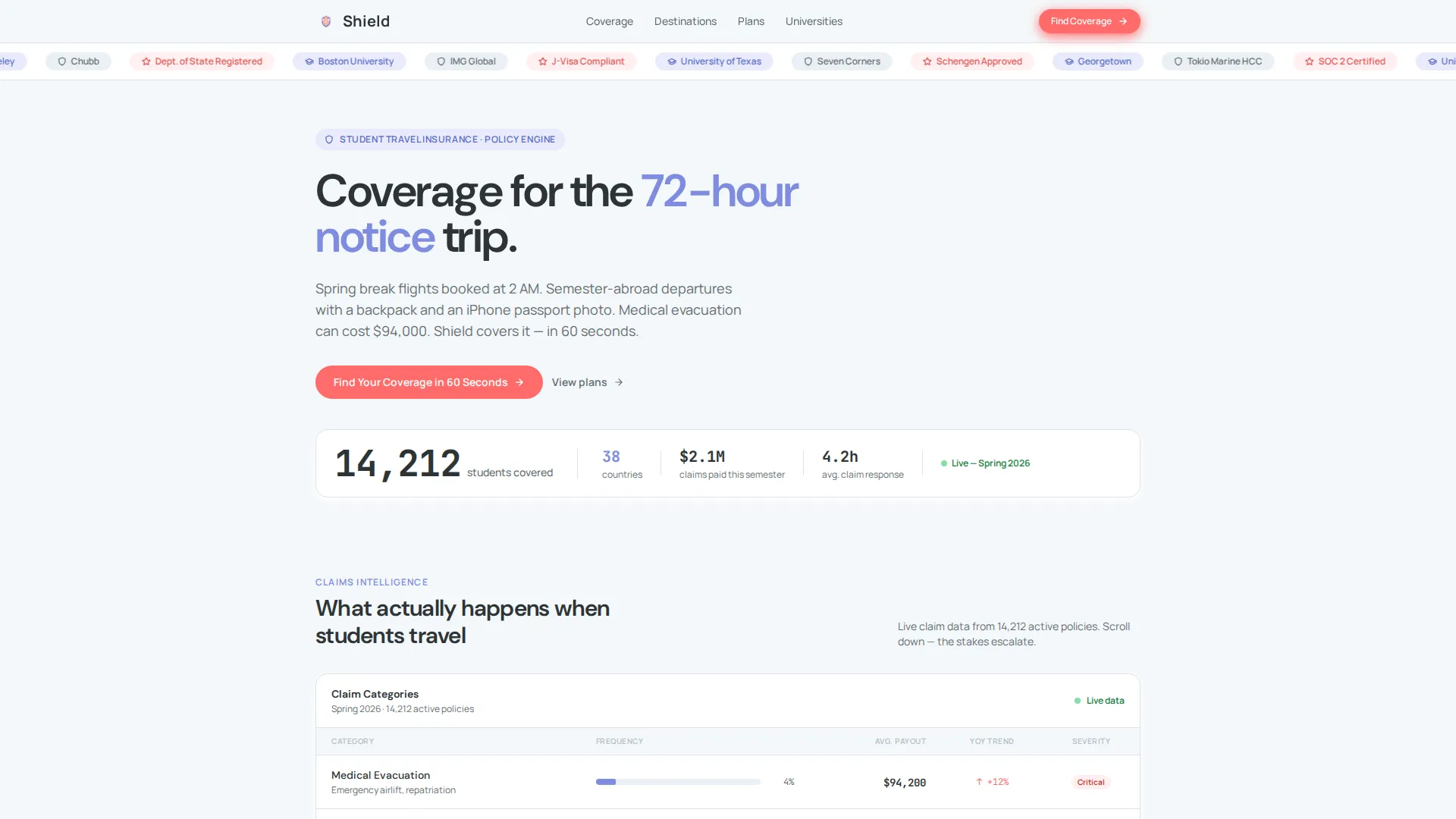
The header runs a slow infinite marquee of university partner logos, travel insurance carrier logos, and compliance badges against a soft cumulus white background. Below the marquee, a single bold stat block reads: "14,212 students covered across 38 countries this semester." There is no hero image. The logos and the number establish trust in under two seconds.
Live-Styled Claim Data Grid
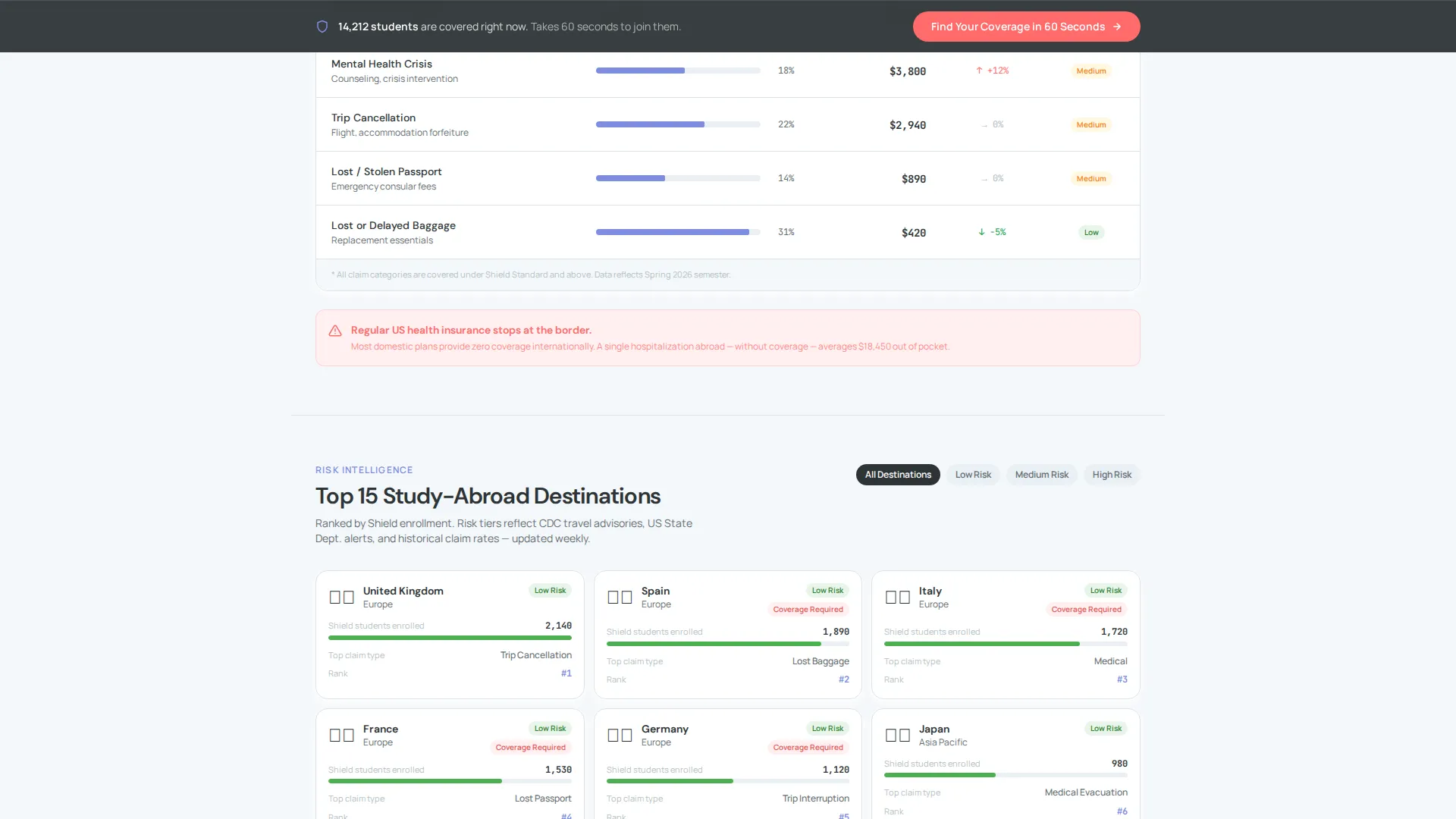
Section one of the page presents a data grid showing real claim categories: medical evacuation, trip cancellation, lost passport, and mental health crisis abroad. Each row includes a frequency bar and an average payout figure. The grid makes abstract risk feel measurable and gives visitors a concrete reason to care.
Destination Risk Map
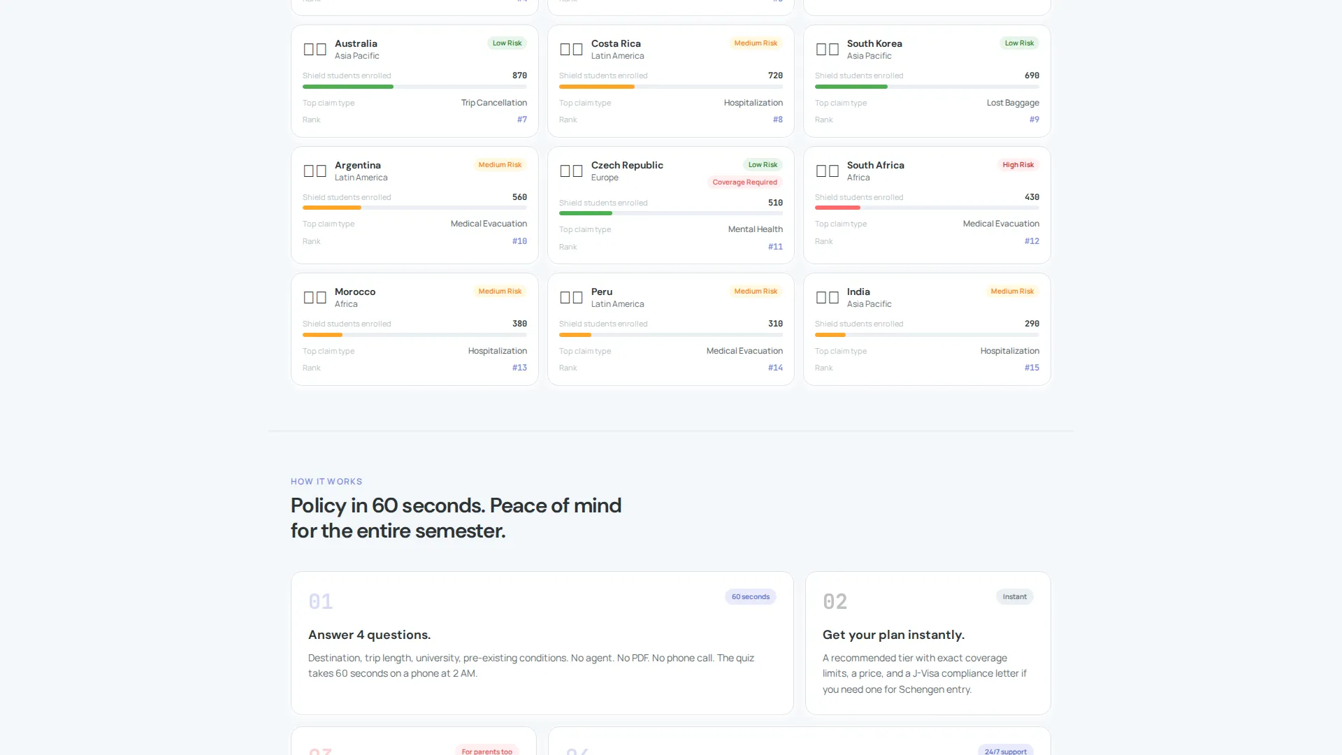
Section two visualizes the top 15 study-abroad destinations with color-coded risk tiers. Visitors can immediately see where their destination falls on the risk scale. The map connects geography to coverage need without requiring any policy reading.
60-Second Coverage Quiz Modal
A sticky bar anchored to the bottom of the page appears after the first data section and prompts visitors to "Find Your Coverage in 60 Seconds." The quiz modal collects four inputs: destination country, trip length, university name (with autocomplete), and a pre-existing conditions toggle. Results show a recommended plan tier, a price, and a coverage summary grid.
Send to My Parents Conversion Path
Inside the quiz results view, a secondary button reads "Send to My Parents." This acknowledges that the person researching is rarely the person paying. It creates a direct handoff path without requiring the student to explain the entire decision themselves.
Industry Report Scroll Design
The page is structured like a typeset annual briefing on student travel risk. Each scroll deeper escalates the stakes, moving from low-urgency inconveniences like delayed baggage to genuine emergencies like hospitalization abroad. The progression builds the case for coverage naturally, without pressure tactics.
Page sections overview
| Section | Purpose |
|---|---|
| Logo Bar Header | Establishes credibility with partner logos, carrier badges, and a live student coverage stat |
| Claim Data Grid | Shows claim categories, frequency bars, and average payouts to quantify real risk |
| Destination Risk Map | Maps top 15 study-abroad destinations with color-coded risk tiers |
| Sticky Quiz Bar | Keeps the primary call to action visible after the first data section |
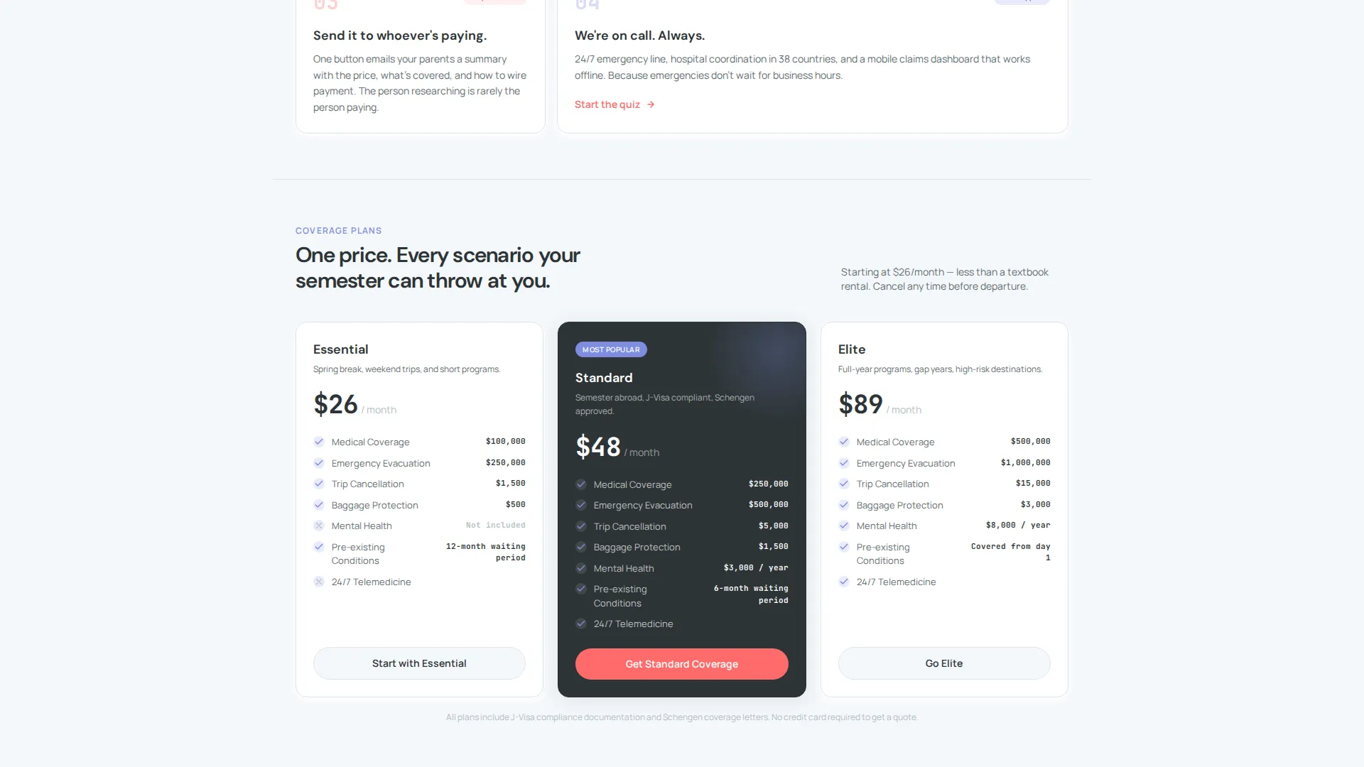
| Quiz Results Modal | Returns a recommended plan, price, coverage summary, and a parent-share button |
Design & branding system
The visual identity follows a Data Command theme using the Cloud Canvas color system. Every color choice serves a functional role rather than a decorative one.
- Soft cumulus white (#F4F7FA) covers panel backgrounds, graphite data ink (#2D3436) handles all primary text and chart lines, and muted periwinkle (#7E8CE0) marks active states and highlighted metrics
- Signal coral (#FF6B6B) appears exclusively on alerts, risk flags, and the primary call-to-action button, keeping visual urgency reserved for moments that truly warrant it
- The overall palette reads like a well-organized workspace at midnight: light enough to read without strain, structured enough to trust with important decisions
Mobile & speed optimization
The template is designed to work cleanly across screen sizes, which matters when students are booking trips from a phone at 2 AM and parents are reviewing options on a tablet in a different time zone.
- The sticky quiz bar and modal are built for thumb-friendly interaction, keeping the primary conversion path accessible without requiring desktop navigation
- The data grid and risk map are structured to remain readable on smaller screens, preserving the clarity that makes the page credible on any device
How this template helps you convert
Shield is built around three specific conversion insights drawn directly from how students, parents, and coordinators actually behave on insurance pages.
- Credibility lands first: the logo bar and stat block handle skepticism before a visitor reads a single line of policy description, reducing the friction that causes early drop-off
- The risk escalation scroll structure moves visitors from low-stakes sections to high-stakes ones naturally, so by the time they reach the quiz bar they already understand why coverage matters
- The "Send to My Parents" button inside the quiz results solves the single biggest drop-off point in student insurance: the student wants coverage but the parent holds the card
Other information about this template
Shield is part of the Finance and Insurance category, specifically built for the college student travel insurance niche. It is a strong fit for insurance providers, university study-abroad offices, and travel insurance aggregators who serve the student market.
- The template style is Dashboard and Data Grid, making it visually distinct from standard insurance brochure pages and more aligned with how this audience expects data-driven tools to look
- The Industry Report creative direction and Data Command theme give the page an editorial authority that separates it from competitors relying on lifestyle photography
- The Cloud Canvas color system and the Header Logo Bar concept are part of the matched design intersection for this template, ensuring visual consistency across the full layout
Theme
Data Command
Creative direction
Industry Report
Color system
Cloud Canvas
Style
Dashboard/Data Grid
Direction
Quiz/Assessment
Page Sections
Scrolling Logo Bar with Credibility Stats
Live-styled Claim Data Grid
Color-coded Destination Risk Map
Sticky 60-second Coverage Quiz
Send to My Parents Conversion Button
Industry Report Scroll Structure
Related questions
Who is this template designed for?
Does the quiz modal require a developer to set up?
Can parents use this page without the student present?
Is this a single landing page or a multi-page website?
Can the template be adapted for a specific university or carrier brand?



