Emergency Painter Landing Page Template
Shield is a single-page emergency painter landing page template built for painting crews that operate around the clock. It uses a stark Arctic White and deep navy palette to project authority and trust. The layout moves visitors through evidence-first content, a mid-page comparison table, and a lead capture form designed to convert property managers, insurance adjusters, and homeowners under pressure.
by Rocket studio
Quick summary
Shield is an urgent painter landing page template designed for 24/7 painting and restoration crews. It opens with a bold, numbers-led headline, builds a legal-style case for acting fast, and closes with a short lead capture form. The design is clinical and direct, making every scroll feel like reading evidence rather than browsing a service website.
Who this template is for
This template is built for painting businesses that respond to property damage emergencies. It speaks directly to the operators who need to move fast and prove they can be trusted before a client even picks up the phone.
- Emergency painting contractors who handle water, fire, and mold damage restoration
- Painting crews that serve property managers, landlords, and insurance adjusters professionally
- Small to mid-sized painting businesses wanting a credible, conversion-focused online presence
What problem this template solves
When property damage happens, the clock starts immediately. Most painting service pages look the same: a gallery, a tagline, a contact form. They do not communicate speed, credentials, or urgency. Shield solves that problem by leading with proof instead of promises.
- Visitors arrive panicked and need instant reassurance, not a homepage tour
- Generic painter websites fail to separate emergency contractors from standard decorators
- Property managers and insurance adjusters need documentation signals before they commit to a call
What you get with this template
Shield gives you a fully structured, single-page layout that makes the case for your service before asking for anything in return. Every section is designed to reduce hesitation and move the visitor toward a contact decision.
- A full-page layout from headline to lead form, built around an urgent restoration service narrative
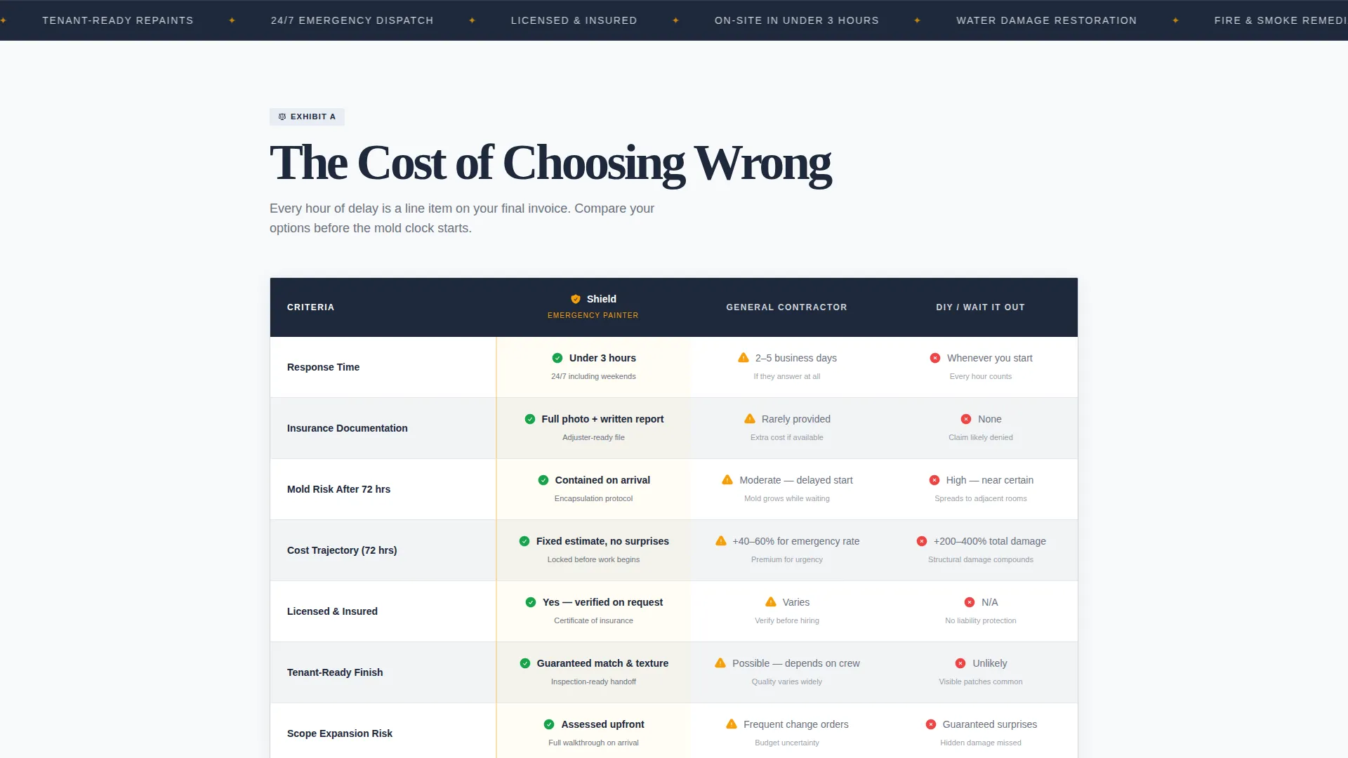
- A mid-page comparison table contrasting your emergency response against general contractors and do-it-yourself delay
- A lead capture form with damage type, zip code, and phone fields inside an amber-bordered card
Feature list
This template is built around six purposeful components that work together to create urgency, establish authority, and capture leads.
Giant Evidence Headline
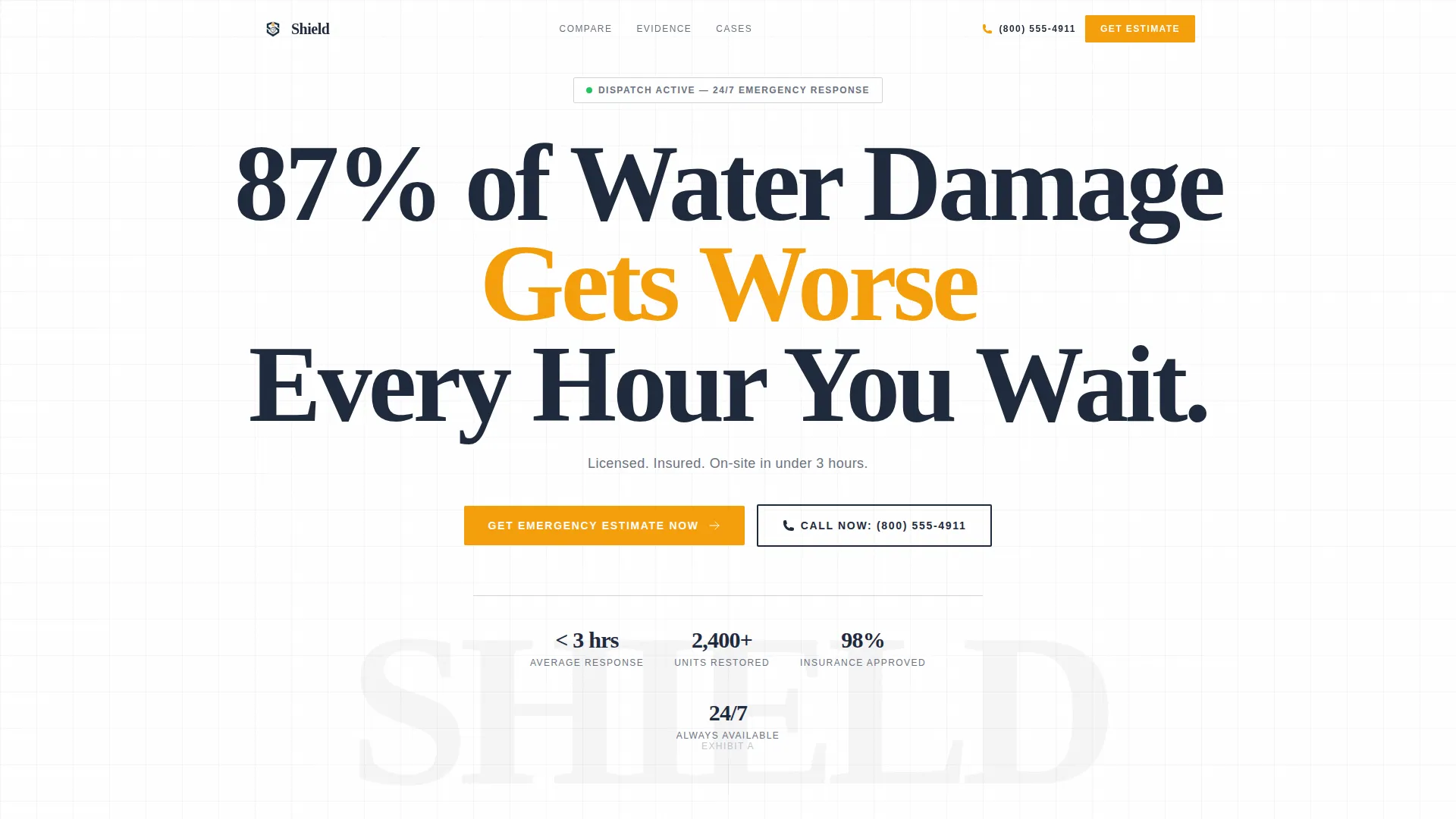
The header opens with a single massive navy headline on pure white: "87% of Water Damage Gets Worse Every Hour You Wait." No image, no illustration. Below it, a single policy-gray subline confirms licensing, insurance, and a three-hour on-site window. The emptiness around the text functions as a design element on its own.
Stats-First Scroll Sections
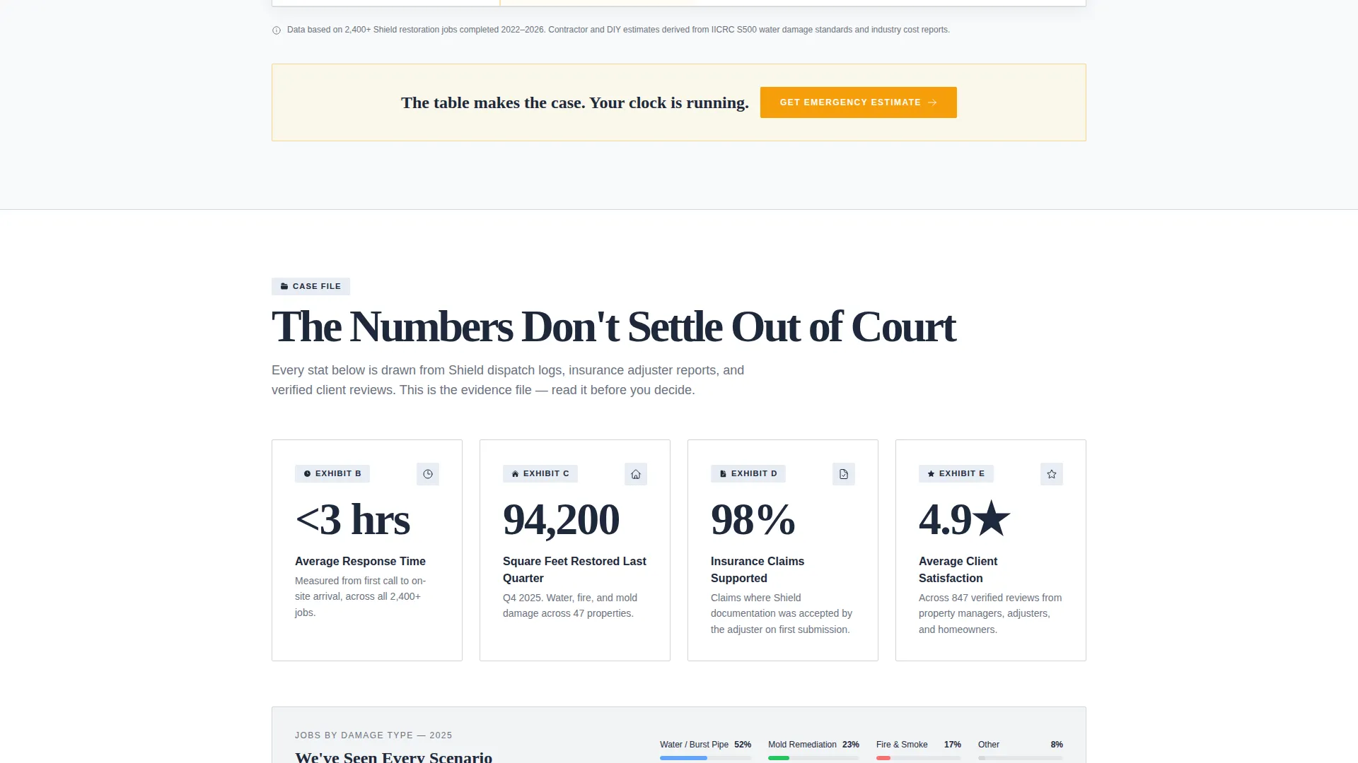
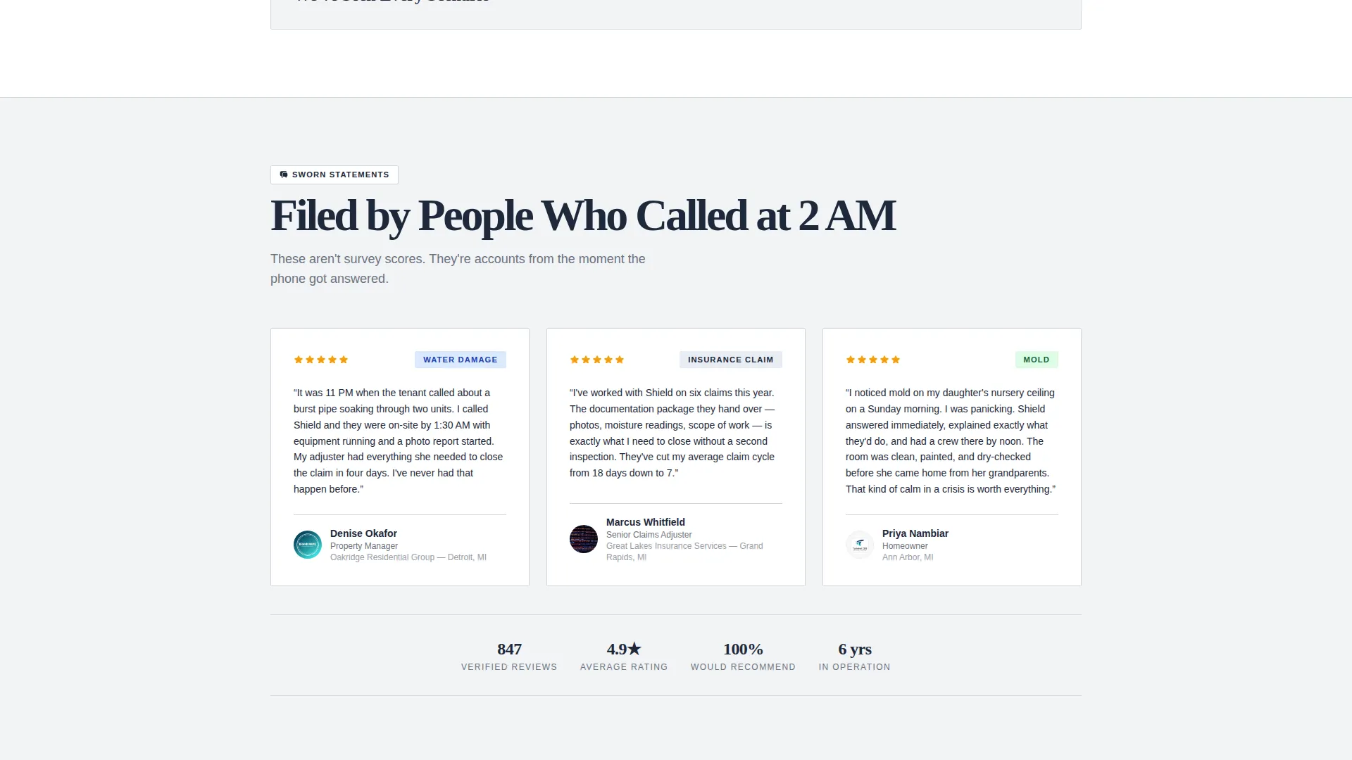
Each scroll section reveals a statistic before its explanation. Response time averages, square footage restored, insurance claims supported, and satisfaction percentages are each presented as standalone evidence before context is added. The layout builds a factual argument across the page.
Three-Way Comparison Table
A mid-page table contrasts "Emergency Painter," "General Contractor," and "DIY / Wait It Out" side by side. Rows cover response time, insurance documentation, mold risk, and cost trajectory over 72 hours. Alternating white and faint gray rows keep the table readable and clinical.
Amber-Bordered Lead Capture Form
The primary lead generation form sits inside a card outlined in emergency amber. It collects damage type, property zip code, and phone number in that order. The amber border breaks the arctic palette deliberately, functioning as a visual hazard sign that draws the eye.
Click-to-Dial Secondary call to action
A secondary "Call Now" button uses click-to-dial functionality for mobile visitors. It sits alongside the primary form path so visitors who prefer to call immediately are not left hunting for a number.
Arctic White Legal Visual System
The full page uses a clinical color palette: white backgrounds, policy-gray body text, deep navy for headlines and table headers, and amber reserved strictly for calls to action and urgent callouts. The result reads like a freshly filed insurance document that also converts.
Page sections overview
| Section | Purpose |
|---|---|
| Hero Headline Block | Opens with a stat-first warning headline and credibility subline |
| Stats Impact Row | Delivers key numbers before their explanations to build authority |
| Comparison Table | Contrasts emergency painter against contractor and DIY options |
| Lead Capture Form | Collects damage type, zip code, and phone inside an amber card |
| Click-to-Dial call to action | Provides a direct call path for mobile visitors in a hurry |
Design & branding system
The visual identity follows a Legal Shield theme built on the Arctic White color system. Every color choice carries a meaning: sterile confidence, institutional trust, and a single streak of urgency.
- Clinical white (#F8F9FA) for all backgrounds, policy-gray (#D1D5DB) for body text and sublines, deep authority navy (#1E293B) for all headlines and table headers
- Emergency amber (#F59E0B) used exclusively for calls to action, the form card border, and urgent callout text
- Comparison table rows alternate between pure white and a faint gray wash to keep the legal-document reading rhythm intact
Mobile & speed optimization
The page layout is structured to work cleanly on mobile devices, which matters most for this audience. A property manager calling at 2 AM is almost certainly on a phone.
- The click-to-dial button is built for mobile-first access so visitors can call without navigating away
- The lead form uses a minimal three-field structure that is fast to complete on a small screen
- The header section is viewport-focused with no images or illustrations, keeping the first screen load lightweight
How this template helps you convert
Shield earns the contact request before it ever asks for one. The page is structured as a progressive argument: each section adds another reason why delay is costly and your crew is the right call.
- The headline and stats sections establish the cost of waiting before any service claim is made, so trust is built on evidence rather than self-promotion.
- The comparison table removes the "should I just call a general contractor?" objection mid-page, right before the lead form appears.
- The amber-bordered form and click-to-dial button give visitors two clear paths to act, reducing friction at the exact moment they are ready to commit.
Other information about this template
Shield is particularly well-suited for painter marketing in the emergency and restoration niche. The template style draws from an Editorial Magazine aesthetic with a Sidebar Companion structure, making it adaptable for painters who want a professional, document-grade web presence without a full multi-page site build.
- The template fits within the Professional Services category and is designed for painter marketing use cases involving urgency, property damage, and insurance-adjacent client types
- The Arctic White color system and Legal Shield visual theme are consistent with the intersection context, which targets transparent process positioning and a click-through audience action model
- The header concept uses a centered Giant Headline approach, adapted here to carry a single data point that does the persuasion work on its own
- This template can support painters who service residential landlords, commercial property managers, and insurance restoration workflows, based on the audience types described in the brief
Theme
Editorial Magazine
Creative direction
Transparent Process
Color system
Arctic White
Style
Sidebar Companion
Direction
Click-Through
Page Sections
Stats-first Evidence Sections
Three-way Comparison Table
Amber-bordered Lead Capture Form
Click-to-dial Mobile Button
Giant Evidence Headline Header
Arctic White Legal Visual System
Related questions
Who is this landing page template designed for?
What does the comparison table cover?
Can I use this template as my main painter service page?
What information does the lead capture form collect?
Does the template include a way for mobile visitors to call directly?



