Teen Driver Program Landing Page Template
Shift is a full-width immersive landing page template built for a teen driver training academy. It combines a helmet-cam video header, stats-first scroll storytelling, and a sharp comparison layout to turn worried parents into enrolled families. The Engineering Blueprint visual theme, carbon fiber palette, and safety-yellow data callouts give every section the authority of a crash-test report.
by Rocket studio
Quick summary
Shift is a precision-built landing page template for a teen and young driver program. It opens with live skid-car footage, builds trust through bold statistics, and guides parents toward enrollment through a focused comparison layout. Every design choice, from the carbon fiber color system to the safety-yellow calls to action, signals that this program is serious about driver safety.
Who this template is for
This template is designed for driving academies that offer hands-on, simulation-based training for teen drivers. It speaks directly to the adults making enrollment decisions, not to the teenagers themselves.
- Parents who recently handed their teen the car keys and want proof the program works
- Guardians and family members researching structured safety training for young drivers
- School counselors building life-skills curricula that include real-world driver preparation
What problem this template solves
Standard driver's education pages look like school brochures. They list hours and prices but do nothing to earn trust from a parent who is genuinely worried. This template solves the credibility gap.
- It replaces vague program descriptions with specific, data-backed comparisons
- It removes friction for late-night visitors by keeping the enrollment form to just three fields
- It gives a safety-focused program the visual weight and authority its training deserves
What you get with this template
You get a single-page layout that moves visitors from first impression to enrollment decision through deliberate scroll storytelling. Each section builds on the last.
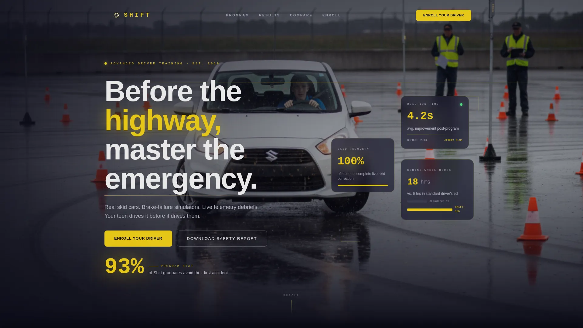
- A helmet-cam product demo video header with a stat overlay that reads "93% of our graduates avoid their first accident"
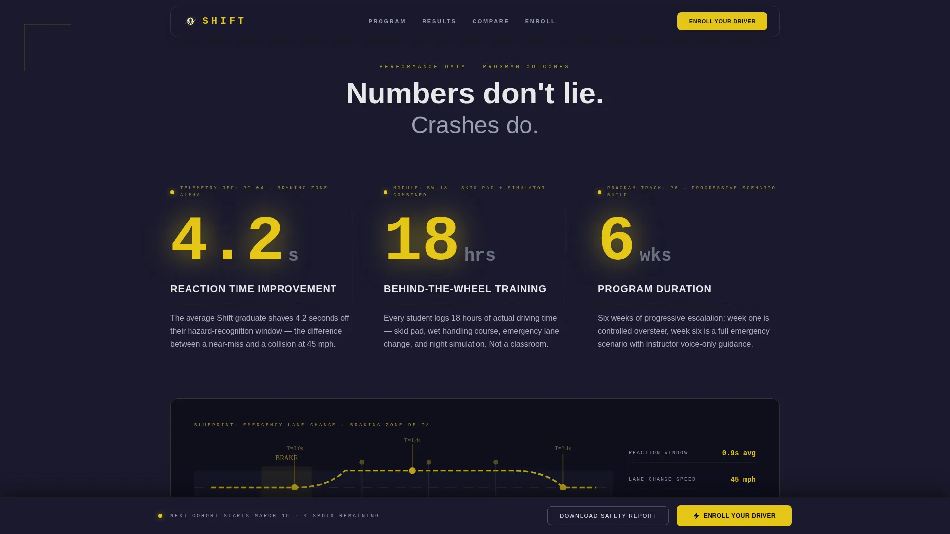
- A stats-first scroll sequence where figures like "4.2 seconds" appear alone before their context is revealed
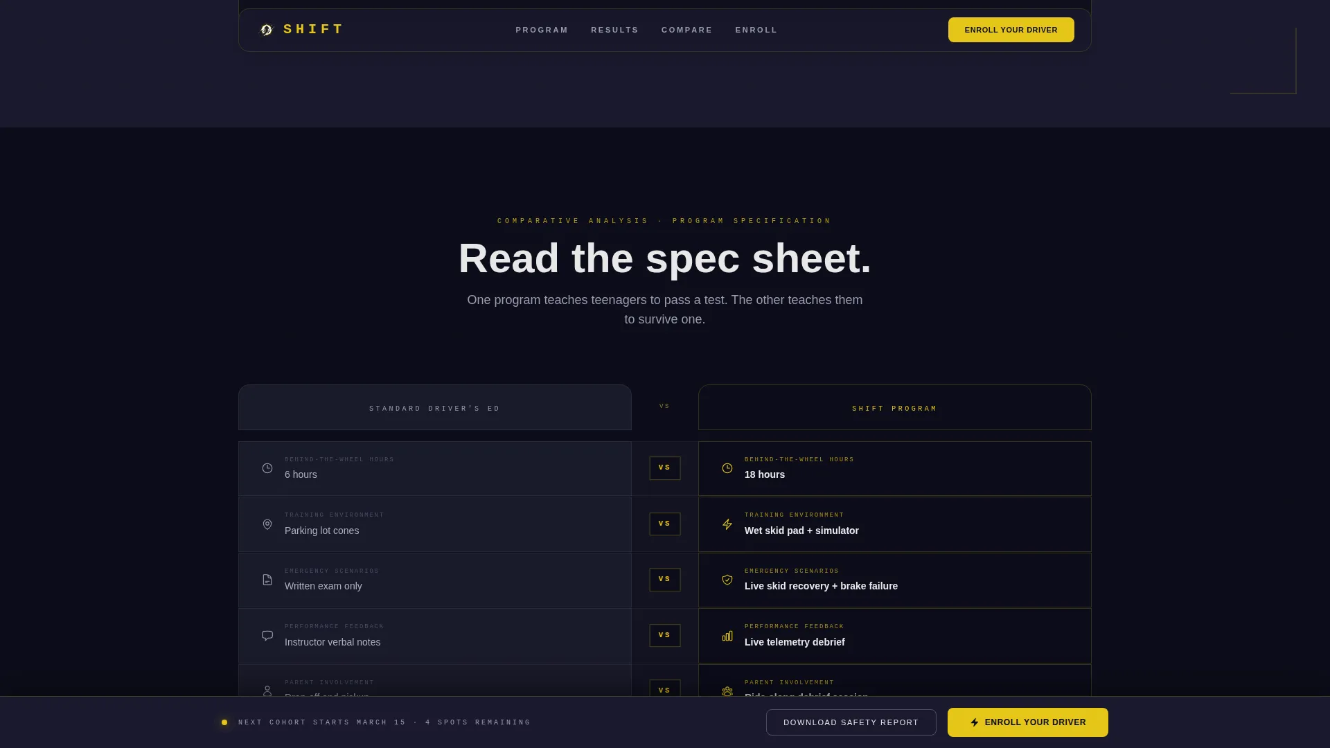
- A side-by-side comparison structure contrasting traditional driver's ed with this program across every key metric
- A pricing table that itemizes simulator hours, skid-pad sessions, and parent ride-along debriefs
- A sticky "Enroll Your Driver" call to action in safety yellow, pinned to the viewport after the first scroll
- A secondary "Download the Safety Report" email capture form with three fields only
Feature list
This template is built around a specific set of structural and visual features. Each one is grounded in the source brief and serves a clear purpose in the conversion flow.
Helmet-Cam Video Header
The header drops visitors directly into six seconds of skid-car footage. A seventeen-year-old corrects an induced oversteer on a wet handling pad. The footage cuts to a wide exterior shot of the full controlled environment. A single stat fades in over the video to anchor attention immediately.
Stats-First Scroll Sequence
Key numbers appear in isolation before their explanation is revealed. Each figure is styled in safety yellow and annotated in a blueprint style. Data points connect visually to diagrams of braking zones, steering angles, and reaction windows. This builds curiosity and authority at every scroll depth.
Comparison Versus Layout
Every major section is structured as a versus frame. Traditional driver's ed sits on the left in flat titanium gray. This program sits on the right in full carbon-and-yellow detail. The contrast covers classroom hours against behind-the-wheel hours, parking-lot cones against hydroplane simulators, and written tests against live telemetry debriefs.
Side-by-Side Pricing Table
The pricing table goes beyond cost-per-course. It itemizes exactly what each dollar buys: simulator hours, skid-pad sessions, and parent ride-along debriefs. This transparency turns a price comparison into a value demonstration.
Sticky Enrollment call to action
"Enroll Your Driver" is pinned to the bottom of the viewport after the first scroll. It stays visible throughout the entire page experience. The button uses the high-vis safety yellow to draw attention without interrupting reading flow.
Minimal Three-Field Capture Form
The secondary conversion path asks for three pieces of information only: the teen's age, permit status, and preferred session timing. This keeps friction low for parents who are in research mode late at night.
Page sections overview
| Section | Purpose |
|---|---|
| Video Hero Header | Opens with skid-car footage and a single trust-anchoring stat |
| Stats Impact Strip | Delivers isolated figures before context, building curiosity |
| Program Versus Ed | Contrasts this program against standard driver's ed side by side |
| Blueprint Data Diagrams | Annotates braking zones, reaction windows, and steering angles |
| Pricing Comparison Table | Itemizes cost versus deliverables for each enrollment option |
| Sticky Enroll call to action | Keeps the primary action visible throughout the full scroll |
| Safety Report Capture | Secondary form for parents still in the research phase |
Design & branding system
The visual identity follows an Engineering Blueprint theme rendered in a Carbon Fiber color system. The result feels like opening the hood of a precision machine, not browsing a school website.
- Core palette: deep carbon black (#1A1A2E), titanium mid-gray (#4A4E69), technical white (#E8E8E8), and high-vis safety yellow (#E6C619)
- Safety yellow is reserved exclusively for calls to action, data callouts, stat figures, and interactive hover states
- Backgrounds stay in the black-to-gray range with a woven carbon weave texture and matte finishes throughout
Mobile & speed optimization
This template is structured to perform for parents who open it on a phone at midnight. The layout choices reflect that reality.
- Full-width sections restack cleanly for narrower screens without breaking the versus-frame logic
- The three-field capture form is compact enough to complete on a mobile keyboard without scrolling
- The sticky call to action button remains accessible at the bottom of the mobile viewport throughout the session
How this template helps you convert
Shift is built around a single conversion goal: turning a worried parent into an enrolled family. The layout earns trust before it asks for anything.
- The video header and opening stat establish credibility in the first six seconds, before a visitor has read a single word of body copy
- The stats-first scroll and comparison sections build a case that feels like reading a safety report, not a sales page, making the enrollment decision feel logical rather than pressured
- The sticky call to action and minimal form ensure that when a visitor is ready to act, whether after two scrolls or ten, the path to enrollment is always one tap away
Other information about this template
This template sits at the intersection of automotive training, teen safety education, and high-stakes parental decision-making. A few additional details help frame its full scope.
- The template is categorized under Automotive and Transport, with a specific focus on the Driving School and Teen or Young Driver Program niche
- The full-width immersive template style means no sidebars, no distractions, and no competing navigation pulling visitors away from the enrollment path
- The Engineering Blueprint theme is intentional: it signals that this program is data-driven and technically rigorous, not just another after-school activity
- The creative direction is Stats-First Impact, meaning numbers lead every section and explanations follow, reversing the typical marketing pattern
Theme
Engineering Blueprint
Creative direction
Stats-First Impact
Color system
Carbon Fiber
Style
Full-Width Immersive
Direction
Comparison/Versus
Page Sections
Helmet-cam Video Hero Header
Stats-first Scroll Storytelling
Comparison Versus Framework
Itemized Pricing Table
Sticky Safety-yellow Call to Action
Minimal Email Capture Form
Related questions
What audience is this landing page template designed for?
Can I edit the video, statistics, and comparison content?
Why does the enrollment form only have three fields?
Does the template include the side-by-side pricing table?
What makes this template different from a standard driving school page?