Product Manager Profile Specialist Pre-Launch Website Template
Shipcard is a dark, bento grid landing page built for product managers who want a digital business card that shows their work, not just their title. It features a Before/After Slider header, a scroll-driven Gallery Walk of card modules, and a frictionless waitlist form. The design uses a deep editorial palette that feels intentional and confident.
by Rocket studio
Quick summary
Shipcard is a single-page bento grid landing page template designed for product managers who need a digital business card that earns attention. The page opens with a visceral Before/After Slider, moves through a gallery of card feature modules, and closes with a low-friction waitlist signup. Every section is built to prove that a PM's card should work as hard as their product.
Who this template is for
This template is built for product professionals who want to show what they have shipped, not just where they work. It speaks directly to the people handing out forgettable paper cards at industry events and walking away with nothing to show for it.
- Senior product managers at Series B startups who want their card to reflect their roadmap thinking
- Group product managers at enterprise technology companies who need a polished, fast first impression
- Freelance product consultants who attend conferences and want prospects to remember their work, not their job title
What problem this template solves
Most business cards reduce a product manager's identity to a name, a title, and an email address. That format throws away the most compelling thing a PM has: a track record of shipped products, measurable outcomes, and clear strategic thinking.
- There is no space on a paper card to show a portfolio, a live project status, or a booking link
- Conference introductions are brief, and a forgettable card means a forgotten conversation
- Building a personal page from scratch takes time a senior PM does not have
What you get with this template
The template delivers a complete, ready-to-customize landing page with a structured layout and a focused visual system. Every section is pre-designed and purposeful, so you spend time filling in your work rather than making layout decisions.
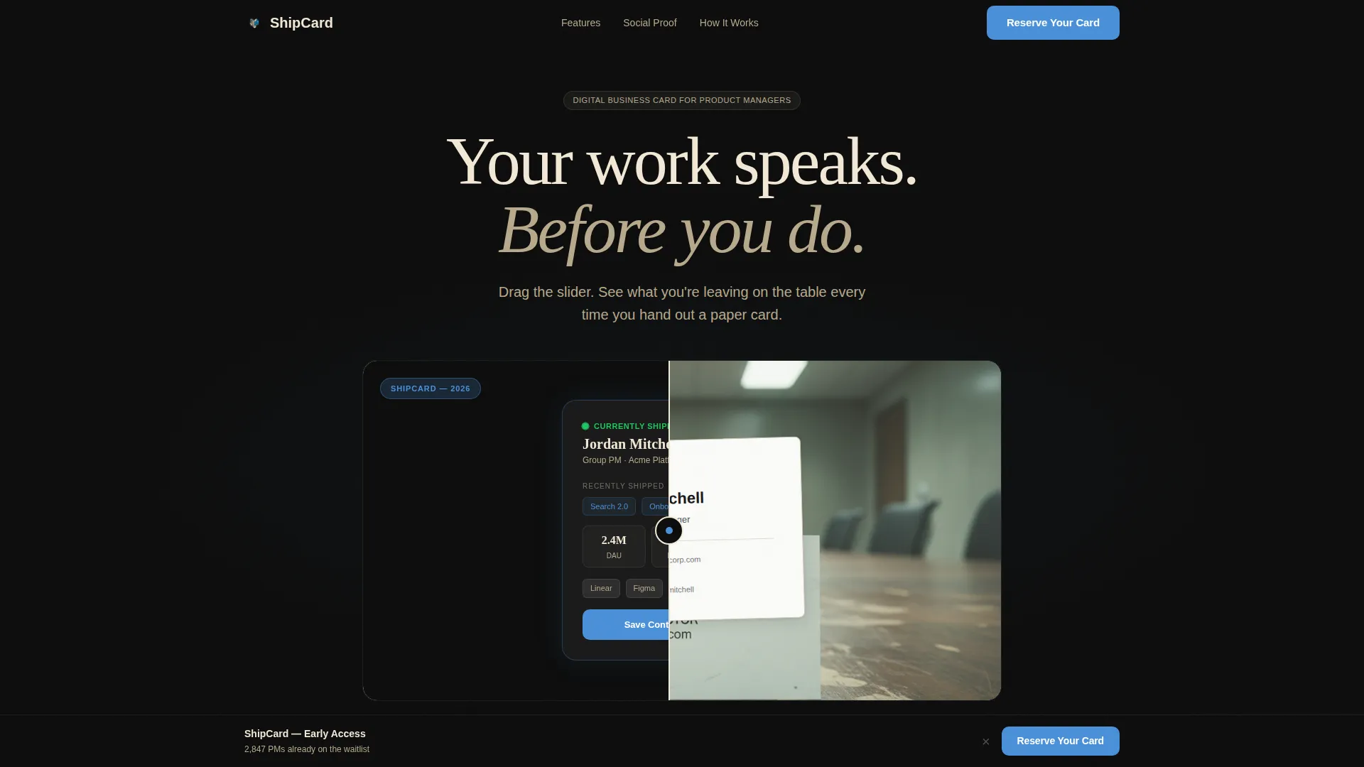
- A Before/After Slider header that makes the value of a digital card immediately obvious
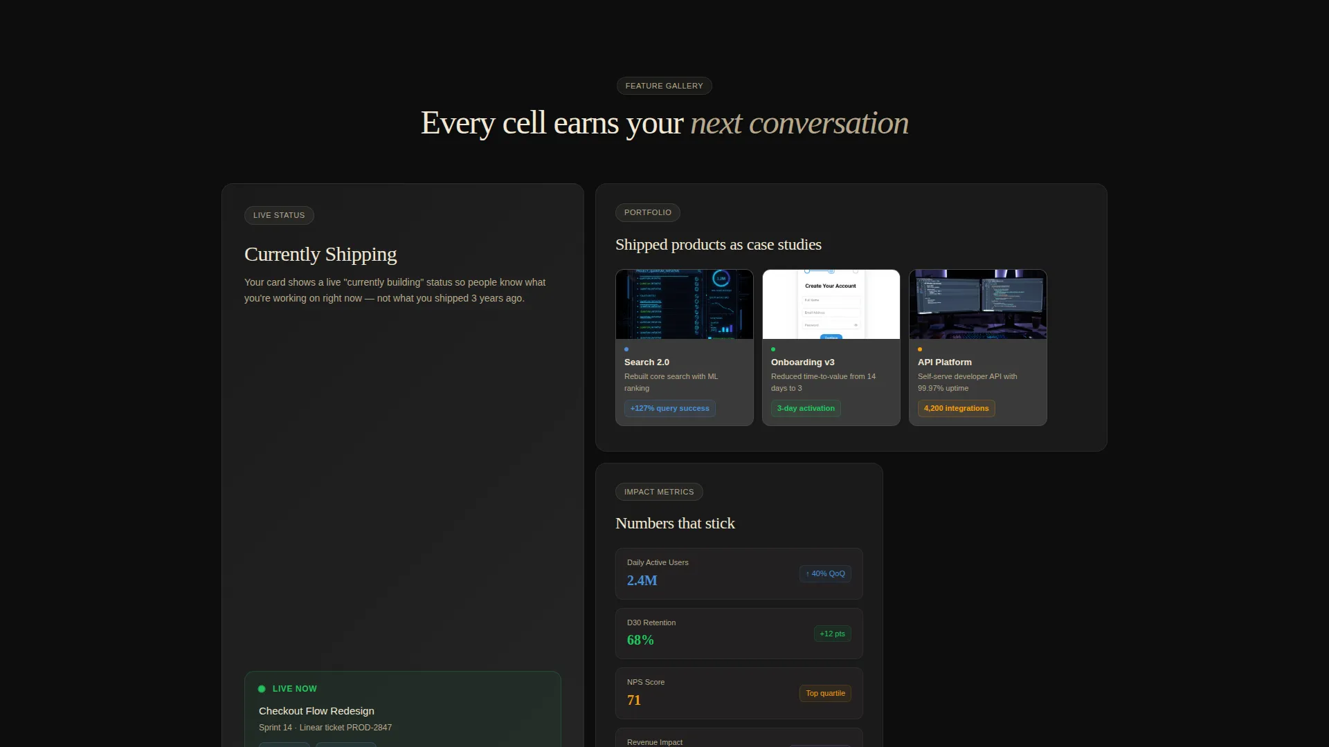
- A bento grid Gallery Walk that spotlights individual card features through scroll-triggered cells
- A segmented waitlist form with a live position counter and a role seniority dropdown
Feature list
This template includes purpose-built sections and interactive elements drawn directly from the source design brief. Each feature below is part of the delivered layout.
Before/After Viewport Slider
The header splits the full viewport into two halves. The left side shows a traditional paper business card on a scuffed conference table. The right side shows the digital card interface with shipped product thumbnails, a live status indicator, and a one-tap contact save. A thin parchment slider handle with a blue accent dot separates the two states.
Bento Grid Gallery Walk
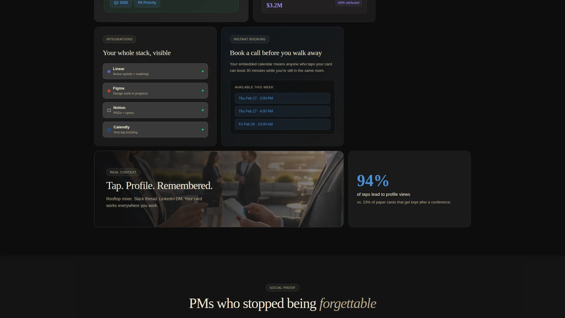
The scroll experience is structured as a curated exhibition. Individual bento cells highlight specific card features, including a live "Currently Shipping" status, a portfolio carousel, metric badges showing numbers like daily active users or retention rates, and a calendar embed for instant booking. Cells vary in size from tight single-stat squares to wide cinematic rectangles.
Scroll-Triggered Paper Unfold Animations
Each bento cell fades into view as the user scrolls, using a subtle paper-unfold animation. The effect reinforces the editorial identity of the template without distracting from the content inside each cell.
Sticky Waitlist call to action Bar
After the third scroll checkpoint, a sticky bottom bar appears with the primary call to action: "Reserve Your Card." The bar stays present without blocking the content, giving users a persistent path to sign up whenever they are ready.
Segmented Waitlist Form
The full-width bento cell near the bottom of the page holds a one-field waitlist form asking only for a work email. A secondary dropdown lets users select their seniority level: IC, Lead, Director, or VP. This doubles as a segmentation tool for future outreach. A live counter shows the user's waitlist position after submission.
Integration Badge Display
The digital card module inside the gallery includes visible integration badges for tools commonly used in product work. These badges communicate at a glance that the card connects to a modern PM workflow.
Page sections overview
| Section | Purpose |
|---|---|
| Before/After Header | Contrast analog versus. digital card experience |
| Gallery Walk Grid | Showcase individual card feature modules |
| Currently Shipping Cell | Display live product status indicator |
| Portfolio Carousel Cell | Show launched product case study thumbnails |
| Metric Badge Cell | Surface key outcome numbers visually |
| Calendar Embed Cell | Enable direct booking from the card |
| Context Scene Cells | Place card in real-world sharing moments |
| Sticky call to action Bar | Persistent waitlist signup access |
| Waitlist Form Cell | Capture email with seniority segmentation |
| Live Position Counter | Confirm signup and show queue position |
Design & branding system
The visual identity follows a Dark Immersive theme built on the Ink & Paper color system. The palette is editorial and restrained, with color used as a functional signal rather than decoration.
- Core colors: deep editorial black (#0D0D0D) for backgrounds, warm parchment (#F2E8D5) for text, graphite mid-tone (#3A3A3A) for card surfaces and grid dividers
- Signal blue (#4A90D9) appears exclusively on interactive elements and calls to action, making every clickable moment visually distinct
- The overall feel references a Moleskine notebook opened under a desk lamp: ink-dark, warm-edged, and intentionally crafted
Mobile & speed optimization
The bento grid layout is structured to adapt across screen sizes, keeping the hierarchy intact whether the page is viewed on a phone tapped at a conference or a desktop in a browser.
- Bento cells reflow to maintain readability on smaller viewports without losing the gallery feel
- The sticky call to action bar is designed to remain accessible and non-intrusive on mobile screens
- The one-field waitlist form keeps the conversion step as simple on a phone as it is on a laptop
How this template helps you convert
The page is built around a progressive trust model. It earns the signup by showing proof before asking for anything.
- The Before/After Slider creates immediate contrast and frames the problem within seconds of arrival, giving visitors a clear reason to keep reading.
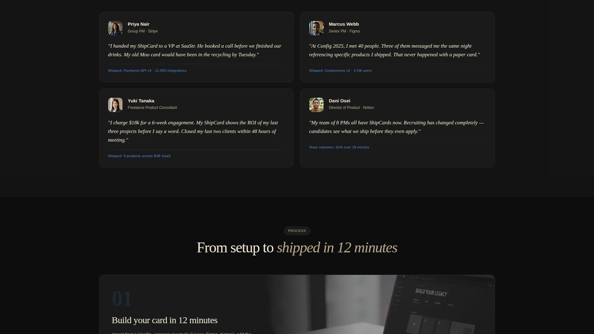
- The Gallery Walk builds a case section by section, each bento cell adding one more reason to want the card, so by the time the waitlist form appears, the decision feels obvious.
Other information about this template
This template fits within the Personal and Resume category, specifically the Product Manager Profile subcategory. It is designed for the product manager digital business card niche and carries a focused intersection match across theme, creative direction, and landing page direction.
- The template style is Bento Grid, the theme is Dark Immersive, and the creative direction is Gallery Walk
- The header concept is a Before/After Slider and the landing page direction is Waitlist and Coming Soon
- The color system is Ink & Paper, which is the named palette used throughout the design
- This is a single landing page, not a multi-page website, so all content lives in one vertically scrolling layout
Theme
Dark Immersive
Creative direction
Gallery Walk
Color system
Ink & Paper
Style
Bento Grid
Direction
Waitlist/Coming Soon
Page Sections
Before/after Viewport Slider
Bento Grid Gallery Walk
Live Currently Shipping Status
Segmented Waitlist Form
Metric Badge and Portfolio Cells
Sticky Reserve Call to Action Bar
Related questions
Who is this landing page template designed for?
What is the purpose of the Before/After Slider in the header?
Can I customize the waitlist form segmentation options?
Is this template suitable for an employed PM, not just a consultant?
Does the page include animations, and are they required for the layout to work?



