SaaS Builders Community Pricing Website Template
Shiplog is a landing page template built for private SaaS founders communities charging a monthly membership fee. It uses a zigzag alternating layout to walk visitors through real community activity, member spotlights, and weekly rituals. The design blends a dark code-editor aesthetic with warm neighborhood energy, guiding founders toward a single invite-request form submission.
by Rocket studio
Quick summary
Shiplog is a single-page landing page template designed for a private, paid Slack community aimed at indie SaaS founders. The layout alternates left-right content blocks to simulate walking through an active clubhouse. Every section proves the room is worth entering before asking for a click.
Who this template is for
This template is built for community operators, indie hackers, and bootstrapped founders who are running a paid membership community for SaaS builders. It works best when the community has real members, real activity, and real results to show.
- Solo developers and two-person SaaS teams looking to grow a paid founder community
- Bootstrapped operators who want a landing page that earns trust before asking for an application
- Community builders who need a conversion-focused invite-request flow, not a generic sign-up wall
What problem this template solves
Most community landing pages look like generic sign-up forms with a short value proposition paragraph. They fail to prove that the room is already alive and worth paying to enter. Shiplog solves this by letting the community speak for itself before the visitor ever sees a call to action.
- Founders scroll past communities that feel empty or unproven before they commit
- A generic pricing page or sign-up form cannot communicate the texture of real peer conversation
- Visitors need social proof layered throughout the page, not just stacked in one testimonials section
What you get with this template
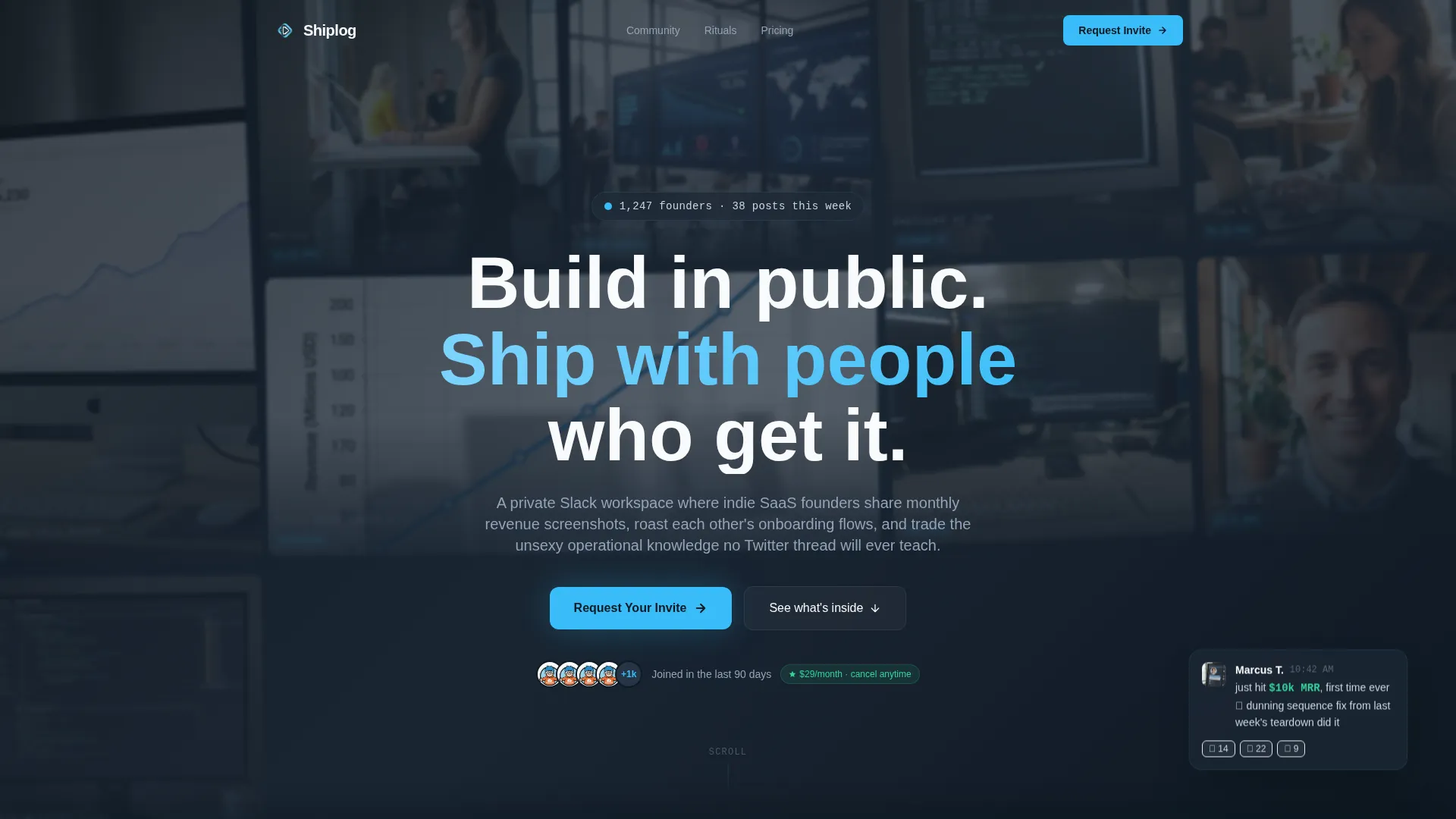
You get a fully structured single-page layout with five distinct content sections, each designed to show a different facet of community life. The template includes a hero with a user-generated content photo wall, live-feeling Slack post cards, member spotlight cards, weekly ritual blocks, and a knowledge-differentiation section. Every section alternates sides to keep the eye moving and the reader engaged.
- Hero section with a mosaic photo grid, frosted overlay headline, and a primary call-to-action button
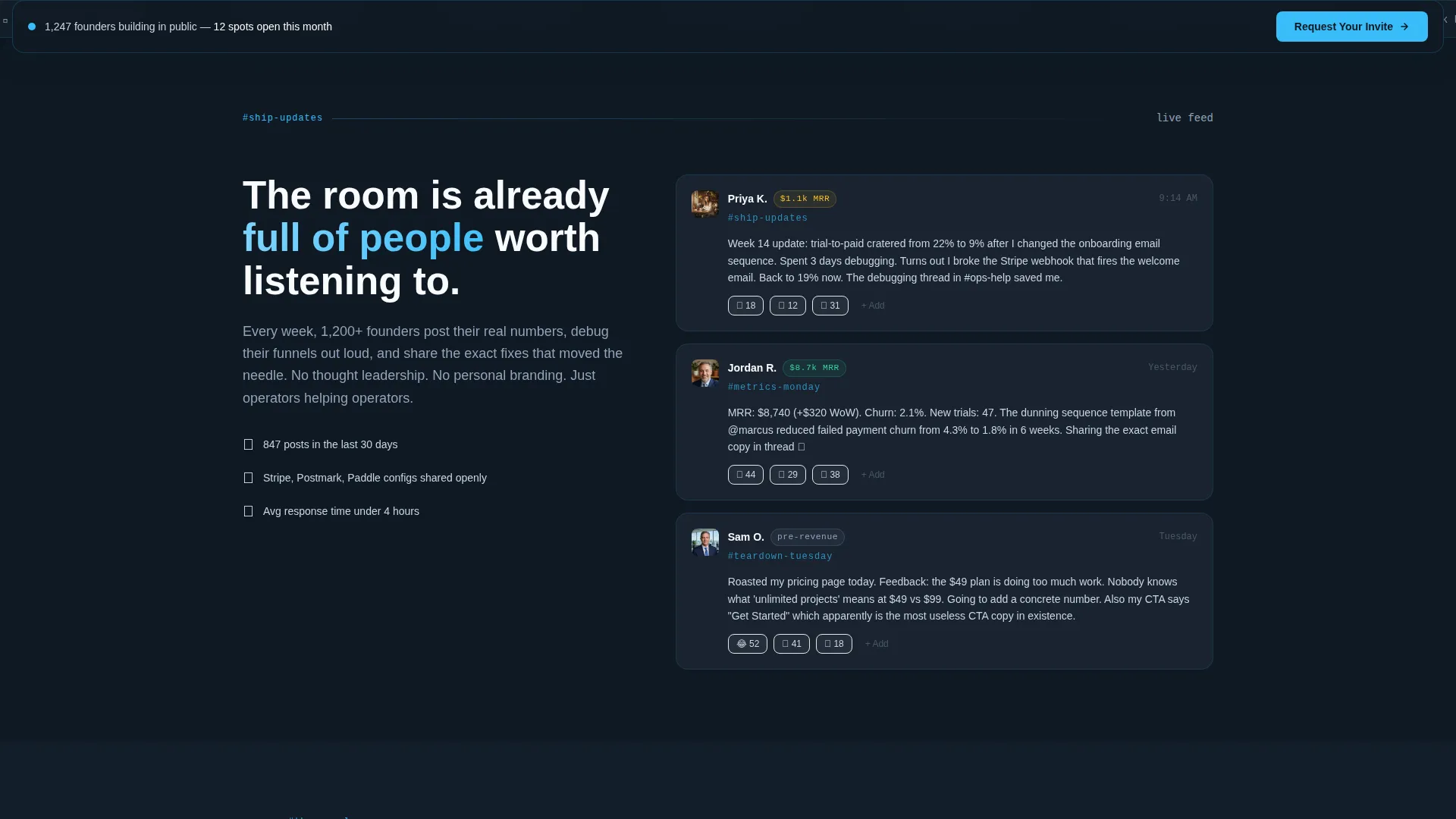
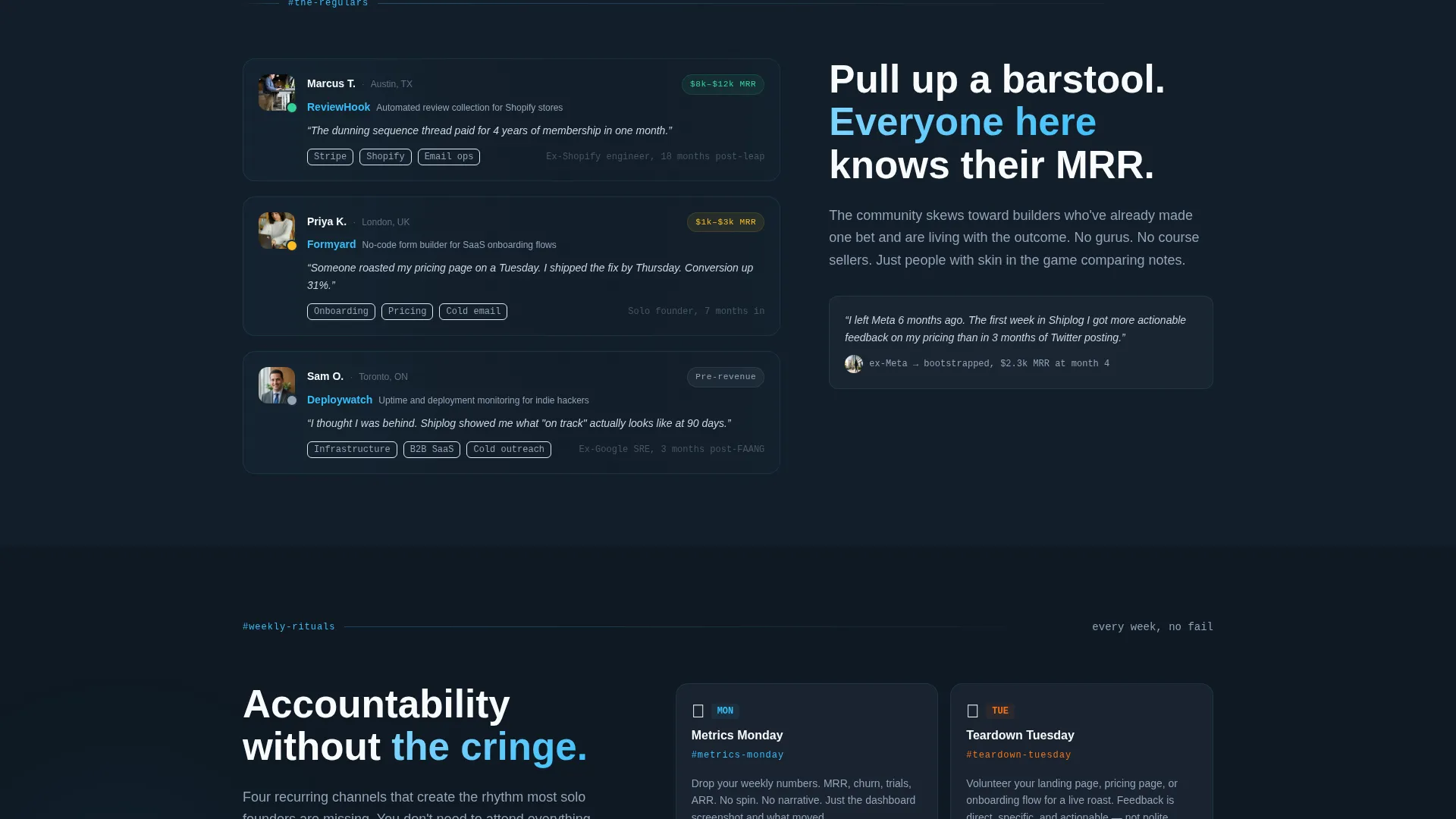
- Zigzag community sections covering activity feed, member spotlights, weekly rituals, and topic depth
- Sticky bottom call-to-action bar that appears after the second scroll and follows the visitor down the page
Feature list
This section covers the core built-in capabilities included in the Shiplog landing page template.
UGC Photo Wall Hero
The hero opens with a mosaic bento grid of member screenshots: Stripe dashboards, deploy terminals, founder selfies, and Slack message previews. The grid is slightly rotated and overflows the viewport edges to feel alive and unpolished. A frosted slate overlay carries the central headline through the visual noise.
Zigzag Alternating Layout
Each content block alternates between left-heavy slate and right-accented sky blue panels. This mirrors the natural scan pattern of reading an active Slack sidebar. The layout keeps visitors engaged as they scroll through five distinct community sections.
Live-Feel Slack Post Cards
The activity feed section displays anonymized Slack post cards styled to look like real in-channel messages. Reaction counts and timestamps make the community feel active right now, not archived. This is one of the most persuasive proof elements on the page.
Member Spotlight Cards
Three member cards show a founder's product name, monthly recurring revenue range, and a one-line quote about their community experience. Cards include profile avatar placeholders and hover states. They humanize the membership before the visitor is asked to apply.
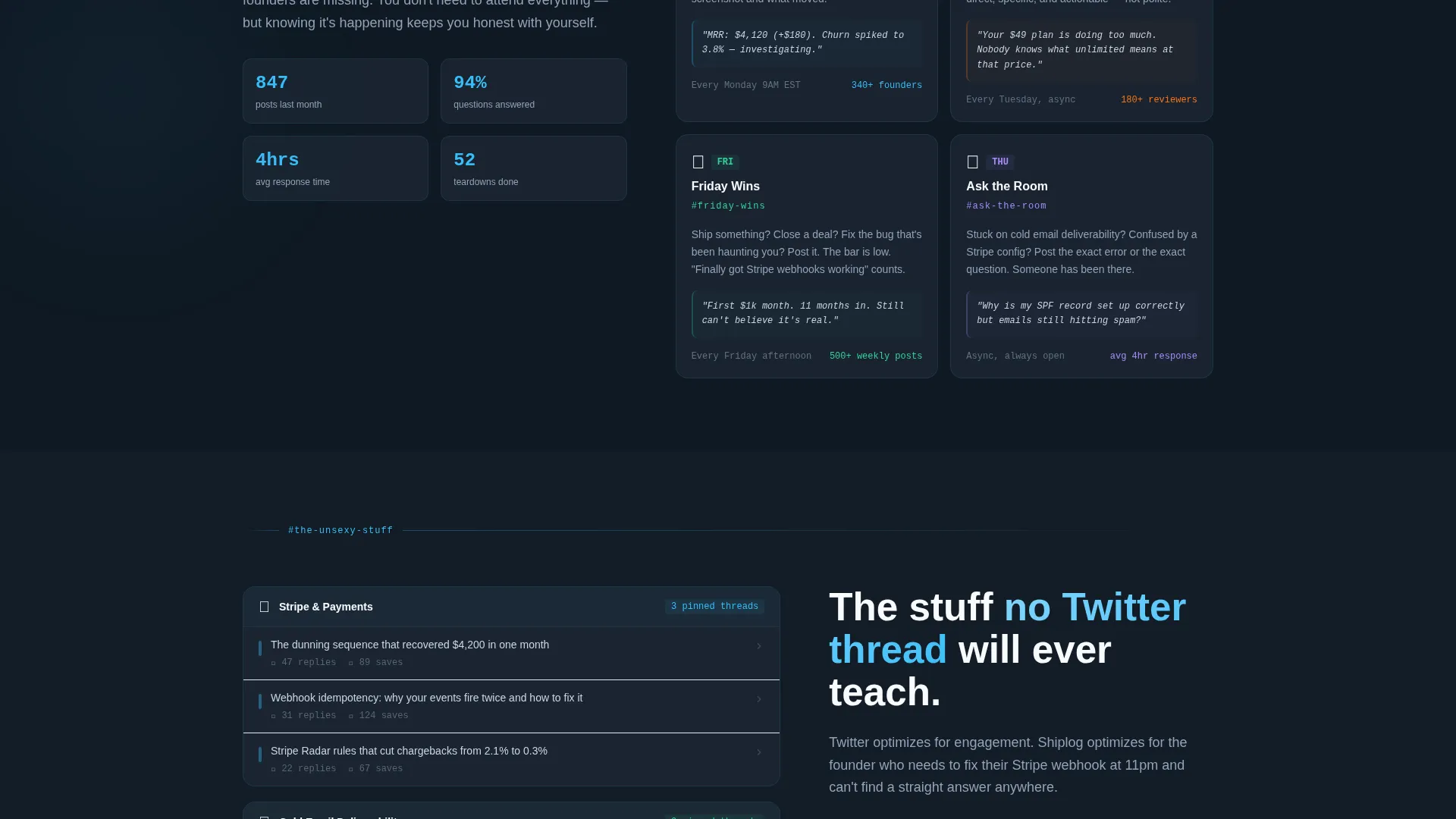
Weekly Ritual Blocks
A dedicated section covers recurring community events: Metrics Monday, Teardown Tuesday, and Friday Wins. Each ritual is presented as its own visual block inside the zigzag flow. This communicates structure and consistency without reading like a feature list.
Sticky Bottom Call-to-Action Bar
A persistent call-to-action bar appears after the visitor scrolls past the second section. It carries the "Request Your Invite" action button and stays visible as they continue reading. The bar reinforces conversion intent without interrupting the reading experience.
Page sections overview
| Section | Purpose |
|---|---|
| Hero Photo Wall | Opens with mosaic member screenshots and frosted headline overlay |
| Ship Updates Feed | Shows anonymized Slack post cards with reactions and timestamps |
| Member Spotlights | Highlights three regulars with product, MRR range, and quote |
| Weekly Rituals Block | Presents Metrics Monday, Teardown Tuesday, and Friday Wins |
| Unsexy Knowledge Section | Differentiates community topics from surface-level online content |
| Footer Flow | Closes with horizontal layout and final invite-request prompt |
Design & branding system
The design follows an Educational Guide theme executed through a Slate and Sky color palette. Deep charcoal slate dominates primary backgrounds to create a focused, code-editor atmosphere. Sky blue fires as the accent color on calls to action, notification indicators, and right-side content blocks, mimicking the feel of a live Slack ping arriving in a quiet workspace.
- Typography uses DM Sans for bold display headings and JetBrains Mono for numerical values and code-style labels
- Color tokens: deep charcoal slate (#1E2A38) for backgrounds, mid graphite (#475569) for secondary surfaces, open sky blue (#38BDF8) for accents, chalk white (#F8FAFC) for text
- Visual details include glassmorphism overlays on the hero, animate-ping live indicators on the activity feed, and staggered card reveal animations on scroll
Mobile & speed optimization
The template is built desktop-first to match the primary context of founders working at standing desks. It maintains a solid mobile experience so the page functions correctly when a founder shares the link from their phone. Static content is handled through server components to keep initial load lean.
- Desktop-first layout with responsive behavior for tablet and mobile viewports
- CSS animations preferred over JavaScript where possible to reduce render overhead
- Server components handle static content sections, keeping the page shell fast on first load
How this template helps you convert
The entire page is structured as a proof-before-ask journey. Visitors encounter social proof and community texture at every scroll step before they ever reach a hard call to action. The friction is intentional and social, not financial.
- The hero photo wall and frosted headline establish immediate credibility by showing real community outputs before the visitor reads a single benefit claim.
- The sticky bottom call-to-action bar keeps the "Request Your Invite" action visible throughout the page without interrupting the scrolling experience, reducing the chance a ready visitor misses the next step.
Other information about this template
This template is specifically scoped for a private SaaS builders Slack community priced at $29 per month with no free tier. The conversion goal is an invite-request form submission, not a direct purchase. The Tally form linked from the call-to-action button asks for a product URL, current monthly recurring revenue bracket, and one sentence about what the applicant is currently stuck on. This social friction model filters applicants while keeping the financial barrier low.
- The template includes a click-through landing page flow pointing to a short external application form
- No credit card or payment wall is introduced on the landing page itself
- The Local and Neighborhood creative direction positions each page section as a different room in a shared clubhouse, giving the scroll experience a spatial, community-first feel
- GSAP ScrollTrigger is specified for zigzag section reveals, giving each content block a staggered entrance as it enters the viewport
- The footer follows a horizontal flow pattern with a final call-to-action prompt
Theme
Educational Guide
Creative direction
Local & Neighborhood
Color system
Slate & Sky
Style
Zigzag/Alternating
Direction
Click-Through
Page Sections
UGC Photo Wall Hero
Zigzag Alternating Content Layout
Anonymized Slack Post Cards
Member Spotlight Cards
Weekly Ritual Section
Sticky Bottom Call-to-action Bar
Related questions
What type of page is included in this template?
Does this template include the application form?
Can I adapt this template for a community that is not on Slack?
Is this template suitable for a free or open community?
What skill level is needed to customize this template?


