Snowboarding Competition Landing Page Template
Shred is a bento grid landing page built for snowboarding competitions and tournament series. It pairs a full-screen video header with interactive Before/After venue reveals, a live countdown timer, and an event registration form. The Fire & Earth color palette and raw mountain aesthetic make it feel like the real deal, bold, urgent, and built to convert riders into registered participants.
by Rocket studio
Quick summary
Shred is a single-page competition template designed for snowboarding events and backcountry series. The bento grid layout organizes venues, rider categories, and past-event highlights into one scrollable experience. A countdown timer drives urgency, and a focused registration form pushes visitors toward one clear action: claiming their start gate.
Who this template is for
This template is built for organizers who run serious snowboarding events. It speaks equally well to grassroots series and established multi-stop competitions.
- Event organizers running Big Mountain, Slopestyle, or Boardercross competitions
- Independent series directors who need a registration-ready page fast
- Local and regional snowboarding crews promoting their annual competition stops
What problem this template solves
Most event pages feel generic. They list dates and divisions but fail to capture the raw energy of a mountain competition. Riders scroll past without feeling anything.
- There is no sense of place or prestige, so riders do not feel compelled to register
- Registration paths are buried, unclear, or split across multiple pages
- Past-event history is absent, so the series feels unproven to new participants
What you get with this template
You get a complete, conversion-focused landing page that communicates urgency, venue identity, and competition credibility all at once. Every section earns its place.
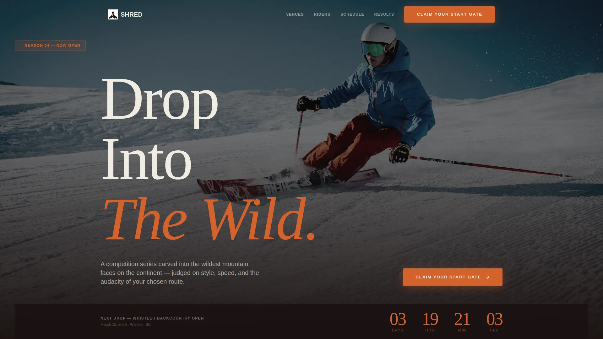
- Full-screen video header with an ember orange countdown clock pinned to the viewport
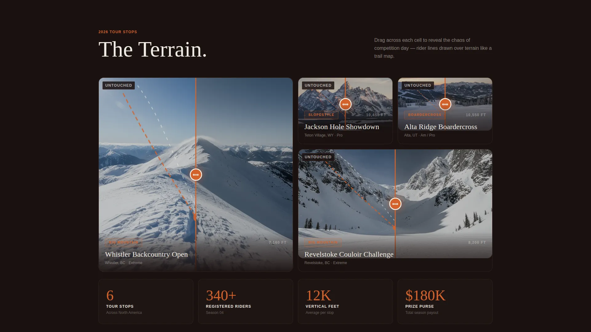
- Bento grid venue cells with Before/After reveal toggling between untouched terrain and competition day chaos
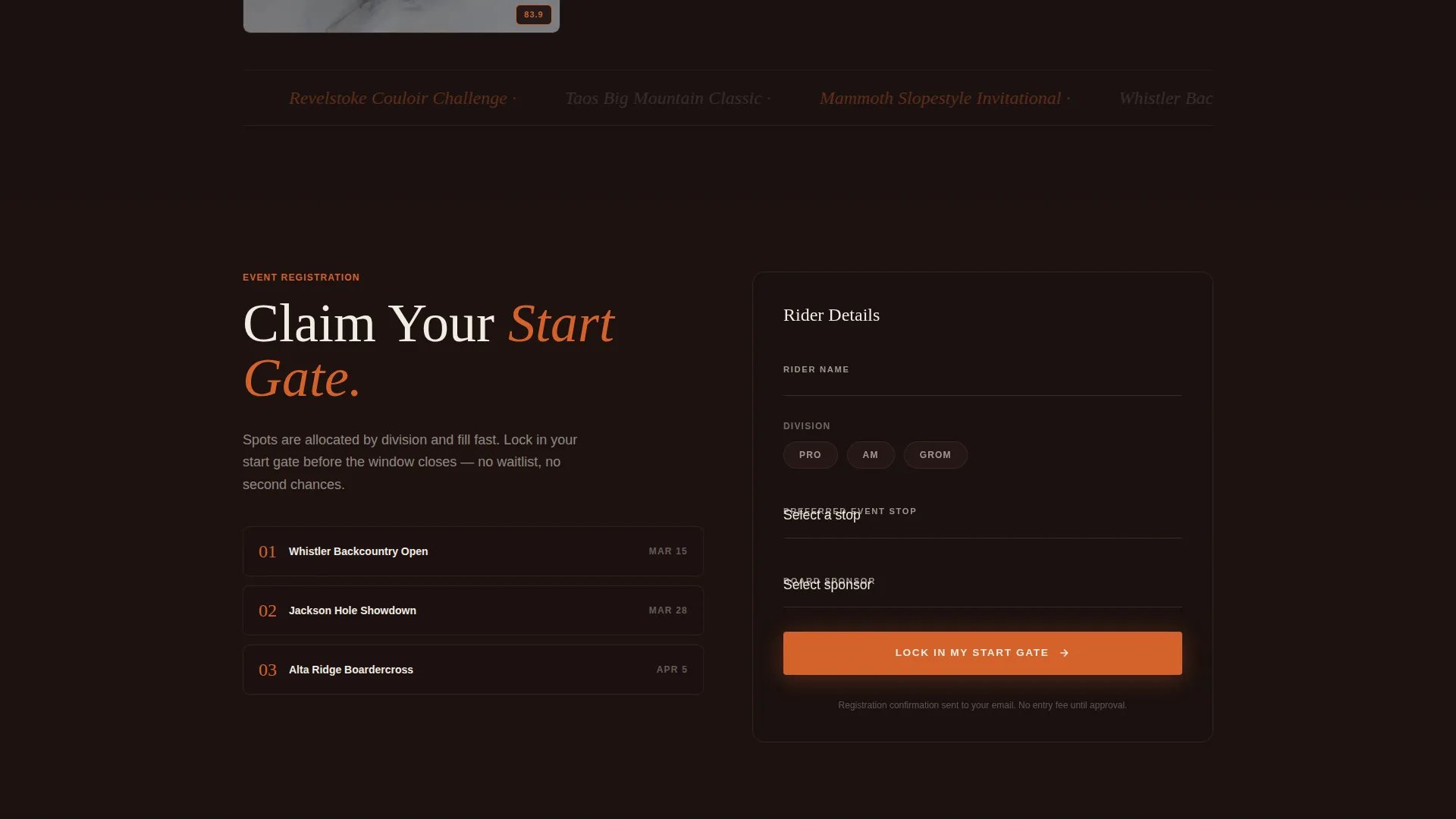
- An event registration form collecting rider name, division, preferred event stop, and sponsor status
Feature list
This template ships with a focused set of purpose-built components. Each one serves a specific role in moving a visitor from curiosity to commitment.
Full-Screen Video Header
The header opens with drone footage chasing a rider through an open powder bowl. The camera pulls back to reveal the full mountain face and competition venue. The footage is intentionally raw and unpolished, giving the page an authentic, on-the-ground energy rather than a corporate production feel.
Ember Orange Countdown Timer
A digital countdown clock burns in ember orange at the bottom of the viewport. It ticks toward the next event date in real time, creating visible urgency without any extra copy. On mobile, the timer stays pinned so it remains visible as visitors scroll through the registration form.
Bento Grid Venue Reveal
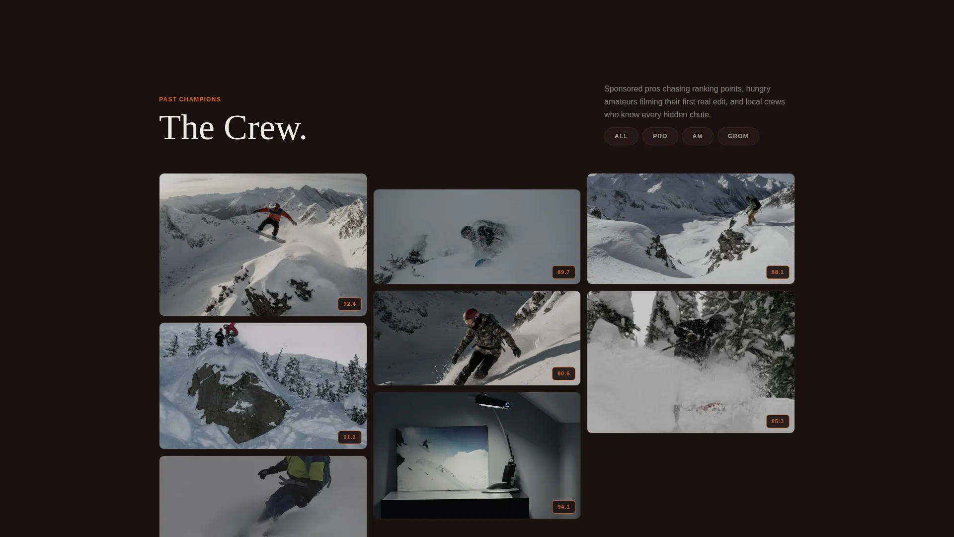
The bento grid is the visual centerpiece of the page. Each cell represents a different venue or event category. Dragging across a cell reveals the same slope mid-competition, with rider lines drawn over the terrain like a trail map. As visitors scroll deeper, the cells shrink and multiply into a dense mosaic of past events, portraits, and score breakdowns.
Event Registration Form
The primary registration form collects four inputs: rider name, division selection (Pro, Am, or Grom), preferred event stop, and a dropdown for board sponsor or unsponsored status. The form sits anchored after the venue reveal section on desktop and is accessible from the pinned call-to-action bar on mobile.
Secondary Email Capture Path
A soft conversion option labeled "Watch Last Season's Highlights" sits alongside the primary call to action. Visitors who click it are prompted to enter their email before the full replay reel unlocks. This captures undecided visitors without forcing them into full registration before they are ready.
Scrolling Mosaic of Past Events
As visitors scroll deeper into the page, the grid cells multiply and compress. Rider portraits, score breakdowns, and past-event thumbnails build up into a dense mosaic. This communicates series scale and credibility without a single line of copy claiming it.
Page sections overview
| Section | Purpose |
|---|---|
| Video Header | Opens with drone footage and countdown timer |
| Venue Bento Grid | Before/After terrain reveal per event category |
| Registration Form | Collects rider details and division selection |
| Secondary call to action | Email capture for highlight reel access |
| Past Events Mosaic | Builds series credibility through visual density |
| Champion Gallery | Rider portraits and score breakdowns from prior stops |
Design & branding system
The Fire & Earth color system is built around contrast and warmth. Volcanic black dominates the grid cells, with ember orange firing on hover states and the countdown timer. The overall effect is a campfire at base camp: warm light punching through cold dark.
- Volcanic black (#1A1110) as the dominant grid background, deep ridge brown (#5C3D2E) for card borders and section dividers, ember orange (#D4622B) for interactive states and timers
- Snowfield white (#F0ECE3) applied to headlines and stat callouts for high contrast and legibility
- The Adventure Terrain theme shapes the visual tone: raw, earned, and mountain-first rather than polished or corporate
Mobile & speed optimization
The template is structured to work cleanly on mobile without sacrificing the drama of the desktop experience. Key interactive elements adapt to touch-based navigation naturally.
- The countdown timer and primary call-to-action button are pinned to the bottom of the viewport on mobile for constant visibility
- Bento grid cells reflow into a single-column scroll on smaller screens, keeping the reveal interaction accessible on touch devices
- The registration form is designed as a compact, vertically stacked input sequence on mobile to reduce friction
How this template helps you convert
The page is built around two complementary conversion paths that serve different levels of visitor readiness. Both paths work together to maximize the number of riders who engage.
- The countdown timer and primary "Claim Your Start Gate" call to action create urgency for visitors who are ready to register, pulling them directly into the four-field registration form with minimal friction.
- The "Watch Last Season's Highlights" path captures email addresses from visitors who need more social proof before committing, turning a soft browse into a qualified lead.
Other information about this template
This template fits naturally into a broader snowboarding event promotion workflow. It can support season launch campaigns, single-stop event announcements, or full multi-stop series pages with minor content swaps.
- The bento grid structure makes it straightforward to swap in new venue photography or video clips for each new event stop
- The Before/After reveal mechanic works for any terrain category, including Big Mountain, Slopestyle, and Boardercross setups
- The template is built as a single-page layout, making it easy to deploy quickly without managing multiple page routes or navigation structures
- Color tokens and typography are consistent throughout, so rebranding for a specific sponsor or series identity requires only a palette swap
Theme
Festival Energy
Creative direction
Launch Energy
Color system
Fire & Earth
Style
Card Grid (Modular)
Direction
Click-Through
Page Sections
Full-screen Video Header with Countdown
Bento Grid Before/after Venue Reveal
Event Registration Form
Secondary Email Capture Path
Scrolling Past-events Mosaic
Fire & Earth Color System
Related questions
Can I use this template for multiple event stops in a single season?
Does the registration form support different rider divisions?
How does the secondary email capture path work?
Can the countdown timer be updated for a new event date?
Is this template suitable for a small local competition, not just large series?