Mountain Biking Race Landing Page Template
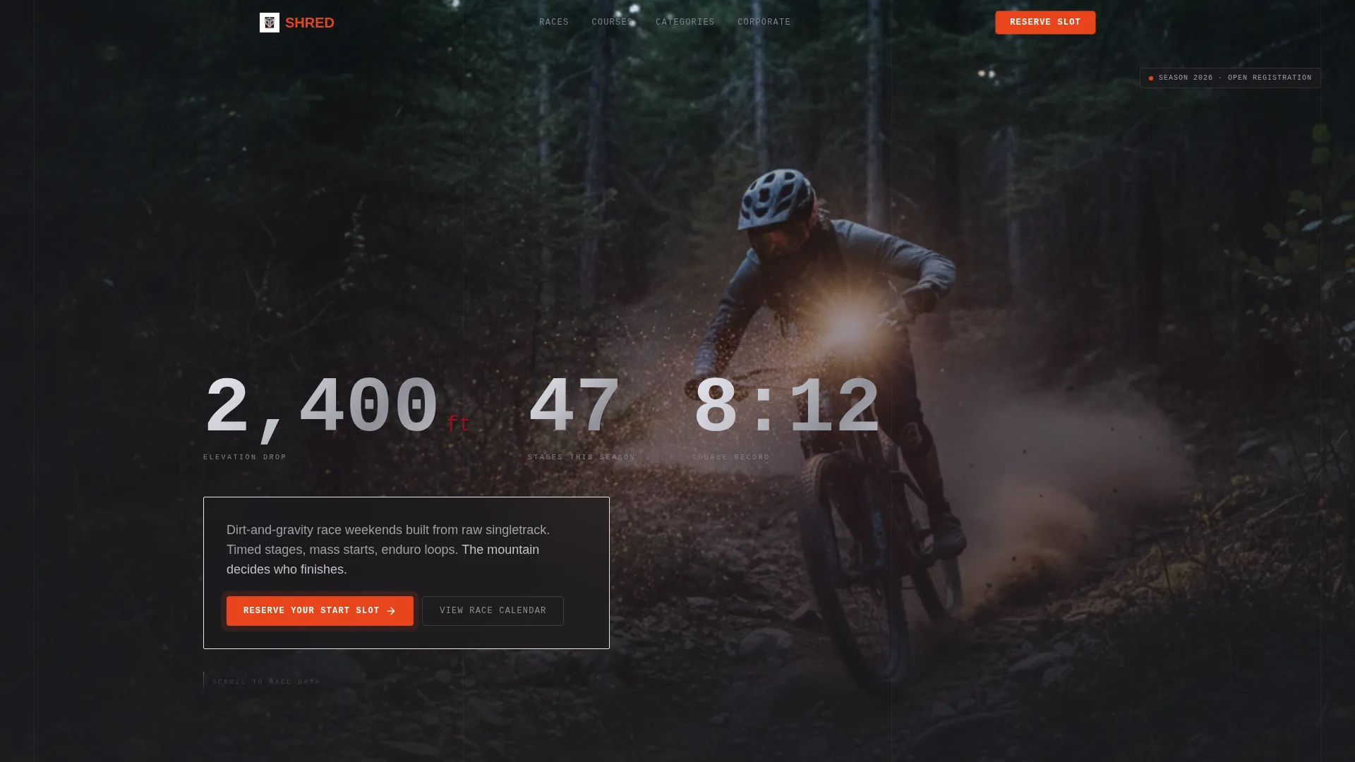
Shred is a full-width mountain biking landing page built for race event organizers who run timed stages, enduro loops, and mass-start weekends. It leads with cinematic visuals and oversized stat counters, then guides riders through a stepped slot-booking flow. The industrial Ruby and Chrome design system makes the page feel as unforgiving as the trail itself.
by Rocket studio
Quick summary
Shred is a high-impact, single-page template built for mountain biking competition organizers. It opens with a dark, edge-to-edge header image and punches stat counters through the darkness before any text loads. A pinned "Reserve Your Start Slot" button drives bookings. The design is industrial, raw, and built to match the intensity of race day.
Who this template is for
This template is made for organizers who run real mountain biking race events. It fits operators who need to fill start slots fast and communicate course data with authority.
- Race organizers running timed stages, enduro loops, or mass-start weekends on natural singletrack
- Semi-pro and amateur event series coordinators managing multiple categories and seasonal points standings
- Corporate event planners offering technical outdoor challenge programs to group clients
What problem this template solves
Generic event pages bury the most important details behind walls of text. Riders want to know distance, vertical drop, and how many slots are left before they read anything else.
- Slow, text-heavy layouts lose riders before they reach the registration button
- No visible scarcity means competitors delay booking until events sell out
- Category-blind forms create friction for solo riders, teams, and licensed racers trying to register correctly
What you get with this template
You get a full-width landing page designed around the rhythm of a race briefing. Numbers hit first, context follows, and the booking path stays visible throughout every scroll.
- A cinematic dark header with a two-second hold before three chrome stat counters animate into view
- A viewport-pinned orange call-to-action button that stays on screen after the first scroll
- A stepped registration flow covering date selection, category choice, and rider details including emergency contact and license entry
Feature list
This template packs a specific set of race-day components into a single focused layout. Each one is built around the brief and nothing is speculative.
Stats-First Hero Section
The header holds a near-black cinematic image edge to edge with zero padding. After a two-second hold, three oversized stat counters appear in chrome type: elevation drop, total stages this season, and the course record time. No tagline competes with the numbers.
Stepped Slot Booking Flow
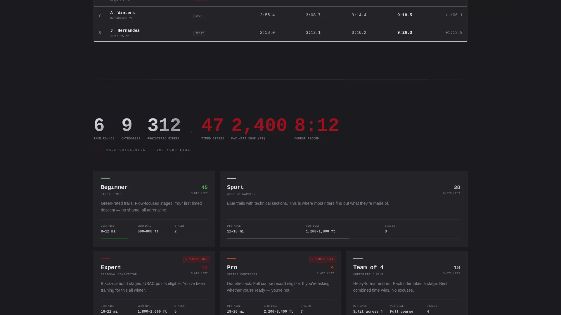
The primary call-to-action opens a three-step booking sequence. Step one shows a visual calendar with remaining slots per date. Step two asks the rider to choose a category: Sport, Expert, Pro, or Team of Four. Step three collects rider name, emergency contact, and United States Auto Club (USAC) license number if applicable.
Real-Time Scarcity Indicators
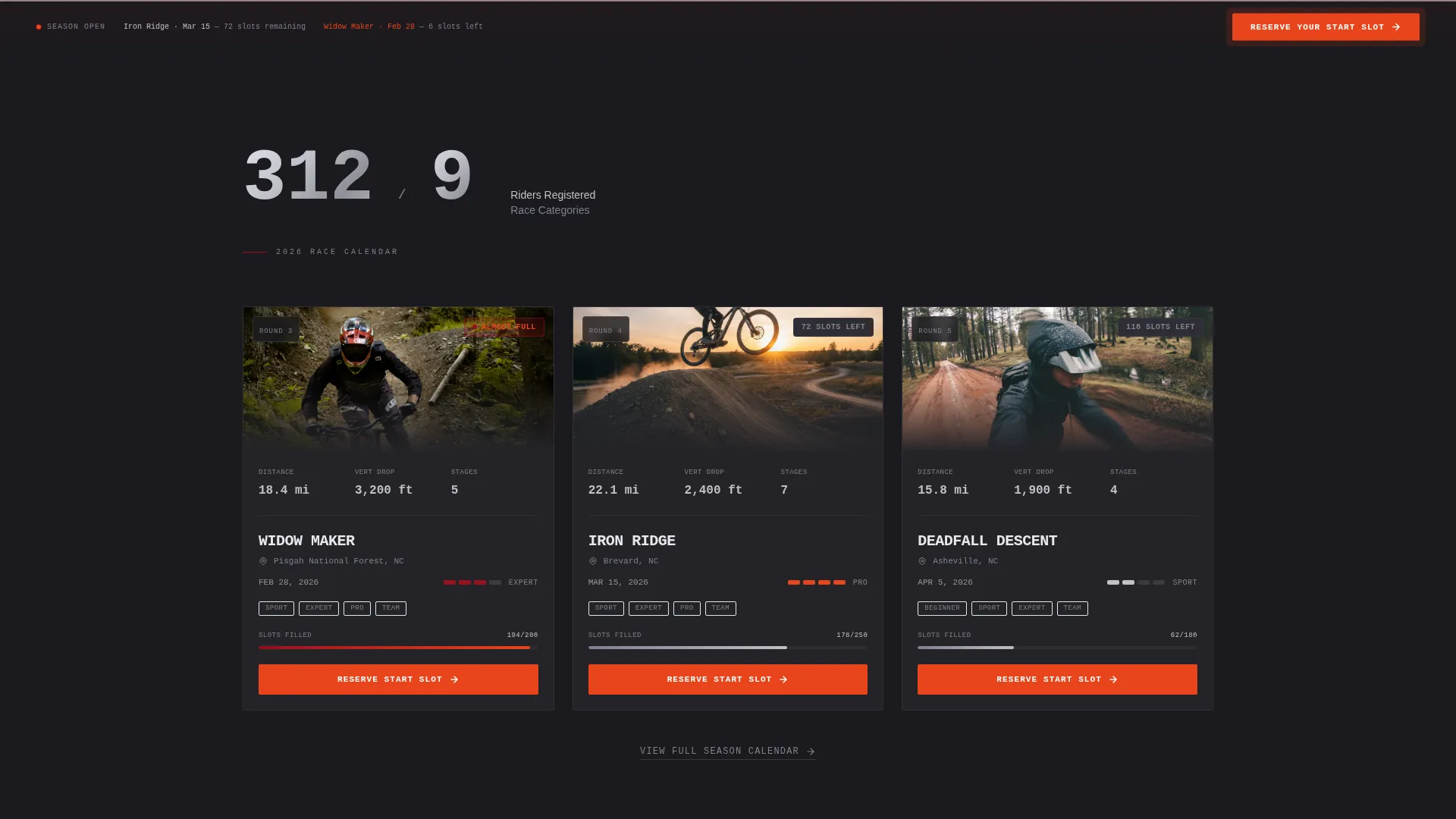
Every event card displays remaining start slots. When a category reaches 80 percent capacity, a ruby badge reading "Almost Full" pulses on that card. This creates visible urgency without resorting to countdown timers or artificial pressure copy.
Team Bulk Registration Path
A secondary entry point labeled "Enter a Team" branches away from the solo flow. It leads to a bulk registration form sized for corporate groups and semi-pro squads registering multiple riders at once.
Elevation Chart Course Profiles
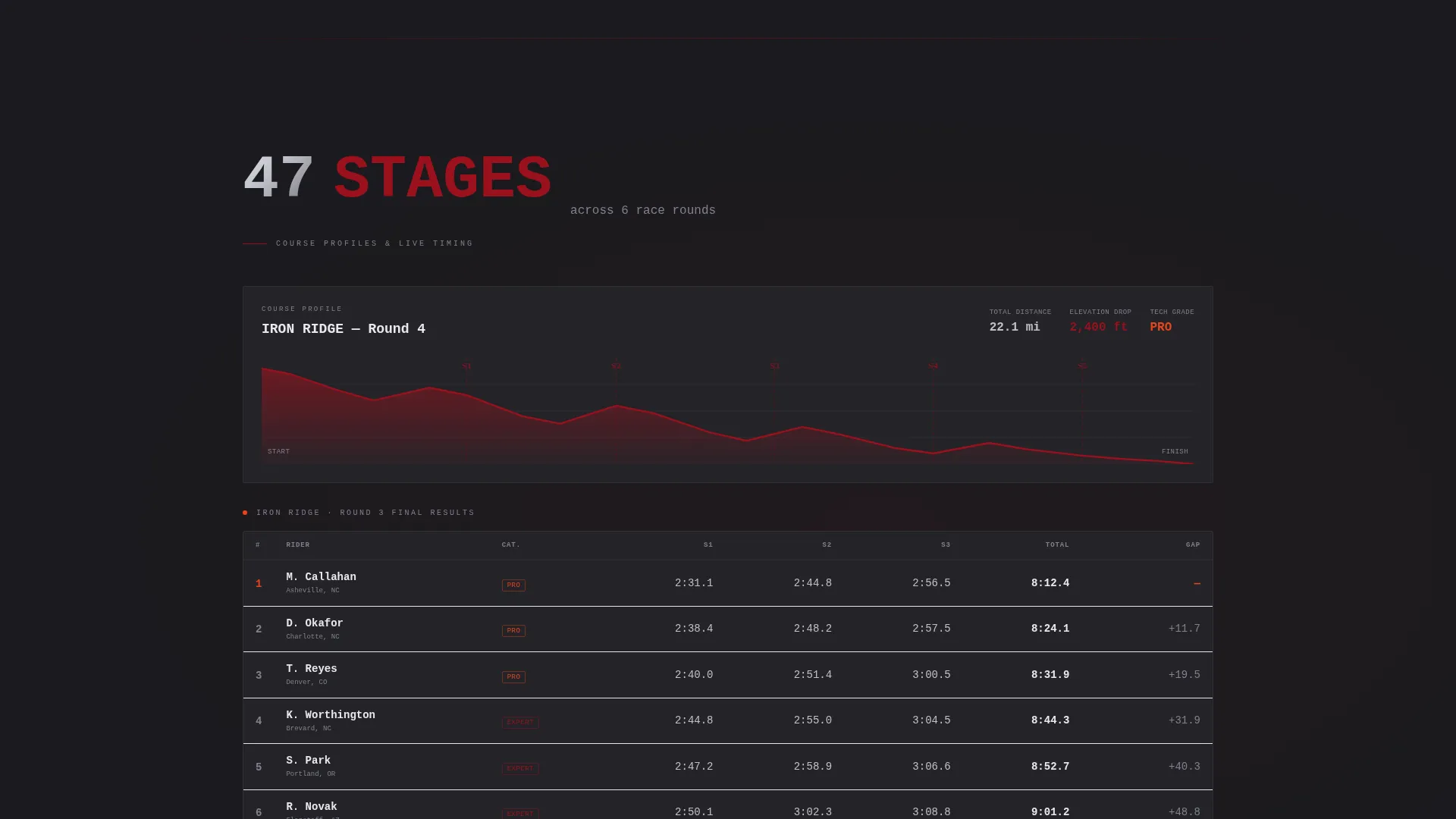
Each race listing renders its course profile as an elevation chart with a ruby gradient fill. Distance, vertical drop, and technical grade lead every listing before a single dark photograph appears below them.
Live Timing Board Layout
Finishing splits are displayed in a horizontally scrolling layout that mimics the feel of a live race timing board. The rhythm mirrors the stats-first creative direction used throughout the entire page.
Page sections overview
| Section | Purpose |
|---|---|
| Dark Hero Header | Cinematic race-day opening with stat counters |
| Stat Counter Block | Chrome numerals for riders and categories |
| Event Race Listings | Distance, grade, and slot availability per race |
| Course Profile Charts | Elevation data with ruby gradient fills |
| Timing Board Splits | Horizontal finishing splits display |
| Slot Booking Flow | Stepped date, category, and rider entry |
| Team Registration Form | Bulk entry path for groups and squads |
| Pinned call to action Bar | Persistent booking button after first scroll |
Design & branding system
The visual identity follows an Industrial Raw theme. Every color and type choice is drawn from the world of machined metal and high-friction race components.
- Color palette: deep asphalt black (#1A1A1E) as the base, brushed chrome (#C0C0C8) for stat typography and section dividers, hydraulic ruby (#9B111E) bleeding through backgrounds and badges, and hot brake-rotor orange (#E8451C) reserved exclusively for call-to-action elements and live data pulses
- Typography scales dramatically between sections: chrome numerals dominate stat blocks while body copy stays tight and legible against the dark backgrounds
- Visual rhythm follows a number-hit, breathe, number-hit cadence that mirrors a heart-rate monitor on a climb
Mobile & speed optimization
The layout is built for the reality of race-morning usage. Riders check event details on a phone in a parking lot, not at a desktop.
- The pinned booking button stays anchored at the viewport bottom on small screens so it never disappears mid-scroll
- The horizontal timing board and elevation charts are designed to scroll cleanly on touch devices without breaking the surrounding layout
- Event cards and scarcity badges remain readable at compact sizes so slot availability is never hidden behind a zoom gesture
How this template helps you convert
The entire page architecture is built around one action: filling every start slot before race day. Every scroll reveals a reason to commit before revealing the full context.
- The viewport-pinned orange call-to-action button keeps "Reserve Your Start Slot" visible at all times after the first scroll, removing the need to hunt for a registration link
- Real-time slot counts and pulsing "Almost Full" ruby badges on event cards create honest urgency that shortens the decision window for riders who are already interested
- The stepped booking flow separates date selection, category choice, and personal details into distinct screens so the process feels manageable rather than overwhelming
Other information about this template
This template suits any organizer building a direct-sales landing page for a mountain biking race series. It is designed for operators who want to communicate authority through data and fill fields through a tight, friction-reduced booking path.
- The page structure supports seasonal race series with multiple event listings, not just a single one-off event
- The corporate group path makes this template useful beyond the traditional rider audience, serving team-building event providers who need a credible, hard-edged brand presentation
- The Industrial Raw visual identity and Ruby and Chrome color system are intentional departures from the bright lifestyle aesthetics common in outdoor recreation marketing
Theme
Festival Energy
Creative direction
Before/After Reveal
Color system
Electric Indigo
Style
Storybook/Full-Page
Direction
Direct Sales
Page Sections
Stats-first Cinematic Hero
Stepped Slot Booking Flow
Real-time Scarcity Badges
Team Bulk Registration Path
Elevation Chart Course Profiles
Viewport-pinned Call to Action Button
Related questions
Can solo riders and teams both register through this template?
How does the scarcity system work on event cards?
What rider categories does the booking flow support?
Is the call-to-action button always visible while scrolling?
Does this template work for organizers running multiple race dates?