Raw Snowboarding Club Landing Page Template
Shred is a card-grid landing page built for snowboarding crews and clubs. It uses an Industrial Raw visual identity with scorched blacks, ember orange, and rust tones to capture the raw energy of backcountry riding and park sessions. The page drives trip sign-ups through an inline scheduling module, a community gallery, and two clear calls to action.
by Rocket studio
Quick summary
Shred is a single-page landing page template designed for snowboarding clubs that run group trips and weekly sessions together. The layout combines a bold full-viewport header, a modular community gallery, and an inline trip-booking module. The Industrial Raw aesthetic makes the page feel lived-in, physical, and ready for riders who take their craft seriously.
Who this template is for
This template is built for snowboarding communities that recruit riders and fill trip spots online. It works equally well for a college club, a local crew, or a small snowboarding academy looking to grow its roster.
- College snowboarding clubs running weekend road trips to nearby mountains
- Intermediate and advanced rider groups wanting a structured but low-commitment sign-up flow
- Snowboarding coaches or organizers who need a fast, visually bold recruiting page
What problem this template solves
Most snowboarding clubs lose potential members because their online presence looks generic and flat. A plain sign-up form does nothing to communicate the energy, community, or lifestyle that actually makes people want to join.
- Visitors cannot picture themselves as part of the crew from a standard contact page
- Trip spots go unfilled because there is no clear, scannable booking path
- The gap between browsing and committing feels too wide without a low-barrier entry option
What you get with this template
You get a fully structured landing page ready to represent a real snowboarding crew. Every section is purpose-built to move a visitor from curiosity to commitment in a single scroll.
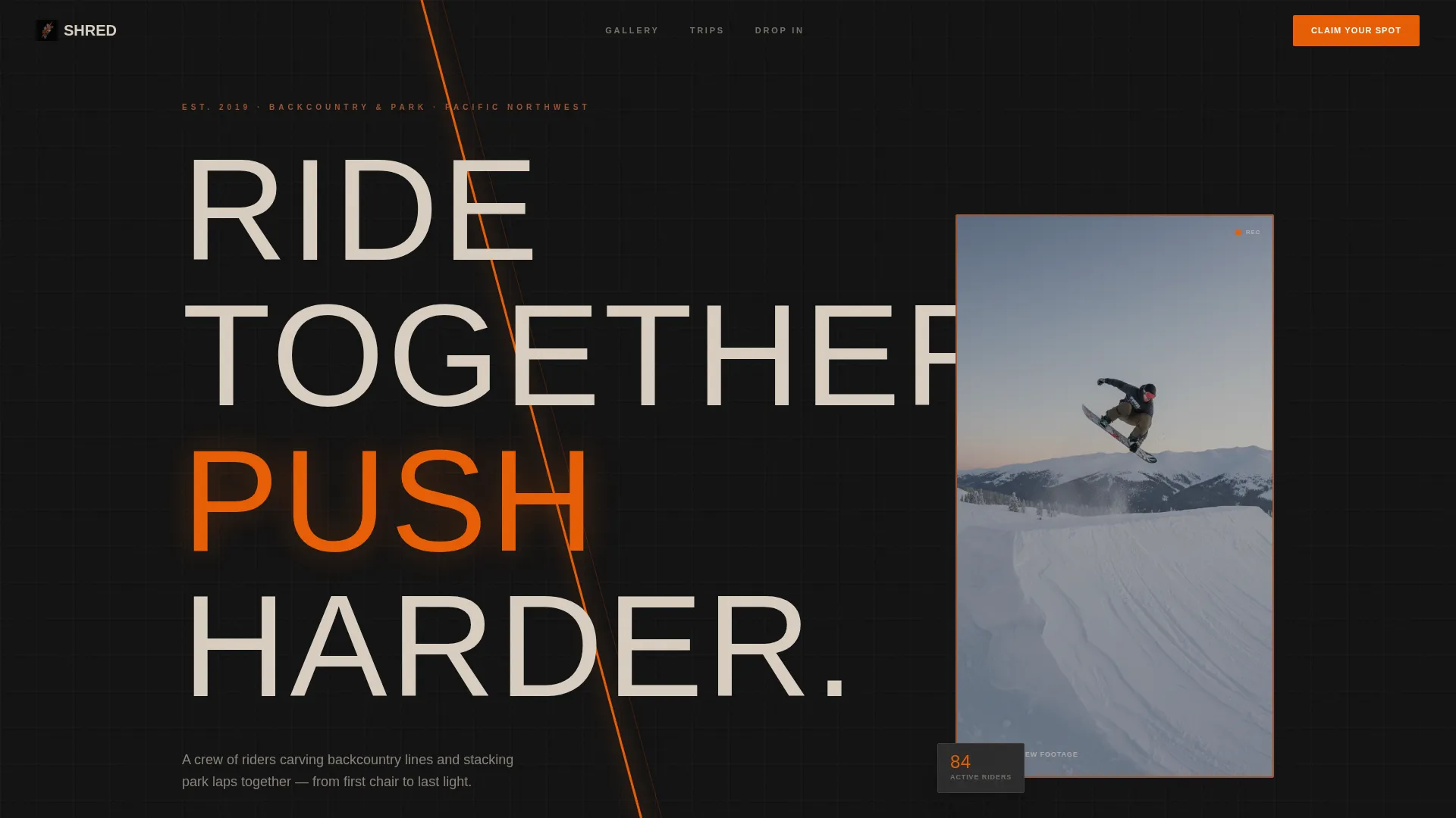
- A full-viewport header with an ember-orange diagonal accent and a looping silent video thumbnail
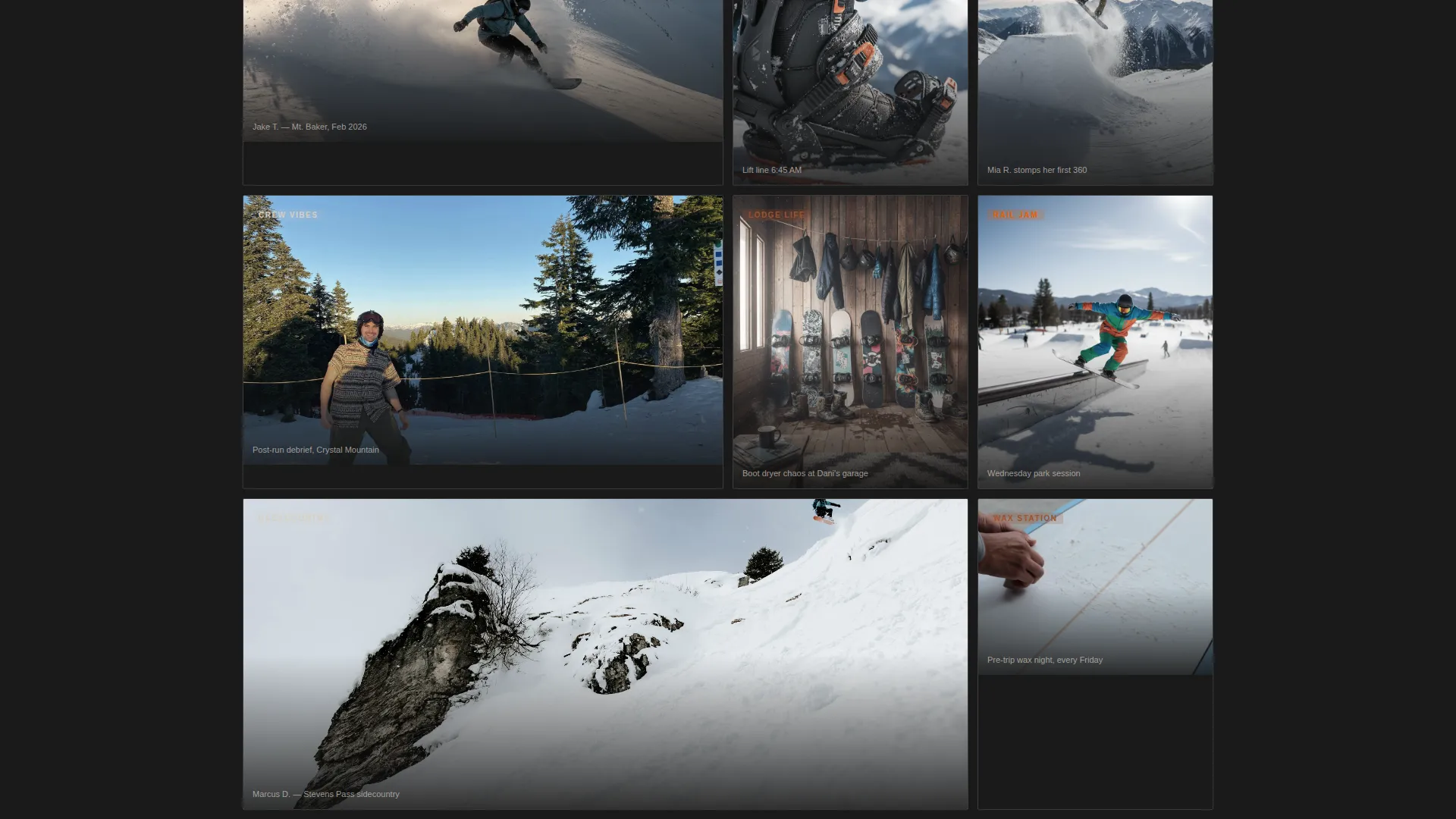
- A modular community gallery with varied card sizes that shift from action shots to behind-the-scenes moments
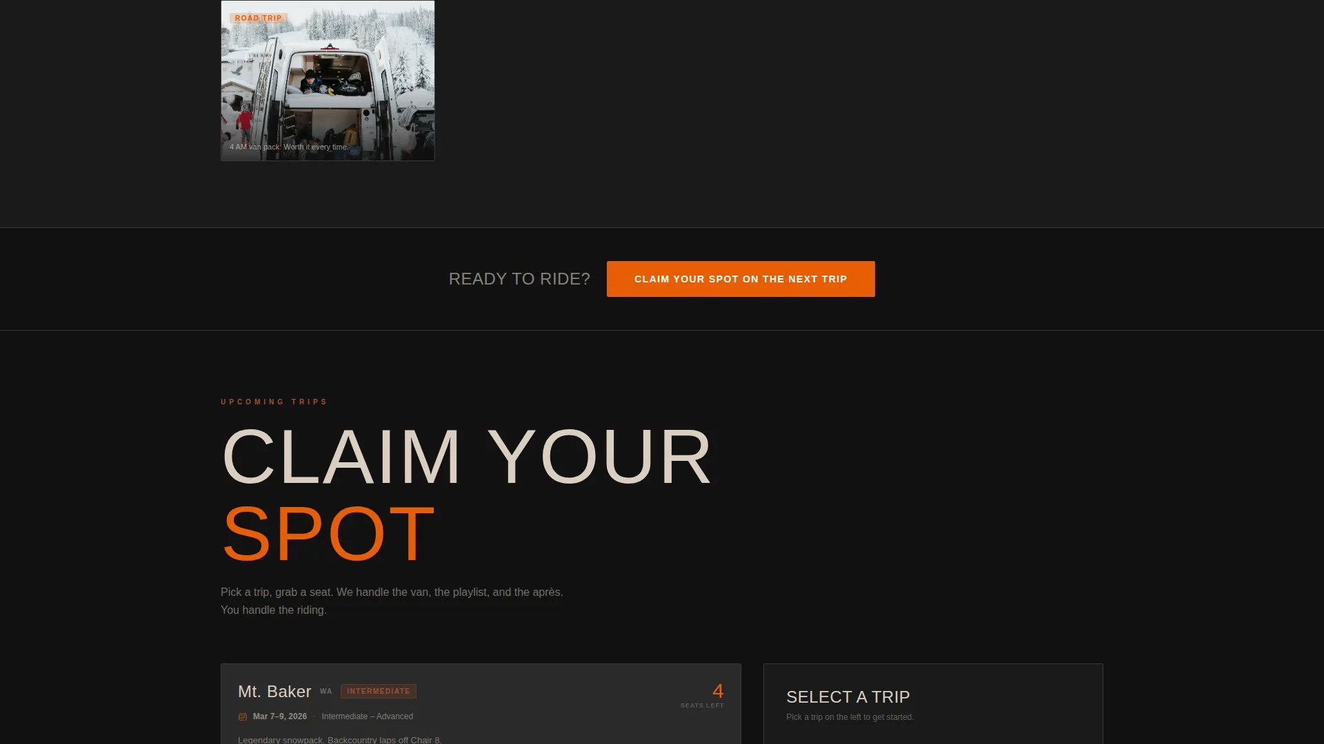
- An inline scheduling module showing upcoming trip dates, destination, skill level range, and remaining seats
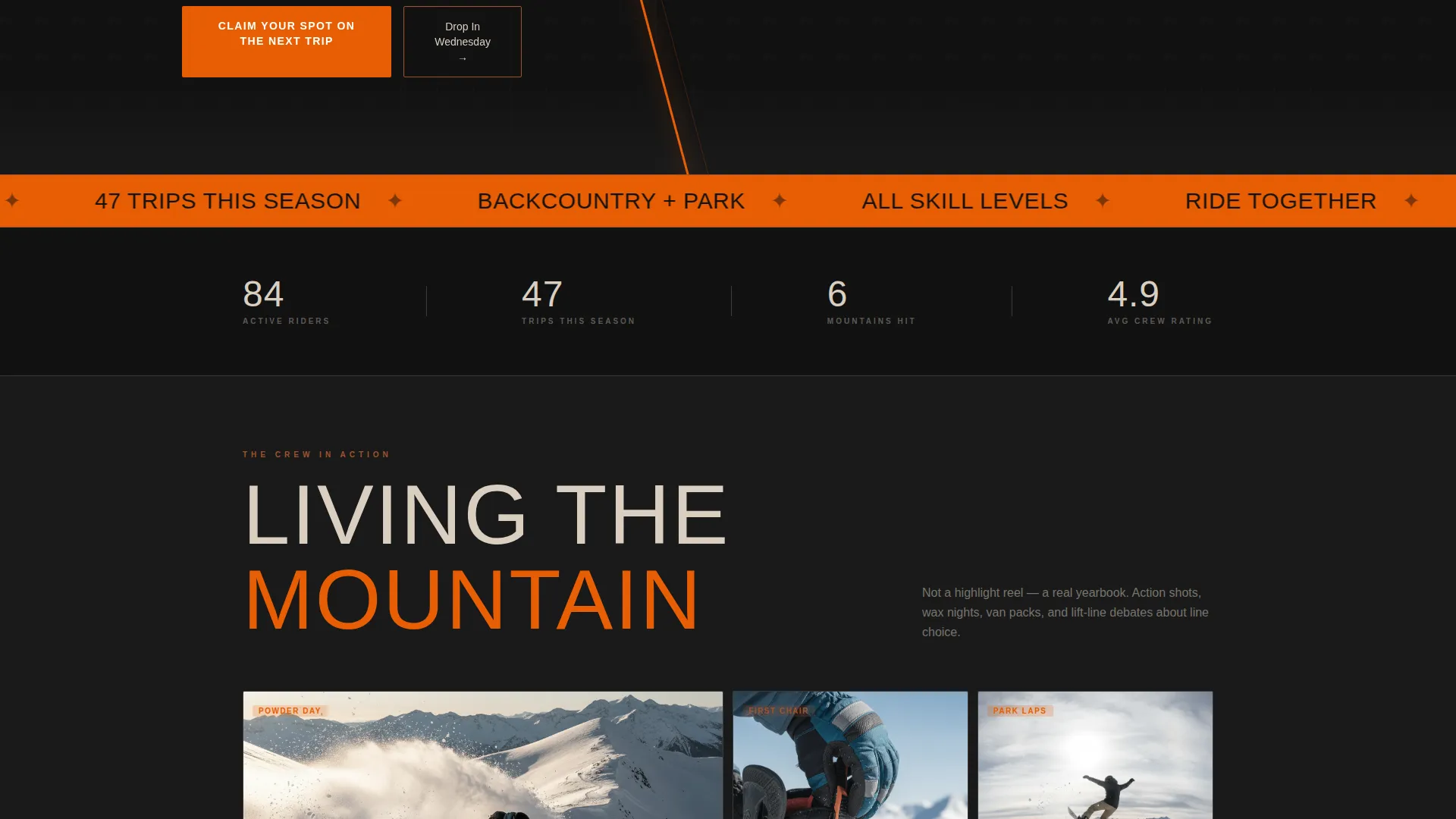
- A primary call-to-action button ("Claim Your Spot on the Next Trip") repeated after the header and after the gallery
- A secondary call-to-action path ("Drop In on a Wednesday Session") for locals who want a free ride-along first
Feature list
This section covers the core built-in features that make Shred work as a snowboarding club landing page.
Full-Viewport Dark Header
The header fills the entire screen with a near-black background and a single ember-orange slash cutting diagonally across the frame. A bold, condensed sans-serif headline sits off-center. A small looping silent video thumbnail inside a rough-edged card is the only animated element, keeping the header focused and energetic.
Modular Community Gallery
Cards vary in size and aspect ratio across the gallery grid, some tall and some wide, creating a collage rhythm that feels pinned-up rather than curated. The scroll progression moves from action shots toward behind-the-scenes content, building the case that this crew is a lifestyle rather than just a mailing list.
Inline Trip Scheduling Module
Clicking the primary call to action opens a booking module directly on the page. Visitors see upcoming trip dates, the mountain destination, the skill level range, and available seats. They enter their name, riding level, and phone number to receive the group chat link.
Dual Call-to-Action Path
Two distinct conversion paths serve different visitor intentions. The primary path targets riders ready to commit to a full trip. The secondary path offers a single free Wednesday ride-along, lowering the barrier for locals who are curious but not yet ready to book a full trip.
Industrial Raw Visual Identity
The color system uses scorched volcanic black for backgrounds, exposed rust for borders and dividers, ember orange for calls to action and hover states, and chalky bone for body text. The result feels like a wood-burning stove inside a steel-walled workshop, warm under pressure and rough at the edges.
Pulsing Orange Accent Animation
The diagonal orange slash in the header pulses with a subtle breathing motion. It adds just enough movement to feel alive without distracting from the headline or the video thumbnail below it.
Page sections overview
| Section | Purpose |
|---|---|
| Full-viewport header | Establishes brand tone and hooks attention immediately |
| Headline and video card | Communicates crew identity with minimal but focused motion |
| Primary call to action block | Drives immediate trip sign-up after the header |
| Community gallery grid | Builds trust and lifestyle context through modular photo and video cards |
| Secondary call to action block | Offers a low-commitment ride-along option after the gallery |
| Inline scheduling module | Handles trip selection, skill level input, and seat reservation |
Design & branding system
The visual identity is built around the Fire and Earth color system, designed to feel industrial, raw, and physically grounded. Every design decision reinforces the idea that this crew works hard and rides harder.
- Scorched volcanic black (#1A1A1A) dominates backgrounds and anchors the dark, high-contrast aesthetic
- Exposed rust (#A0522D) marks borders, dividers, and structural edges throughout the layout
- Ember orange (#E85D04) powers every call-to-action button, hover state, and the animated diagonal accent
- Chalky bone (#D9CFC1) keeps body text and card surfaces legible without looking polished or corporate
Mobile & speed optimization
The card-grid layout is built to adapt cleanly across screen sizes. Modular cards restack for smaller viewports without breaking the collage rhythm that makes the gallery feel authentic.
- Variable card sizes and aspect ratios reflow naturally on mobile screens
- The looping silent video thumbnail is contained within a single card, keeping load weight manageable
- The inline scheduling module is designed to be usable on a phone screen with minimal scrolling
How this template helps you convert
The page is structured to reduce friction at every stage of the visitor's decision. Both conversion paths are clear, low-pressure, and placed exactly where momentum is highest.
- The primary call-to-action button appears twice, once right after the header while attention peaks and again after the gallery once trust is built, giving visitors two natural moments to act.
- The secondary "Drop In on a Wednesday Session" path removes the biggest barrier for hesitant locals by offering a single free ride-along before any commitment is required.
- The inline scheduling module keeps the booking experience on the same page, so visitors never leave to complete a sign-up form elsewhere.
Other information about this template
Shred is part of a broader Sports and Recreation template collection and is tagged under the Snowboarding Academy and Training intersection. It is built as a Card Grid (Modular) layout following a Click-Through landing page direction, meaning the page is optimized to move visitors into a booking action rather than a passive email capture.
- The template theme follows a Festival Energy creative direction, which prioritizes visual intensity, motion cues, and community feeling over static product presentation
- The header concept follows a Vertical and Portrait orientation, making the page feel tall and immersive on first load
- The template is suitable for snowboarding clubs, recreational riding groups, and small snowboarding academies building their first dedicated recruiting page
- No prior design experience is needed to adapt the color system, card grid, or call-to-action blocks to match a specific crew's identity
Theme
Festival Energy
Creative direction
Launch Energy
Color system
Fire & Earth
Style
Card Grid (Modular)
Direction
Click-Through
Page Sections
Full-viewport Dark Header
Modular Community Gallery Grid
Inline Trip Scheduling Module
Dual Call-to-action Structure
Industrial Raw Visual Identity
Pulsing Diagonal Accent Animation
Related questions
Can I use this template if my club does not have photos yet?
What information does the scheduling module collect from visitors?
Is this template only for advanced riders or large crews?
Can the color palette be changed to match a different crew identity?
What makes this different from a generic club sign-up page?