Shri - Rapid Appliancerepair Landing Page Template
Shūri is a single-column lead generation landing page built for a Tokyo appliance repair service. It uses a dark full-bleed header with a glowing control panel, a testimonial mosaic that builds social proof as visitors scroll, and a minimal three-field repair request form. The template is designed to move urgent visitors from first impression to booked repair in seconds.
by Rocket studio
Quick summary
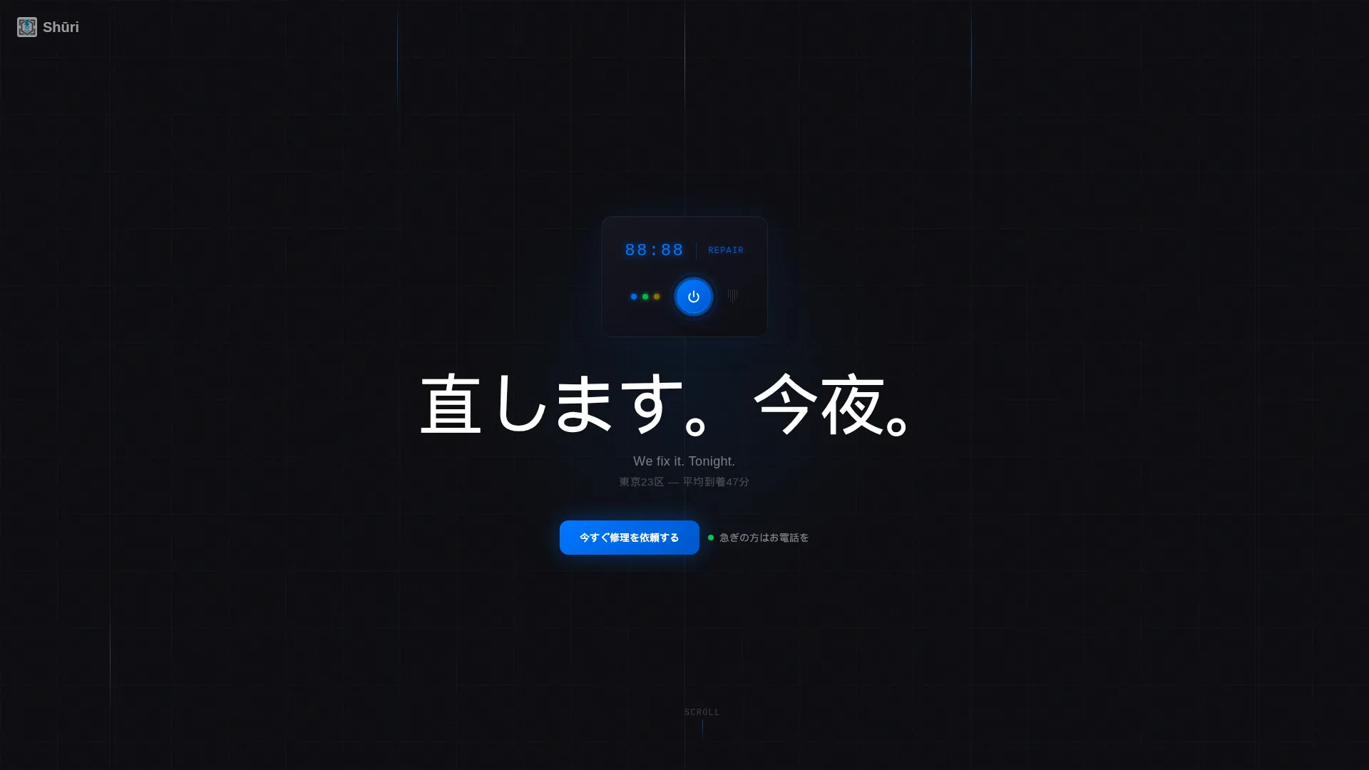
Shūri is a single-column landing page for a fast-response appliance repair service covering all twenty-three Tokyo wards. The design opens with a pitch-black header and a glowing appliance panel, then transitions to clean Arctic White as testimonials and service details build trust. A three-field form and tap-to-call button drive every conversion action.
Who this template is for
This template is built for small repair businesses that need to convert distressed, time-pressed customers fast. It works especially well for operators who rely on phone calls and short booking forms rather than lengthy onboarding flows.
- Appliance repair technicians serving urban residential or commercial clients
- Small local service businesses that need a simple, credible online presence
- Operators who want social proof and a repair request form on one focused page
What problem this template solves
Urgent service businesses lose customers when their page feels slow, cluttered, or untrustworthy. A person with a broken refrigerator at midnight does not browse. They scan, decide, and either call or leave.
- No clear call to action above the fold means visitors bounce before they book
- Walls of text and service grids bury the credibility signals that close the deal
- Complex forms ask for information the customer does not have time to provide
What you get with this template
You get a focused, single-column landing page that moves visitors from the first scroll to a completed repair request without friction. Every section is purpose-built to reduce hesitation and speed up contact.
- A dark cinematic header with a glowing appliance panel and a phased headline
- A scrolling testimonial mosaic that grows denser with real customer quotes and district names
- A three-field booking form covering appliance type, Tokyo ward, and phone number only
Feature list
This landing page is structured around three core design and conversion principles: visual impact at arrival, trust built through scroll, and a form so simple it feels like a single tap.
Dark Full-Bleed Header with Glow Effect
The header fills the entire viewport in pitch black (#0B0B0F). A single appliance control panel glows to life at center, LED digits brightening and a blue power ring pulsing once. The headline phases in above it. No navigation appears until the visitor scrolls, holding their full attention on the message.
Testimonial Mosaic Layout
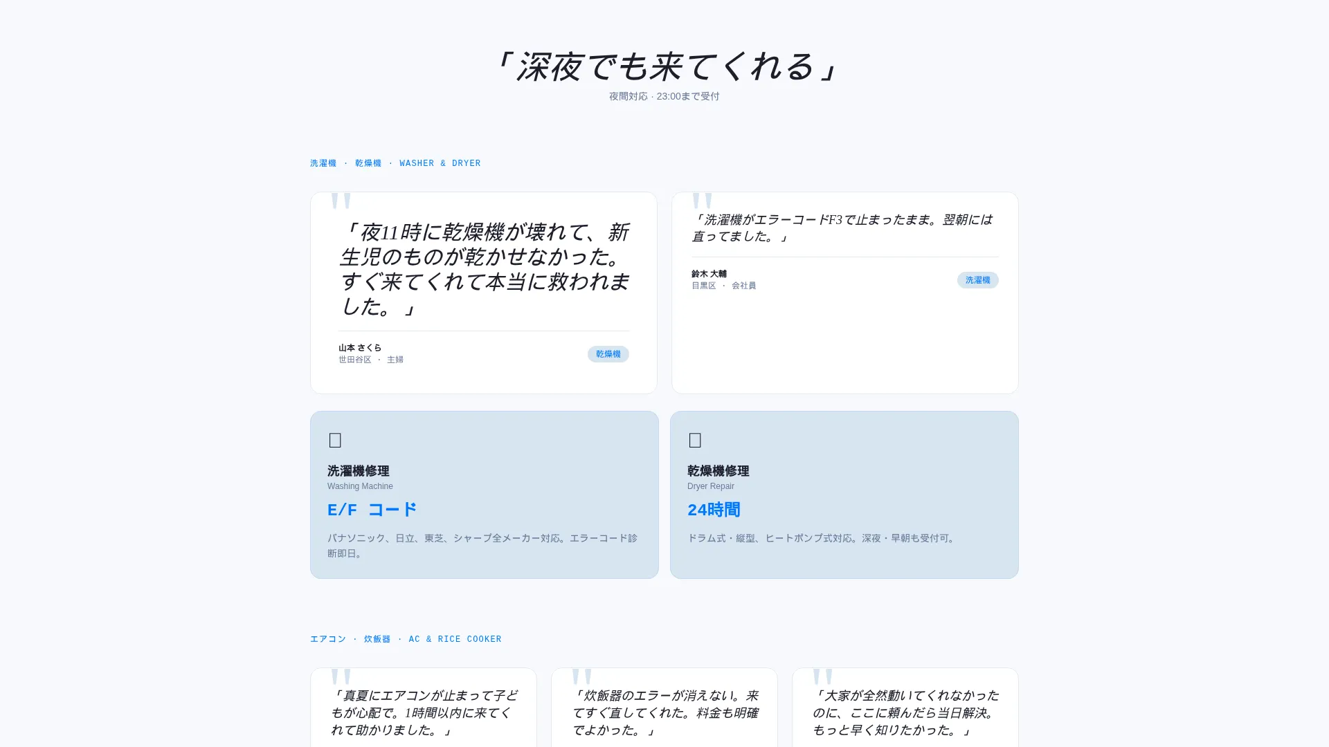
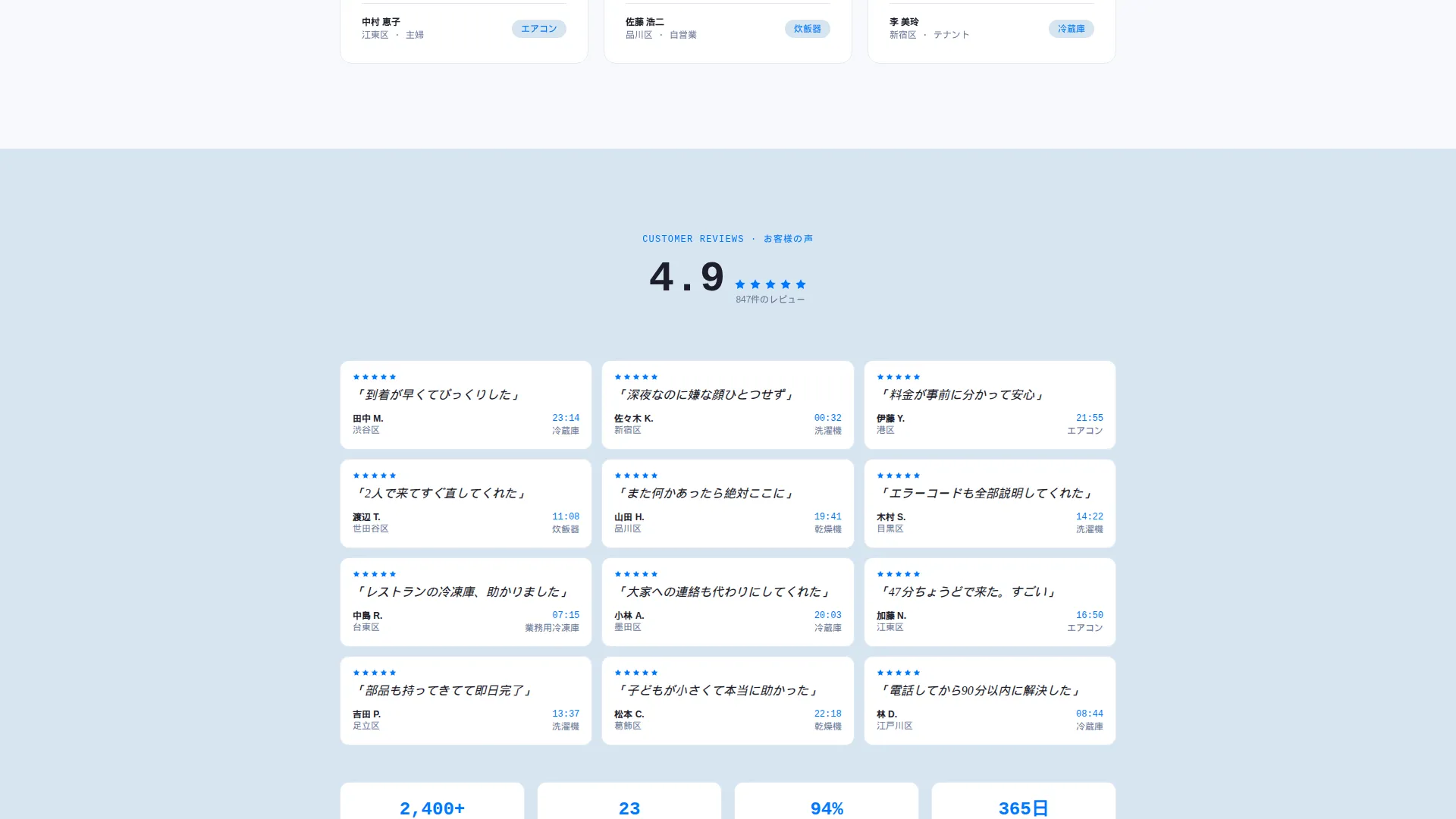
Customer quotes in large Japanese type anchor every service section. Single quotes appear early, then cluster into groups of three, five, and finally a full wall of micro-reviews with ward names and timestamps. Social proof accumulates naturally as the visitor scrolls, building confidence without a separate reviews page.
Minimal Three-Field Repair Form
The booking form asks only three things: appliance type via a dropdown with icons, Tokyo ward via auto-suggest from all twenty-three options, and a phone number. No name field. No email field. The brevity mirrors the speed of the service itself.
Tap-to-Call Emergency Button
A secondary contact path sits alongside the form. The button is labeled for urgent callers and links directly to a phone number. It is designed for the visitor who needs help right now and will not wait for a callback.
Floating Mobile Call-to-Action Bar
On mobile viewports, the primary repair request button fixes to the bottom of the screen. It stays visible as the visitor scrolls through testimonials and service details, so the path to booking is never more than one tap away.
Isolated Stat Display
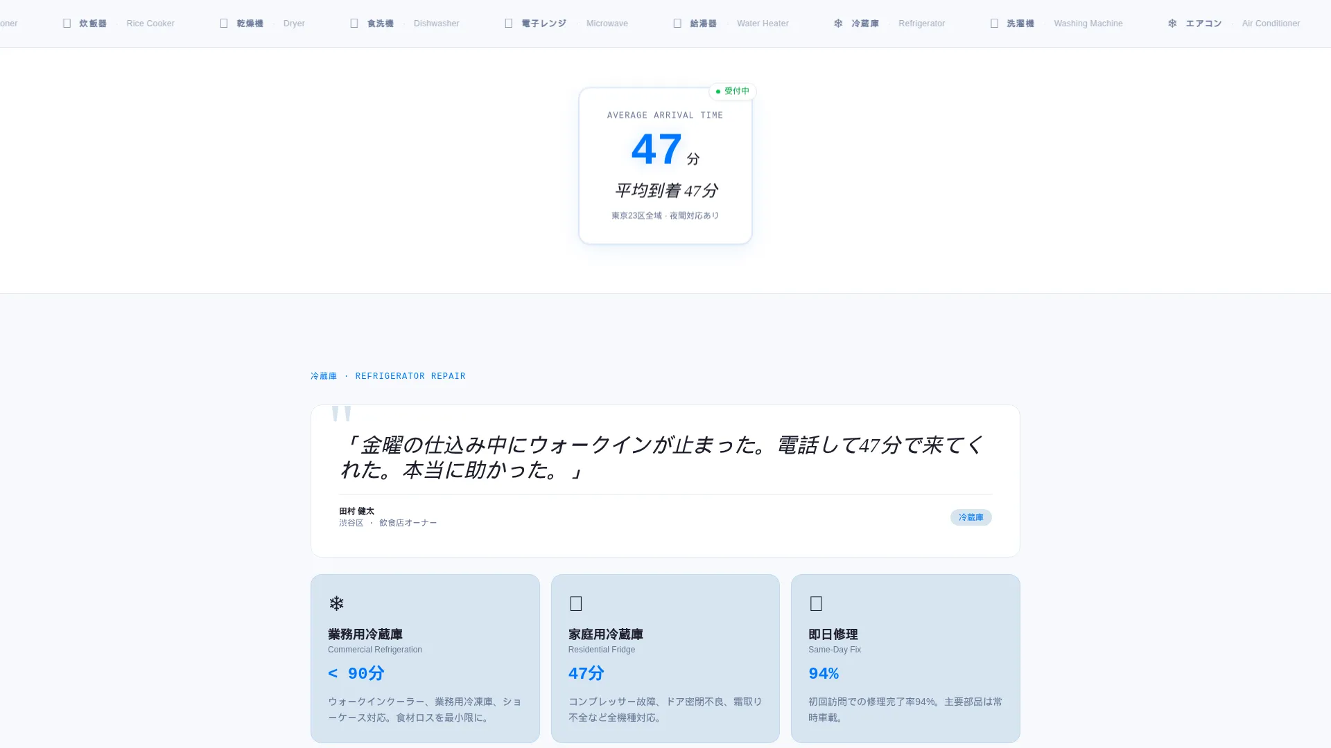
A single performance figure floats between testimonial clusters in clean, open space. Presented in large type, it gives the service a concrete, specific credibility signal without requiring a separate statistics section.
Page sections overview
| Section | Purpose |
|---|---|
| Dark Header Frame | Captures attention with a glowing appliance panel and phased headline |
| Primary call to action Strip | Places the repair request button at the header's lower edge |
| Opening Testimonial | Anchors the first service detail with a single large customer quote |
| Commercial Refrigeration | Introduces fridge and walk-in cooler repair using a restaurant owner quote |
| Washer and Dryer Repair | Introduces laundry appliance repair using a residential customer quote |
| Growing Quote Clusters | Builds social proof from single quotes to groups of three and five |
| Isolated Stat Block | Displays average arrival time in large isolated type |
| Full Review Wall | Shows a dense mosaic of micro-reviews with ward names and timestamps |
| Repair Request Form | Collects appliance type, Tokyo ward, and phone number |
| Tap-to-Call Button | Provides a direct phone link for urgent or after-hours callers |
Design & branding system
The visual identity follows a Service Utility theme built on the Arctic White color system. Clinical white dominates at least seventy percent of every viewport below the header, making the dark entry and the electric blue calls to action feel purposeful and sharp.
- Arctic White (#F7F9FC) for open page backgrounds; pale frost (#D6E4F0) for card surfaces
- Charcoal tool-steel (#1E1E2C) for all body text and section dividers; pitch black (#0B0B0F) reserved for the header
- Electric blue (#0077FF) used exclusively for calls to action and active interactive states
Mobile & speed optimization
The template is built as a single-column flow, which means it translates directly to mobile without layout shifts or collapsed grids. The most important conversion tools are placed where mobile users naturally reach them.
- The repair request button fixes to the bottom of the viewport on mobile for one-tap access at any scroll depth
- The three-field form uses a dropdown and auto-suggest input, reducing typing effort on small screens
- The single-column structure keeps the reading and scrolling flow linear and uninterrupted on any screen size
How this template helps you convert
This landing page is built around the emotional state of someone whose appliance just failed. Every design and copy decision reduces the time between arrival and a completed contact action.
- The cinematic dark header and phased headline create an immediate emotional hook, giving distressed visitors the feeling that help is already on the way before they read a single service detail.
- The testimonial mosaic replaces a generic service grid with real voices from real wards, so visitors recognize their own situation in someone else's words and trust the service before they ever see the form.
- The three-field form and the tap-to-call button offer two conversion paths suited to two different urgency levels, so no visitor leaves without a clear next step.
Other information about this template
This template is part of the Shri collection of service-focused landing pages. It is designed for operators who want a professional online presence without building a full multi-page website.
- The template style is Single Column Flow, keeping every element in a linear reading order
- The creative direction is Testimonial Mosaic, a layout approach where customer quotes structure the page rather than decorating it
- The header concept is Dark Full-Bleed with Glow, a high-contrast cinematic opening that works equally well in light and dark display environments
- The lead generation direction means every section leads toward the form or the call button, with no sidebar content, no blog links, and no navigation distractions
Theme
Service Utility
Creative direction
Testimonial Mosaic
Color system
Arctic White
Style
Single Column Flow
Direction
Lead Generation
Page Sections
Dark Full-bleed Header with Glow
Testimonial Mosaic That Builds as You Scroll
Minimal Three-field Repair Request Form
Tap-to-call Emergency Button
Fixed Mobile Call-to-action Bar
Isolated Stat Display Block
Related questions
Can I use this template for a service business outside Tokyo?
Does this template include a working form backend?
Can I replace the testimonials with my own customer reviews?
How many fields does the repair request form contain?
Is this template suited for a single-page setup or a full website?



