Vivid Summer Photography Landing Page Template
Shutter is a vivid photography and videography landing page built for summer season creatives. It showcases bundle packages, a scrollable gallery grid, a muted video reel, and flip-card add-ons inside a warm sunset gradient design. The sticky "Lock In Your Summer Date" call-to-action drives visitors directly to a booking calendar with no form required.
by Rocket studio
Quick summary
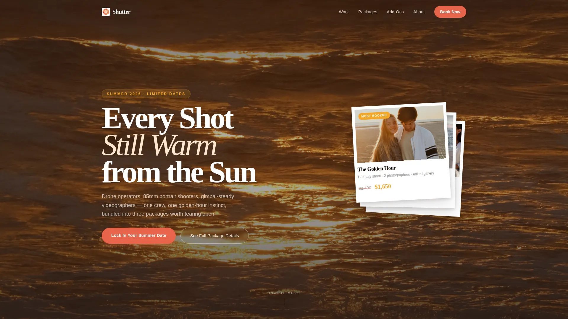
Shutter is a single-page landing page designed for summer photography and videography teams. It opens with three fanned Polaroid-style bundle cards against a sun-flared beach backdrop, then unspools into a masonry gallery, a viewfinder-framed video reel, and flippable add-on cards. Every scroll feels like unwrapping a gift box of summer memories.
Who this template is for
This template is built for creative professionals who shoot summer events and need a page that sells before the client ever picks up the phone.
- Photographers and videographers who cover pool parties, beach weddings, family reunions, and brand lifestyle campaigns
- Event planners looking for a vendor page that communicates value and packages at a glance
- Direct-to-consumer brands and marketing teams needing warm, lifestyle-driven visual content for summer campaigns
What problem this template solves
Summer booking seasons move fast. Clients make decisions quickly, and a slow or confusing page loses the booking before the conversation starts. This template removes that friction.
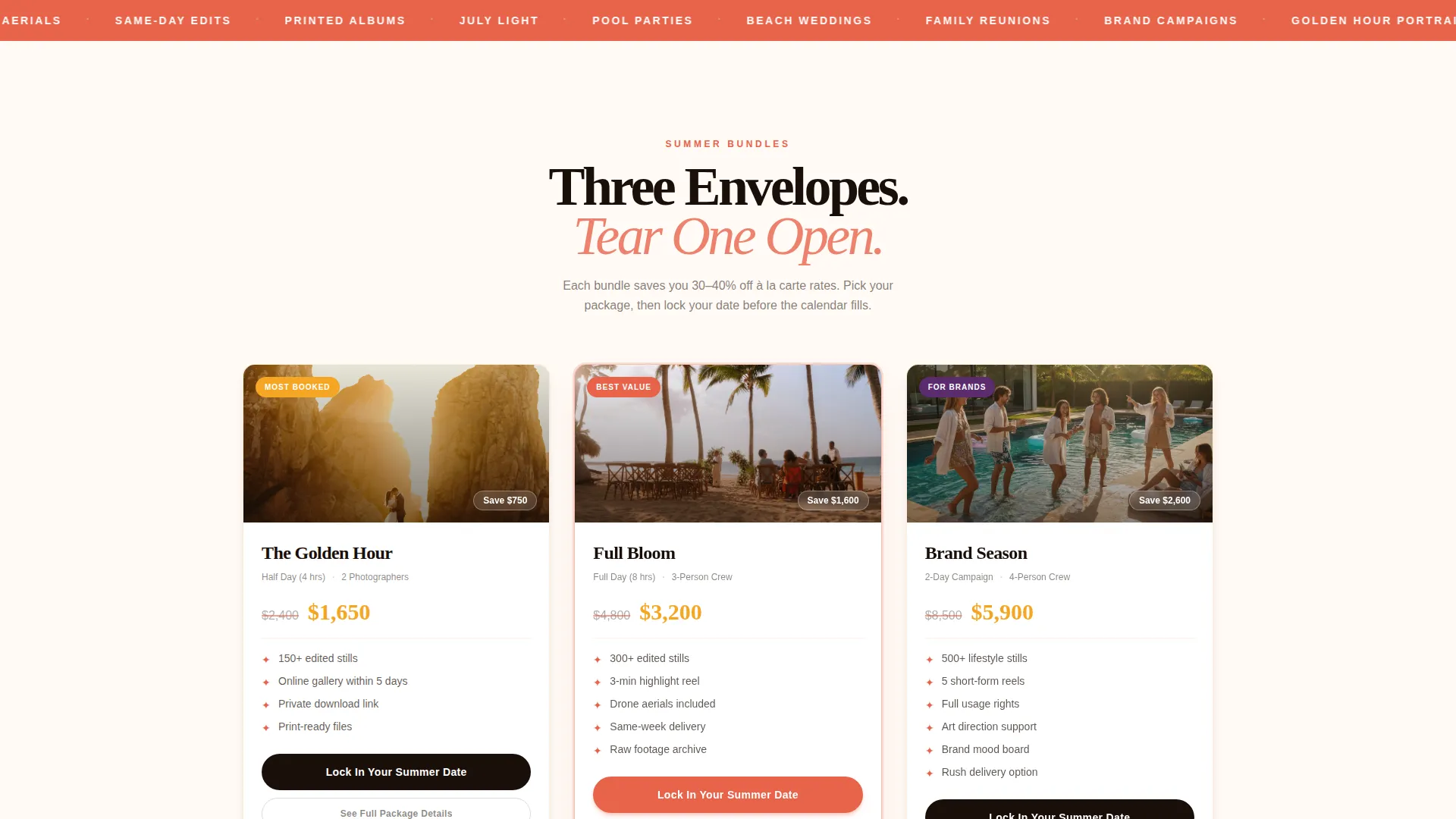
- It presents bundle pricing clearly upfront, with crossed-out individual prices and bundle prices in high-contrast tangerine, so visitors understand the value instantly
- It replaces long service descriptions with a tactile, layered scroll experience that builds excitement and trust as visitors discover each included element
- It pushes visitors toward a booking action through a persistent call-to-action bar rather than burying the next step at the bottom of a form
What you get with this template
This template delivers a full visual landing page experience designed around summer photography services. Everything below is included in the layout as described in the design brief.
- A three-card bundle header with Polaroid-style fanning, hero thumbnails, animated shimmer, and dual call-to-action buttons per card
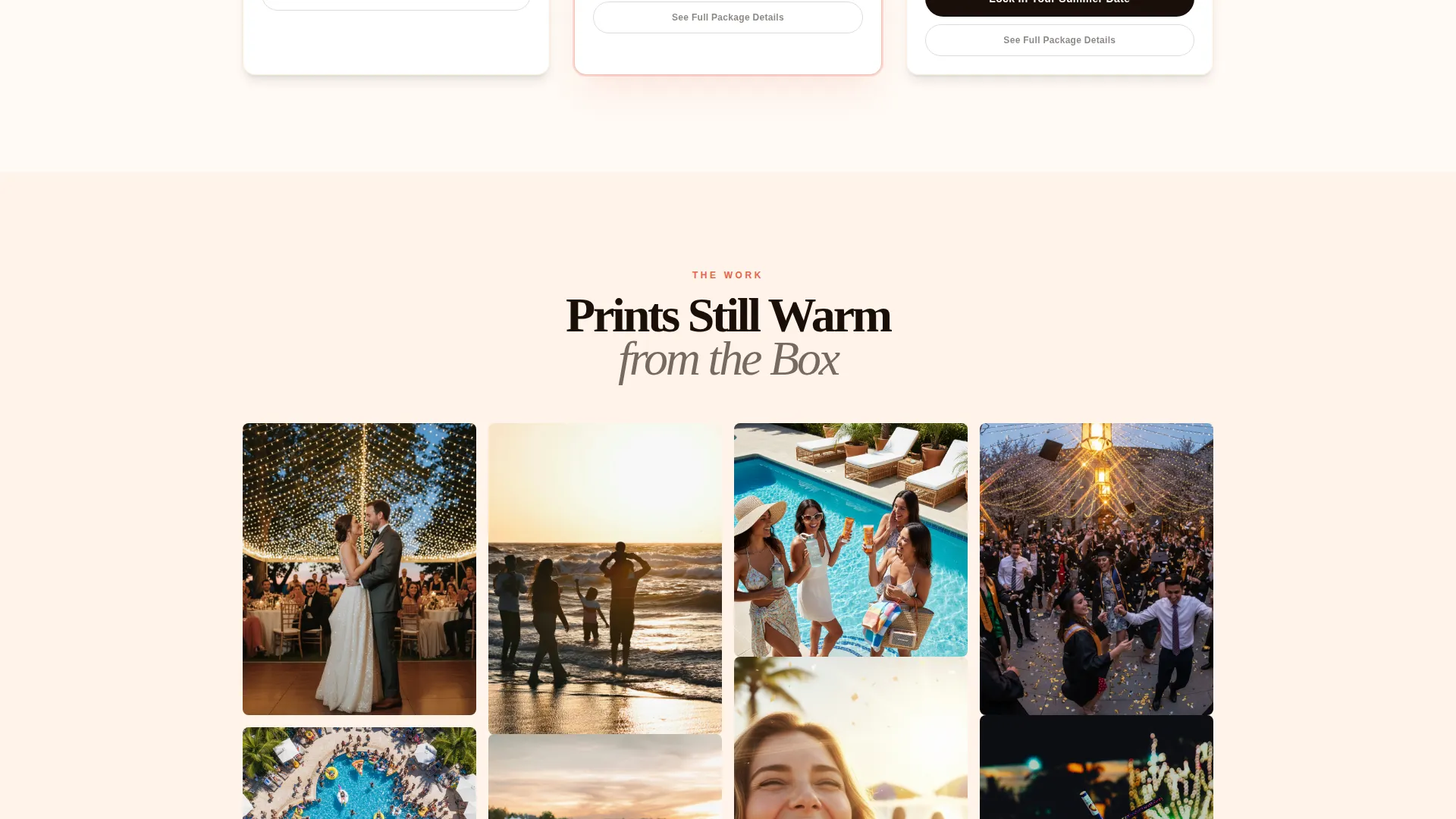
- A masonry photo gallery grid with a tumble-in scroll animation, a vintage viewfinder video reel block, and individual flip-card add-on panels for drone aerials, same-day edits, and printed albums
- A sticky bottom call-to-action bar that transitions from warm sand to deep coral as the user scrolls, linking out to an external booking calendar filtered to the summer season
Feature list
This landing page is built around a clear visual hierarchy and deliberate scroll pacing. Each feature serves a specific purpose in moving visitors from curiosity to booking commitment.
Polaroid Bundle Card Header
Three package cards fan out like Polaroids against a full-bleed beach backdrop. Each card shows a package name, a hero thumbnail, a crossed-out individual price, and the bundle price in molten tangerine. A thin animated shimmer traces the top card edge, making the offer feel premium and time-sensitive.
Masonry Photo Gallery Grid
The gallery section uses a Pinterest-style grid layout where photo prints appear to tumble in as the user scrolls. This gives the gallery a tactile, organic feel rather than a static row of images, letting the work speak without a caption in sight.
Viewfinder-Framed Video Reel
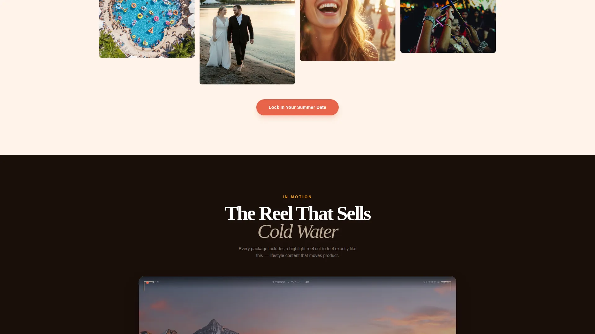
The video section sits inside a vintage viewfinder shape and auto-plays on mute. This framing device keeps the video contextual and on-brand without feeling like a generic embed, reinforcing the photography-crew identity of the service.
Flip-Card Add-On Panels
Add-on services appear as individual cards the visitor flips to reveal details. Drone aerials, same-day edits, and printed albums each get their own card, making upsells feel like discoveries rather than line items on a price sheet.
Scroll-Intensifying Sticky Call-to-Action Bar
A persistent bar fixed to the bottom of the viewport carries the primary call-to-action throughout the entire page. The bar's background color deepens from warm sand to coral as the user scrolls deeper, reinforcing urgency without interrupting the experience.
Secondary "See Full Package Details" Anchor
A second call-to-action below each bundle card gives comparison shoppers a way to review package specifics before committing. This keeps hesitant visitors on the page rather than sending them to search elsewhere.
Page sections overview
| Section | Purpose |
|---|---|
| Bundle Card Header | Presents three fanned Polaroid-style package cards with pricing and animated shimmer |
| Masonry Gallery Grid | Displays photo work in a tumble-in scroll-animated Pinterest-style layout |
| Muted Video Reel | Shows motion work inside a vintage viewfinder frame with auto-play on mute |
| Flip Add-On Cards | Reveals drone aerials, same-day edits, and printed album upsells through card flip interaction |
| Sticky Booking Bar | Anchors the primary call-to-action persistently at the bottom, deepening in color on scroll |
Design & branding system
The color palette cycles through a sunset gradient that feels intentional rather than decorative. Each hue carries a specific role in the layout hierarchy.
- Deep horizon coral (#E8634A) and molten tangerine (#F5A623) handle primary text accents and pricing highlights, while warm sand (#FDE8D0) anchors background tones in the upper sections
- Twilight violet (#5B2C6F) is reserved for hover states and call-to-action pulse effects, creating a moment of surprise and urgency when the visitor is closest to clicking
- The overall palette moves from warm and honeyed at the top of the page to electric and urgent near the booking call-to-action, using color itself as a scroll-driven conversion signal
Mobile & speed optimization
The layout is designed to translate the layered, tactile experience of the desktop version onto smaller screens without losing its energy or visual rhythm.
- The masonry grid and flip-card panels are built to reflow cleanly on mobile viewports, keeping the scroll-reveal pacing intact on touch devices
- The sticky call-to-action bar remains fixed and prominent on mobile, ensuring the booking link is always one tap away regardless of scroll position
- The muted auto-play video reel and shimmer animation are lightweight visual treatments that keep the page feeling alive without requiring heavy media loads
How this template helps you convert
Every design decision in this template is oriented toward one outcome: getting a summer booking confirmed before the visitor leaves the page.
- The bundle card header anchors the page on value immediately, using price contrast to make the package deal feel like the obvious choice before the visitor even scrolls
- The unboxing scroll structure layers new value at every section, so the visitor's confidence and excitement compound as they move down the page, reducing drop-off before the call-to-action
- The sticky booking bar with its scroll-triggered color shift ensures the primary action is always visible and always building in urgency, directing visitors to a pre-filtered summer booking calendar without requiring a form fill
Other information about this template
This template fits within a Marketplace Grid theme and was built under a Gallery plus Detail creative direction. It is designed as a click-through landing page, meaning its sole job is to move visitors to an external booking calendar. No form is embedded on the page.
- The template style pairs a curated gallery presentation with individual package detail sections, making it well suited for service businesses that sell through visual proof and clear pricing
- The header concept is price-anchored, leading with bundle value rather than brand story, which is appropriate for summer season businesses competing for a short booking window
- The design system and scroll behavior are set up to support seasonal campaign use cases beyond photography, including event services, experience packages, and any summer season business where a vivid, confident visual identity helps close a booking
Theme
Marketplace Grid
Creative direction
Curated Collection
Color system
Obsidian & Gold
Style
Gallery + Detail
Direction
Click-Through
Page Sections
Polaroid-style Bundle Card Header
Masonry Photo Gallery Grid
Viewfinder-framed Video Reel
Flip-card Add-on Panels
Scroll-intensifying Sticky Call-to-action Bar
Secondary Package Detail Anchor Links
Related questions
What types of photography businesses work best with this template?
Does the page include a contact form or booking form?
Can I edit the bundle packages and pricing shown on the cards?
How does the flip-card add-on section work?
Can this template support summer season businesses outside of photography?



