Bold Brutalist LinkedIn Landing Page Template
Signal is a bold, brutalist-styled landing page template built for a LinkedIn profile optimization service targeting mid-career marketing managers. It features a draggable Before/After Slider header, scroll-driven layered card interactions, and a minimal waitlist form. The obsidian and gold visual system makes every conversion moment feel deliberate, urgent, and unmistakably premium.
by Rocket studio
Quick summary
Signal is a single-page, overlap-layered landing page template designed for a LinkedIn profile rewrite service. It targets marketing managers at business-to-business software and agency roles who want to stop looking generic online. The page combines a visceral Before/After Slider, interactive scroll-driven card exploration, and a focused waitlist form to drive sign-ups.
Who this template is for
This template is built for service providers who help professionals stand out on LinkedIn. It speaks directly to mid-career marketing managers who know how to build a brand for any product except themselves.
- Founders or consultants selling a LinkedIn profile optimization service to marketing professionals
- Mid-career marketing managers at B2B SaaS companies or agencies who are the intended end clients
- Service creators launching a cohort-based or waitlist-first offer who need a page that converts before the product fully opens
What problem this template solves
Most landing pages for personal branding services look like every other service page: a headline, three bullet points, and a generic call-to-action button. Signal solves the credibility gap between what a profile optimization service claims to do and what the page actually makes a visitor feel.
- Marketing managers scroll past pages that tell them to "stand out" without showing them what standing out actually looks like
- Service providers lose potential clients because their page looks as generic as the LinkedIn profiles they promise to fix
- Waitlist-led offers need genuine scarcity and social proof baked into the layout, not bolted on as an afterthought
What you get with this template
Signal delivers a fully structured, single-page layout with distinct interactive zones that guide a visitor from curiosity to commitment. Every section has a clear job, and the design system does most of the persuasion before a word is read.
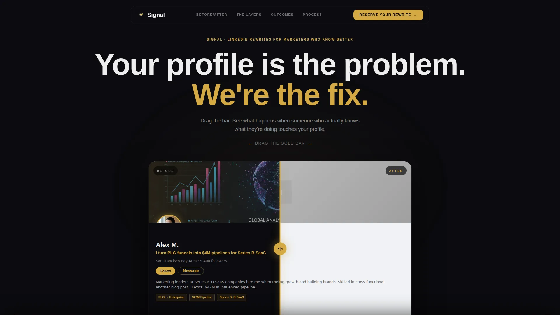
- A draggable Before/After Slider header that shows the transformation immediately and viscerally
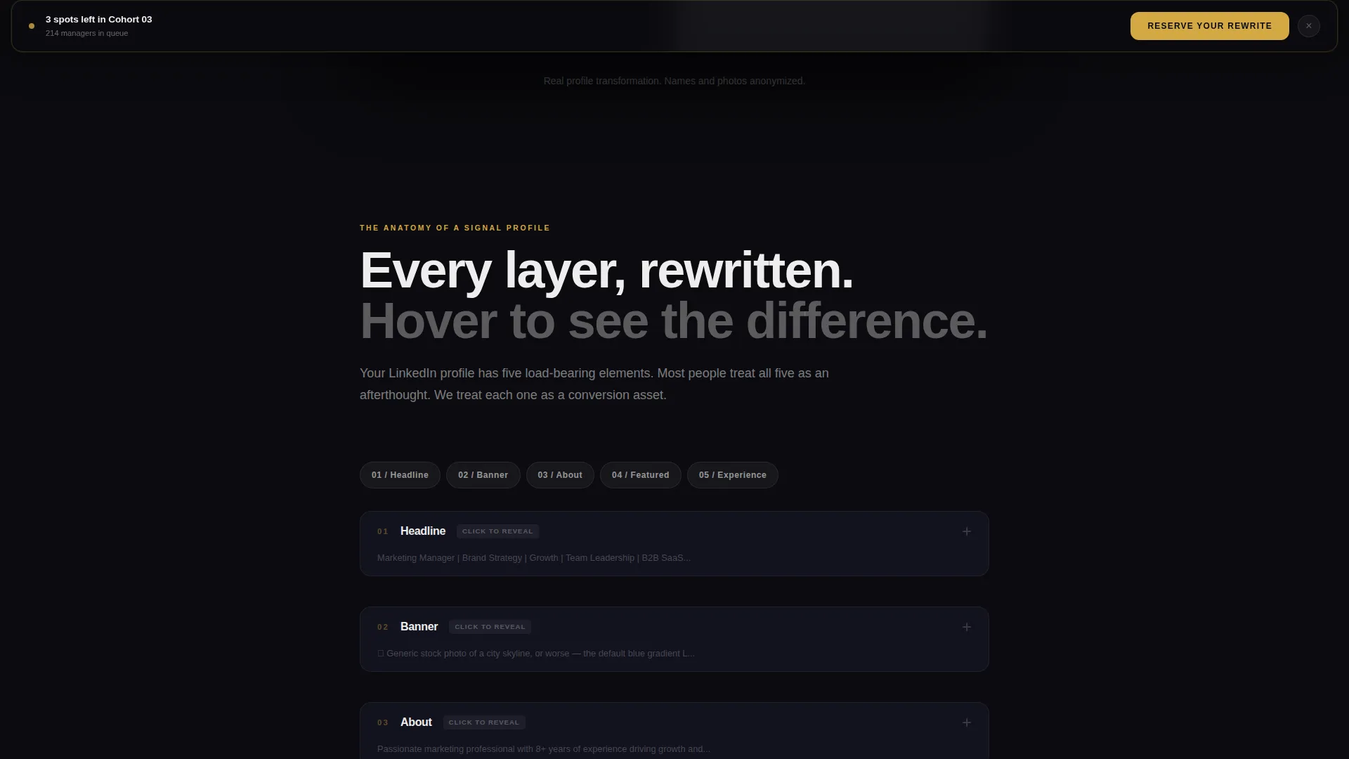
- Scroll-triggered layered cards that let visitors explore each LinkedIn profile element with before-and-after copy and strategic annotations
- A minimal waitlist form with a live spot counter and a social proof line, designed to close the page on a feeling of urgency
Feature list
This template includes several purpose-built components derived directly from the project brief. Each one earns its place by doing a specific conversion job.
Before/After Slider Header
The header splits the full viewport into two states. The left side renders a washed-out, generic LinkedIn profile card. The right side shows the same profile after the rewrite, with a sharp headline and a follower count that signals real reach. A draggable gold slider bar sits between them, letting visitors pull the transformation into view at their own pace.
Scroll-Driven Layered Card Explorer
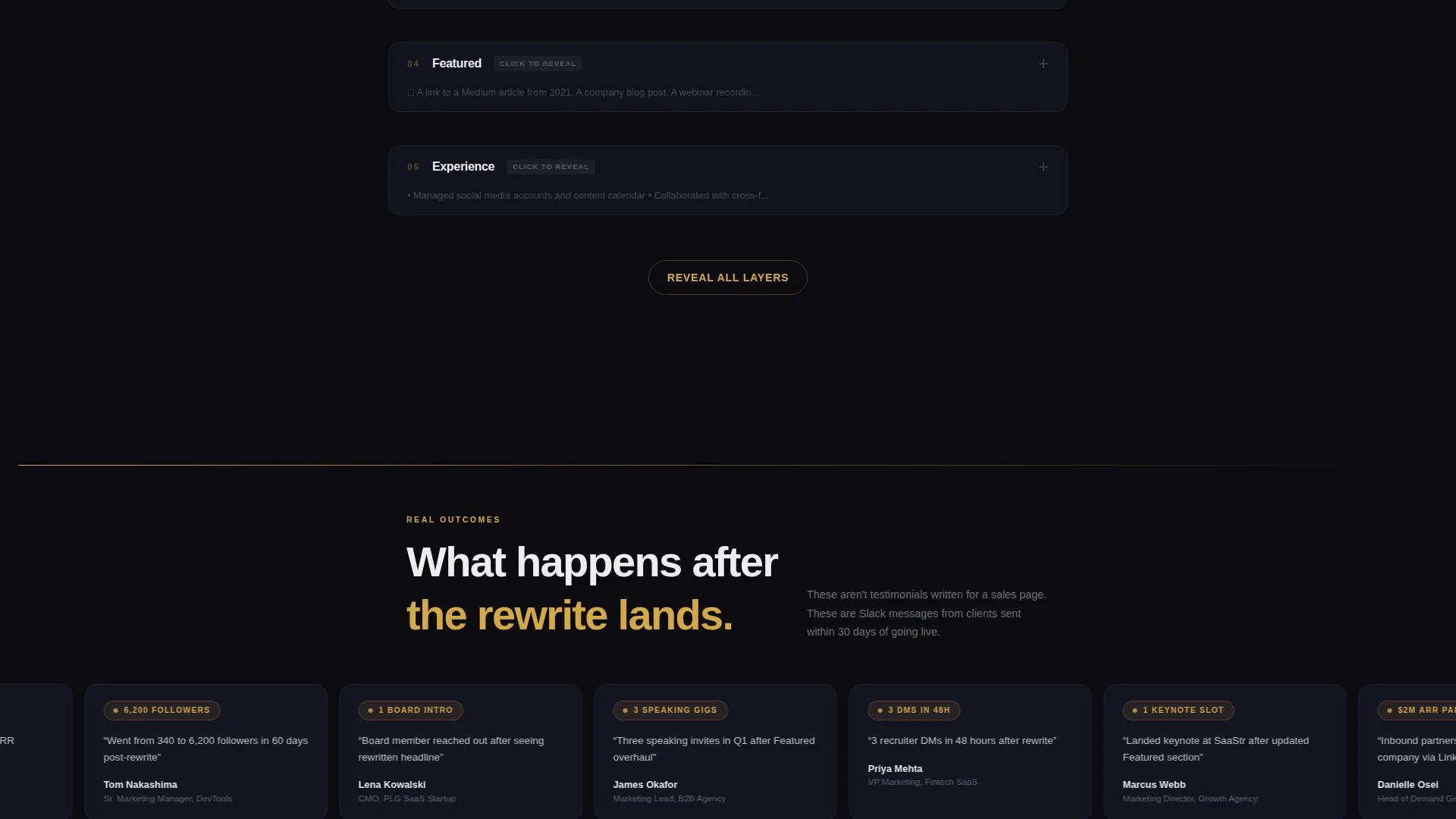
Below the header, cards stack and unstack as the visitor scrolls. Each card isolates a single LinkedIn profile element: headline, banner image, About section, Featured posts, and experience bullets. Hovering or tapping any card flips it between the before copy and the rewritten version, with gold-highlighted annotations explaining the strategic reasoning behind each change.
Fixed Bottom Conversion Bar
After the hero scroll, a fixed bottom bar appears and stays visible throughout the rest of the page. It carries the primary call-to-action, "Reserve Your Rewrite," in gold type on an obsidian background. The bar keeps the conversion path accessible without interrupting the exploratory experience above it.
Minimal Waitlist Form with Live Counter
The closing section of the page contains a two-field form: a LinkedIn profile URL field and an email address field, nothing else. A live counter displays the number of remaining spots in the current cohort, and a single line of social proof below the form reinforces urgency.
Bold Brutalist Visual System
The entire page runs on a tight obsidian and gold color system. Deep obsidian black serves as the dominant background. Raw charcoal is used for the stacked card layers. Molten gold appears on every interactive element and accent line. Bone white sets the headline type in oversized, unapologetic sans-serif. Gold never touches body text; it only marks where the eye should move next.
Page sections overview
| Section | Purpose |
|---|---|
| Before/After Header | Show the transformation immediately with a draggable slider |
| Layered Card Explorer | Let visitors interact with each LinkedIn profile element |
| Fixed Conversion Bar | Keep the primary call-to-action visible during scroll |
| Waitlist Form Section | Capture email and LinkedIn URL with urgency-driven copy |
| Social Proof Line | Reinforce scarcity with a cohort queue counter |
Design & branding system
Signal uses a Bold Brutalist theme that feels like a matte black business card with a single gold-foil edge. The palette is restrained enough to signal taste and loud enough to signal ambition. Every color decision is intentional and has a specific job in the visual hierarchy.
- Deep obsidian black (#0B0B0F) as the dominant background, raw charcoal (#1A1A2E) for layered card surfaces, molten gold (#D4A843) for all interactive elements and accent lines, and sharp bone white (#EDEDED) for headline type
- Oversized, unapologetic sans-serif typography sets headlines at a scale that commands attention without requiring decoration
- Gold is reserved strictly for interactive moments and visual direction cues; it never appears in body text
Mobile & speed optimization
The overlap and layered card structure is designed to translate cleanly from desktop to mobile. Touch interactions replace hover states so the card explorer stays fully usable on smaller screens.
- The Before/After Slider supports drag on desktop and swipe on touch devices, keeping the hero interaction intact across screen sizes
- Layered cards adapt their stacking behavior for vertical mobile scroll, so each profile element still gets its own focused moment
- The fixed bottom conversion bar remains anchored on mobile, ensuring the call-to-action is always one tap away
How this template helps you convert
Signal is engineered around a single conversion goal: getting a marketing manager to add their LinkedIn profile URL and email address to a waitlist. Every layout decision serves that goal in sequence.
- The Before/After Slider creates an immediate emotional contrast. Visitors see the gap between a generic profile and a magnetic one before they read a single line of copy, making the value case visceral rather than descriptive.
- The layered card explorer builds credibility by showing the strategic thinking behind each profile element. Visitors do not just see a finished result; they see the reasoning, which turns a service into a methodology.
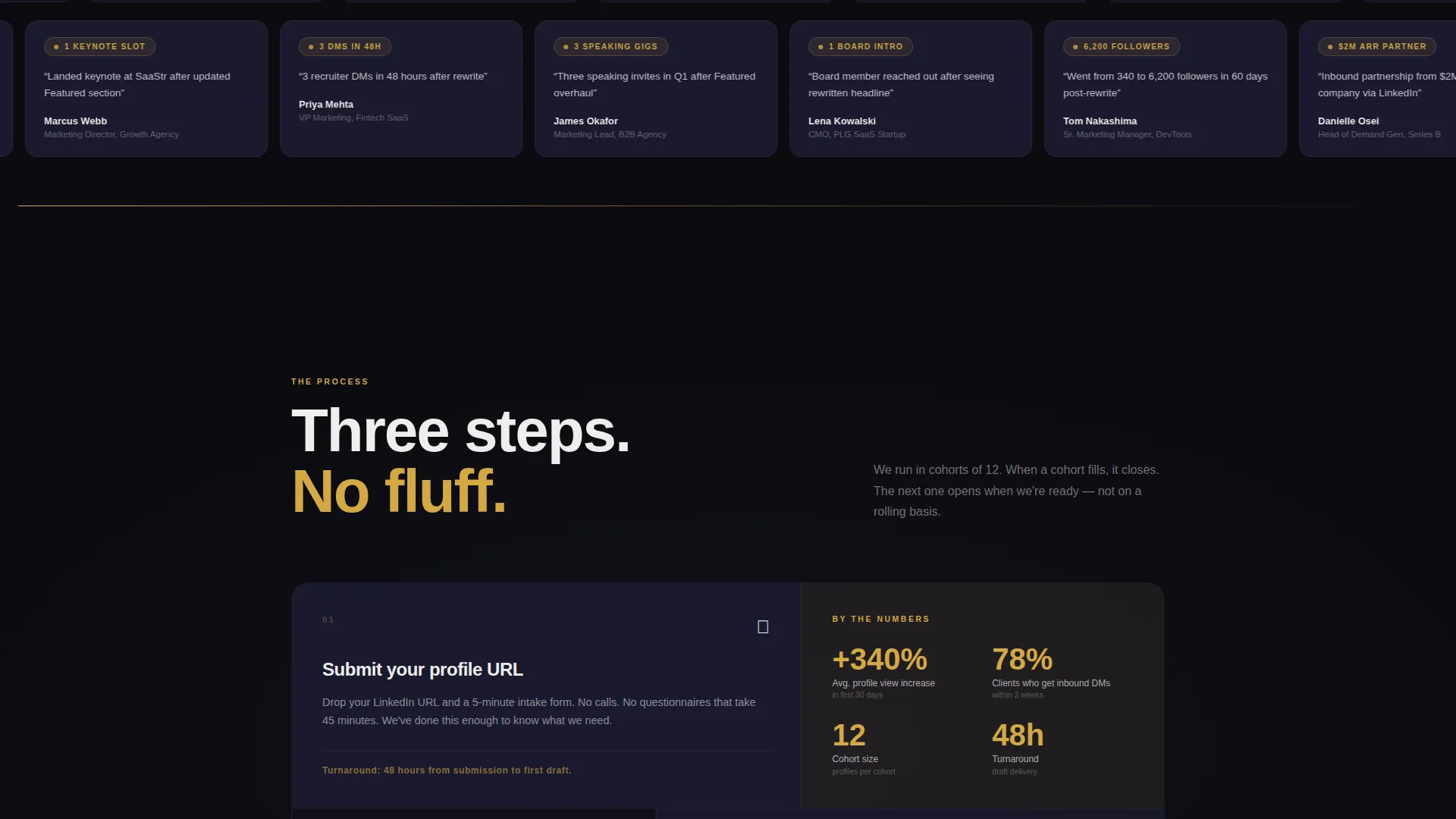
- The live spot counter and social proof line at the form close the loop with genuine scarcity. Knowing that 214 marketing managers are already in the queue makes the visitor feel late rather than early, converting hesitation into action.
Other information about this template
Signal is categorized under Personal and Resume templates, with a specific focus on the Marketing Manager Profile subcategory and the Marketing Manager LinkedIn Optimization niche. It is built as an Overlap/Layered single-page template using the Interactive Explorer creative direction. The header concept is a Before/After Slider, and the landing page direction is Waitlist and Coming Soon. The theme is Bold Brutalist, and the color system is Obsidian and Gold.
- This template is purpose-built for a LinkedIn profile optimization service and is not a general-purpose personal branding or resume template
- The waitlist structure makes it suitable for cohort-based services, limited-capacity consulting offers, or pre-launch campaigns where scarcity is genuine
- The intersection match score for this template is 13 out of the available range, reflecting a tight alignment between the niche, subcategory, design system, and conversion direction
Theme
Bold Brutalist
Creative direction
Interactive Explorer
Color system
Obsidian & Gold
Style
Overlap/Layered
Direction
Waitlist/Coming Soon
Page Sections
Before/after Slider Header
Scroll-driven Layered Card Explorer
Fixed Bottom Conversion Bar
Minimal Waitlist Form with Live Counter
Bold Brutalist Visual Identity
Related questions
Can I use this template for a service other than LinkedIn profile optimization?
Does the live spot counter update automatically?
Is this template suitable for a fully launched service, or only for a waitlist?
What does the two-field form include?
How does the Before/After Slider work on mobile devices?



