Telecom Branding Agency Landing Page Template
Signal is a bold, asymmetric 60/40 landing page template built for telecommunications branding agencies. It pairs a Photo Grid Mosaic header with a Creator Spotlight scroll structure, an Ink and Paper visual identity, and a Monochrome Steel color system. The page guides visitors from editorial case studies to a gated PDF download, earning every conversion with real creative thinking shown upfront.
by Rocket studio
Quick summary
Signal is a single-page landing page template for telecom branding agencies. It opens with a nine-frame Photo Grid Mosaic and unfolds through a Creator Spotlight scroll, alternating newsprint and press-black sections. The page builds trust section by section, then converts with a gated 40-page PDF download and a lightweight newsletter sign-up.
Who this template is for
This template is built for branding agencies that serve the telecommunications industry. It speaks directly to studios presenting work to sophisticated B2B buyers, not consumer shoppers.
- Creative directors and strategists at telecom-focused branding agencies
- Agency principals pitching regional carriers, MVNOs (mobile virtual network operators), and infrastructure companies
- Teams launching a content-led growth strategy around a flagship resource like a playbook or brand guide
What problem this template solves
Telecom branding agencies often struggle to stand out in a category full of generic portfolio sites. A slide deck or a grid of logos does not communicate depth. Buyers need to feel the thinking before they trust the agency.
- Shallow portfolio pages fail to show the reasoning behind brand decisions
- Generic agency templates do not reflect the authority a specialized telecom practice has earned
- Lead forms placed too early lose visitors who have not yet seen enough proof
What you get with this template
You get a fully structured, single-page landing page that doubles as a brand statement and a lead generation tool. Every layout decision in the template is intentional, from the uneven photo crops to the darkening scroll rhythm.
- A nine-frame Photo Grid Mosaic header with a single knockout headline
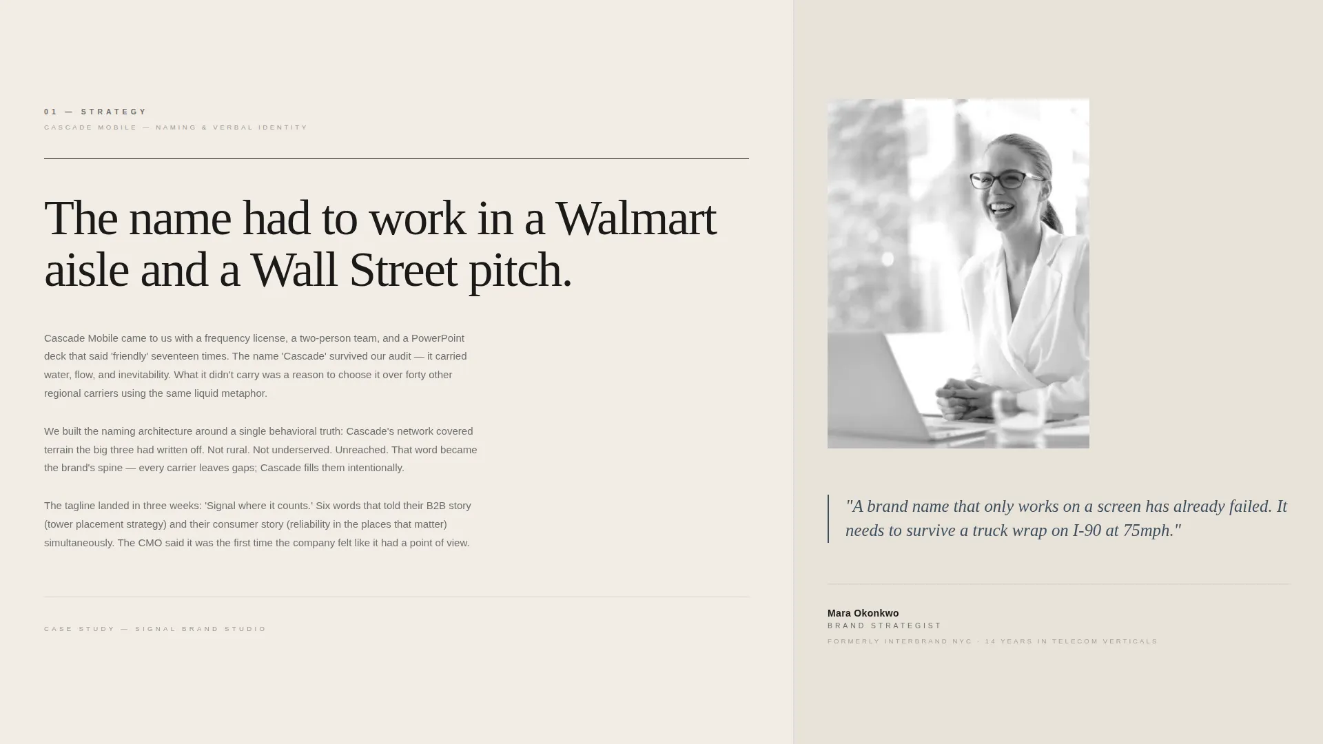
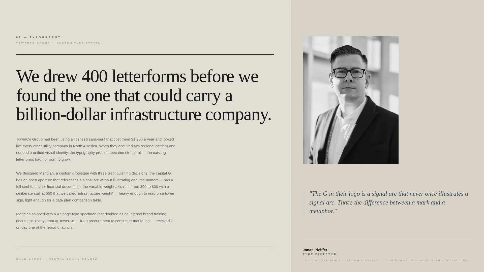
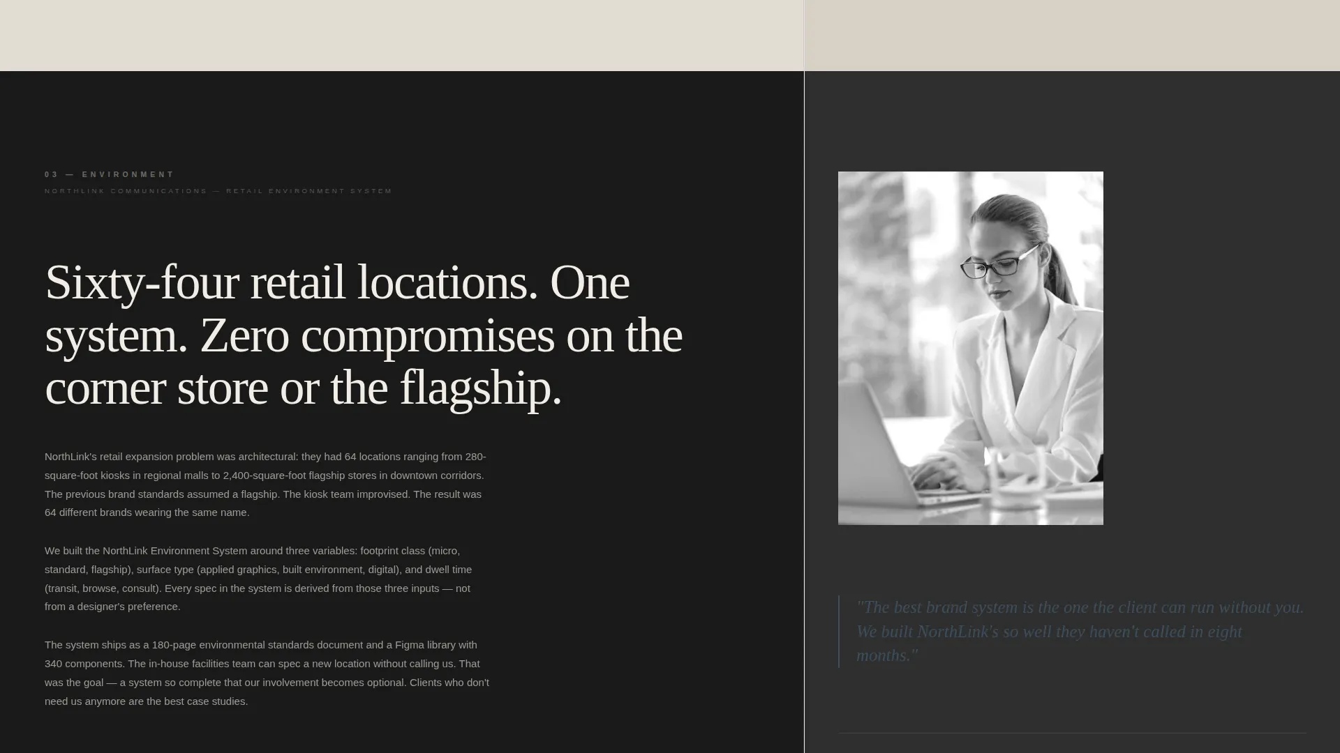
- Three Creator Spotlight sections, each pairing a case study column with a portrait and pull quote
- A gated PDF download form and a secondary newsletter sign-up path
Feature list
This section describes the core built-in features of the Signal landing page template.
Nine-Frame Photo Grid Mosaic Header
The header fills the full viewport with nine unevenly cropped editorial frames, each showing a different telecom brand artifact. No two frames share the same aspect ratio, creating a dynamic, print-editorial opening that immediately signals creative authority.
Asymmetric 60/40 Grid Layout
The page uses a deliberate 60/40 column split throughout. The wider column carries case study narratives told by individual team members. The narrower column holds a portrait, a pull quote, and a single credential line.
Creator Spotlight Scroll Structure
Each section below the header is handed to a different agency team member. The strategist, type designer, and environmental designer each tell their part of a brand story. This structure turns a single page scroll into a layered creative presentation.
Darkening Section Rhythm
The newsprint-to-press-black ratio shifts as the visitor scrolls deeper. Sections grow progressively darker, giving the page a physical sense of turning through a brand book. This pacing builds emotional weight before the conversion moment.
Gated PDF Download with Three-Field Form
After the third Creator Spotlight, a form invites visitors to download a 40-page Telecom Branding Playbook. The form asks for work email, company name, and role only, keeping friction low while qualifying the lead.
Secondary Newsletter Sign-Up Path
A lightweight opt-in for a monthly newsletter on telecom identity trends requires only an email address. It offers a lower-commitment conversion path for visitors who are not yet ready for the full download.
Page sections overview
| Section | Purpose |
|---|---|
| Photo Grid Mosaic | Opens the page with nine editorial brand artifact frames and a single headline |
| Creator Spotlight One | Strategist narrates the naming rationale with a portrait and pull quote |
| Creator Spotlight Two | Type designer walks through custom letterform decisions |
| Creator Spotlight Three | Environmental designer presents the retail rollout story |
| PDF Download Form | Converts engaged visitors with a three-field gated playbook offer |
| Newsletter Sign-Up | Captures lighter-intent visitors with an email-only opt-in |
Design & branding system
The template uses an Ink and Paper theme built on a Monochrome Steel color system. Every color choice is purposeful and restrained, making the work feel like a freshly inked letterpress proof.
- Press black (#1A1A1A) and warm newsprint (#F2EDE4) alternate as section backgrounds throughout the page
- Mid-tone graphite (#6B6E70) carries all body text, keeping long reading passages easy on the eye
- Steel (#3D4F5F) appears only on interactive elements and pull quotes, training the visitor to read it as a signal of action or importance
Mobile & speed optimization
The Signal template is structured with single-column reflow in mind. The asymmetric grid adapts gracefully for smaller viewports without losing its editorial character.
- The Photo Grid Mosaic reconfigures into a stacked sequence of cropped frames on mobile screens
- The 60/40 column split collapses to a single reading column, placing the portrait and credential line below each case study narrative
- Pull quotes and the PDF download form remain prominent at every screen size, keeping the conversion path clear
How this template helps you convert
The page is built around a content-first conversion strategy. Visitors receive real creative value before they encounter any form, which means the download request feels earned rather than extracted.
- The Creator Spotlight sections give away genuine strategic and craft thinking in three consecutive passes, building credibility with every scroll
- The PDF download form arrives only after the third spotlight, once the agency's depth has been demonstrated, making it feel like a natural next step
- The secondary newsletter opt-in offers a no-pressure entry point for visitors who want to stay connected without committing to the full playbook
Other information about this template
Signal is part of the Portfolio and Agency category, sitting specifically in the Telecommunications Marketing and Agency subcategory. It was designed for the Telecommunications Branding Agency niche, where the template intersection score reached 13 out of a possible scale, indicating a strong fit between the creative direction, the landing page strategy, and the target audience.
- The template theme is Ink and Paper, and the creative direction is Creator Spotlight
- The header concept is Photo Grid Mosaic, and the layout style is Asymmetric Grid at a 60/40 split
- The landing page direction is Content and Resource, meaning the page is built to deliver value before asking for anything in return

Theme
Ink & Paper
Creative direction
Creator Spotlight
Color system
Monochrome Steel
Style
Asymmetric Grid (60/40)
Direction
Content/Resource
Page Sections
Nine-frame Photo Grid Mosaic Header
Asymmetric 60/40 Grid Layout
Creator Spotlight Scroll Structure
Darkening Section Rhythm
Gated PDF Download with Three-field Form
Secondary Newsletter Sign-up Path
Related questions
Who is the Signal template designed for?
What is the Creator Spotlight scroll structure?
What does the PDF download form include?
Can this template be adapted for agencies outside the telecom industry?
What is the secondary conversion path on this page?



