Telecommunications Marketing & Agency Portfolio Website Template
Signal is a single-page landing page template built for telecommunications social media agencies. It uses an asymmetric 60/40 grid, a Tech Glass visual identity in Obsidian and Gold, and a case study narrative scroll to prove industry fluency fast. Three escalating client stories lead visitors directly into a progressive B2B contact form and a gated benchmark report.
by Rocket studio
Quick summary
Signal is a high-impact landing page template designed for telecom-focused social media agencies. It combines an asymmetric 60/40 grid layout with a Tech Glass aesthetic in deep obsidian and signal gold. Three scrollable case studies build credibility before a progressive B2B contact form closes the deal.
Who this template is for
This template is built for agencies that work exclusively inside the telecommunications industry. It speaks the language of spectrum, churn, and tower density rather than generic social metrics.
- Social media agencies pitching VP-level marketing leads at regional carriers
- Agencies targeting enterprise sales directors at infrastructure companies who need LinkedIn to generate pipeline
- Brand consultancies serving chief marketing officers at mobile virtual network operators (MVNOs) competing against larger carriers on limited budgets
What problem this template solves
Most agency landing pages look identical. They show logos, list services, and ask visitors to book a call. That approach fails with senior telecom buyers who can spot a generalist within seconds.
- Visitors arrive skeptical and leave without converting because the page never proves vertical expertise
- Telecom decision-makers need to see campaign proof in their own industry language before they trust an agency with budget
- A generic contact form signals low seniority intent and filters out the wrong leads while repelling the right ones
What you get with this template
You get a fully structured single-page layout that earns trust through narrative before it ever asks for a meeting. Every section is purposefully sequenced to move a senior buyer from skeptic to contact.
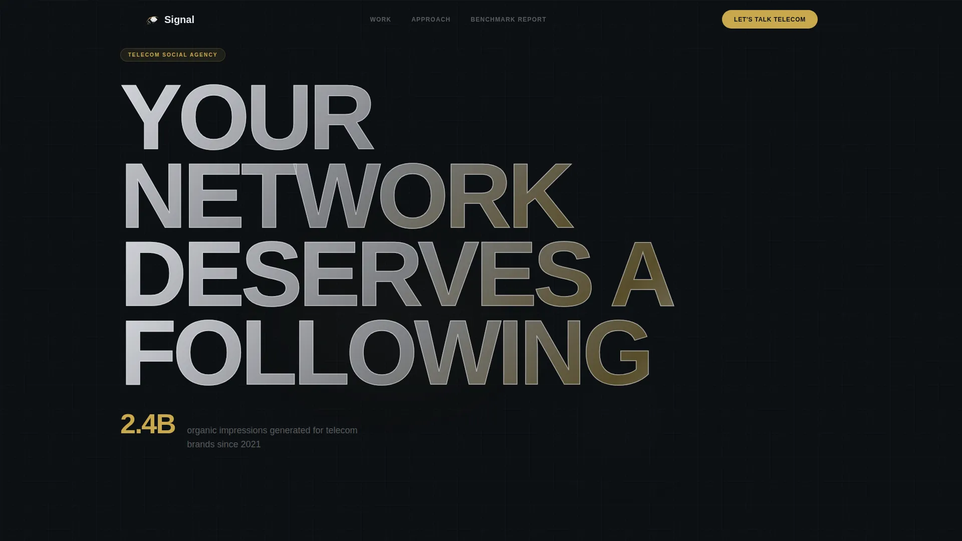
- A viewport-scale headline section with a gold stat callout and a blinking cursor animation
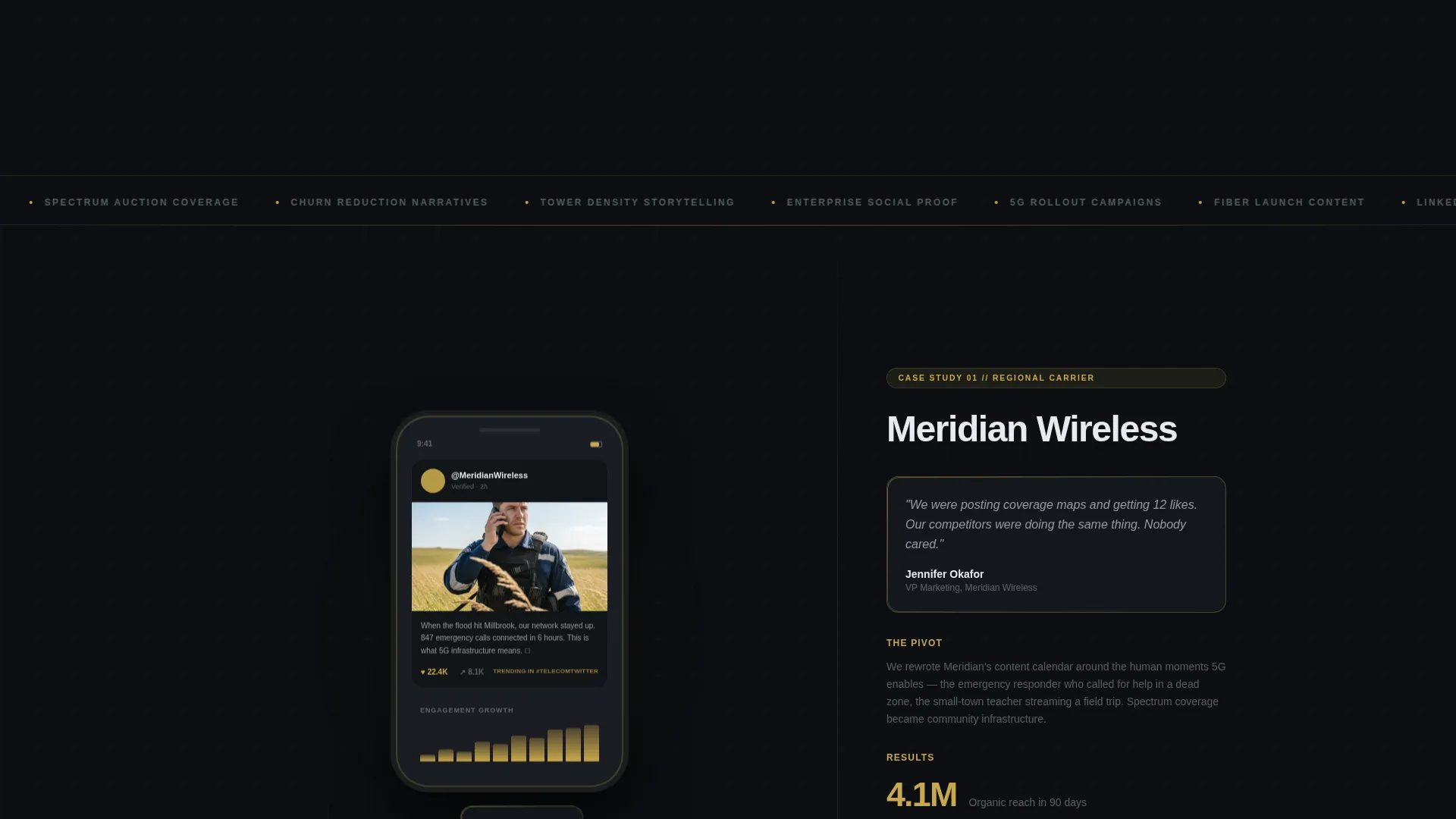
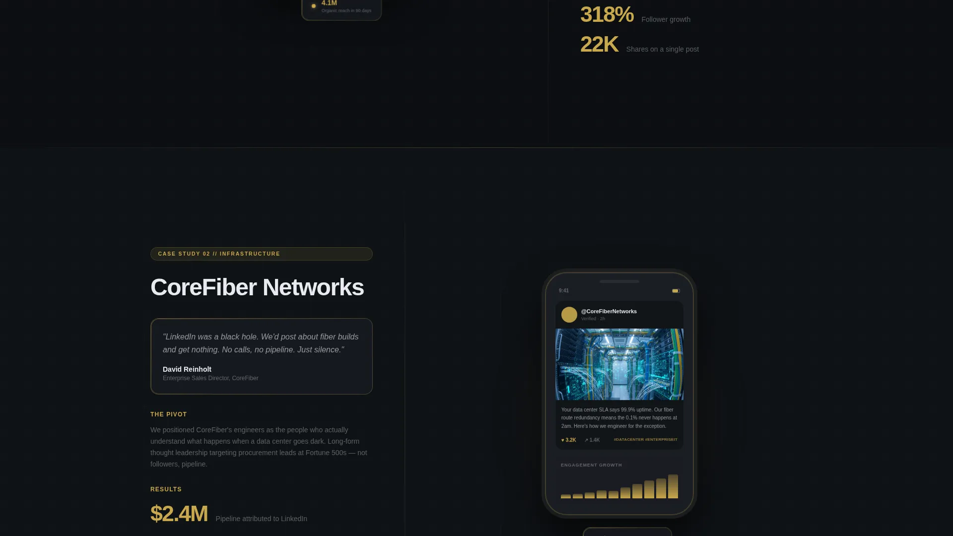
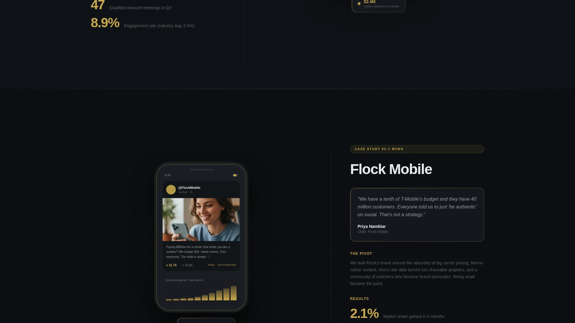
- Three parallax case study blocks in a 60/40 asymmetric grid, each with phone frame mockup space, engagement graph slots, and stacked gold numeral results
- A three-step progressive disclosure contact form plus a secondary gated download path for mid-funnel prospects
Feature list
This section describes the core template capabilities built directly into the Signal landing page design.
Asymmetric 60/40 Grid Layout
The page uses a deliberate 60/40 column split throughout the case study section. The wider column holds rich campaign visuals including phone frame mockups, engagement graphs with gold data lines, and screenshot carousel slots. The narrower column carries the narrative: client problem, strategic pivot, and stacked result numerals.
Three Escalating Case Study Blocks
Three distinct client story sections are built into the scroll. Each story increases in strategic stakes, moving from follower growth at a regional carrier to LinkedIn pipeline generation for an infrastructure brand to market share gains for an MVNO. Parallax transitions animate each phone frame off-screen as the next rises.
Giant Viewport Headline Section
The header is a single typographic statement set in a condensed sans-serif at near-viewport scale. A frosted-glass texture maps across the letterforms. A gold cursor blinks at the end of the headline as if it was just typed, and a gold stat line sits directly below.
Three-Step Progressive Disclosure Form
The contact form qualifies leads across three steps. The first step collects company name and role title to establish seniority. The second presents a free-text field asking about the visitor's biggest social challenge. The third captures email and an optional phone number.
Gated Benchmark Report Download
A secondary conversion path offers a downloadable Telecom Social Benchmark Report gated behind email only. This gives mid-funnel visitors a low-commitment reason to engage before they are ready to book a call.
Persistent Gold call to action Navigation
A signal gold pill button labeled "Let's Talk Telecom" lives in the top navigation bar and persists throughout the scroll. A full-width version of the same call to action reappears after the third case study, reinforcing the conversion moment at peak credibility.
Page sections overview
| Section | Purpose |
|---|---|
| Top Navigation Bar | Persistent call to action and orientation anchor |
| Giant Headline Block | Immediate authority statement with gold stat |
| Case Study One | Regional carrier follower growth story |
| Case Study Two | Infrastructure brand LinkedIn pipeline story |
| Case Study Three | MVNO market share campaign story |
| Primary Contact Form | Three-step progressive B2B lead qualification |
| Benchmark Report Gate | Mid-funnel secondary email capture |
| Full-Width call to action Band | Final conversion push after case studies |
Design & branding system
The visual identity is built on a Tech Glass theme using four intentional colors. Every color decision serves a functional role, nothing is decorative without purpose.
- Deep obsidian black (#0B0E11) fills the primary background, polished graphite (#1A1D23) surfaces cards and section breaks, and frosted glass white (#E8EAF0) handles body text and interface borders
- Signal gold (#C9A84C) is used surgically on metric numbers, active navigation indicators, button fills, hover states, and the thin luminous borders on glassmorphic cards
- Typography uses a condensed sans-serif for display headlines and a clean readable face for narrative body copy, maintaining the high-contrast legibility the Tech Glass style demands
Mobile & speed optimization
The template is structured for clean rendering across screen sizes. The asymmetric grid and large typographic elements are designed to reflow predictably on smaller viewports.
- The 60/40 grid collapses to a single-column stacked layout on mobile, keeping case study visuals above narrative text for readable flow
- Phone frame mockup slots and engagement graph areas scale proportionally so campaign visuals remain clear without overflow
- The persistent navigation pill and three-step form are sized for thumb-friendly interaction on touch screens
How this template helps you convert
This template sequences the visitor experience so that trust is built before any ask is made. By the time the form appears, the visitor has already seen three detailed proofs of telecom-specific expertise.
- The escalating case study structure teaches visitors that this agency understands their precise world, including spectrum auctions, churn rates, and tower density, not just content calendars. Senior buyers recognize the fluency and feel met at their level.
- The three-step progressive form reduces friction by spacing out qualification questions. Visitors share more when the form feels like a conversation rather than a data grab. The result is higher form completion and better-qualified leads.
- The gated benchmark report creates a second conversion lane for prospects who are researching but not yet ready to commit. Capturing that email keeps those leads in reach without forcing a premature sales conversation.
Other information about this template
Signal is purpose-built for one niche and does not try to serve every agency type. That focus is its competitive advantage as a template.
- The page direction is Partnership and Business-to-Business outreach, meaning every layout and copy cue is aimed at senior decision-makers rather than consumer audiences
- The creative direction is Case Study Narrative, which means the template is structured around proof before pitch, a deliberate sequence for high-skepticism buyers
- The header concept uses a Giant Headline Centered approach, where a single bold statement at near-viewport scale does the work that most agencies spread across hero images and explainer videos
- This template is categorized under Portfolio and Agency with a subcategory of Telecommunications Marketing and Agency, making it specifically suited for positioning an agency as a vertical specialist rather than a generalist shop
Theme
Tech Glass
Creative direction
Case Study Narrative
Color system
Obsidian & Gold
Style
Asymmetric Grid (60/40)
Direction
Partnership/B2B
Page Sections
Asymmetric 60/40 Case Study Grid
Parallax Case Study Transitions
Viewport-scale Typographic Header
Three-step Progressive Disclosure Form
Gated Benchmark Report Conversion Path
Persistent Signal Gold Call to Action
Related questions
Who is the Signal landing page template designed for?
What makes the three-step contact form different from a standard form?
What is the purpose of the gated Telecom Social Benchmark Report?
How does the asymmetric 60/40 grid work across the case study sections?
Can this template work for an agency that serves industries beyond telecommunications?



