Telecommunications PR Agency Landing Page Template
Signal is a Bold Brutalist landing page template built for telecommunications PR agencies. It combines a cinematic scroll sequence, an animated illustration header, and a three-step progressive contact form to convert high-level industry decision-makers. The Electric Indigo color system and overlapping layout give the page an urgent, insider-only feel that matches the pressure of telecom communications work.
by Rocket studio
Quick summary
Signal is a single-page, overlap-layered landing page template for telecommunications PR agencies. It uses a Bold Brutalist design language, an Electric Indigo color system, and a cinematic scroll narrative to speak directly to telecom executives under pressure. The primary call to action, "Brief Our War Room," appears three times and is backed by a three-step progressive inquiry form.
Who this template is for
Signal is built for PR and communications agencies that serve the telecommunications industry at a senior level. It speaks the language of spectrum auctions, merger announcements, and regulatory filings, and it is designed to attract the clients who live inside those pressures every day.
- Communications strategists and PR agency principals targeting telecom sector clients
- Agency teams pitching to CTOs at regional carriers, VP Comms leads at infrastructure companies, or government affairs directors at tower companies
- Boutique firms that want a landing page presence that signals expertise before a single conversation happens
What problem this template solves
Most agency landing pages look like brochures. They describe services in calm, generic language that fails to match the urgency of the clients they are trying to attract. Telecom executives fielding coverage complaints or navigating a zoning battle before a permit is filed need to feel that an agency already understands their world the moment they land on the page.
- Generic agency templates do not communicate sector fluency or crisis readiness to specialist clients
- Standard contact forms feel transactional and fail to qualify high-stakes B2B leads effectively
- Flat, forgettable layouts cannot hold the attention of senior decision-makers who scan fast and leave faster
What you get with this template
Signal delivers a complete, single-page layout built around three distinct narrative acts. Every section builds tension and trust until the visitor is ready to start a conversation. The design, animation logic, and form structure are all defined and ready to deploy.
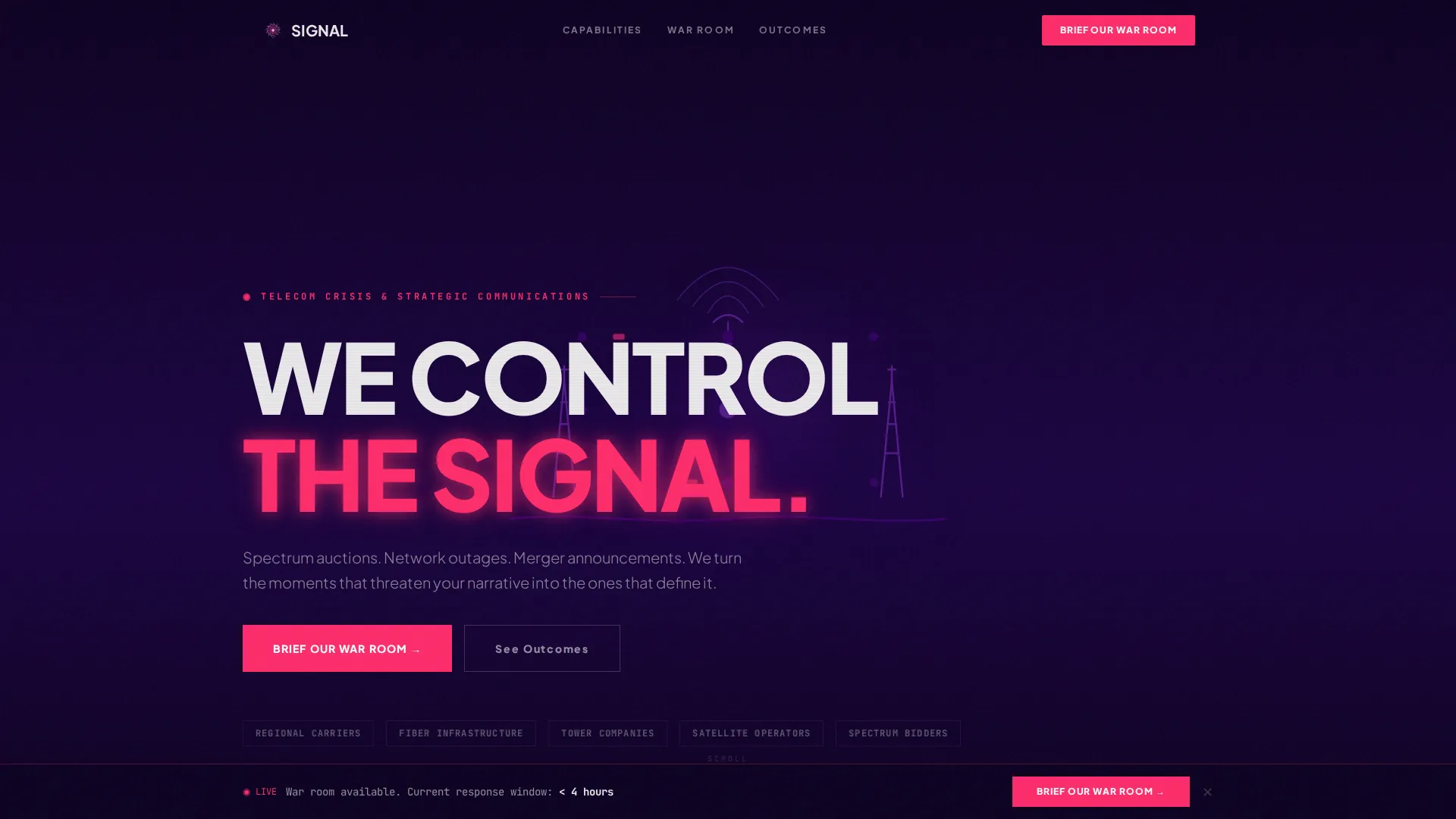
- An animated illustration header that assembles a brutalist schematic of signal towers, satellite dishes, and fiber optic cables before stamping a full-screen headline
- A three-act cinematic scroll sequence covering the inciting incident, the war room framework, and outcome case studies with before-and-after headline comparisons
- A three-step progressive contact form that qualifies leads by telecom subsector, engagement type, and the specific headline the client is trying to prevent
Feature list
Signal is packed with purposeful components, each designed to serve the B2B conversion goal of the page.
Animated Schematic Header
A flat-vector, monochrome indigo animation assembles signal towers, satellite dishes, and fiber optic cables into a geometric engineering grid. When the final element locks into place, a single pink pulse radiates outward and the headline "WE CONTROL THE SIGNAL" stamps onto the screen in uppercase slab type with no fade-in.
Cinematic Scroll Sequence
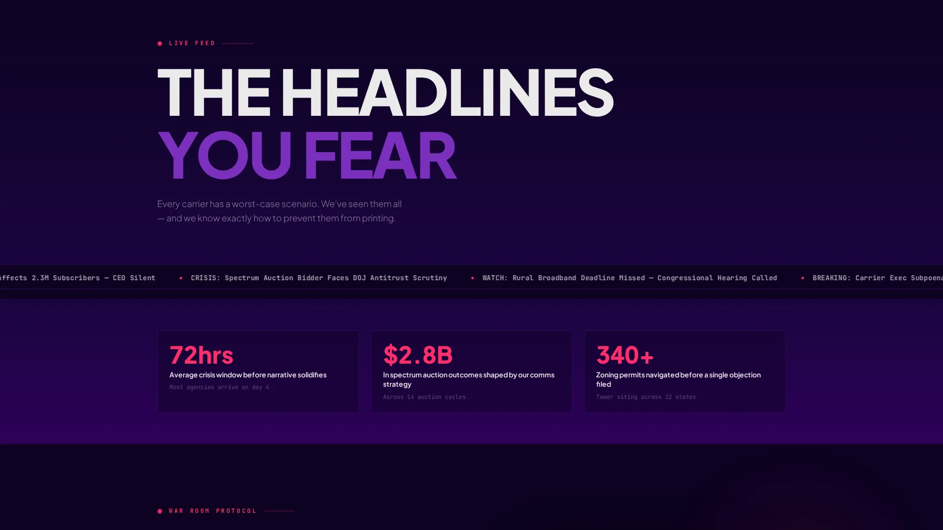
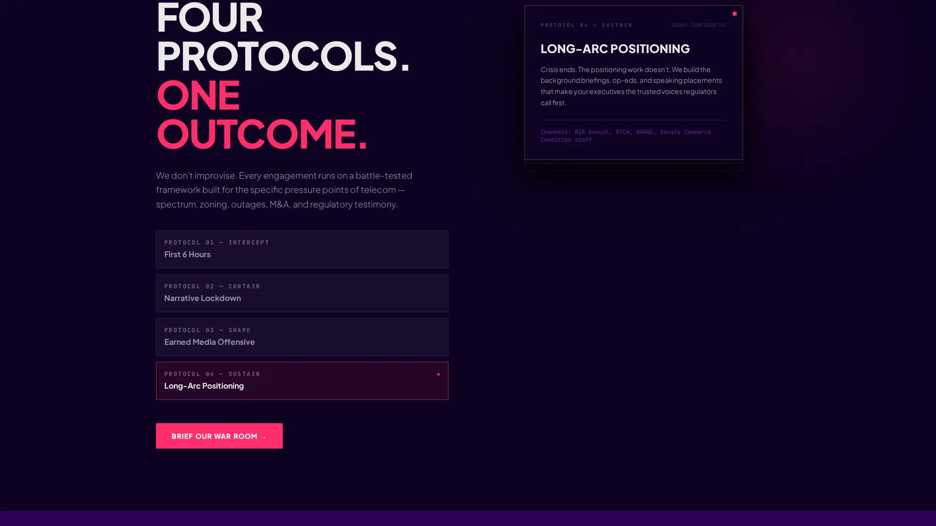
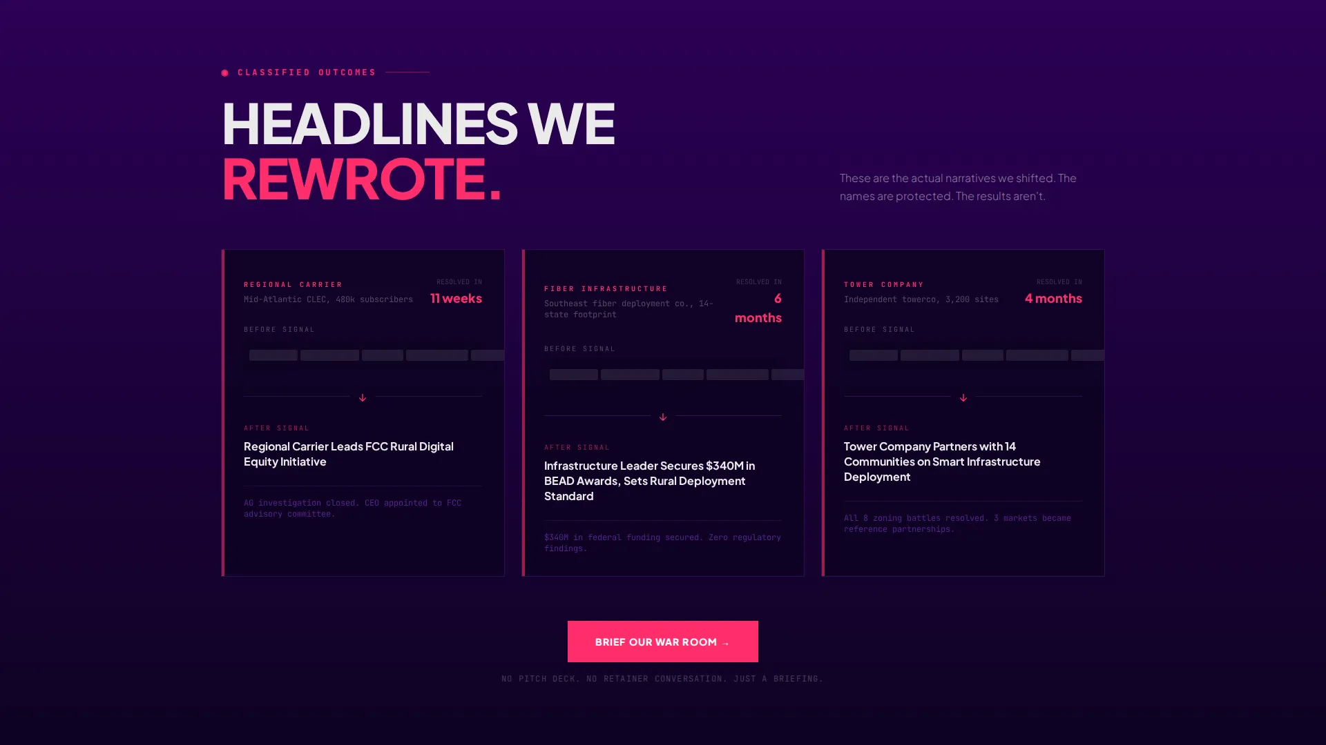
Three narrative sections drive the scroll like acts in a crisis communications thriller. A breaking news ticker simulates worst-case headlines across parallax-layered panels. Overlapping cards reveal the agency's response framework like classified documents being declassified. Case studies show before-and-after headline comparisons with animated black-bar redactions replaced by earned media wins.
Triple-Placed Primary Call to Action
The "Brief Our War Room" call-to-action button appears three times: after the framework reveal, after the case studies, and in a fixed bottom bar that activates after the visitor has scrolled through 40 percent of the page. Placement is deliberate and tied to the narrative arc.
Three-Step Progressive Inquiry Form
The contact form moves through three focused steps. Step one collects company name and telecom subsector from a defined list including carrier, infrastructure, tower, satellite, and vendor. Step two offers a dropdown for engagement type covering crisis, proactive campaign, regulatory, and merger and acquisition communications. Step three presents a free-text field asking what headline the client is trying to prevent.
Overlap and Layered Layout
Sections are built with depth. Cards slide from beneath one another, panels overlap on parallax scroll, and each section sits darker than the one before it. The final call-to-action section floods the screen with indigo light, creating a visual payoff that rewards the full scroll.
Bold Brutalist Typography System
Oversized grotesque fonts anchor every typographic slab. White text cuts through dark backgrounds like closed-caption data. Pink is reserved strictly for calls to action and hover states, keeping the visual hierarchy clean and the action moments impossible to miss.
Page sections overview
| Section | Purpose |
|---|---|
| Animated Header | Introduces agency identity with a schematic animation and full-screen headline stamp |
| Breaking News Ticker | Simulates a client's worst-case coverage scenario to establish crisis credibility |
| War Room Framework | Overlapping cards reveal the agency's strategic response process |
| Case Study Outcomes | Before-and-after headline comparisons show earned media results |
| Brief Our War Room | Primary call-to-action block with the three-step progressive inquiry form |
| Fixed Bottom Bar | Persistent conversion prompt that activates at 40 percent scroll depth |
Design & branding system
The Electric Indigo color system gives Signal its confrontational, high-stakes atmosphere. Every color plays a defined role, and nothing is decorative for its own sake.
- The five-color palette uses deep broadcast black (#0D0221), high-voltage indigo (#4B0082), interference purple (#7B2FBE), signal white (#EAEAEA), and hot transmission pink (#FF2D6B) reserved exclusively for calls to action and hover states
- Oversized uppercase grotesque fonts form the typographic backbone, with white text on dark planes ensuring maximum contrast and readability at every scroll depth
- The overall aesthetic is described as phosphorescent and confrontational, like a cathode ray tube warming up in a dark control room, giving the brand a visceral identity that stands apart from conventional agency sites
Mobile & speed optimization
The overlap and layered structure of Signal is designed with intentional stacking behavior so the cinematic sequence reads clearly on smaller screens as well as large displays.
- Parallax layering and card-slide animations are structured to collapse gracefully into stacked vertical layouts on mobile viewports
- The fixed bottom bar and triple call-to-action placement ensure conversion touchpoints remain visible and accessible regardless of screen size
- The progressive three-step form breaks a potentially long inquiry into short, focused steps that are easier to complete on a mobile device
How this template helps you convert
Signal is built around one goal: starting a qualified conversation with a senior telecom decision-maker. Every design and structural choice serves that outcome.
- The cinematic scroll sequence earns trust before asking for anything, proving sector fluency through crisis scenarios, framework cards, and real headline comparisons so the visitor is primed to engage by the time the form appears.
- The three-step inquiry form replaces a generic contact box with a structured qualification process, ensuring every submission arrives with enough context for the agency to respond as an informed equal rather than a vendor chasing a lead.
- The fixed bottom bar and triple call-to-action placement create persistent, low-pressure conversion moments that meet the visitor wherever they stop scrolling, without ever feeling like a hard sell.
Other information about this template
Signal fits into a broader category of high-specialization agency templates designed to serve niche B2B markets where credibility must be established visually before a single word is read.
- The template style is classified as Overlap and Layered, a structural approach that creates depth and narrative momentum through visual stacking rather than flat sequential sections
- The Bold Brutalist theme is a deliberate creative choice for audiences in high-pressure industries where polish without edge reads as inexperienced
- The landing page is suited for telecommunications marketing and agency contexts, particularly firms operating in crisis communications, regulatory affairs, spectrum strategy, and merger and acquisition narrative management
- The header concept, an Animated Illustration, is a meaningful differentiator for agencies competing on first impressions in a sector where most digital presences are outdated or generic
- The partnership and B2B conversion direction means the page is optimized for starting senior-level conversations rather than generating volume leads or driving direct transactions
Theme
Bold Brutalist
Creative direction
Cinematic Sequence
Color system
Electric Indigo
Style
Overlap/Layered
Direction
Partnership/B2B
Page Sections
Animated Schematic Header
Three-act Cinematic Scroll
Triple Call-to-action Placement
Three-step Progressive Inquiry Form
Overlap and Layered Section Design
Electric Indigo Branding System
Related questions
Who is the ideal client type for this landing page template?
Can the inquiry form be adapted for different agency service types?
Does the page require a lot of content to launch?
Is the 'Brief Our War Room' call-to-action wording locked in?
What makes this different from a standard agency portfolio layout?



