Immersive Podcast Production Landing Page Template
Signal is a full-width immersive landing page template built for technology podcast production companies. It combines a Neo-Retro visual identity with a Sunset Gradient color system, a cinematic Spotlight header, animated waveform audio preview, seasonal scroll storytelling, and a live event registration flow that turns curious visitors into confirmed attendees.
by Rocket studio
Quick summary
Signal is a single-page, full-width immersive landing page template designed for a technology podcast production company. It guides visitors from a dramatic ambient header through a season-by-season story arc, building urgency around a live premiere event. The registration form captures first name, email, and listening preference, while a secondary email path serves visitors who are not ready to commit.
Who this template is for
Signal is purpose-built for podcast production studios and creative teams that sell high-production audio to sophisticated clients. It speaks directly to the people who understand that sound quality is a brand decision.
- Technology podcast production companies pitching VC firms, SaaS founders, and developer communities
- Studios launching a flagship seasonal show and building an audience around a live premiere event
- Production teams who need a conversion-focused landing page that demonstrates quality before a visitor reads a single word
What problem this template solves
Most podcast landing pages look like a feed embed dropped onto a plain white background. They give no sense of craft, no urgency, and no reason to stay. Signal fixes that by making the production quality visible and visceral from the first second.
- Visitors hear the work before they read about it, so credibility arrives immediately through the auto-playing waveform preview in the header
- There is no clear event registration path on a typical podcast page, but Signal builds a full countdown-driven call to action flow that creates real scarcity around a fixed live date
- Past seasons feel archival and credible, the upcoming season feels electric, and together they create a gravitational pull toward the registration form
What you get with this template
You get a complete, production-ready landing page layout that handles both the emotional storytelling and the practical conversion mechanics in a single scroll. Every section has a defined job and a defined visual mood.
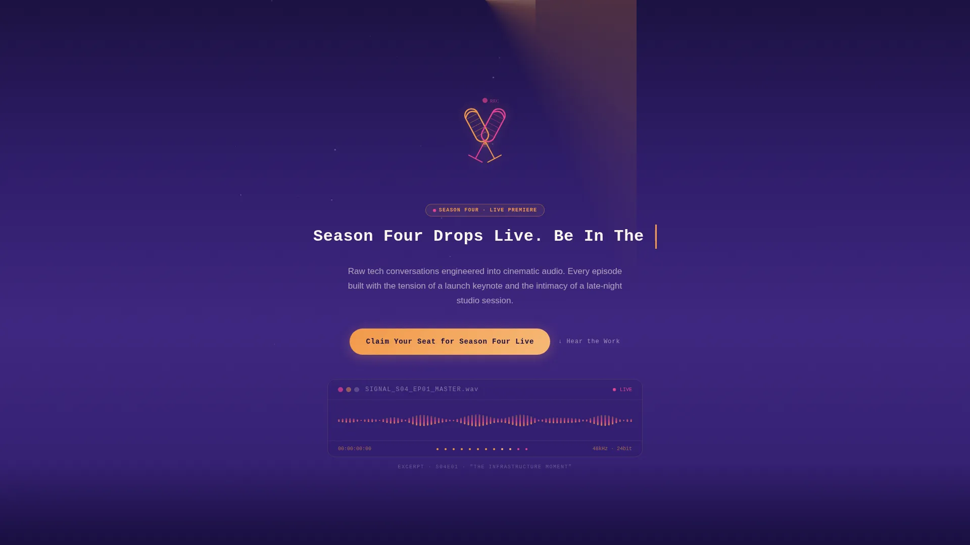
- A cinematic Spotlight header with crossed studio microphones, animated dust particles, a live-play waveform preview, and a self-typing headline
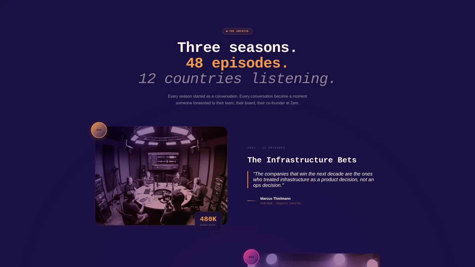
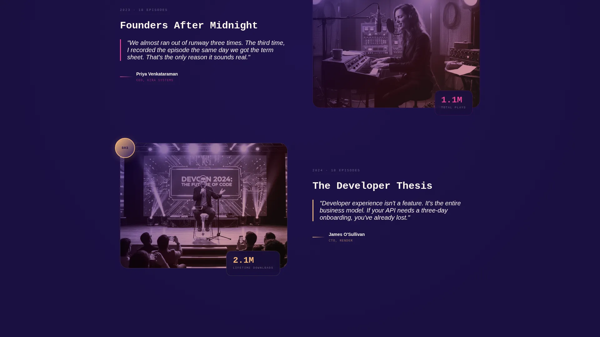
- A seasonal scroll narrative with past-season quote moments in oversized typography, duotone guest photography, and single-stat callouts (for example: 2.1M downloads, 48 episodes, 12 countries)
- A dual-call to action registration system: a sticky bottom bar after the header, a full-width section before the footer, a three-field event form, a countdown clock in magenta, and a secondary single-field email subscribe path
Feature list
Signal's feature set is built around one idea: let the audio do the selling, then give the visitor a clear path to act.
Cinematic Spotlight Header
A single overhead amber cone cuts through broadcast purple darkness, illuminating two crossed studio microphones. Dust particles drift through the beam. Below the mics, a real waveform snippet animates and plays automatically at page load. The headline types itself in a monospaced font. No navigation is visible until the visitor begins scrolling, keeping focus entirely on the opening moment.
Scroll-Triggered Sunset Gradient
The background gradient shifts position as the visitor scrolls. Purple dusk anchors the top of the page. Amber midtones warm the middle sections. Magenta highlights activate on hover states and call to action buttons. The page breathes like a slow sunset, guiding mood as the story moves from archival past seasons toward the live upcoming event.
Seasonal Moment Story Arc
Each scroll section surfaces a past season as a distinct moment: one key episode quote in massive typography, a guest photo treated in duotone purple-amber, and a single standout stat. Past seasons feel warm and archival. The current season feels unfinished and electric. The contrast builds forward momentum toward the event registration section.
Countdown Clock and Sticky call to action Bar
A magenta countdown clock ticks beside the primary call to action, making the live event date tangible. After the header, a sticky bottom bar carries the "Claim Your Seat for Season Four Live" button on every scroll. The urgency is structural, not just rhetorical, because the event date is fixed and the clock is always visible.
Dual-Path Registration Flow
The primary event form collects first name, email address, and a dropdown asking "How do you listen?" with options for Apple Podcasts, Spotify, YouTube, RSS, and First time. A secondary path labeled "Subscribe to the Feed Instead" captures a single email field for visitors who are interested but not ready to attend, so no warm lead leaves the page empty-handed.
Neo-Retro Typography and Waveform Accents
Monospaced headline type references broadcast equipment panels and vintage liner notes. Waveform graphics appear as both functional audio elements and decorative section dividers. The overall typographic system feels like it belongs on a limited-edition vinyl sleeve, giving the production company a visual voice that matches the quality of its audio work.
Page sections overview
| Section | Purpose |
|---|---|
| Spotlight Header | Opens with cinematic microphone visual, auto-playing waveform, and self-typing headline |
| Sticky call to action Bar | Locks "Claim Your Seat" button into view after the header on every scroll |
| Season One Moment | Surfaces past season quote, duotone guest photo, and download stat |
| Season Two Moment | Continues archival story arc with episode quote and listener stat |
| Season Three Moment | Closes the retrospective arc, warming toward the live upcoming season |
| Season Four Teaser | Presents the upcoming season as electric and unfinished, building urgency |
| Event Registration Section | Full-width form with countdown clock and three-field registration flow |
| Secondary Subscribe Path | Single email field for visitors not ready for the live event |
| Footer | Closes the page with brand identity |
Design & branding system
Signal's visual identity follows a Neo-Retro theme that treats broadcast history as a design language. The palette and typography work together to evoke a VU meter peaking at golden hour.
- Color system uses four values: deep broadcast purple (#2D1B69) for dark backgrounds, analog warmth amber (#F2994A) for the spotlight and midtones, hot mic magenta (#E84393) for hover states and active call to action buttons, and faded tape-deck cream (#FDF6EC) for all text surfaces
- Typography relies on a monospaced font for headlines, referencing studio equipment readouts and vintage liner notes, while supporting body text stays legible against the gradient backgrounds
- Duotone photography treatment applies the purple-amber palette to guest images, so every visual element reinforces the same two-tone broadcast aesthetic
Mobile & speed optimization
The template is designed to maintain its immersive quality across screen sizes without sacrificing the animated and gradient-heavy visual system. Mobile layout decisions preserve the emotional arc of the scroll experience.
- The gradient system and scroll-breathing background are structured to reflow naturally on smaller viewports without breaking the visual mood
- The sticky call to action bar remains functional on mobile, keeping the event registration button accessible at every point in the scroll journey
- The waveform header and countdown clock components are sized to remain readable and impactful on portrait-orientation phone screens
How this template helps you convert
Signal earns the click by making quality audible before making it legible. The conversion path is layered so it catches visitors at different levels of intent.
- The auto-playing waveform in the header delivers an immediate proof-of-quality moment before any copy is read, reducing skepticism early and priming the visitor to trust the production standard
- The seasonal scroll arc builds credibility through real stats and past-season moments, so by the time the visitor reaches the registration section they have already been shown the track record
- The dual-path call to action system captures both high-intent visitors ready to claim a live event seat and lower-intent visitors who prefer a simple feed subscription, so the page converts across two distinct audience states without friction
Other information about this template
Signal is a strong fit for production studios preparing a seasonal content calendar and needing a single destination to anchor their launch. The template is built for the Media and Entertainment category within the Content Creator Niches subcategory, specifically serving the Technology Podcast Production Company niche.
- The Seasonal/Moment creative direction means the template structure is intentionally time-anchored. It is designed around a live premiere event and a defined countdown, so it works best when deployed ahead of a real season launch
- The full-width immersive template style means there are no sidebar columns or grid-based content blocks. Every section stretches edge to edge, reinforcing the cinematic quality of the brand
- The Event Registration landing page direction means the page is optimized around one primary action: getting a visitor to claim a seat. The secondary subscribe path exists to support that goal, not to compete with it
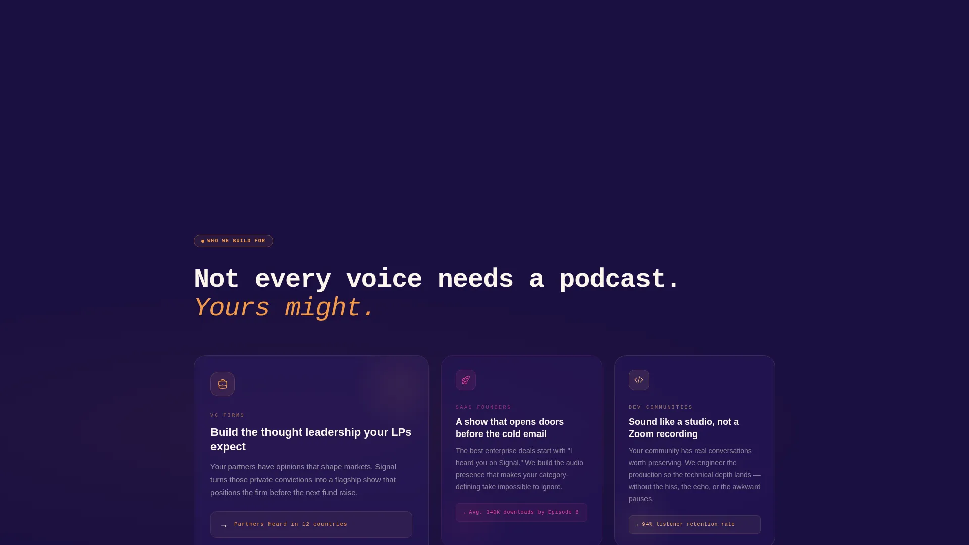
- The template supports the storytelling needs of production companies whose clients include venture capital firms building thought leadership content, SaaS founders running flagship interview shows, and developer communities producing audio series
Theme
Neo-Retro
Creative direction
Seasonal/Moment
Color system
Sunset Gradient
Style
Full-Width Immersive
Direction
Event Registration
Page Sections
Cinematic Spotlight Header with Live Waveform
Scroll-driven Sunset Gradient Background
Seasonal Moment Story Arc
Countdown Clock and Sticky Call to Action Bar
Dual-path Event Registration Flow
Neo-retro Typography and Waveform Accents
Related questions
Who is this landing page template built for?
Can I use this template if my podcast does not have a live event planned?
What does the registration form collect from visitors?
Does the waveform in the header play real audio?
How does the scroll experience change the visual mood?