Telecom SEO Agency Landing Page Template
Signal is a dark immersive landing page template built for telecommunications SEO agencies. It uses a masonry grid layout, a void-black and deep-violet color system, and a manifesto-style header to communicate authority fast. The template drives partnership conversions through two clear paths: a telecom SEO audit request form and a gated SERP landscape report download.
by Rocket studio
Quick summary
Signal is a single-page masonry landing page template for telecom-focused SEO agencies. It opens with a full-screen manifesto header set over an aerial dusk photograph, then moves visitors through a provocative grid of statistics, case study tiles, and conversion cards. The layout is built to turn enterprise buyers and procurement teams into qualified audit leads.
Who this template is for
This template is built for agencies and consultants who help telecom companies win organic search visibility. It speaks directly to the niche where infrastructure credibility meets digital marketing.
- SEO agencies specializing in fiber providers, regional internet service providers, and wireless or MVNO clients
- Telecom marketing consultants pitching enterprise buyers and municipal procurement teams
- Fiber-to-the-home startups and MVNO marketing directors looking to establish a credible digital agency presence
What problem this template solves
Telecom infrastructure companies are often technically strong but digitally invisible. A generic agency template cannot communicate the stakes of enterprise search intent. Signal is built to fix that gap.
- Regional internet service providers and fiber startups lose search ground to national carriers without a strong organic presence
- Standard agency portfolio pages fail to speak the language of procurement teams or enterprise IT buyers
- Most landing page templates lack the visual weight needed to position an agency as a specialist, not a generalist
What you get with this template
Signal delivers a complete single-page layout that argues a point, builds credibility, and pushes visitors toward a decision. Every section earns its place.
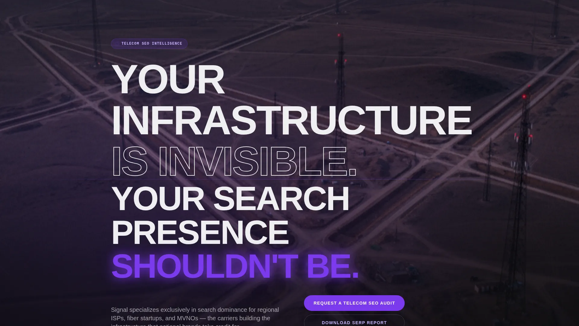
- A full-screen Type Over Image manifesto header with stacked sans-serif display text and a slow-panning aerial background
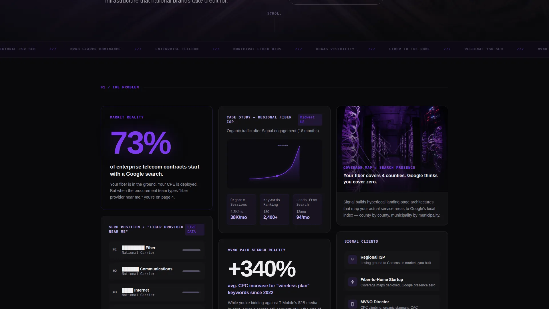
- A masonry grid of provocation cards covering SERP data, competitor dominance visuals, case study traffic curves, and a violet-lit audit request card
- Two distinct conversion paths: an audit request form and a gated downloadable report, each targeting different stages of buyer readiness
Feature list
Signal's built-in components are specific to the telecommunications SEO agency use case. Each one is designed to move a skeptical enterprise buyer forward.
Manifesto Header with Type Over Image
The header fills the entire viewport with an aerial dusk photograph of cell towers and fiber trenches. Enormous stacked sans-serif text reads "YOUR INFRASTRUCTURE IS INVISIBLE. YOUR SEARCH PRESENCE SHOULDN'T BE." The word "INVISIBLE" is knocked out to reveal the image underneath. "SHOULDN'T BE" glows in deep spectrum violet. No navigation appears until the visitor begins to scroll.
Masonry Provocation Grid
The grid layout is deliberately uneven, creating visual tension as visitors scroll. Cards shift progressively from problem statements to proof to philosophy. One card displays a competitor search engine results page with redacted brand names. Another presents a single statistic in massive type. A third shows a regional fiber company's organic traffic curve bending upward. Violet accent intensity increases toward the bottom of the grid, simulating rising signal strength.
Inline Audit Request Card
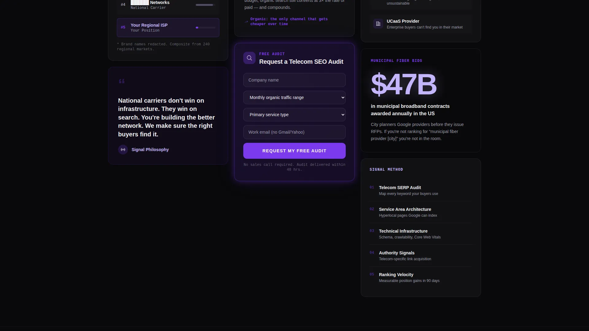
A violet-lit card breaks the masonry pattern and acts as an embedded call to action. The form collects company name, monthly organic traffic range via dropdown (under 10K, 10K to 100K, or 100K and above), primary service type (fiber, wireless, MVNO, or UCaaS), and a work email address. Personal Gmail addresses are not accepted by design, keeping the lead pool qualified.
Gated SERP Landscape Report
A secondary conversion path offers a downloadable Telecom SERP Landscape Report. The gate requires only an email address and company name, lowering friction for buyers who are not yet ready to request an audit. This path captures and qualifies leads at an earlier stage of their decision process.
Persistent Mobile Audit Bar
On mobile screens, the primary call to action appears as a fixed bottom bar reading "Request a Telecom SEO Audit." The bar stays visible as visitors scroll, keeping the conversion action accessible without interrupting the reading experience.
Void and Violet Color System
The entire template runs on a four-color palette: void black (#09090B) as the dominant background, deep spectrum violet (#7C3AED) for calls to action and hover states, cathode-ray phosphor (#C4B5FD) for subheadings and card borders, and signal-white (#EEEEF0) for all primary body text. The system is self-contained and consistent across every card, section, and interactive element.
Page sections overview
| Section | Purpose |
|---|---|
| Manifesto header | Establishes agency positioning with a full-screen Type Over Image statement |
| Masonry provocation grid | Moves visitors from problem awareness through proof and agency philosophy |
| SERP dominance card | Shows competitor search visibility data with redacted brand names |
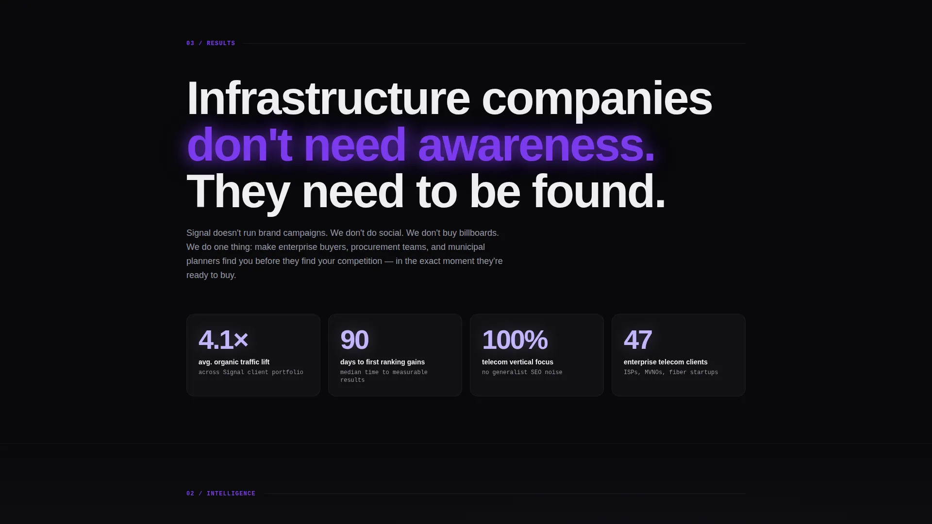
| Statistics card | Presents a single high-impact data point in oversized type |
| Case study tile | Displays a regional fiber client's organic traffic growth curve |
| Audit request card | Embedded form card capturing qualified partnership leads |
| SERP report gate | Secondary download path for earlier-stage buyers |
| Mobile audit bar | Persistent bottom call-to-action bar for mobile visitors |
Design & branding system
Signal's visual identity is built around the feeling of fiber optic infrastructure: absolute darkness punctuated by precise bursts of violet light. Every design decision reinforces the agency's technical authority.
- Void black (#09090B) covers every background surface; deep spectrum violet (#7C3AED) lights up calls to action, hover states, and data highlights like nodes on a network map
- Cathode-ray phosphor (#C4B5FD) handles subheadings and card borders, glowing faintly against the dark to create depth without distraction
- Signal-white (#EEEEF0) provides high-contrast typography that stays clean and readable without competing with the violet accents
Mobile & speed optimization
The template is designed so the mobile experience matches the intent of the desktop layout. The layout shifts cleanly to a single-column flow without losing the visual weight of the masonry grid.
- The persistent bottom audit bar keeps the primary call to action visible on mobile screens throughout the full scroll
- The masonry grid reflows for smaller viewports, preserving the card sequence and the progressive shift from problem to proof
- The header photograph and oversized text scale correctly across screen sizes, maintaining the immersive manifesto effect
How this template helps you convert
Signal is built around two distinct conversion paths, each calibrated to a different buyer stage. The layout removes friction without removing qualification.
- The audit request form sits inside the masonry grid as a pattern-breaking violet card, catching visitors at peak engagement when they have already absorbed the problem, the proof, and the philosophy.
- The gated SERP Landscape Report download captures leads who are still in research mode, qualifying them with minimal fields while delivering immediate value.
Other information about this template
Signal is categorized under Portfolio and Agency templates with a specific focus on the telecommunications marketing and agency subcategory. A few additional details worth noting before you customize:
- The template style is Masonry and Pinterest layout, meaning the grid is asymmetric by design and intentional visual tension is a feature, not a flaw
- The creative direction is Manifesto, so the scroll experience is structured as a progressive argument rather than a traditional agency showcase
- The landing page direction targets Partnership and business-to-business conversions, making it most effective when the visitor is a marketing director, procurement officer, or agency evaluator
- The Intersection Match Score for this template's category, subcategory, and niche alignment is 13, indicating a tightly matched use case
Theme
Dark Immersive
Creative direction
Manifesto
Color system
Void & Violet
Style
Masonry/Pinterest
Direction
Partnership/B2B
Page Sections
Manifesto Header with Knockout Typography
Masonry Provocation Grid
Qualified Audit Request Form
Gated SERP Landscape Report
Persistent Mobile Audit Bar
Void and Violet Color System
Related questions
Who is the Signal template designed for?
Can I customize the form fields in the audit request card?
What is the gated SERP Landscape Report download?
Does the dark background theme apply to every section?
Is Signal built as a single-page layout?



