LinkedIn Marketing Agency Landing Page Template
Signal is a single-page landing page template built for LinkedIn marketing agencies. It combines a scroll-jacked animated header, layered creator spotlight cards, and a resource-led conversion flow. Designed with a Void and Violet color system, it turns proof-heavy storytelling into a seamless path from curiosity to download, targeting B2B founders, marketing leads, and consultants.
by Rocket studio
Quick summary
Signal is a bold, overlap-layered landing page template for LinkedIn marketing agencies. It opens with a scroll-jacked simulated feed, moves through client transformation cards, and drives conversions via a free playbook download and a persistent profile audit bar. The design runs on a deep Void and Violet palette with phosphor white type throughout.
Who this template is for
This template is built for agencies that manage and grow LinkedIn presence for B2B clients. It speaks directly to the kinds of buyers who already understand the platform but want proof before they commit.
- LinkedIn marketing agencies presenting services to B2B founders and marketing directors
- Solo consultants and boutique firms positioning thought leadership as a core deliverable
- Agency teams needing a polished, proof-first landing page to replace a generic website
What problem this template solves
Most agency landing pages tell visitors what they do. Signal shows what actually happened. B2B decision-makers are skeptical by default, and a list of services rarely moves them. The template is designed around evidence, not assertions.
- Founders with strong businesses but invisible LinkedIn profiles need to see transformation, not promises
- Marketing directors under pressure to produce CEO thought leadership need a credibility shortcut
- Agencies lose leads when their page asks for commitment before delivering proof
What you get with this template
Signal delivers a fully structured, single-page layout with every section pre-built for agency storytelling. From the animated header through to the conversion bar, every component serves the proof-first narrative.
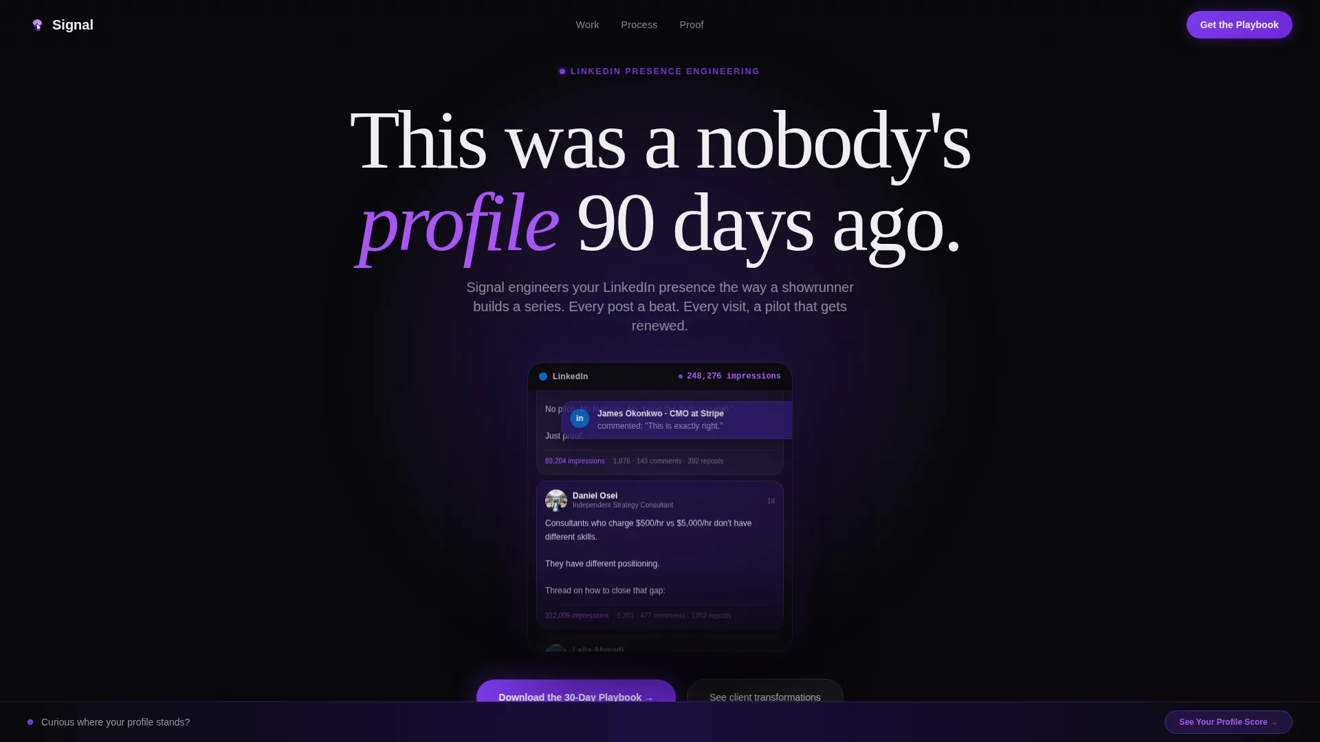
- A scroll-jacked header with a simulated LinkedIn feed, live engagement counters, and a toast notification moment
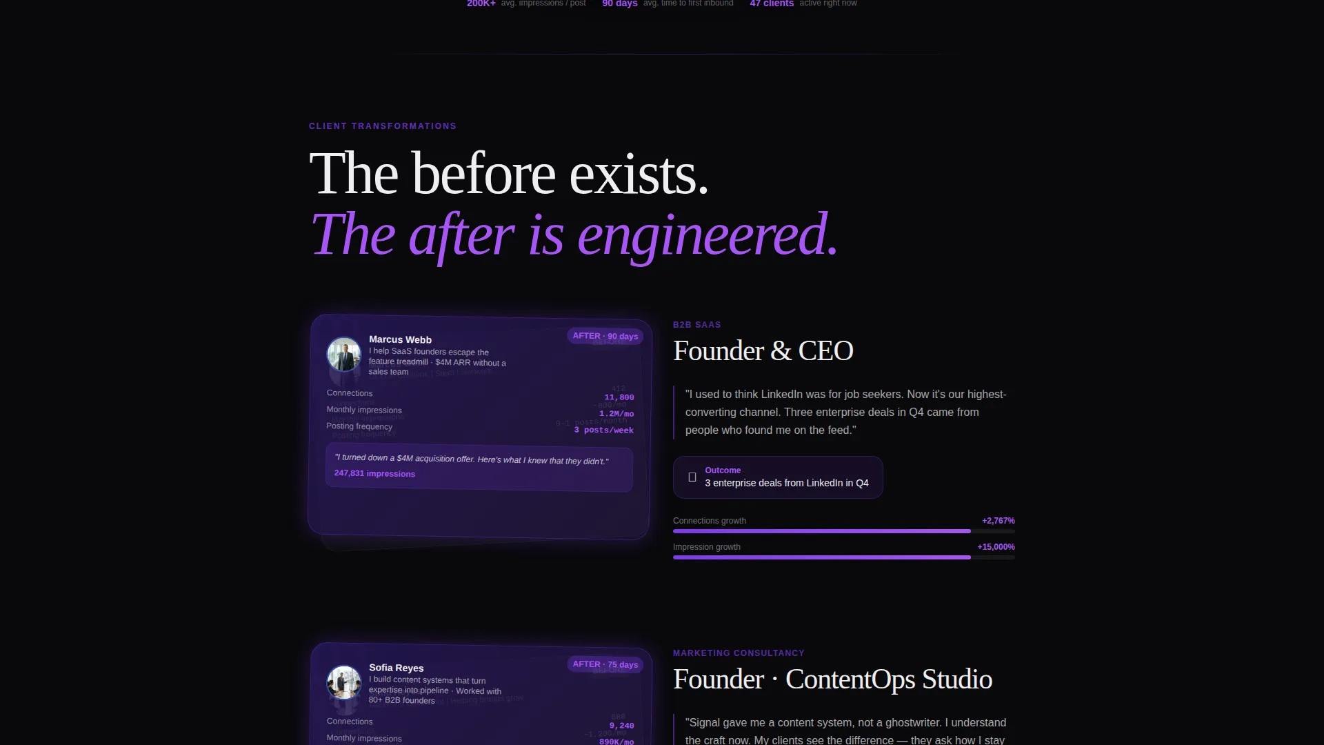
- Layered before-and-after creator spotlight cards with post screenshots, follower graphs, and impression counts
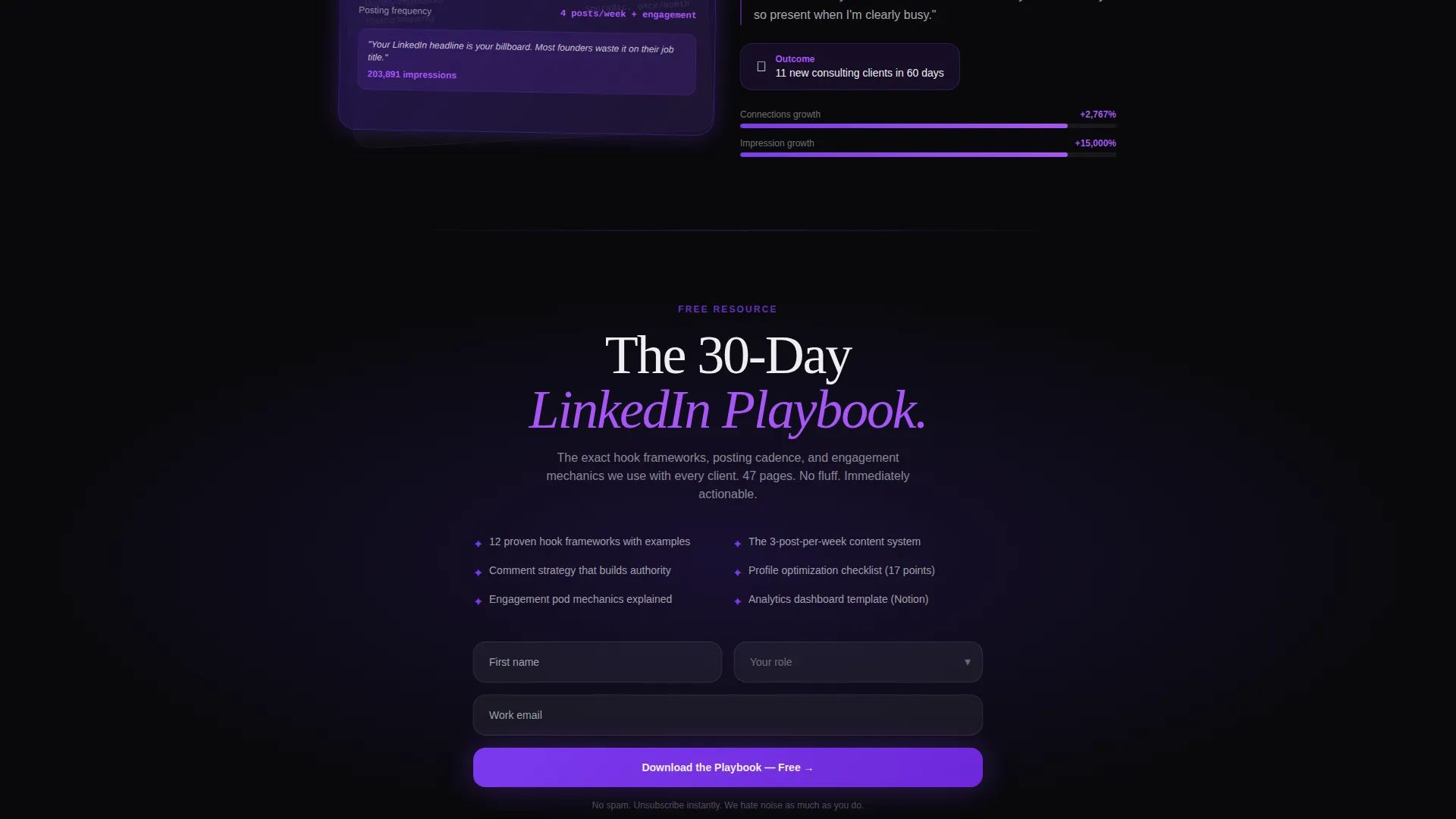
- A dual conversion system: a three-field playbook download form and a persistent bottom bar linking to a profile audit tool
Feature list
This template packages agency storytelling tools into a single cohesive layout. Each feature is designed to move a skeptical B2B buyer from passive scroll to active conversion.
Scroll-Jacked Animated Header
The viewport locks on load as a simulated LinkedIn feed scrolls autonomously behind a frosted-glass frame. Posts blur upward until one snaps into focus. Engagement counters tick upward in real time, and a Fortune 500 VP connection request appears as a toast notification. A single phosphor white headline materializes over the feed.
Layered Creator Spotlight Cards
Each spotlight section is a stacked card design. A faded before-profile card sits underneath, partially visible, while the after-card overlaps it at an angle. The new headshot, updated headline, and content cadence are shown on the front card. Real post screenshots and before-and-after follower graphs reinforce every transformation story.
Proof-Led Content Sections
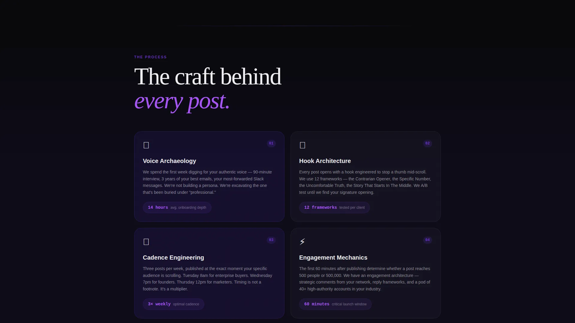
Scrolling deeper than the spotlight cards reveals the craft behind each result. Ghostwriting process breakdowns, hook frameworks, engagement mechanics, and analytics dashboards with violet-highlighted growth curves are all shown. This turns the page into a portfolio-grade display of methodology, not just outcomes.
Dual Conversion Path Design
The primary call to action is a three-field form: first name, company role via dropdown (Founder, Marketing Lead, Consultant, Other), and work email. It is positioned after the second creator spotlight when credibility is highest. A secondary persistent bottom bar stays visible on scroll, linking to a free LinkedIn profile audit tool.
Void and Violet Visual System
The color system uses absolute void black, deep ultraviolet, electric violet, and phosphor white. Backgrounds recede, violet panels float forward with layered shadow depth, and white type cuts through cleanly. The overall effect is a phone screen glowing in a dark room, which mirrors the exact moment the target audience encounters high-performing LinkedIn content.
Physical Depth and Overlap Layout
Sections do not sit flat. Each layer literally overlaps the previous one, creating a glass-desk portfolio effect as the visitor scrolls. This overlap-and-peel visual structure reinforces the before-and-after narrative and makes the page feel like a crafted artifact rather than a standard scrolling site.
Page sections overview
| Section | Purpose |
|---|---|
| Scroll-Jacked Header | Opens with a simulated live LinkedIn feed and a single transformative headline |
| Toast Notification Moment | Shows a Fortune 500 VP connection request appearing as a real notification |
| First Creator Spotlight | Introduces client one with layered before-and-after profile cards |
| Playbook Download call to action | Three-field form offering the 30-Day LinkedIn Playbook after peak credibility |
| Second Creator Spotlight | Reinforces proof with a second client transformation and impression data |
| Craft and Process Section | Reveals ghostwriting flow, hook frameworks, and engagement pod mechanics |
| Analytics Dashboard View | Displays violet-highlighted growth curves and real impression counts |
| Persistent Audit Bar | Bottom bar prompting visitors to get a free LinkedIn profile score |
Design & branding system
The Void and Violet color system creates a specific emotional context. The palette feels like a phone screen glowing at 11 pm, which is precisely when the target audience scrolls LinkedIn and discovers content that changes their perception of what is possible.
- Colors: absolute void black (#09090B), deep ultraviolet (#2D1B69), electric violet (#7C3AED), and phosphor white (#EEEEF0)
- Stacked card depth: void backgrounds recede, violet panels layer forward with shadow, white type reads like a cursor on a blank compose window
- Lens and Frame theme: the frosted-glass overlay, simulated feed frame, and spotlight card angles all reinforce a cinematic, viewfinder-style visual language
Mobile & speed optimization
The template is designed with layered visual depth and scroll-jacked animation, both of which are implemented to work within a single-page layout structure. The persistent bottom bar and form remain accessible regardless of where a visitor is on the page.
- Overlay cards and frosted-glass elements are styled to maintain visual hierarchy on smaller screens
- The three-field conversion form is minimal by design, reducing friction across all device sizes
- The persistent audit bar stays visible on scroll, keeping the secondary conversion path reachable at all times
How this template helps you convert
Signal earns the conversion before it asks for one. The page builds credibility through specific, visual proof at every scroll depth, then presents the download offer at exactly the right moment.
- The scroll-jacked header creates an immediate emotional hook by showing a real profile transformation in motion, pulling the visitor into the narrative before a single word of copy is read.
- Layered creator spotlights with real screenshots, impression counts, and follower graphs provide the kind of evidence that moves skeptical B2B buyers, making the playbook download feel like a logical next step rather than a risk.
- The persistent profile audit bar gives hesitant visitors a zero-commitment entry point, capturing their LinkedIn URL and email through a free tool that still serves the agency's lead generation goal.
Other information about this template
Signal is built on the Lens and Frame visual theme with a Creator Spotlight creative direction. It is categorized under Portfolio and Agency, specifically within the Social Media and Influencer Agency subcategory. The niche focus is LinkedIn marketing, and the template style is Overlap and Layered with a Content and Resource landing page direction. The header concept is a Scroll-Jacked Experience. This combination of intersection context fields makes Signal a highly specific fit for agencies selling LinkedIn growth services to B2B audiences.
- The template is purpose-built for the LinkedIn marketing agency niche, not a generic social media agency layout
- The intersection match score for this template's category, subcategory, and niche combination is 13, reflecting a tightly aligned use case
- All visual and structural decisions in Signal are derived from the Void and Violet color system and the Lens and Frame theme, which are defined at the intersection level
Theme
Lens & Frame
Creative direction
Creator Spotlight
Color system
Void & Violet
Style
Overlap/Layered
Direction
Content/Resource
Page Sections
Scroll-jacked Animated Header
Layered Before-and-after Spotlight Cards
Proof-led Process Sections
Dual Conversion Path System
Void and Violet Color System
Physical Depth Overlap Layout
Related questions
Who is Signal built for?
What is the primary conversion goal of this landing page?
Can I edit the creator spotlight cards to show my own client results?
Does the template include the simulated LinkedIn feed animation?
What makes Signal different from a standard agency landing page?



