Data Scientist LinkedIn Optimization Landing Page Template
Signal is a precision-built landing page template for data scientist LinkedIn profile optimization services. It combines an asymmetric 60/40 grid layout with an animated ink illustration hero, before-and-after transformation spotlights, typographic interstitials, and a three-field lead capture form. The Ink and Paper visual identity delivers editorial authority from the first scroll, turning profile audit sign ups into a repeatable, trust-driven sales process.
by Rocket studio
Quick summary
Signal is a single-page landing page template built specifically for LinkedIn profile optimization services targeting data scientists. It pairs a hand-drawn ink animation hero with a Creator Spotlight narrative, accumulating social proof across a 60/40 asymmetric grid. Every section is designed to move a skeptical, technically minded visitor from curiosity to conversion, ending at a frictionless three-field audit request form.
Who this template is for
This template is built for coaches, consultants, and specialists who help data science professionals rewrite their LinkedIn profile and get seen by the right hiring managers. It suits solo practitioners and boutique agencies operating in the career services and personal branding space.
- LinkedIn profile optimization consultants serving mid-career data scientists and senior machine learning engineers
- Career coaches working with PhD graduates who need to translate academic language into industry-ready positioning
- Digital marketing professionals running lead generation campaigns for professional services in the tech sector
What problem this template solves
Most LinkedIn optimization services struggle to earn trust fast. A generic page with no specific proof, no before-and-after context, and no emotional connection fails to convert technically sophisticated visitors who can spot a vague promise immediately. The real pain points go deeper than aesthetics: job seekers in data science need to see that a service understands their world before they hand over their profile URL.
- Visitors arrive skeptical and need immediate, specific social proof before they consider signing up
- The typical landing page has no message match for data scientists, so the user journey stalls before the call to action
- Without a clear demonstration of transformation, hiring managers and recruiters remain the invisible audience, and the visitor never feels the stakes
What you get with this template
Signal delivers a complete, ready-to-customize landing page with every section already structured for high conversion rates. You are not assembling pieces from scratch. The layout, the narrative flow, the lead capture form, and the visual system all arrive pre-built so you can focus on adding your actual client data.
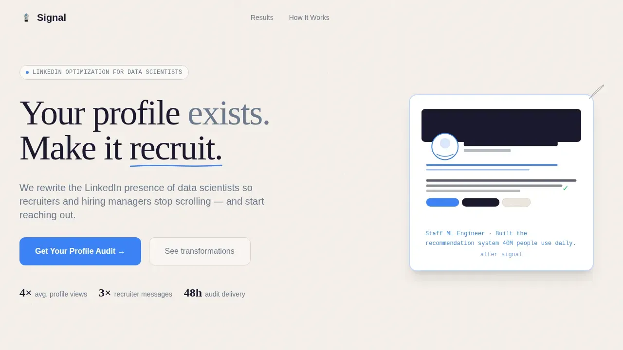
- A 60/40 asymmetric grid with animated hero, transformation spotlights, typographic interstitials, a three-step how-it-works block, and a three-field audit request form
- A full Cloud Canvas color system using parchment white, fountain-pen black, graphite, and signal blue, paired with Fraunces serif display headlines, DM Sans body text, and JetBrains Mono for metadata
- SVG path-drawing ink animation on hero load, scroll-triggered section reveals, sticky call to action on scroll, and hover states on spotlight cards
Feature list
This section covers the core capabilities built into the Signal landing page template.
Animated Ink Illustration Hero
The hero opens with a four-second SVG path-drawing animation. A generic LinkedIn profile card is sketched line by line, then crumpled and redrawn into a sharper version. A fine-tip pen traces a data-scientist-specific headline in real time. The animation uses CSS-driven ink-draw techniques so it plays smoothly without heavy JavaScript overhead. The call to action appears beneath the animation once it completes, capturing visitor attention at the most critical moment on the page.
60/40 Asymmetric Transformation Grid
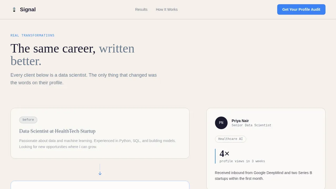
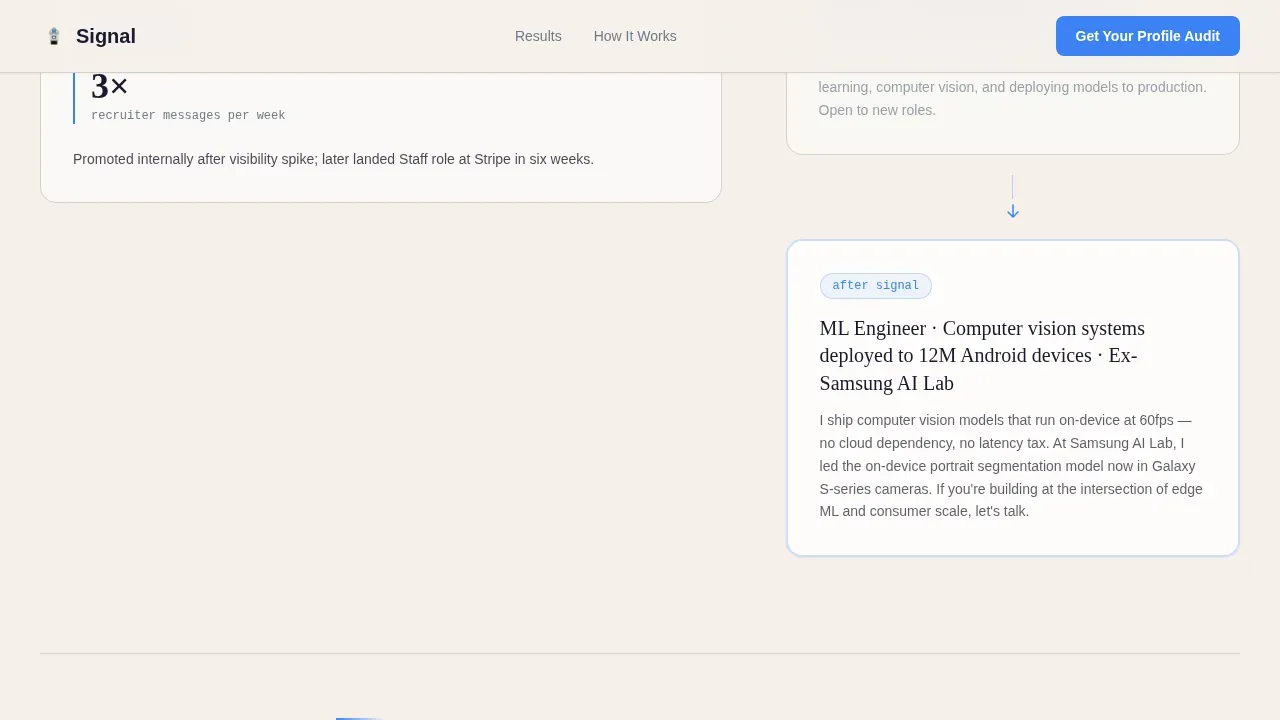
The wider left column of each grid row holds a before-and-after LinkedIn profile headline and summary rewrite. The narrower right column holds a client spotlight: role, industry, and a specific metric such as profile views up four times, inbound connection requests tripled, or a role landed in six weeks. The accumulating seniority structure means each spotlight is slightly more senior than the last, so visitors naturally locate themselves in the progression.
Typographic Interstitials
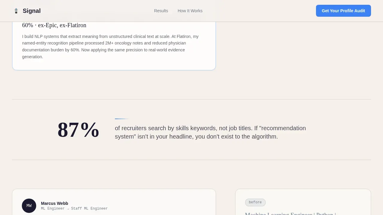
Between each client spotlight, sharp single-observation callouts appear in fountain-pen black on parchment white. These interstitials share recruiter insights, explain how LinkedIn's algorithm ranks profiles, and challenge weak headline habits. They serve as typographic landing page trust signals that sustain momentum between transformation examples without needing images or icons.
Three-Field Lead Capture Form
The lead capture form uses only three fields: current LinkedIn profile URL, current job title, and a single dropdown asking about the visitor's goal. Options in the dropdown include landing a new role, attracting freelance clients, and building thought leadership. Simplifying conversion forms to the fewest possible fields reduces friction and improves conversion rates. The form drives sign ups toward a free personalized audit delivered as a video within 48 hours.
Sticky Call to Action on Scroll
A signal-blue call to action button labeled "Get Your Profile Audit" appears first beneath the hero animation and then persists as a sticky element throughout the scroll. This keeps the primary action visible at every point in the user journey, so visitors never have to scroll back up to convert. Effective landing pages keep only one element as the persistent action anchor, and this template follows that best practice precisely.
Scroll-Triggered Section Reveals
Each section enters the viewport through Intersection Observer-powered scroll reveals. This technique keeps the page feeling deliberate and editorial. It also prevents the page from feeling overwhelming on first load, guiding user behavior section by section rather than presenting everything at once.
Page sections overview
| Section | Purpose |
|---|---|
| Animated Hero Block | Opens with ink animation and primary call to action |
| Transformation Grid Row 1 | Before/after headline rewrite plus junior client spotlight |
| Typographic Interstitial 1 | Recruiter insight callout on headline visibility |
| Transformation Grid Row 2 | Before/after summary rewrite plus mid-career spotlight |
| Typographic Interstitial 2 | Insight on LinkedIn's algorithm and profile ranking |
| Transformation Grid Row 3 | Before/after full rewrite plus senior engineer spotlight |
| Typographic Interstitial 3 | Observation on why vague copy kills recruiter outreach |
| How It Works | Three-step process: Audit, Rewrite, Results |
| Lead Capture Form | Three-field audit request with goal dropdown |
| Footer Block | Linear single-row footer with minimal links |
Design & branding system
The Ink and Paper visual identity treats every pixel like a typeset résumé printed on heavyweight cotton stock. The Cloud Canvas color system uses restraint as its primary design tool: one background tone, one text tone, one secondary tone, and one accent. Nothing competes with the content.
- Parchment white (#F5F0EB) as the full-page background; fountain-pen black (#1A1A2E) for all headlines and body text; muted graphite (#6B7B8D) for secondary copy, metadata, and timestamps; signal blue (#3B82F6) reserved exclusively for calls to action, links, and interactive highlights
- Fraunces serif for display headlines to deliver editorial weight; DM Sans for body and interface text for clean readability; JetBrains Mono for code-style metadata elements like profile URLs and role labels, reinforcing the data science context
- The illustration style is architectural and precise, using thin ink strokes on cream rather than generic stock photos or playful icons, so the brand identity reads as technically credible from the first frame
Mobile & speed optimization
Signal is designed desktop-first because LinkedIn power users research services on desktop, but the layout is fully responsive for mobile devices. The asymmetric grid collapses gracefully to a single-column flow on smaller screens, and all interactive elements scale for touch. Mobile speed is supported by keeping animations CSS-driven rather than script-heavy.
- SVG path animations and CSS-driven ink draws keep page performance high without sacrificing the visual richness of the hero; it is good practice to compress images and use vector formats wherever possible to protect mobile speed
- Intersection Observer scroll reveals load only what is in the viewport, reducing unnecessary rendering work and keeping page performance consistent across mobile devices
- The sticky call to action uses large, easy-to-tap button sizing so visitors on mobile devices can convert without pinching or zooming
How this template helps you convert
Signal is built around a single conversion goal: capturing a qualified audit lead. Every section decision supports that goal without distraction. The "5-Second Hook" principle is embedded in the hero: visitors understand the unique value proposition within seconds of landing. A 1-second delay in page load speed can reduce conversions by 7%, so the template avoids heavy assets that slow the critical moment of first impression.
- The animated hero establishes a clear value proposition immediately, the sticky call to action keeps it accessible throughout scroll, and the three-field form removes every barrier between interest and sign up, creating a tight, high converting landing page that supports the full customer journey from first visit to booked audit.
- Social proof accumulates across three transformation spotlights with real role names, real industries, and specific metrics, so trust signals are embedded in the narrative rather than bolted on at the bottom. Client logos or media mentions can be added to further reinforce credibility for higher conversion rates.
- Typographic interstitials deliver valuable insights between spotlights, sustaining scroll momentum and reinforcing the service's authority, so visitors arrive at the capture forms already convinced rather than uncertain.
Other information about this template
Signal is a focused, professional template in the Personal and Resume category, built for the Data Scientist Profile subcategory and the Data Scientist LinkedIn Optimization niche. It is a purpose-built alternative to a generic page that tries to serve everyone. Below are additional context points useful for customization and deployment.
- The signal precision linkedin optimization landing page template is designed for B2B professional services where the sales process depends on trust, authority, and demonstrated results before pricing is revealed
- Effective landing page optimization for this service type means aligning your content strategy with the profile narrative: post ideas, consistent posting habits, and thought leadership content all reinforce the same positioning the optimized LinkedIn profile communicates
- The template supports the full landing page optimization workflow: set a baseline conversion rate, run A/B testing on headline copy and call to action labels, review performance data after each test cycle, and iterate; this is an ongoing process, not a one-time setup
- A/B testing (also called b testing in split-test tools) is a critical component of landing page optimization; test the hero headline, the dropdown options in the form, and the sticky call to action label to identify which elements drive the highest conversion rates
- Adding high quality images of actual client results or screen-recorded profile transformations as supplementary media can increase emotional connection and engagement; avoid generic stock photos, which undermine the editorial credibility the Ink and Paper theme establishes
- The description for this image approach used in the hero animation should be replicated in any supplementary visuals: a brief, precise caption in graphite text beneath each transformation screenshot gives context without cluttering the layout
- The landing page can support organic traffic from search, referral traffic from LinkedIn posts, and paid campaigns including google ads or linkedin ads, making it a versatile dedicated landing page for multiple acquisition channels; web traffic from any source lands on a page built to convert
- For digital marketing campaigns, maintaining message match between your ad copy and the landing page headline is essential; if your ad calls out "ML engineers stuck in the wrong title," the landing page headline should echo that language immediately
- Personal stories and personal branding elements, such as a profile picture with a background neutral enough not to distract, can be added to the consultant or coach bio section within the footer or alongside the how-it-works block
- Turning on Creator Mode on LinkedIn and aligning your own content strategy with the page's core message helps drive consistent referral traffic from job seekers and hiring managers who discover the service organically
- Revenue growth for a LinkedIn optimization service depends on converting cold visitors into audit leads efficiently; Signal's three-field form and sticky call to action are both designed to maximize the audit-to-paid-package conversion that powers that revenue growth
- The template follows best practices for high performing pages: a clear headline that grabs attention within three seconds, benefit-focused body copy that addresses real pain points, social proof embedded throughout, and capture forms kept to the minimum viable number of fields
- Tools such as Unbounce, Leadpages, and ConvertFlow can be used alongside this template structure when building and hosting a dedicated landing page for LinkedIn traffic, offering additional b testing and performance data capabilities
- The page is built as a good landing page in the strictest sense: it focuses on only one element as the primary conversion action, eliminates navigation distractions, and guides every user interaction toward the audit request
Theme
Ink & Paper
Creative direction
Creator Spotlight
Color system
Cloud Canvas
Style
Asymmetric Grid (60/40)
Direction
Lead Generation
Page Sections
Animated Ink Illustration Hero
60/40 Asymmetric Transformation Grid
Typographic Interstitial Callouts
Three-field Audit Request Form
Sticky Call to Action on Scroll
Scroll-triggered Section Reveals
Related questions
Who is Signal built for specifically?
Does the template include the animation, or do I need to build it separately?
Can I add my own client spotlights and real metrics?
Does this landing page support paid traffic from LinkedIn ads?
Is the three-field form the only lead capture mechanism?



