Telecommunications Marketing & Agency Specialist Portfolio Website Template
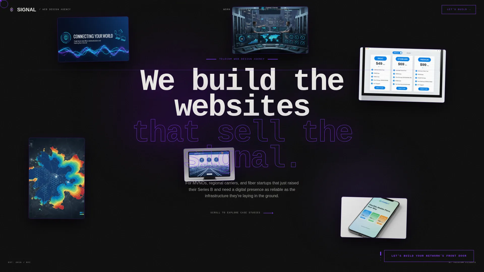
Signal is a horizontal scroll landing page template built for telecommunications web design agencies. It combines a Bold Brutalist visual identity with an Electric Indigo color system, floating device mockups, and a case study narrative layout. Designed to win VP-level and CTO-level clients, it moves visitors through proof, strategy, and a conversion-focused intake flow.
by Rocket studio
Quick summary
Signal is a single-page horizontal scroll template for telecom-focused web design agencies. It opens with floating browser mockups against a void-black background, then guides visitors through three full case studies. The layout is built for B2B partnership conversations with senior buyers at regional carriers, MVNOs (mobile virtual network operators), and fiber-optic startups.
Who this template is for
This template is built for agencies that specialize in designing and building digital experiences for telecommunications companies. It speaks directly to a B2B audience of senior decision-makers, not general visitors browsing portfolios.
- Web design agencies pitching VP-level marketing leads and CTOs at telecom companies
- Studio teams working with MVNOs launching new brands or regional carriers refreshing their presence
- Agency founders targeting fiber-optic startups that have just raised funding and need a credible digital front door
What problem this template solves
Generic agency portfolio templates fail to communicate the specialized, high-stakes nature of telecom web work. A carrier's VP of Marketing is not impressed by soft gradients and friendly rounded buttons. They need proof of competence at scale.
- Telecom buyers need to see real evidence of conversion lifts and session improvements, not just pretty screenshots
- Standard portfolio layouts bury the strategic thinking behind decorative project grids
- Most templates lack a structured path from first impression to qualified B2B lead capture
What you get with this template
Signal delivers a complete horizontal scroll landing page experience engineered for agency credibility and B2B lead generation. Every section has a defined job, and every visual decision reinforces seniority and confidence.
- A constellation header with six to seven floating browser mockups and device screens drifting with cursor parallax
- Three full case study panels moving left to right, each revealing client problem, strategic response, design system, and live results
- A dual conversion path: a three-question intake form for ready buyers and a gated PDF download for research-phase leads
Feature list
This template ships with a set of design and layout components built specifically for the telecom agency context. Each one is described below.
Floating Parallax Header
Six or seven browser mockups and device screens are suspended at varying z-depths against a void-black background. Each screen is cropped to its most visually striking moment, including hero animations, pricing grids, and coverage maps. The constellation drifts subtly as the cursor moves, creating immediate depth and visual authority.
Horizontal Scroll Case Study Narrative
Three complete telecom project case studies are laid out left to right, structured like panels in a graphic novel. Each case study moves from client problem to strategic response to exposed design system to live browser result with real metrics. Brutalist vertical dividers between panels display single oversized statistics to punctuate the proof.
Progressive Sticky Call to Action
A sticky call-to-action element anchored to the horizontal scroll track intensifies in color as the visitor progresses. It begins as a ghost-outlined button and transitions to a solid electric indigo fill by the final panel. The label reads "Let's Build Your Network's Front Door" and remains accessible throughout the scroll journey.
Three-Question Intake Form
The primary lead capture form asks three sequential questions: carrier type (MVNO, regional, fiber, or enterprise), current website URL with a "We're launching fresh" toggle, and preferred contact method. The sequenced format reduces friction and qualifies the lead before any sales conversation begins.
Gated PDF Lead Magnet
A secondary conversion path offers a downloadable report titled "The Telecom user experience Benchmark Report." It is gated behind a single business email field, capturing research-phase prospects who are not yet ready for a direct conversation but are actively evaluating their options.
Brutalist Divider Stats
Between each case study, a full-height vertical indigo bar slams into view with a single metric rendered in enormous type. These dividers serve as visual proof points, breaking the scroll rhythm to force attention on outcomes before the next project begins.
Page sections overview
| Section | Purpose |
|---|---|
| Floating Header Constellation | Establishes visual identity and agency positioning with drifting device mockups |
| Central Headline Block | Delivers the core brand statement in oversized brutalist mono type |
| Case Study One | Presents first telecom project with problem, strategy, design system, and results |
| Brutalist Stat Divider One | Punctuates first case study with a single oversized performance metric |
| Case Study Two | Presents second telecom project using the same narrative reveal structure |
| Brutalist Stat Divider Two | Punctuates second case study with a high-impact standalone metric |
| Case Study Three | Presents third telecom project with live browser frame and conversion data |
| Sticky call to action Element | Progressive call-to-action that intensifies from ghost to solid across the scroll |
| Intake Form Panel | Three-question sequential form qualifying carrier type and contact preference |
| PDF Lead Magnet Panel | Email-gated download capturing research-stage leads |
Design & branding system
Signal uses an Electric Indigo color system layered over a Bold Brutalist visual framework. Every palette and type choice is deliberate, referencing the industrial materiality of real telecommunications infrastructure.
- Four-tone palette: deep void black (#0D0D0D) for backgrounds, electric indigo (#4B0082) for section fills and hover states, crackling violet (#7C3AED) for accent lines and interactive affordances, and exposed concrete white (#E8E6E3) for body text and negative space
- Oversized brutalist mono typeface for headlines, with type specimens and color chips exposed inside each case study design system panel
- Visual language references a server room at midnight, with status-LED color logic and terminal-glow contrast ratios driving every visual decision
Mobile & speed optimization
The horizontal scroll mechanic is the centerpiece of this template's experience. The layout is structured to support that interaction cleanly across common viewing contexts.
- Horizontal scroll behavior is built as the primary navigation axis, with the sticky call-to-action element tracking scroll progress throughout
- Each case study panel is self-contained, so the layout remains coherent even when the scroll position is mid-journey
- The floating parallax header and brutalist dividers are designed to perform their visual function without relying on external media or bloated asset libraries
How this template helps you convert
Signal is built around two parallel conversion paths, each targeting a different stage of the B2B buying journey. The layout does not ask every visitor to do the same thing.
- The progressive sticky call-to-action builds commitment across the scroll, so by the time a visitor reaches the intake form they have already consumed three full case studies and a sequence of proof-point metrics.
- The gated PDF download captures email addresses from prospects in the research phase, turning early-stage interest into a qualified lead without requiring a sales call.
Other information about this template
Signal is a purpose-built template for a specific niche: web design agencies that serve the telecommunications sector. It is not a general-purpose agency portfolio. The entire layout, copy structure, and conversion architecture assumes that the buyer is a senior operator at a carrier, MVNO, or fiber startup.
- The template is categorized under Portfolio and Agency, with a subcategory focus on telecommunications marketing and agency work
- The horizontal scroll format is intentional and structural, not decorative. It mirrors the left-to-right narrative logic of a graphic novel, giving each case study room to breathe and build
- The Bold Brutalist theme is matched to the audience: senior telecom buyers respond to confidence and industrial precision, not soft consumer aesthetics
- The dual conversion path design reflects a real B2B buying pattern where some prospects are ready to engage and others need more evidence before making contact



Theme
Bold Brutalist
Creative direction
Case Study Narrative
Color system
Electric Indigo
Style
Horizontal Scroll
Direction
Partnership/B2B
Page Sections
Floating Parallax Header
Horizontal Scroll Case Study Panels
Progressive Sticky Call to Action
Three-question Intake Form
Gated PDF Lead Magnet
Brutalist Stat Dividers
Related questions
Who is this landing page template designed for?
What does the horizontal scroll layout actually do?
How does the template capture leads?
Can I customize the case study content and color system?
Is the sticky call-to-action always visible during the scroll?



