Regional & Specialty Restaurant Appointment Booking Website Template
Nabe is a shabu-shabu restaurant landing page template built around immersive, hand-drawn illustration and a single reservation call to action. The design follows a Japanese Zen color system with warm stone whites, hinoki wood tones, and ponzu amber accents. It guides visitors through a sensory scroll experience that makes the dining ritual feel tangible before they ever book a seat.
by Rocket studio
Quick summary
Nabe is a hero-dominant landing page template designed for a shabu-shabu restaurant. It uses Edo-period ink illustration, scroll-linked animation, and a focused click-through structure to turn first-time visitors into reservation bookings. Every section of the page performs a layer of the dining experience rather than simply listing menu information.
Who this template is for
This template is ideal for fine dining Japanese restaurant operators who want their online presence to match the craft of their food. It works equally well for new openings and established counters looking to refresh their digital identity.
- Shabu-shabu and hot pot restaurant owners who want a reservation-driven landing page
- Japanese restaurant groups showcasing seasonal menus and specialty proteins
- Hospitality designers creating a high-craft page for an intimate counter dining concept
What problem this template solves
Most restaurant landing pages describe the food rather than make visitors feel it. A generic page with stock images and a contact form rarely communicates the warmth of a shabu-shabu dinner. This template solves that by building the page as a sensory journey, each scroll step raising the temperature until clicking "Reserve Your Pot" feels like the natural next move.
- Visitors leave generic restaurant pages without booking because nothing creates urgency or desire
- Showcasing seasonal ingredients and specialty cuts is difficult without a purpose-built visual framework
- Counter-style Japanese restaurant experiences are hard to translate online without the right design language
What you get with this template
This template includes a complete set of illustrated sections, each mapped to a specific moment in the shabu-shabu experience. The design system is pre-configured and easy to apply across every section of the page.
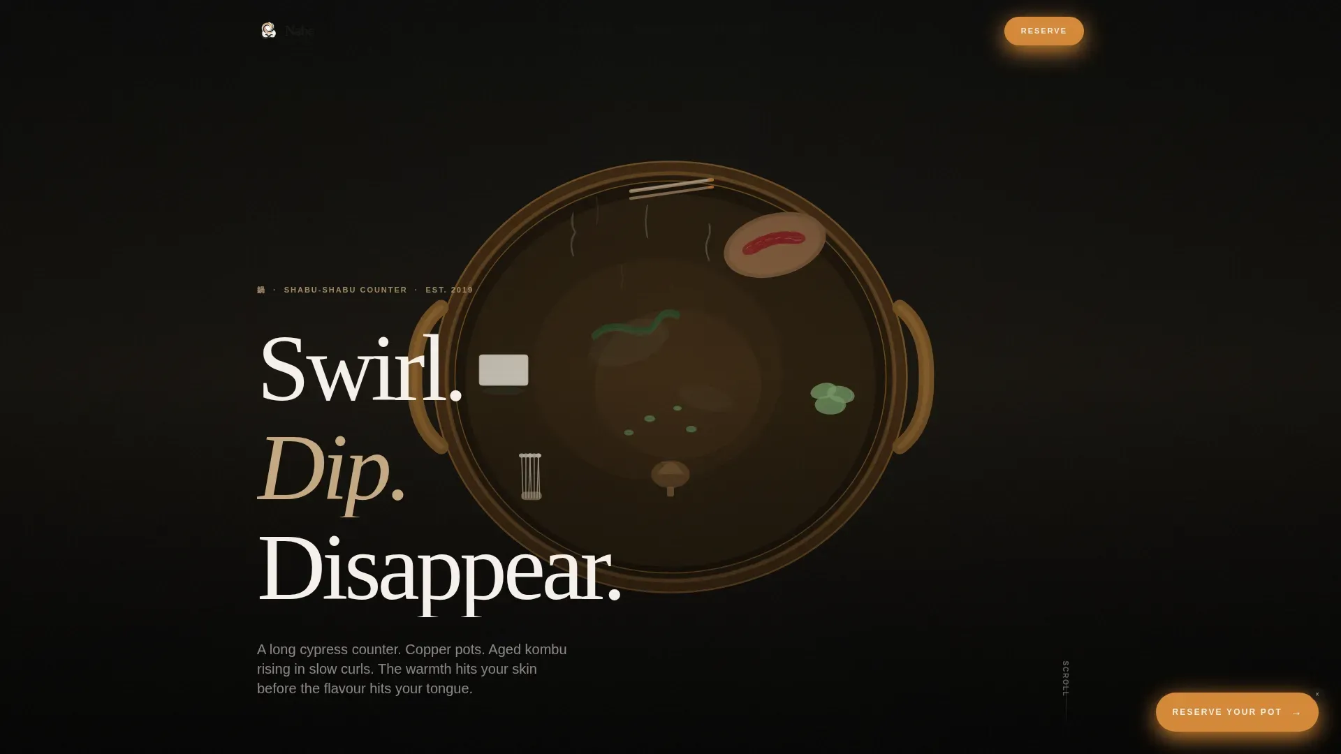
- A 90-viewport-height hero with a Studio Ghibli-meets-Edo-period copper pot illustration and animated steam
- Five sequential content sections covering broth, proteins, seasonal vegetables and noodles, dipping sauces, and a final reservation scene
- A clean, ultra-minimal footer using a horizontal flow layout with no visual clutter
Feature list
This landing page template is built around a tight set of design decisions that each serve the single conversion goal: getting visitors to reserve a seat.
Hero Illustration with Steam Animation
The hero fills ninety percent of the viewport with a hand-drawn ink-and-watercolor scene of a copper hot pot from above. Steam is rendered through soft SVG particle animations. The headline "Swirl. Dip. Disappear." fades in from the rising steam using mixed English and Japanese brushstroke typography.
Scroll-Linked Taste and Aroma Arc
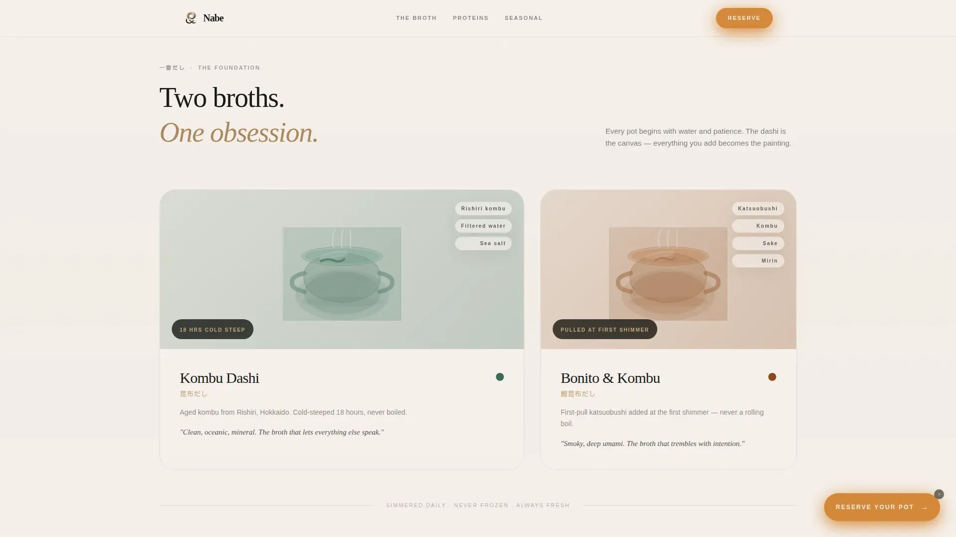
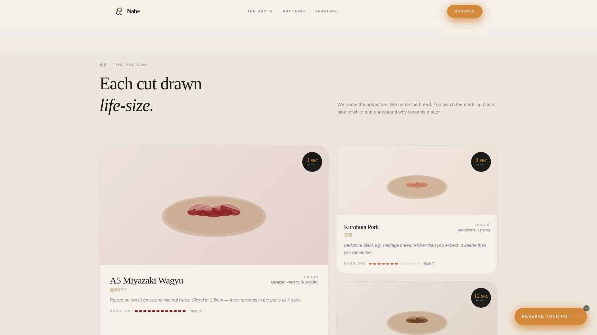
Each page section introduces one layer of the shabu-shabu experience in sequence. Watercolor broth pots drift in on scroll, wagyu cuts appear life-size with origin callouts, and the seasonal bento grid shifts its palette with the months. The scroll arc is designed to feel like sitting down and eating in real time.
Floating and Anchored Reservation Call to Action
A ponzu amber "Reserve Your Pot" button appears as a subtle floating element after the broth section. It anchors boldly at the final scene: an empty counter seat with chopsticks resting and steam rising from a waiting pot. No form is included on the page; the click passes directly to an external booking system.
Japanese Zen Color System
The palette uses four values: stone broth white, seasoned hinoki wood, deep nori black, and ponzu amber. Amber appears only on interactive elements, making every button and hover state feel deliberate. Backgrounds stay warm and pale, text lives in nori black, and the overall effect is clean negative space doing most of the visual work.
Fraunces and DM Sans Typography Pairing
Headlines use Fraunces, a warm literary serif that pairs naturally with hand-drawn illustration. Body text uses DM Sans for clean, unhurried readability. The combination feels formal but approachable, perfect for a restaurant that values both craft and calm.
Seasonal Bento Grid for Vegetables and Noodles
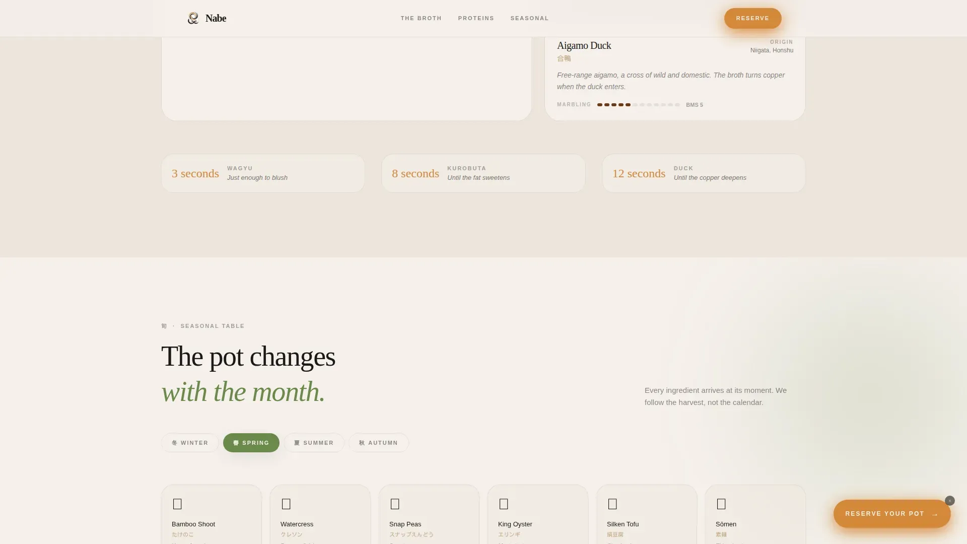
The vegetables and noodles section is arranged as a seasonal grid. The grid's palette shifts with the months, allowing the page to reflect the restaurant's commitment to seasonal sourcing without requiring a full site rebuild. It is easy to update as offerings change.
Page sections overview
| Section | Purpose |
|---|---|
| Hero Illustration | Establish atmosphere and introduce the "Swirl. Dip. Disappear." headline |
| Broth Selection | Showcase kombu and bonito broth options with watercolor pot illustrations |
| Protein Cuts | Present wagyu and other proteins life-size with one-line origin stories |
| Seasonal Table | Display vegetables and noodles in a bento-style grid with shifting seasonal palette |
| Sauces and Reservation | Feature sesame and ponzu sauce illustrations and deliver the final "Reserve Your Pot" call to action |
| Minimal Footer | Close the page with a clean horizontal flow layout |
Design & branding system
Shabu-shabu restaurants often utilize unique branding elements to create a memorable dining experience. This template builds that identity through illustration rather than photography, making the visual language ownable and distinct. Visual identity across the page includes color, type, and hand-drawn imagery that all reflect Japanese culture and ingredient-level craft.
- Stone broth white (#F5F0EB) and hinoki wood (#C4A882) for backgrounds; nori black (#1A1A18) for all text; ponzu amber (#D4883A) reserved for buttons and hover states only
- Organic Flow theme with Edo-period food illustration style, Studio Ghibli warmth, and staggered watercolor reveal animations on scroll
- Fraunces serif headlines paired with DM Sans body type for a warm, literary, and unhurried reading experience
Mobile & speed optimization
The template is built desktop-first to honor the counter dining aesthetic, with graceful adaptation across smaller screens. Static illustration sections use server components to keep the page light, and scroll-triggered animations rely on minimal JavaScript so the experience stays smooth on every device.
- Illustrations and typography reflow cleanly across screens of all sizes without losing composition
- SVG steam animations and scroll-linked ingredient drift are optimized to avoid layout shift on mobile
- Server component architecture keeps static sections fast while preserving the full visual design on any device
How this template helps you convert
Restaurant landing pages should be designed to charm and convert visitors into loyal customers. Effective restaurant landing pages utilize intuitive layouts and visually stunning presentations. This template earns its reservation click by making the visitor hungry, not by arguing with them.
- The sensory scroll arc builds desire section by section, so the "Reserve Your Pot" call to action feels earned by the time it appears at the bottom of the page
- The floating call to action button appears after the broth section, catching visitors at peak interest without interrupting the experience
- A secondary text link, "View Tonight's Seasonal Menu," sits just beneath the final call to action for visitors who want one more reason before they commit
Other information about this template
This template fits naturally alongside other specialty Japanese restaurant concepts. If your brand spans more than one dining style, including sushi counters, sukiyaki dinners, or barbeque tables, the design language and color system are clean enough to adapt across concepts while keeping each page distinct. Showcasing different dining formats on separate pages is easy when the visual framework is this well-set.
- The Nabe Immersive Shabu Shabu Restaurant Landing Page Template is designed for sharing across social media platforms with open graph metadata support included in the base build
- Branding for shabu-shabu restaurants can include creative menu designs that align with the overall aesthetic; this template makes showcasing that alignment easy without requiring custom development
- The template is compatible with design tools including Sketch, Figma, and Adobe XD, allowing teams to customize illustrations, swap seasonal images, and adjust the color set to match their preferences
- Showcasing high-quality images of ingredients and cuts helps users understand the menu before arriving; the template's illustration framework is built around that principle
- Information about proteins, seasonal ingredients, and sauce preferences is woven into the page structure, so every section is delivering detail that helps potential diners make confident choices
Theme
Organic Flow
Creative direction
Taste & Aroma
Color system
Japanese Zen
Style
Hero-Dominant (90/10)
Direction
Click-Through
Page Sections
Hero Illustration with Steam Animation
Scroll-linked Taste and Aroma Arc
Floating and Anchored Reservation Call to Action
Japanese Zen Four-color System
Seasonal Bento Grid Section
Fraunces and DM Sans Type Pairing
Related questions
Does this template include a reservation form?
Can I use this template for a sushi or sukiyaki restaurant?
Is the template easy to edit without a developer?
Does the page work well on mobile screens?
Can I showcase sushi or barbeque alongside the hot pot menu?



