Haute Craft Ready-to-Eat Brand Landing Page Template
Simmer is a Haute Craft ready-to-eat brand landing page template built for direct-to-consumer food brands that lead with story. A modular card grid layout, a nine-tile Photo Grid Mosaic header, and a warm stone color system combine to guide visitors from founder origin to farm sourcing to meal discovery, ending at a clear, frictionless path to purchase.
by Rocket studio
Quick summary
Simmer is a single-page, card-grid landing page template designed for premium ready-to-eat food brands. It pulls visitors through an origin story, introduces sourced ingredients, showcases individual meals, and delivers two conversion paths: "Explore the Menu" and "Send as a Gift." The visual identity is warm, editorial, and built for trust from the very first scroll.
Who this template is for
This template is for food founders who have a real story to tell and a kitchen worth showing off. It suits direct-to-consumer ready-to-eat brands that want to sell through feeling before they sell through pricing. The layout rewards craft-first brands whose customers care about where their food comes from and who made it.
- Ready-to-eat meal brands targeting busy, quality-conscious households
- Food entrepreneurs selling slow-cooked, handmade, or small-batch products direct to consumer
- Gift-food brands looking to reach buyers who want to send something meaningful, not generic
What problem this template solves
Most ready-to-eat food brands face a hard challenge online: they need to close the gap between a vacuum-sealed pouch and the warmth of a real home-cooked dinner. Without the right landing page, even the best cooking reads flat on a screen. Visitors arrive curious, scroll past a generic hero image, and leave before they ever feel anything about the food.
This template solves that specific tension. It replaces the standard single-hero-image format with a nine-tile mosaic that immediately communicates abundance, craft, and story. By the time a visitor reaches the meal cards, they have already met the cook, visited the farm, and watched the kitchen in motion. Trust is built before any price is shown.
- Bridges the emotional gap between craft food and a digital shop without forcing visitors through a lengthy form
- Gives small-batch and ready-to-eat food brands a layout that competes visually with the best restaurants and editorial food publications
- Removes friction from the path to purchase by leading with story and ending with a direct, pre-built product page link
What you get with this template
The template ships as a complete, ready-to-customize landing page. Every section is pre-structured and pre-styled. The card grid system is fully modular, so meal tiles can be added, reordered, or removed without breaking the layout.
- A nine-tile asymmetric Photo Grid Mosaic header with floating serif headline typography
- A modular origin story section covering founder cards, farm sourcing bento rows, and individual meal tiles each carrying their own call-to-action button
- Asymmetric testimonial tiles, a dual-path conversion section, and a linear single-row footer, all styled to the Warm Stone color system
Feature list
This section covers the core built-in capabilities of the Simmer template. Each feature is grounded directly in the design brief and section plan.
Nine-Tile Asymmetric Photo Grid Mosaic Header
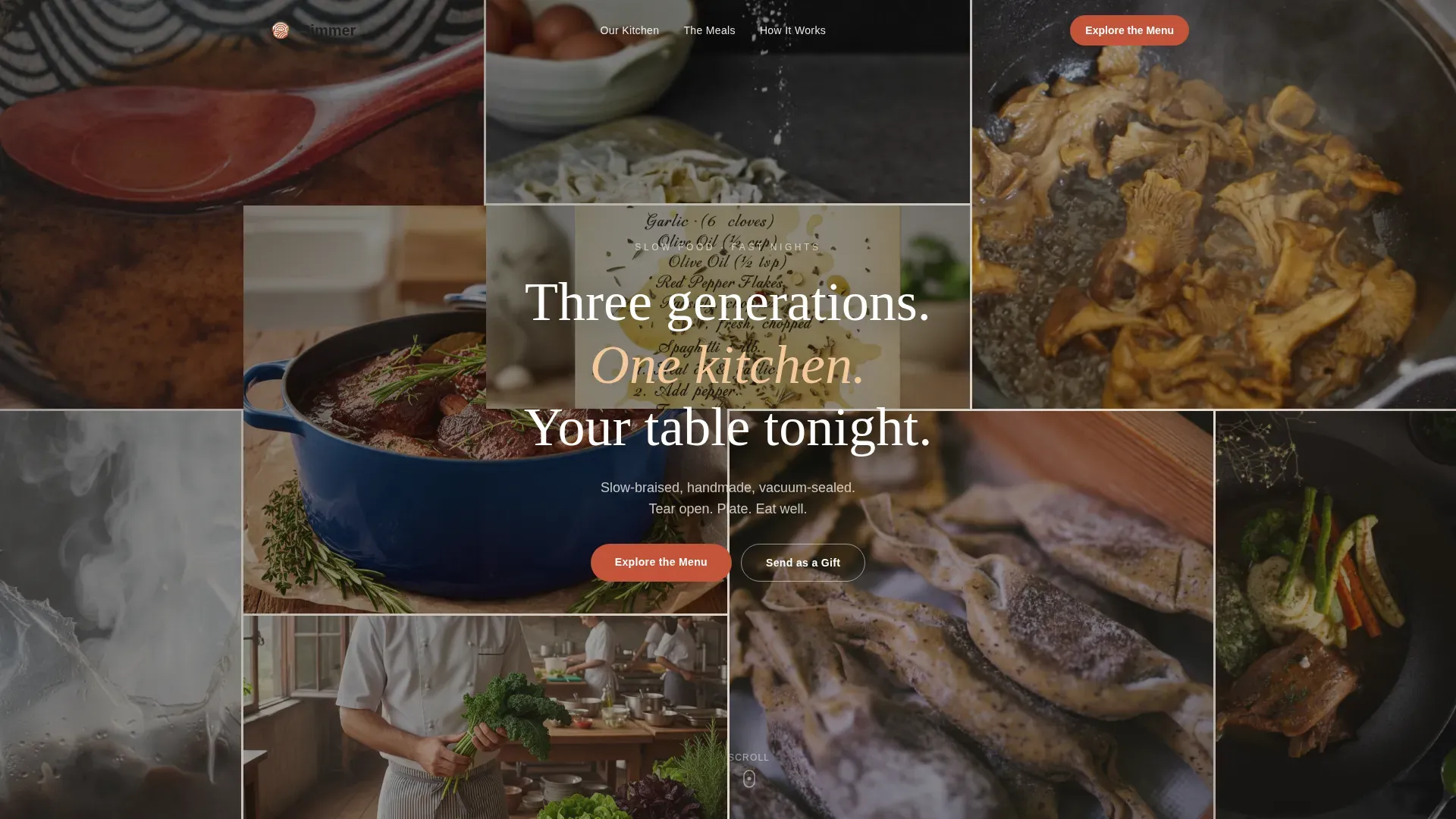
The header replaces a single hero image with nine asymmetrically tiled editorial photo slots that fill the entire viewport. Each tile is sized and rotated independently to create visual tension and a sense of abundance. A single line of hand-set serif type floats across the center of the mosaic. This treatment immediately communicates that this food brand has too many stories to fit into one frame, which matters when cooking is the whole point of the brand.
Modular Card Grid Meal Section
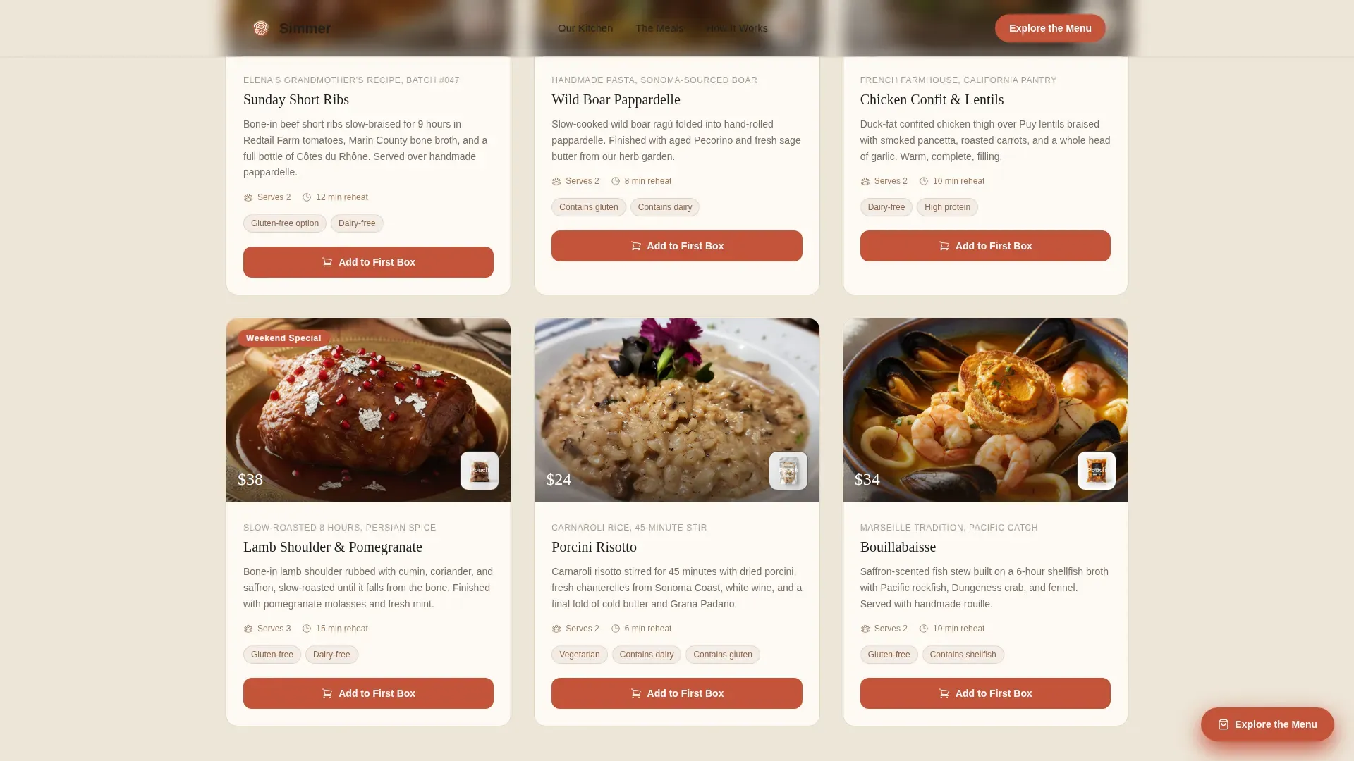
Every meal is presented as a self-contained card tile. Each card shows the dish plated on real ceramic alongside the vacuum-sealed pouch it ships in. This side-by-side visual collapses the distance between craft and convenience in a single glance. An "Add to First Box" button sits anchored below each card, giving visitors a direct path to a pre-built product page without any intermediate form or friction. The grid is modular: tiles reorder cleanly and new meals can be added to the layout without redesign.
Scroll-Driven Origin Story Section
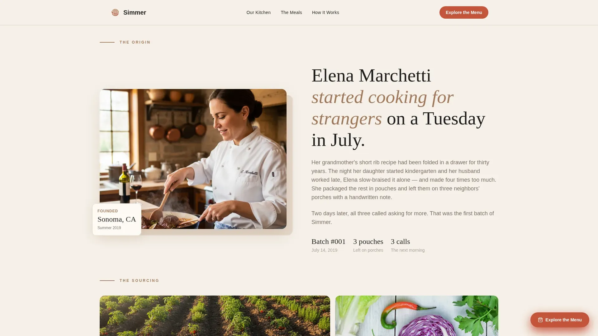
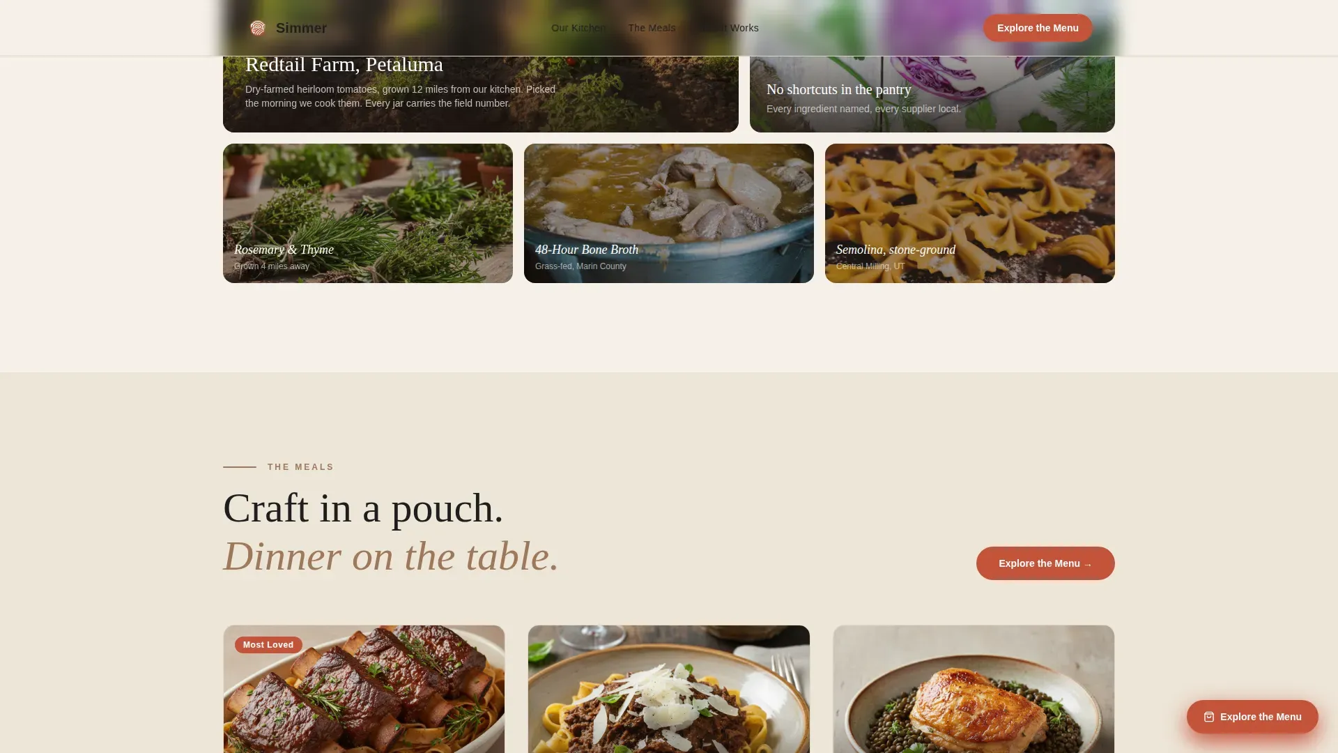
Below the mosaic, the layout pulls visitors downward through time. A founder card introduces a specific person and their specific reason for cooking for strangers. The next card row reveals the sourcing story: named farms, numbered small batches, ingredients photographed still dirty from the field. The scroll rhythm is deliberate and editorial, like flipping through a family photo album that somehow ends with an order form. This section is the primary trust-building engine before any price or call to action appears.
Dual-Path Conversion Architecture
Two conversion paths coexist without competing. The primary path, "Explore the Menu," appears first as a floating button after the origin section and again beneath the meal grid. The secondary path, "Send as a Gift," captures visitors who are browsing on behalf of someone else. Both buttons link directly to pre-built product pages. No form, no sign-up gate, no friction. Every click moves the visitor forward.
Asymmetric Testimonial Tile Section
Social proof is presented as asymmetric tiles rather than a uniform row of star ratings. Each tile can carry a customer quote with their name, city, and the context of their purchase. This keeps the social proof section consistent with the editorial visual language of the rest of the page. Customer testimonials with photos and specific context enhance credibility in a way that generic aggregate ratings cannot.
High-Interactivity Animation Layer
The template includes rotated mosaic tile animations, scroll-reveal stagger effects, float animations, and hover scale states on all card elements. The primary call-to-action button uses a magnetic hover behavior. Scroll-linked effects are handled by client-side components while static sections use server-side rendering for clean performance separation.
Page sections overview
| Section | Purpose |
|---|---|
| Photo Grid Mosaic | Nine asymmetric tiles fill the viewport; floating serif headline anchors brand voice |
| Founder Origin Card | Introduces the person, the place, and the moment the brand began |
| Farm Sourcing Row | Named farms, small-batch numbers, field-fresh ingredient photography |
| Meal Card Grid | Modular tiles show each dish plated and sealed; each carries its own call-to-action |
| Testimonial Tiles | Asymmetric social proof with customer names, cities, and context |
| Dual-Path Conversion | "Explore the Menu" and "Send as a Gift" buttons side by side |
| Linear Single-Row Footer | Brand links and contact essentials in a compact single-row layout |
Design & branding system
The Warm Stone color system is the visual backbone of this template. Every surface reads like a farmhouse table that has been oiled a hundred times: warm, tactile, and carrying the memory of past meals. The palette is deliberate and restrained, with each color assigned a specific role so nothing competes with the food photography.
- Fired clay (#A0785A) serves as the primary color for headers, cards, and dominant user interface surfaces; linen tablecloth cream (#F5F0E8) is the background tone that keeps the page open and readable; cast iron black (#1E1E1E) handles body text for high contrast and legibility
- Slow-roasted tomato (#C4533A) is reserved exclusively for buttons, badges, and price callouts, ensuring every action point pulls the eye without overwhelming the editorial photography
- Typography pairs Fraunces as the serif display face for headlines and the floating mosaic type, and DM Sans as the body face for cards, descriptions, and button labels, creating a clear hierarchy between story and information
Mobile & speed optimization
The template is built mobile-first. The primary target user is a parent holding a phone with one hand while a toddler pulls at their leg. Every tap target, button size, and scroll behavior is designed around that reality. The layout reflows gracefully from desktop mosaic to stacked mobile card grid without losing the editorial warmth of the original design.
- Large, tappable buttons with clear labels ensure the "Add to First Box" and "Explore the Menu" calls to action are easy to reach on smaller screens
- Server components handle static sections for fast initial load, while client-side components manage animations and interactive states separately, keeping the experience smooth without blocking the first render
- Images are structured for optimized delivery, and the mosaic header reflows into a stacked tile arrangement on mobile so the visual impact is preserved even on narrow viewports
How this template helps you convert
This landing page is engineered to earn trust before asking for a purchase. The page follows a deliberate conversion arc: visitors meet the founder, visit the farm, watch the kitchen, then encounter the meals already feeling warm toward the brand. By the time the first "Add to First Box" button appears, the visitor has context, emotional connection, and appetite. That sequence matters.
- Trust is built through story before price is revealed: the origin section, farm sourcing row, and kitchen photography establish credibility without requiring a single review or star rating, so the meal cards land with weight when they appear
- Two distinct conversion paths serve two distinct buyers: the "Explore the Menu" primary path captures visitors ready to order for themselves, while the "Send as a Gift" secondary path captures the gifting use case without any layout compromise, broadening the addressable buyer pool on a single page
Other information about this template
The Simmer template was designed with a highly personal philosophy at its core: that real food has a history worth telling before it has a price worth paying. The driving force behind the layout is the belief that cooking is one of the most intimate acts a person can perform for a stranger, and that a landing page should honor that intimacy. Understanding that context helps when filling in the template's story sections.
The creative brief draws loosely from the world of fine dining editorial design, where the tasting menu experience begins long before the first bite. In the best restaurants, the room tells you something before the food arrives. This template borrows that logic: the mosaic, the founder card, the farm sourcing row, and the plated meal photography all work together to set a table before any order is placed.
Food culture runs deep in America, and this template is built to reflect that. From the farmers market sourcing rows to the small-batch batch numbers, the template invites brands to wear their quality control practices visibly. Transparency about sourcing, ingredients, and cooking methods builds the kind of trust that moves buyers who have spent money on disappointing ready-to-eat products before and are cautious about trying something new. A brief, immediately visible trust signal, whether a batch number, a farm name, or a customer quote with a real city attached, does more for conversion than a generic "Organic & Non-GMO" badge alone.
The ready-to-eat food industry is experiencing a meaningful shift toward healthier, more transparent options, and convenience remains the primary driver for most buyers. Plant-based meals are growing year round in popularity alongside slow-braised and heritage-breed meat options. This template accommodates both directions: the card grid can feature any flavor profile without requiring a page rebuild, and the meal tile layout supports dietary icons or callout badges for quick visual filtering.
The template's visual language draws inspiration from the world where food, art, and daily life overlap. Think of the sense you get walking through a city food hall, or the feeling of sitting at a counter in a small restaurant where the kitchen door is open and you can smell wood smoke and rendered fat from your seat. That feeling, translated into a digital surface, is what this template is designed to deliver. Every color choice, every typographic decision, and every card proportion was made to recreate that warmth on a screen.
This template also suits brands that want to grow their online presence through content and social proof over time. Customer feedback and reviews play a central role in shaping how ready-to-eat brands build credibility, and the testimonial tile section is structured to carry real voices with real context. Email marketing campaigns, influencer partnerships, and seasonal promotions can all be communicated through the existing section structure without requiring new layout work.
Using this template requires no traditional programming skills. AI-powered no-code tools allow food brand founders to build production-ready pages from natural language prompts, and this template is designed to fit that workflow. No-code platforms handle deployment and backend integrations so that a proud owner of a small-batch food brand can launch a professional landing page and start directing traffic to their shop without writing a single line of code. AI and no-code tools can significantly reduce both the time and cost of getting a brand online, which is a big deal for solopreneurs and small food businesses operating with tight margins.
The template works equally well for brands based in major food cities and those operating out of smaller production kitchens. Whether your brand is rooted in the culinary culture of the bay area, the Italian food traditions of a specific neighborhood, or the farm-to-table heritage of the American heartland, the section structure gives you space to tell that story with specificity and pride. Named farms, local farms sourcing rows, and small-batch identifiers are built into the layout so the sourcing story is always front and center.
The gifting use case is worth building out deliberately. The "Send as a Gift" conversion path speaks to a buyer who is not cooking for themselves but for a best friend recovering from surgery, a family member who just moved to a new city, or a colleague who deserves more than a gift card. That buyer is often willing to spend more money per order and is highly motivated once they land on the page. The dual-path layout captures that intent without adding a separate page or flow.
Seasonal use is strong for this template. Summer meal launches, fall braising menus, and limited-edition holiday boxes all fit cleanly into the modular meal card grid. Incorporating seasonal promotions directly into the meal tile badges keeps the page fresh year round without a full redesign. Clear and consistent pricing displayed on each card, alongside honest nutritional information and ingredient lists, helps customers make confident decisions without second-guessing their order.
The template references a broader cultural conversation about food, craft, and the way eating well can feel like a luxury even when it is simply a necessity. From the world of haute cuisine and fine dining to the humble act of tearing open a pouch on a Tuesday night, Simmer positions itself as the bridge between those two worlds. The page does not talk down to the buyer or oversell the experience. It simply sets the table and lets the food speak.
The Simmer haute craft ready to eat brand landing page template is available now. It is ready to use as a starting point for any direct-to-consumer food brand that leads with craft, values transparency, and wants a page that feels as good as the food it represents.
- The template includes placeholder content for all named sections, so customization can begin immediately without starting from a blank layout
- All card tiles, mosaic slots, and testimonial blocks accept real photography and copy, and the Warm Stone color system can be adjusted to match a brand's existing palette if needed
- The "Send as a Gift" path and the "Add to First Box" per-card call-to-action both link to pre-built product pages, so no additional page design is required before launch
Theme
Haute Craft
Creative direction
Origin Story
Color system
Warm Stone
Style
Card Grid (Modular)
Direction
Click-Through
Page Sections
Nine-tile Asymmetric Mosaic Header
Modular Meal Card Grid
Scroll-driven Origin Story Section
Dual-path Conversion Buttons
Asymmetric Testimonial Tile Section
High-interactivity Animation System
Related questions
Who is this landing page template designed for?
Can I add or remove meal cards from the grid?
Does the template include both conversion paths out of the box?
How does the template handle trust-building before the purchase ask?
Is this template suitable for brands that want to highlight nutritional information?