Neo-Retro Meal Planning App Landing Page Template
Simmer is a neo-retro meal planning app landing page template designed for food-tech platforms. It uses a warm Parchment and Rust color system, a masonry grid layout styled like a community cookbook, and a guided booking flow that helps visitors plan meals for their first week. The template is mobile-first and built for high engagement from the very first scroll.
by Rocket studio
Quick summary
Simmer is a single-page landing page template for recipe and meal planning apps. It blends nostalgic 1970s kitchen aesthetics with a practical, conversion-focused layout. Visitors scroll through a masonry recipe grid, review three complete meal plans, and book their first week through a structured scheduling flow. Every section earns trust before asking for commitment.
Who this template is for
This template is designed for food-tech founders, indie app developers, and product teams building consumer-facing meal planning services. It fits anyone who needs a landing page that feels personal, warm, and immediately useful rather than corporate and cold.
- Developers and designers launching a recipe or meal planning app
- Food-tech teams looking to convert free-tier visitors into scheduled users
- Solo creators building a community cookbook or meal plan subscription service
What problem this template solves
Most meal planning app landing pages feel like software product sheets. They list features, show screenshots, and ask for a sign-up before the visitor has tasted anything. Simmer solves this by leading with the food itself. The page earns the booking by showing real meal plan value first.
- Visitors often leave before reaching a call to action because the page fails to connect emotionally
- Generic templates do not communicate the warmth and convenience that a food and meal app promises
- A standard grid layout cannot replicate the feeling of flipping through a beloved recipe box
What you get with this template
This template includes a full set of designed sections, interactive components, and a cohesive visual system. Everything is ready to customize and publish as a landing page for your meal planning app.
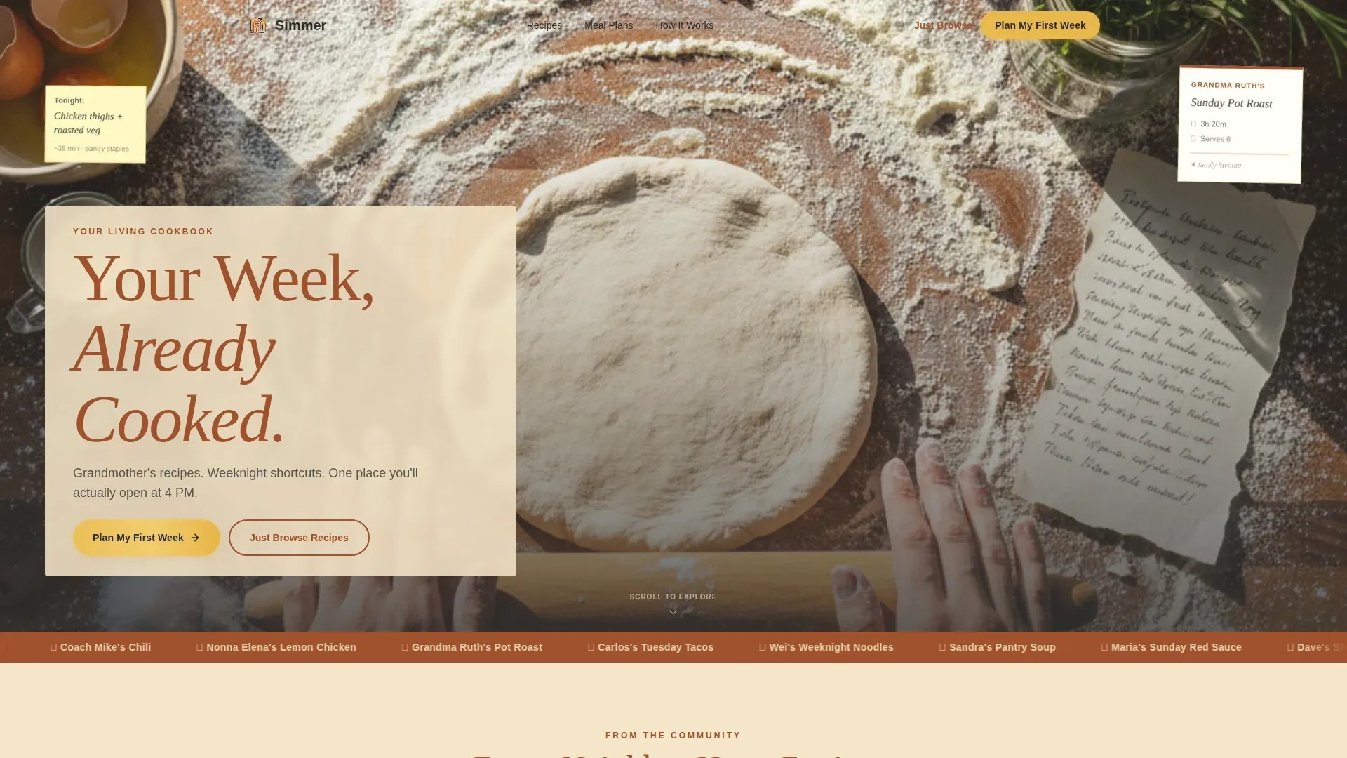
- A full-bleed cinematic hero section with a parchment-band headline overlay
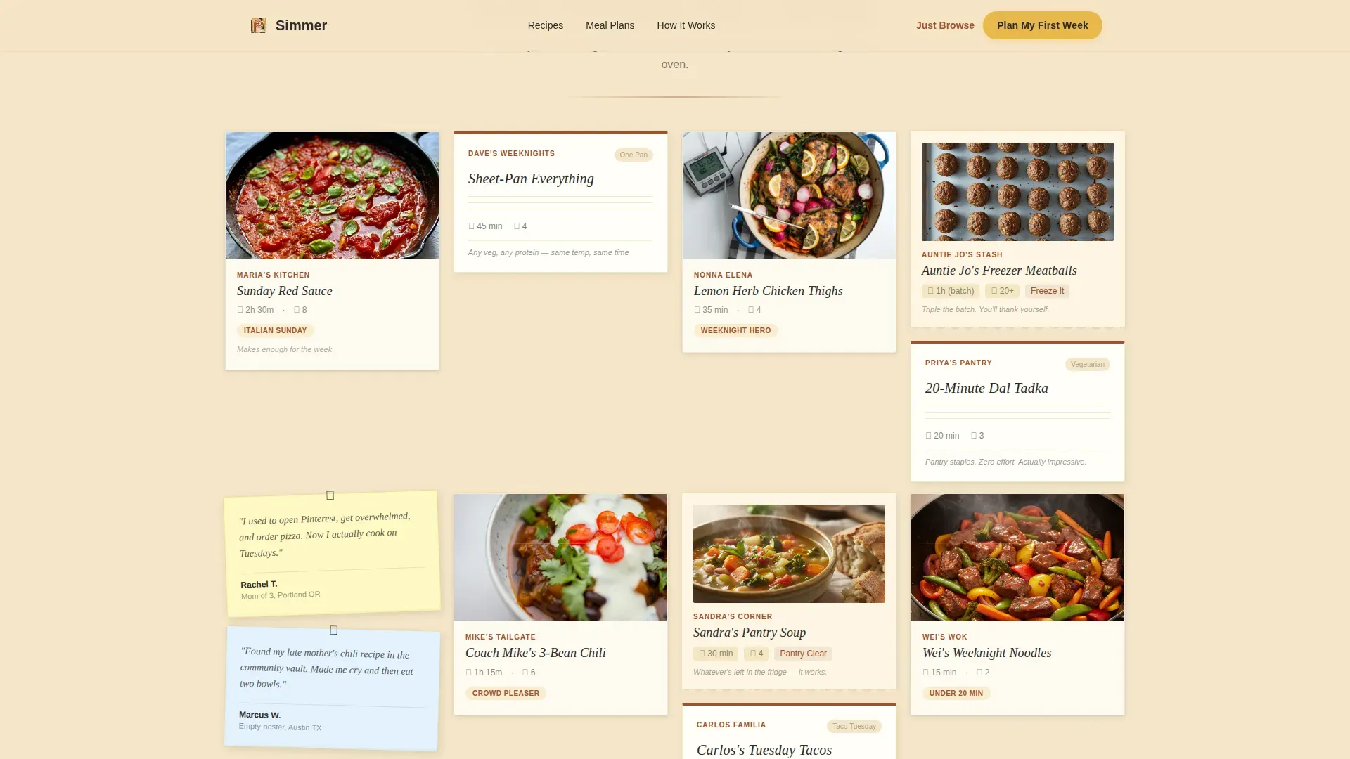
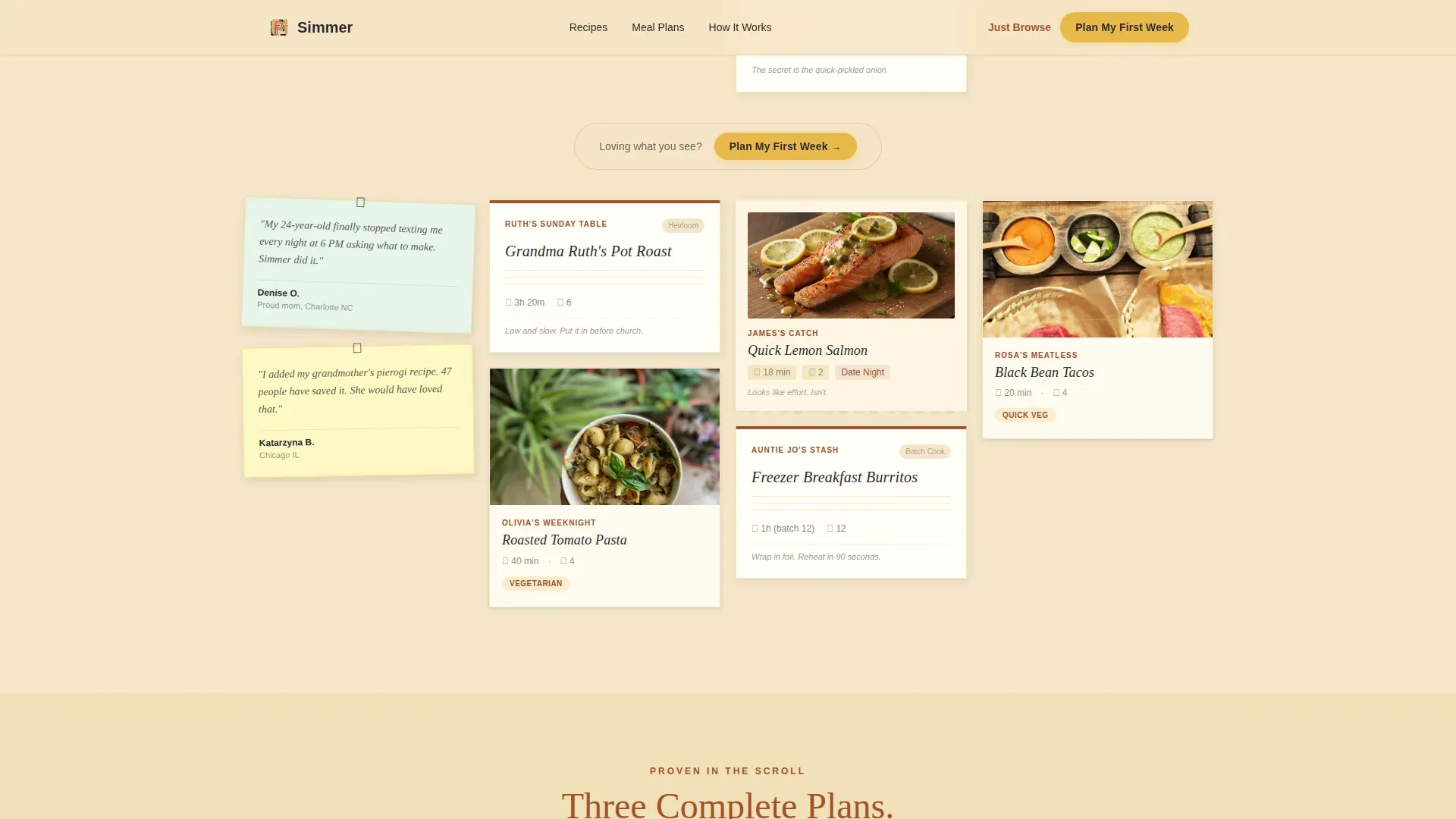
- A masonry recipe card grid with polaroid-style cards and neighbor-attributed meal entries
- A multi-step booking flow with household size input, a cooking-nights slider, allergy toggle chips, and a wall-planner-style calendar
Feature list
This template includes purpose-built components designed to plan meals, capture leads, and guide visitors from first scroll to first booking.
Masonry Recipe Card Grid
The masonry grid is the heart of the template. Cards are styled like polaroids and torn-edge recipe notes pinned to a corkboard. Each row introduces a different neighbor contributor, such as "Maria's Sunday Red Sauce" or "Dave's Sheet-Pan Everything." The grid tightens and loosens as visitors scroll, creating a rhythm that pulls them deeper into the food before any commitment is asked.
Multi-Step Booking and Scheduling Flow
The primary call to action, "Plan My First Week," appears after the third masonry row. Clicking it opens a structured scheduling flow where visitors set their household size, choose cooking nights per week using a slider from two to seven, flag dietary needs using tap-to-toggle allergy chips, and select a start date from a calendar designed to look like a wall planner. This flow is designed to simplify the decision to start planning without overwhelming users.
Weekly Meal Plan Display Sections
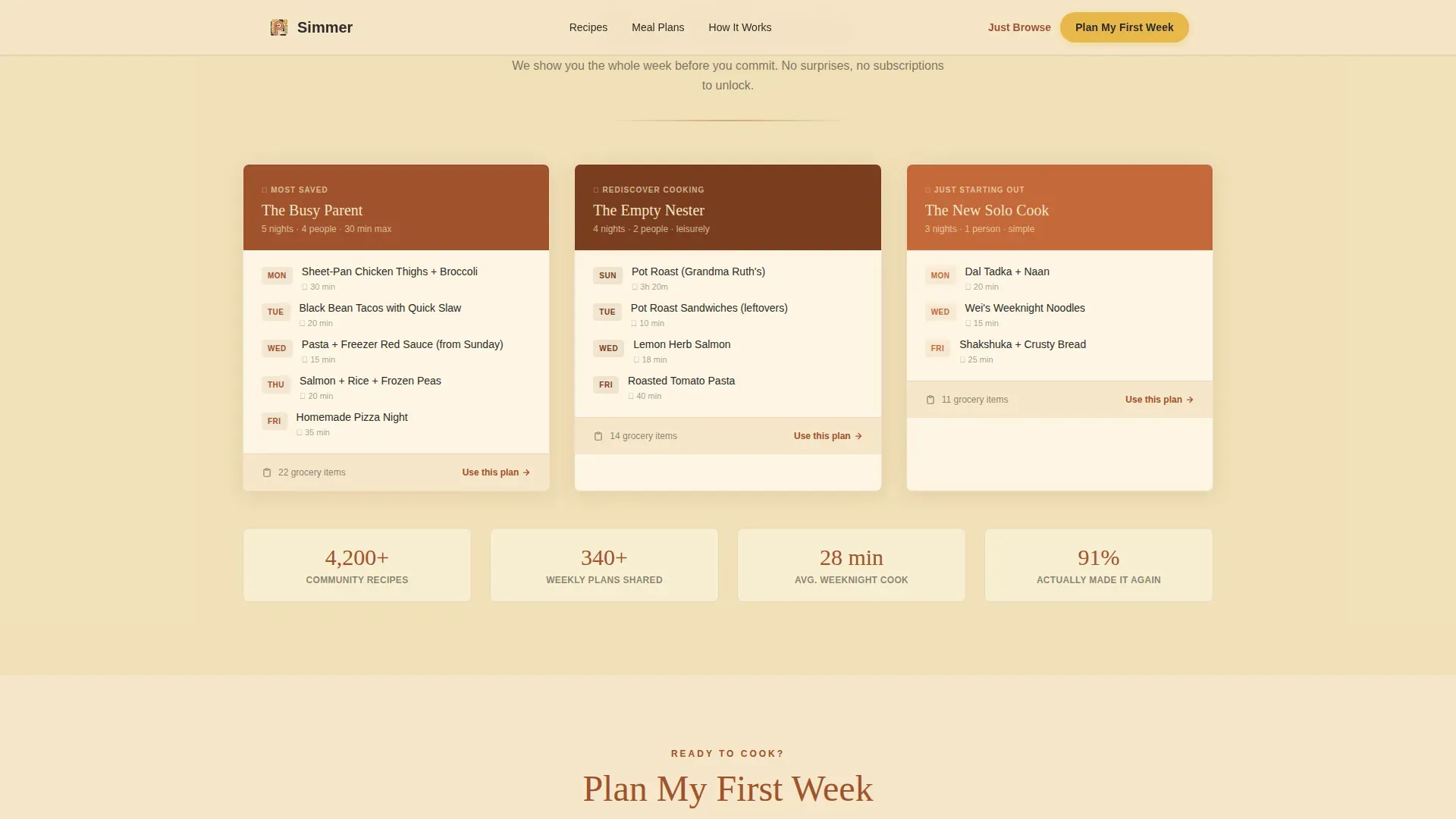
Three complete weekly meal plans are shown within the scroll itself. Visitors can see a full weekly menu before they ever create an account. This in-scroll proof strategy lets the template earn the booking by showing rather than telling. Each plan demonstrates the range from breakfast through dinner and covers snacks and lunch options.
Sticky Note Testimonials
Social proof appears as sticky notes tucked between masonry rows. Each note is attributed to a real-sounding user, following the neighborhood creative direction. These trust signals appear naturally within the scroll rather than in a separate section, keeping the page feeling like a conversation rather than a sales pitch.
Free-Tier Email Capture Path
A secondary call to action, "Just Browse Recipes," gives hesitant visitors a free way to enter the experience. Clicking it captures an email address before unlocking the full recipe grid. This secondary path protects conversion by offering convenience to visitors who are not ready to commit to a full week plan.
Neo-Retro Visual Identity System
The template is built around a warm Parchment and Rust color palette. Backgrounds use aged parchment tones, rust anchors headlines and dividers, cast-iron black grounds body text, and egg-yolk gold highlights every interactive element. Typography uses a rounded serif for display text and a clean sans-serif for body copy, creating a look that feels like a 1970s community cookbook reprinted on heavy stock.
Page sections overview
| Section | Purpose |
|---|---|
| Hero Full-Bleed | Sets tone with cinematic kitchen photo and parchment-band headline |
| Masonry Recipe Grid | Displays polaroid-style recipe cards across three neighbor-attributed rows |
| Weekly Meal Plans | Shows three complete meal plans in-scroll to prove value before sign-up |
| Sticky Note Testimonials | Places user feedback between masonry rows as handwritten-style notes |
| Booking Flow call to action | Guides visitors through household size, cooking schedule, and calendar selection |
| Free-Tier Email Capture | Offers a secondary path to access the full recipe grid via email |
| Footer Pattern | Closes with a horizontal footer following a structured layout |
Design & branding system
The template follows a Neo-Retro theme. The visual direction feels like a 1970s community cookbook, sun-faded and oil-spotted, reprinted on warm heavy stock. Vibrant color palettes reminiscent of 70s and 80s kitchen design often include mustard yellow, orange, and warm earth tones, and this template channels that same energy through its Parchment and Rust system.
- Color system: Parchment (#F5E6C8) for backgrounds, Rust (#A0522D) for headlines and dividers, Cast-Iron Black (#2B2B2B) for body text, and Egg-Yolk Gold (#E8B84B) for buttons and interactive highlights
- Typography: DM Serif Display for headlines and section titles, Manrope for body copy and labels
- Visual details: grain overlay, scroll-reveal animations, masonry stagger, floating recipe cards, and a translucent parchment band on the hero image
Mobile & speed optimization
The template is designed mobile-first. The primary audience is someone scrolling at 4 PM on a phone, standing at a counter with a chicken thawing nearby. Every layout choice, button size, and scroll behavior reflects that real in-kitchen use case.
- Mobile-first layout with large tap targets and app-like scrolling behavior throughout the page
- Animations and scroll reveals are built with native CSS and IntersectionObserver, keeping the website's performance smooth without heavy JavaScript libraries
- The booking flow components, including the slider, toggle chips, and calendar, are all designed for thumb-friendly interaction on small screens
How this template helps you convert
The template is structured around a Booking and Scheduling conversion model. It earns trust through content before asking for any action. Visitors are not pushed to sign up on arrival. Instead, they are pulled forward by the food itself.
- Three complete weekly meal plans appear in the scroll before the primary call to action, so visitors already know what they are planning when they reach "Plan My First Week"
- The secondary "Just Browse Recipes" path captures emails from visitors who want to explore free resources first, giving the app a second conversion opportunity without losing hesitant users
Other information about this template
The Simmer neo retro meal planning app landing page template is built for the Food and Beverage category, specifically the Food Technology and Platform subcategory. It is a strong starting point for any team that wants to display a meal planning app with warmth, depth, and clear direction.
- The template supports planning meals across a full week, covering breakfast, lunch, dinner, and snacks in a clear day-by-day format
- The grocery list section can be extended to show weekly shopping needs, helping users save money by reducing impulse purchases at the store
- Meal prep is made visible through the weekly menu and plan structures already built into the page layout
- The page is designed for teams that want to track engagement through the booking flow without relying on third-party services
- The template can be adapted for monthly planning by expanding the calendar section to cover a whole month of scheduled meals
- Printable meal planner formats can be linked from the template, including options in PDF format for users who prefer to print and write their weekly meals by hand
- The masonry grid uses category-based filters in concept, with searching and sorting behaviors designed to resemble vintage toggle switches
- Meal planning templates across the industry can include sections for Monday through Sunday, and this template follows that weekly structure with space for each day
- The template is free to download and reuse within your project, and it includes clean, well-organized code that makes sharing and adapting the design straightforward
- The booking flow is divided into clear steps, making it easy for users of all experience levels to follow and complete
- Keeping a list of family favorite recipes is one of the most effective ways to simplify weekly planning, and the neighbor-attributed recipe cards in this template are designed to evoke exactly that kind of personal list
- The template earns trust through social proof and gives teams the resources to launch a polished food-tech landing page without starting from scratch
- AI-driven meal planning solutions can adapt to changing user preferences over time, and this template is structured to support that kind of personalized experience if the app layer provides it
- AI tools can also help users create grocery lists automatically, reducing the time spent on shopping preparation, and the grocery list section of this template can be connected to that kind of service
Theme
Neo-Retro
Creative direction
Local & Neighborhood
Color system
Parchment & Rust
Style
Masonry/Pinterest
Direction
Booking/Scheduling
Page Sections
Masonry Recipe Card Grid
Multi-step Booking and Scheduling Flow
In-scroll Weekly Meal Plan Proof
Sticky Note Social Proof System
Free-tier Email Capture Path
Neo-retro Visual Identity System
Related questions
Who is this landing page template designed for?
Can visitors access a meal plan before signing up?
What does the booking flow include?
Is there a free path for visitors who are not ready to book?
Can the template be adapted for monthly meal planning?



