Mexican Dining Professional Website Template
Plancha is a full-width immersive landing page template built for Mexican fast casual restaurants that lead with craft and convert through hunger. It combines macro food photography, a scroll-driven origin story, an interactive protein-organized menu, and a sticky "Order Pickup Now" bar to guide every visitor from first glance to confirmed order.
by Rocket studio
Quick summary
Plancha is a single-page template designed for Mexican fast casual restaurants that sell through storytelling. It opens with a full-bleed macro food photo, walks visitors through a generational origin narrative, presents an interactive menu organized by protein, and closes with a catering module and location section. Every design choice is built to make visitors hungry before asking them to order.
Who this template is for
This template fits restaurant owners and operators who want their landing page to do real selling work. It is especially useful when your food has a genuine story worth telling and your ordering flow needs to be frictionless on mobile.
- Mexican fast casual restaurants serving a local, repeat-order customer base
- Family-owned or story-driven food businesses launching or refreshing their online presence
- Operators running both direct pickup orders and group catering side by side
What problem this template solves
Most restaurant landing pages show a menu and a phone number. That approach skips the part that actually makes people hungry. Visitors arrive undecided and leave without ordering because nothing on the page earns their appetite first.
- No immersive storytelling means first-time visitors never connect with why the food is different
- Generic menu layouts bury the best items instead of presenting them at close range
- Catering inquiries get lost because there is no dedicated, easy-to-use path for group orders
What you get with this template
You get a complete, production-ready single-page layout built around a clear conversion sequence. The page is designed to move a visitor from visual impact to emotional connection to a confirmed order, all without leaving the page.
- A full-viewport macro hero section, a scroll-linked origin story with video support, and an interactive protein-organized menu
- A dedicated catering module with a group-size slider and delivery date picker
- A sticky order bar, an hours and location section, and a minimal footer
Feature list
Plancha delivers a tightly scoped set of high-impact features drawn directly from its restaurant context. Each one serves either the storytelling sequence or the ordering conversion.
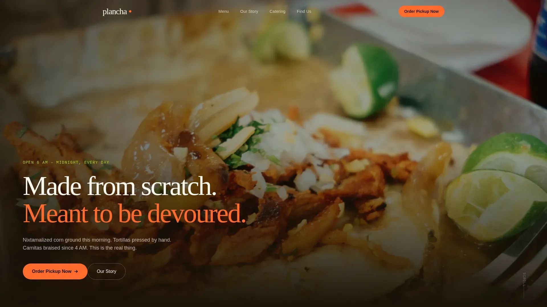
Full-Bleed Macro Hero Section
The header fills the entire viewport with a close-up food photograph shot at a scale that makes individual details visible. A single line of crema-white text sits at the bottom of the frame: "Made from scratch. Meant to be devoured." No navigation clutter competes with the image.
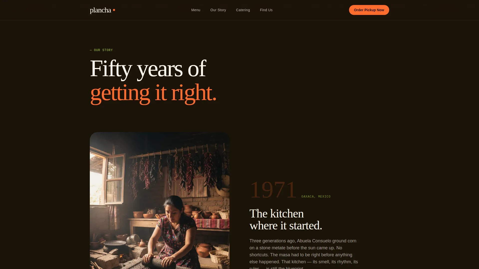
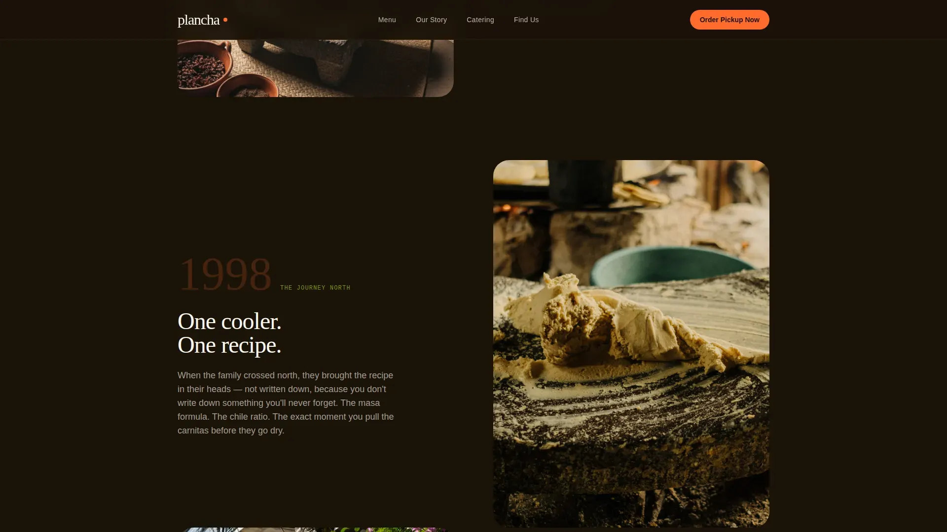
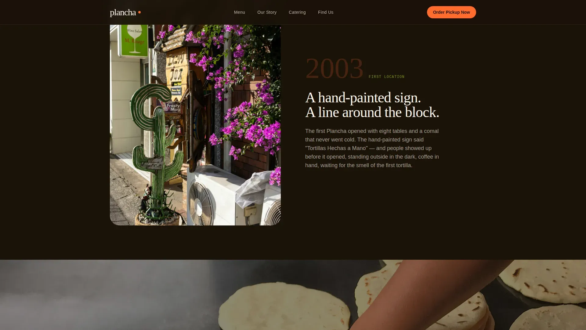
Scroll-Linked Origin Story
The origin narrative pulls visitors downward through time, from a family kitchen in Oaxaca through the journey north to the present-day counter. Sections flow into each other without hard breaks, with images and text overlapping. A full-width, audio-free tortilla-making video anchors the middle of the sequence.
Protein-Organized Interactive Menu
The menu section groups items by protein rather than by meal type. Each item shows a macro food photograph, a three-word description, and a one-tap add button. This layout makes choices feel intentional and fast, especially on a phone screen.
Sticky Order Pickup Bar
After the visitor scrolls past the menu, a habanero-orange "Order Pickup Now" bar fixes to the bottom of the viewport. The call to action stays visible without interrupting the reading experience, so the path to ordering is always one tap away.
Catering Module with Group Tools
The "Feed the Crew" section gives group buyers a dedicated experience. A group-size slider and a delivery date picker let visitors configure their order details without leaving the page or making a phone call.
Hours and Location Section
A final conversion touchpoint before the footer presents the restaurant's hours and address. It serves both first-time visitors looking for directions and regulars confirming the schedule before they drive over.
Page sections overview
| Section | Purpose |
|---|---|
| Macro Hero | Opens with full-bleed food photography and a single brand statement |
| Origin Story | Scroll-driven narrative moving from family roots to present day |
| Tortilla Video | Full-width, audio-free video of hand-pressed tortillas |
| Interactive Menu | Protein-organized items with macro photos and add buttons |
| Feed the Crew | Catering module with group slider and date picker |
| Hours & Location | Final info touchpoint for address and operating hours |
| Minimal Footer | Clean close following a superhuman extreme minimal pattern |
Design & branding system
The visual identity follows an Organic Flow theme built around the Citrus Burst color system. The palette is raw and unapologetic, grounded by a deep charred-black base and lifted by electric accent colors that feel sticky and alive.
- Colors: charred tortilla black (#1A1208) for backgrounds, fresh-squeezed lime (#A8D408) and habanero orange (#FF6B2B) for calls to action and section transitions, crema white (#FFF8F0) for typography and breathing space
- Typography: DM Serif Display for headings, Manrope for body copy
- Animations include text reveals, parallax scrolling, a marquee element, and scroll-linked section transitions driven by GPU-accelerated CSS
Mobile & speed optimization
The template is built mobile-first, reflecting its primary audience of construction crews and on-the-go regulars who order from their phones. The interaction patterns are optimized for one-handed use and small screens.
- Images are lazy-loaded so the page begins rendering quickly even on slower connections
- CSS animations are GPU-accelerated to keep scroll and transition performance smooth on mobile devices
- The sticky order bar and one-tap menu add buttons are sized and positioned for easy thumb reach
How this template helps you convert
The conversion strategy is sequenced deliberately. The page earns the click by making visitors hungry first and making the ordering step easy second.
- The macro hero and origin story build appetite and trust before any menu item or price appears, so visitors arrive at the ordering section already engaged and ready to choose.
- The protein-organized menu with macro photos and one-tap add buttons removes friction at the moment of decision, and the sticky pickup bar keeps the primary call to action visible throughout the rest of the page.
- The catering module gives group buyers a clear, self-serve path so high-value orders do not require a phone call to complete.
Other information about this template
Plancha is designed as a full-width immersive landing page with a high animation and interactivity level. It suits operators who want their online presence to match the energy and craft of their physical counter.
- The template uses DM Serif Display and Manrope as its type pairing, giving headings warmth and body copy strong readability at all sizes
- The footer follows a superhuman extreme minimal pattern, keeping the close clean and focused
- Localization defaults are set for the United States market, with English copy and USD pricing in mind
- The design style is described in the brief as raw, organic, and unapologetic, which makes it suitable for brands that lead with authenticity rather than polish
Theme
Organic Flow
Creative direction
Origin Story
Color system
Citrus Burst
Style
Full-Width Immersive
Direction
Direct Sales
Page Sections
Full-bleed Macro Hero
Scroll-linked Origin Story
Protein-organized Interactive Menu
Sticky Pickup Order Bar
Catering Group Module
Related questions
Can I update the menu items and photos myself?
Does the sticky order bar link to an external ordering system?
Is the catering module ready to use as shown?
How does the origin story section work on mobile?
Can I change the color palette to fit my own brand?