Osteoporosis Care Professional Website Template
Marrow is a specialist osteoporosis clinic landing page template built around interactive comparison tables and an expert panel layout. It demonstrates the gap between general practitioner care and specialist intervention, guiding postmenopausal women, older men, and adult caregivers toward a bone health guide download or a fracture risk assessment.
by Rocket studio
Quick summary
Marrow is a single-page template for an osteoporosis specialist clinic. It uses interactive comparison tables, a typographic hero, and a four-voice expert panel to show visitors exactly what specialist bone care offers that general practice cannot. The primary goal is a guide download. A secondary path leads to a fracture risk questionnaire and scan booking.
Who this template is for
This template is designed for osteoporosis specialist clinics that need to convert anxious, research-driven patients into booked appointments or guide downloads. It works best when the clinic can present credentials across multiple disciplines.
- Specialist clinics serving postmenopausal women with a T-score at or below -2.5
- Practices treating men over sixty who have experienced a fragility fracture
- Clinics whose patients include adult children researching care options for a parent
What problem this template solves
Most people with low bone density arrive at a specialist clinic after a general practitioner has flagged a number on a scan report. They do not yet understand what that number means or what comes next. This template bridges that knowledge gap before a single appointment is booked.
- Patients cannot easily compare general practitioner management against specialist-level care on their own
- The clinical language around bone density scans, T-scores, and fracture risk feels inaccessible and frightening
- Clinics struggle to demonstrate their multidisciplinary value in a format that earns trust without overwhelming visitors
What you get with this template
The template delivers a fully structured, single-page layout that carries visitors from emotional connection at the hero through clinical evidence in the comparison tables to a low-friction conversion step. Every section has a defined role and a defined audience action.
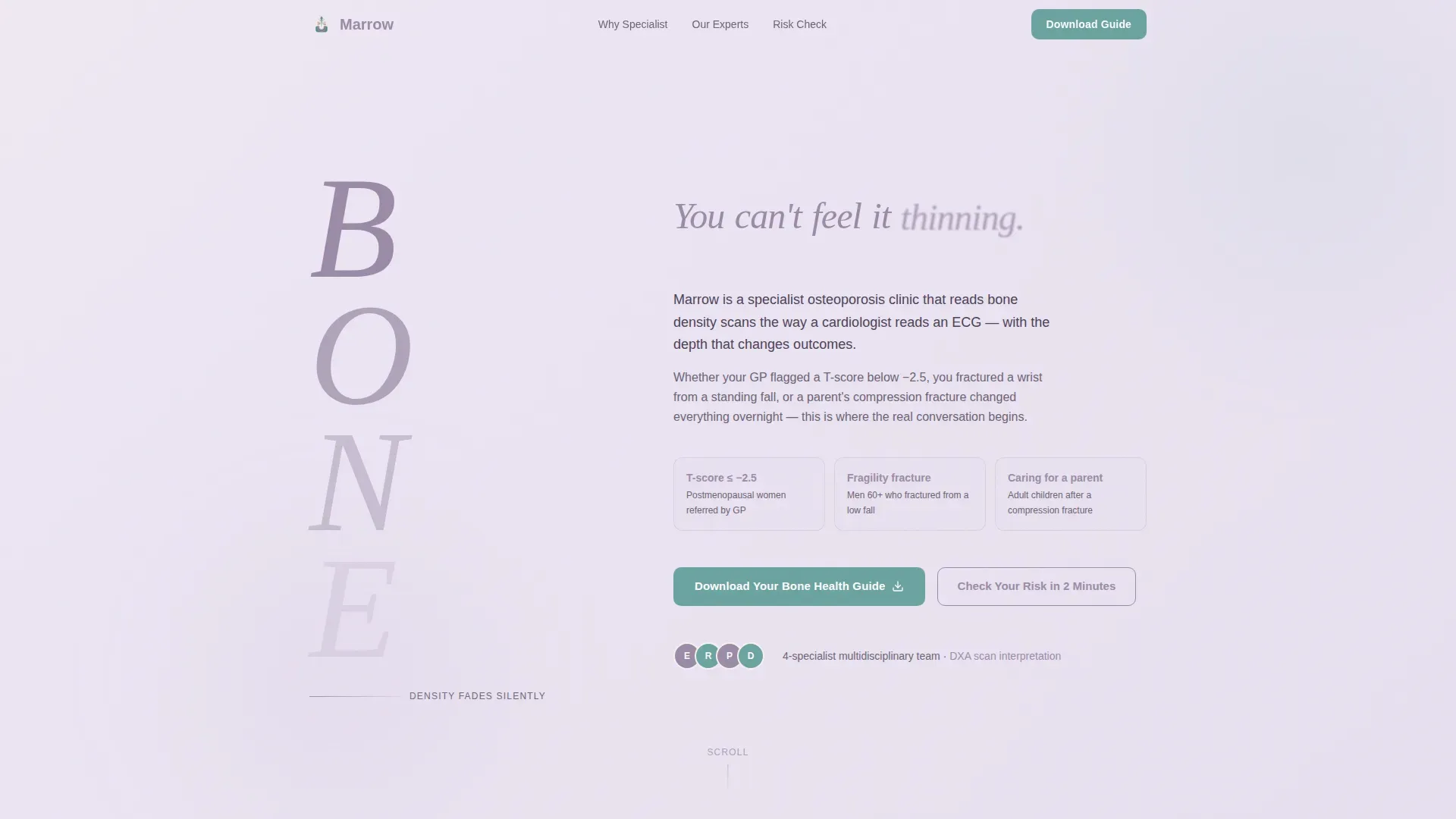
- A typographic hero section built around a stacked vertical BONE letterform with an animated gradient density effect
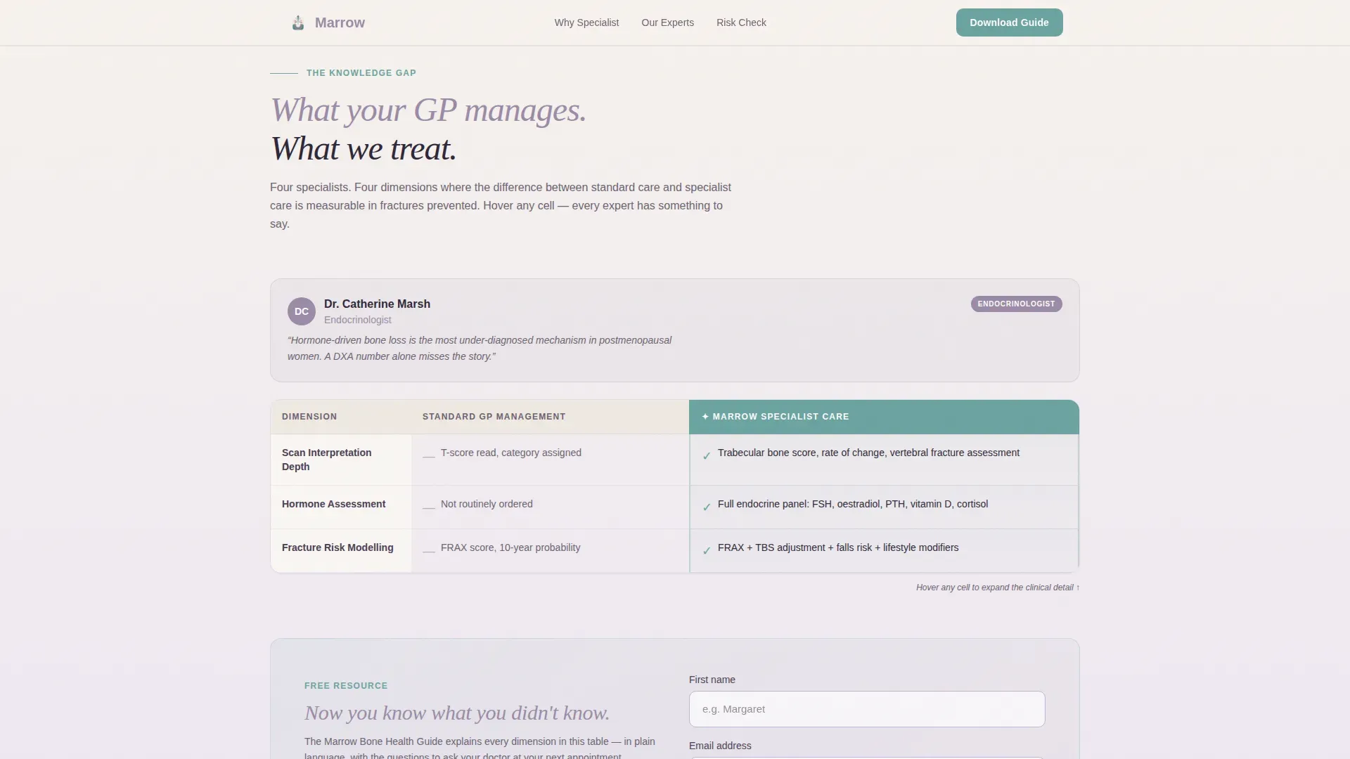
- An interactive four-column comparison table with hover-to-expand specialist quotes for each row
- A lead capture form requiring only a first name and email, placed after the first table to demonstrate value first
- A call-to-action block linking to a FRAX-style two-minute fracture risk questionnaire with a personalised recommendation output
Feature list
This template includes the following built-in features, each grounded in the source brief.
Stacked Type Tower Hero
The hero uses an oversized serif letterform spelling BONE vertically. Each letter fades from solid dusk mauve at the top to near-transparent at the base, making bone density loss visible through typography alone. A short animated sentence runs beside the tower in measured intervals, setting the clinical tone without a single image.
Interactive Expert Panel Comparison Table
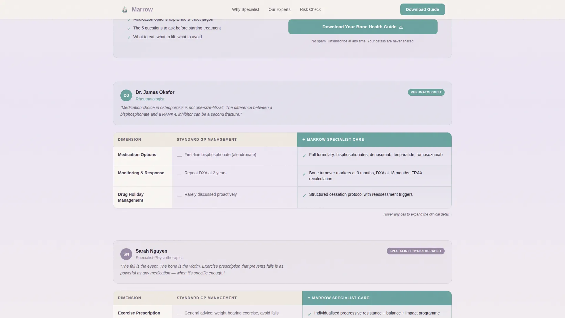
A four-column table contrasts general practitioner management against specialist intervention across dimensions including scan interpretation depth, medication options, fracture risk modelling, and exercise prescription. Hovering any cell expands a brief quote from the relevant specialist, giving the table a live, consultative quality.
Multidisciplinary Specialist Voices
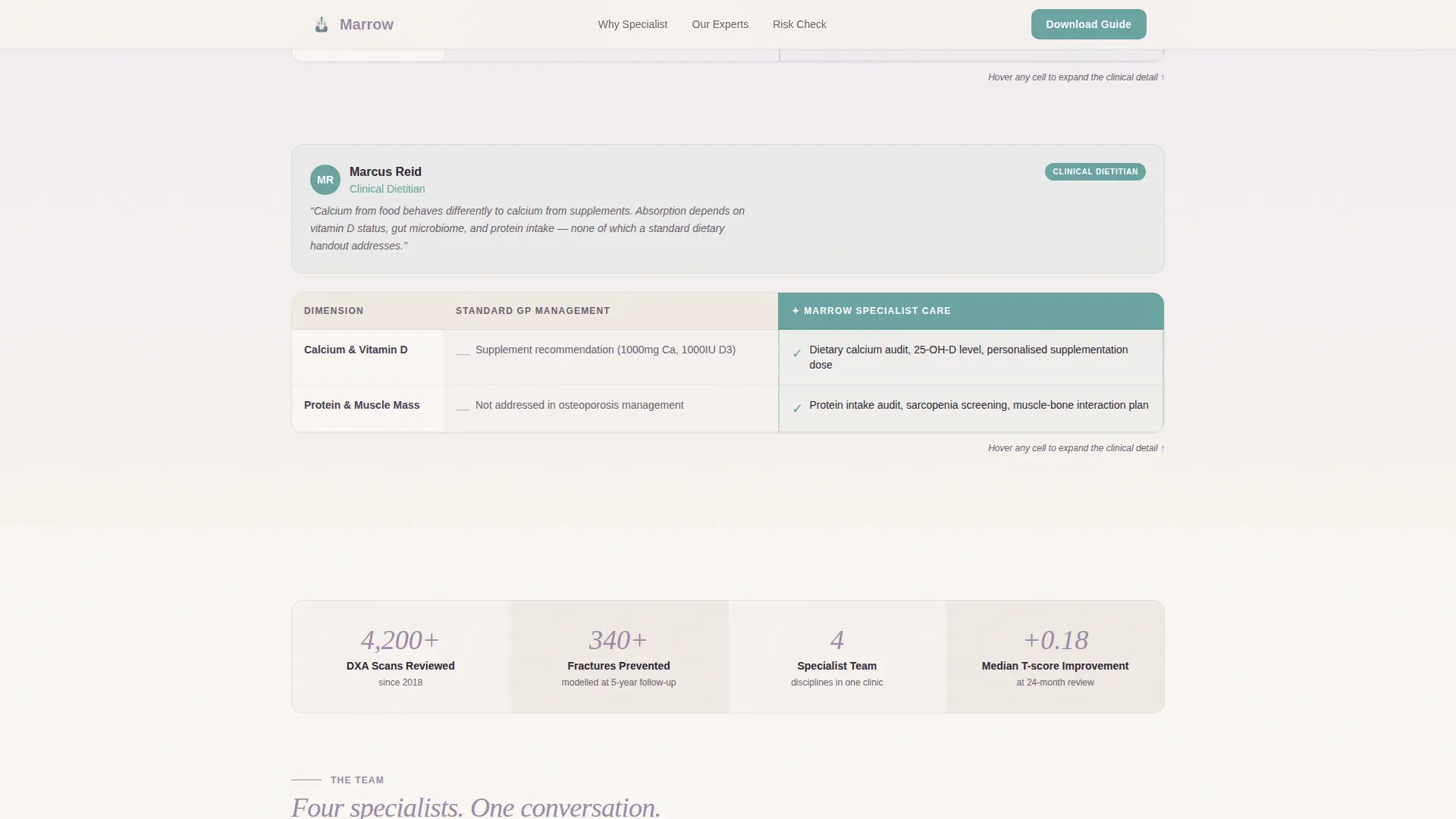
Each row of the comparison table is owned by a different clinician: endocrinologist, rheumatologist, physiotherapist, and dietitian. This structure gives the page layered authority and helps visitors understand the full scope of specialist osteoporosis care.
Bone Health Guide Lead Capture
A form placed immediately after the first comparison table collects a first name and email address in exchange for a downloadable bone health guide. The positioning ensures visitors have already seen the value of specialist knowledge before they are asked for anything.
FRAX-Style Risk Questionnaire Path
A secondary call-to-action block links to a two-minute interactive questionnaire modelled on fracture risk assessment tools. It scores fracture probability and ends with a personalised recommendation to book a DXA (dual-energy X-ray absorptiometry) scan review.
Soft Gradient Cloud Canvas Design System
The entire page uses a warm, non-clinical colour palette moving from bone white through pale lavender mist. All interactive elements and table highlights use a quiet mineral teal. The result is a page that feels like a recovery-focused environment rather than a clinical waiting room.
Page sections overview
| Section | Purpose |
|---|---|
| Hero Type Tower | Introduces density loss concept through vertical typographic animation |
| Why Specialist Panel | Comparison table with four specialist voices and hover-expand quotes |
| Bone Health Download | Lead capture form gated behind demonstrated value |
| Risk Check Block | FRAX-style questionnaire call-to-action with fracture probability scoring |
| Footer Linear | Closing navigation and contact links in a clean linear pattern |
Design & branding system
The visual identity is built on the Cloud Canvas colour system, a palette chosen to feel warm and restorative rather than cold or clinical. Typography pairs a large serif display face with a clean sans-serif body font, keeping the page readable for an audience that skews toward larger screens.
- Colour palette: bone white (#F7F3EE), pale lavender mist (#E8E0F0), dusk mauve (#9B8AA6), mineral teal (#6BA3A0)
- Typography: Fraunces serif for the hero and headings, DM Sans for all body and interface text
- Animation approach: character reveal on the hero sentence, blur reveal on scroll, hover-expand on table cells, and a slow gradient animation across the background
Mobile & speed optimization
The template is designed desktop-first, reflecting the primary audience of adults aged fifty and over who tend to favour larger screens. Full mobile responsiveness is built in so the experience holds across all devices.
- The comparison table and hover interactions adapt cleanly to touch and smaller viewports
- Static sections use server-side rendering for fast initial load; the interactive table and lead capture form use client-side rendering
- Larger text sizing and generous spacing support readability for an older primary audience
How this template helps you convert
The page is structured as a content and resource destination, earning the conversion step rather than demanding it. By the time a visitor reaches the download button, they have already absorbed the clinical case for specialist care.
- The comparison table makes the knowledge gap between general practitioner and specialist management undeniable, building the case for specialist intervention before any ask is made
- The bone health guide download is placed at the precise moment of peak intent, requiring only a first name and email to reduce friction
- The FRAX-style risk questionnaire provides a second, lower-commitment path for visitors who are not yet ready to book, ending with a personalised recommendation that naturally leads toward a DXA scan review
Other information about this template
This template is part of a broader Soft Gradient theme collection and uses the Expert Panel creative direction pattern alongside the Stacked Type Tower header concept. It is categorised under Health and Medical, specifically within the osteoporosis care niche. A few additional details worth noting:
- Template style is a Comparison Table layout, making it well suited to any specialist clinic that needs to contrast care levels side by side
- The page uses AU and UK English medical terminology throughout, with metric units and no currency references
- Social proof is built through specialist credentials and clinical metrics such as T-score thresholds and fracture risk percentages, rather than through testimonial widgets
- The footer follows a Pattern 1 Linear layout, keeping the close of the page clean and consistent with the overall warm-clinical tone
Theme
Soft Gradient
Creative direction
Expert Panel
Color system
Cloud Canvas
Style
Comparison Table
Direction
Content/Resource
Page Sections
Stacked Type Tower Hero
Interactive Expert Panel Comparison Table
Multidisciplinary Specialist Voice Structure
Bone Health Guide Lead Capture Form
Frax-style Risk Assessment Path
Cloud Canvas Soft Gradient Design System
Related questions
Who is this template designed for?
Can I edit the comparison table rows for my clinic's services?
What does the lead capture form collect?
Does the template include the fracture risk questionnaire?
What fonts and colours does this template use?



