Illustration & Art Portfolio Reviews Website Template
Inkwell is a dark, immersive editorial illustration landing page built for studios and ink artists who commission work for legacy publications. The asymmetric 60/40 grid showcases award-winning inking projects with escalating social proof, a brief intake panel, and an email-gated studio deck download. It converts art directors into commission clients with editorial gravitas and confident design.
by Rocket studio
Quick summary
Inkwell is a single-page editorial illustration template designed to win commissions from art directors and brand editors. It pairs a dense Photo Grid Mosaic hero with a scroll-driven, award-stacked portfolio layout. Every section earns trust before asking for the click. The result feels less like a portfolio and more like a case for why this studio belongs on your masthead.
Who this template is for
This template is built for serious visual creators who sell inking and illustration services to publications and brands. If your work has been recognized and you want your page to reflect that weight, this layout is ready for you.
- Editorial illustration studios seeking B2B commission clients at magazines and digital publishers
- Freelance ink artists and illustrators with award recognition looking to attract art directors
- Creative studios building internal buy-in with brand editors who need a studio deck before committing
What problem this template solves
Most portfolio pages treat art as decoration. They display work in a grid and hope the viewer connects. That approach fails with art directors, who are evaluating procurement risk, not just aesthetics. They need to see recognition, publication context, and social proof before they will write a brief.
- Awards and laurels are buried or absent, making it hard for visitors to trust the studio's credentials quickly
- No structured commission path forces art directors to send cold emails rather than submit a clear brief
- Generic portfolio layouts fail to communicate the escalating quality and editorial relevance that wins high-profile commissions
What you get with this template
This template delivers a fully designed landing page structure built around inking credibility and editorial storytelling. Every section has a defined job, from the opening mosaic to the final commission call to action.
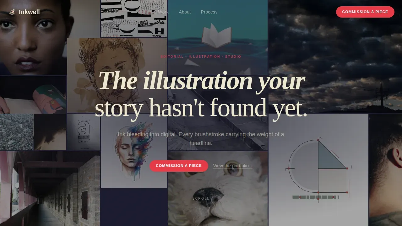
- A Photo Grid Mosaic hero with a staggered tile layout and an emerging headline over dense editorial imagery
- A 60/40 asymmetric featured projects section where awards, publication mastheads, and testimonials stack beside each illustration
- A brief intake panel and an email-gated studio deck download path for two distinct buyer stages
Feature list
This template is built around a set of purposeful design and interaction decisions. Each feature serves the goal of converting a visiting art director into a commission client.
Asymmetric 60/40 Project Grid
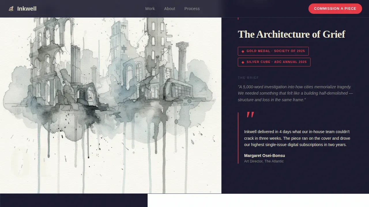
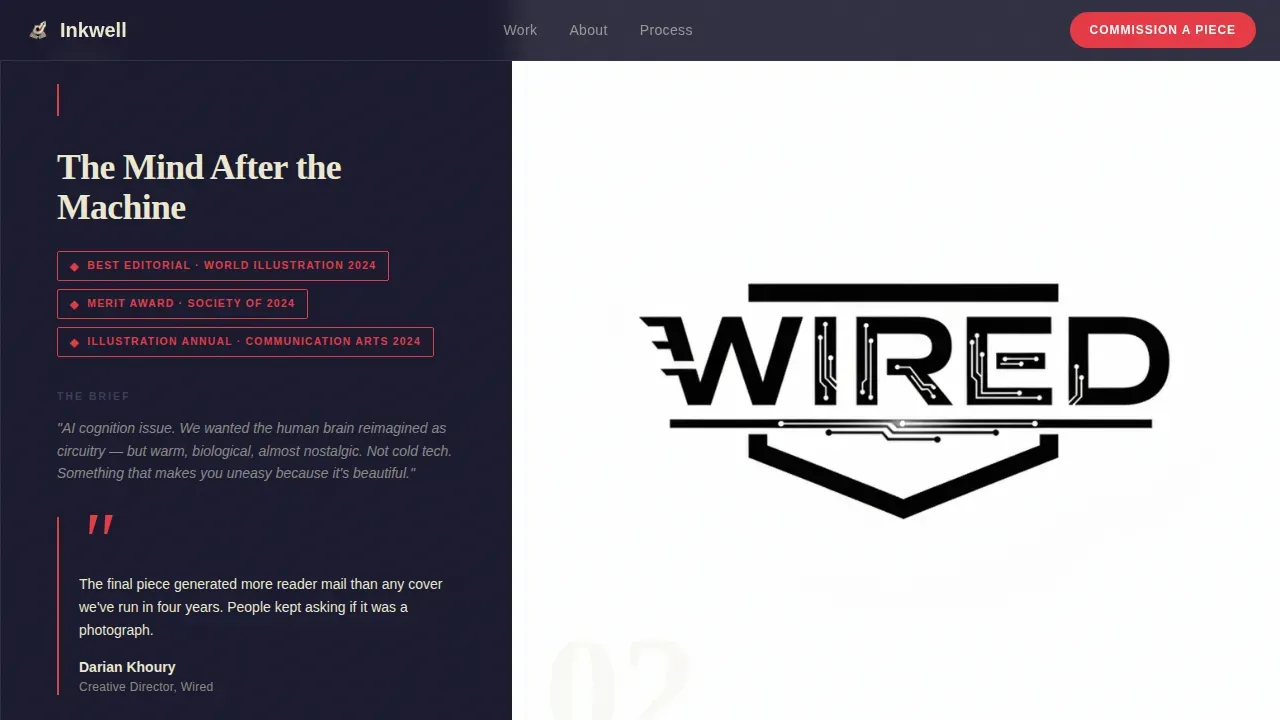
The featured projects section places the finished illustration in the larger 60% column. The 40% column stacks publication context, award laurels, a one-line art director testimonial, and the original brief. The rhythm escalates from editorial spots to full covers to campaign series, so the page builds momentum as the visitor scrolls.
Photo Grid Mosaic Hero
The header fills the viewport with a dense, asymmetric arrangement of cropped editorial illustrations. Tiles stagger in on load. Crops cut tight into faces and hands, making the eye jump across commissions. A spare headline in parchment white emerges over the mosaic after a beat, anchoring the visual energy without interrupting it.
Commission Brief Intake Panel
The primary call to action reads "Commission a Piece" and appears as a fixed pill in the top navigation and again beside the final featured project. Clicking opens a structured brief panel. Fields include publication name, project type (cover, feature spread, series, or branded editorial), estimated run date, and a textarea labeled "Describe the story we'd be illustrating."
Email-Gated Studio Deck Download
A secondary conversion path offers a downloadable studio deck behind an email gate. This serves art directors who are still building internal buy-in and need a document to share with editors or procurement leads. The gate is presented as a value exchange, not a barrier.
Scroll-Linked Award Reveals
Each featured project section uses scroll-linked animation to reveal the illustration, then the award laurels, then the testimonial. The cadence mirrors the way recognition accumulates in a career. By mid-page, visitors are not evaluating style; they are calculating what this studio's awards would mean beside their competitors' commissions.
Publications Marquee and Testimonial Strip
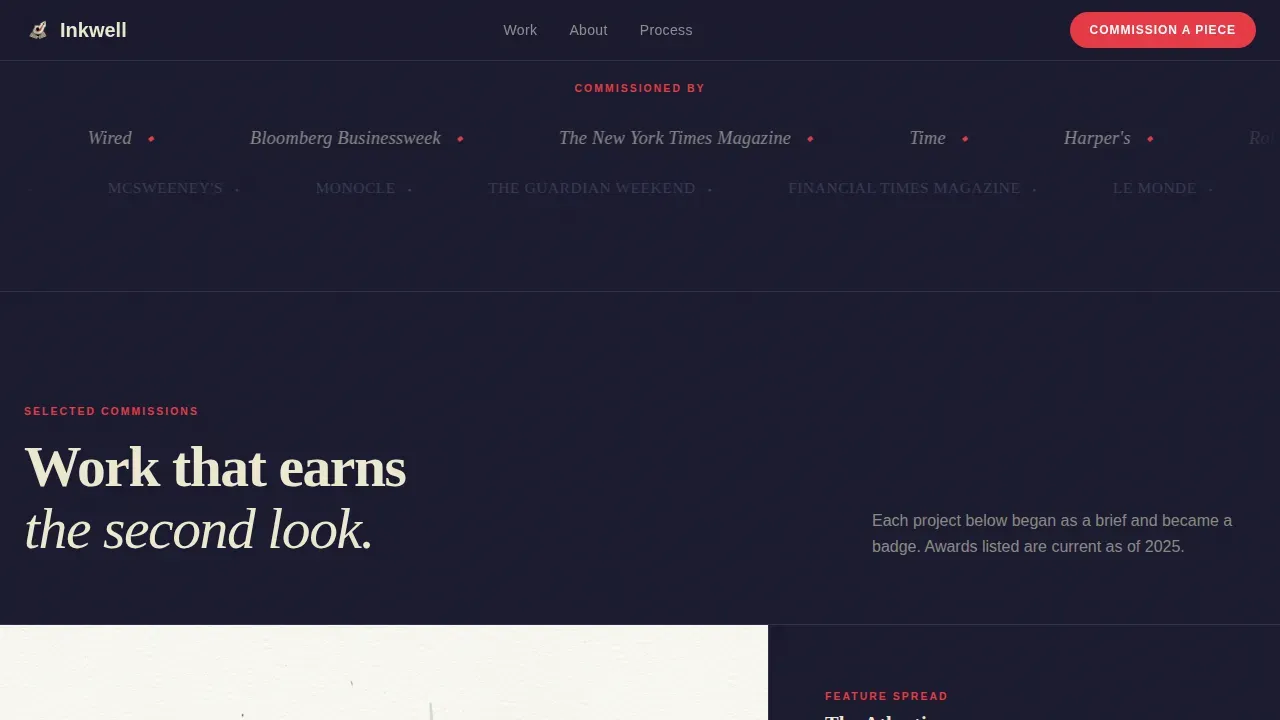
A scrolling ticker of publication names runs between project sections to reinforce credibility at a glance. Below it, art director testimonials appear with publication context, turning peer validation into continuous social proof across the page.
Page sections overview
| Section | Purpose |
|---|---|
| Photo Grid Mosaic Hero | Fill the viewport with dense editorial imagery and surface the studio headline |
| Featured Projects Grid | Showcase award-winning inking work in escalating 60/40 project blocks |
| Publications Name Marquee | Scroll a credibility ticker of publication mastheads between project sections |
| Art Director Testimonials | Display peer quotes with publication context to reduce commission risk |
| Commission Call to Action | Present the brief intake panel and studio deck download as dual conversion paths |
| Footer Horizontal Flow | Close the page with studio contact and navigation in a clean horizontal layout |
Design & branding system
The visual identity follows a Dark Immersive theme that feels like a lithographer's workshop at midnight. The palette is intentionally restrained so the illustrations carry all the color weight.
- Colors: deep charcoal ground (#1A1A2E), muted storm gray (#3D3D5C), parchment white (#EDE8D0) for text and negative space, and cadmium vermilion (#E63946) reserved for award badges, hover states, and pull-quote marks
- Typography: Fraunces display serif for headlines paired with DM Sans for body copy, built on two typefaces to maintain a premium, magazine-like feel
- Motion: mosaic tile stagger on load, scroll-linked project reveals, and a continuous marquee animation give the page a living, editorial rhythm without overwhelming the art
Mobile & speed optimization
The template is designed desktop-first, reflecting how art directors work. A large monitor view is the primary experience. However, responsive behavior is built in so the layout holds up across screen sizes.
- Images use lazy loading so high-resolution editorial illustrations do not block the initial page render
- GPU-accelerated transforms power the scroll animations and mosaic stagger, keeping motion smooth without taxing the browser
- The brief intake panel and studio deck gate are thumb-friendly on smaller screens, with clear tap targets for visitors who discover the studio on a phone
How this template helps you convert
The page is structured to remove friction at every stage of the art director's decision process. Awards do the persuading so the form feels like joining a roster, not making a cold inquiry.
- The mosaic hero and emerging headline create immediate editorial atmosphere, establishing the studio's voice before a single word of body copy is read
- Escalating award laurels and publication mastheads across the project sections build trust progressively, so by the time the visitor reaches the commission call to action they have already seen the evidence
- The dual conversion path serves both ready buyers (brief intake panel) and cautious buyers (email-gated studio deck), capturing leads at two different stages of the procurement cycle
Other information about this template
This template takes its name and conceptual spirit from the tradition of recognizing ink artists and their creative achievement across the history of comics and editorial illustration. Understanding that context helps users appreciate the depth the design is referencing.
- The Inkwell Awards are the only official 501(c)(3) non-profit organization dedicated to promoting and educating the public about the art form of comic-book inking, founded in 2008 by inker Bob Almond with a volunteer committee of creators and advocates
- The Inkwell Awards annually recognize excellence across categories including favorite inker, most-adaptable inker, and the Props Award for under-sung talent, drawing on the work of industry professionals and professional ambassadors from across comics
- The Joe Sinnott Hall of Fame Award, part of the Inkwell Awards program, honors lifetime contributions to inking; Joe Sinnott himself is a legendary figure in the art of inking, and the joe sinnott hall carries that legacy forward through the sinnott hall of fame recognition
- Past hall of fame honorees and ambassadors connected to the awards include figures such as joe kubert, whose kubert school trained generations of ink artists, as well as david spurlock, bob smith, tim townsend, danny miki, dan panosian, wade von grawbadger, keith williams, jim tournas, and joe prado, among many others listed in alphabetical order in official records
- Additional names associated with the awards and the broader comics inking community include frank frazetta, wally wood, neal adams, dick giordano, al williamson, joe kubert, john romita sr, adam hughes, laura martin, tony parker, mark brooks, mike mignola, bill morrison, phil jimenez, eric basaldua, ethan van sciver, brian pulido, pat broderick, rags morales, rich buckler, trevor von eeden, dan didio, mike mckone, christopher priest, jim starlin, mark sinnott, clifford meth, and bob almond himself
- The Inkwell Awards celebrate the craft, visibility, and legacy of ink artists who work on comic pages for publishers including marvel and others; inking defines shapes, shadows, and light across comic book pages, transforming penciled artwork into finished stories
- Events such as the great philadelphia comic con and organizations connected to new bedford have supported the awards; series such as black panther and infinity watch feature inking work that has drawn more attention to the craft
- Power comics and other publications have benefited from the visibility that peer-driven awards and public outreach bring to the art form of comic inking; creators who ink their own pencils bring a distinct voice to every page
Theme
Dark Immersive
Creative direction
Award & Recognition
Color system
Cloud Canvas
Style
Asymmetric Grid (60/40)
Direction
Partnership/B2B
Page Sections
Asymmetric 60/40 Project Showcase
Photo Grid Mosaic Hero
Commission Brief Intake Panel
Email-gated Studio Deck Download
Scroll-linked Award Reveals
Publications Marquee and Testimonial Strip
Related questions
Who is the primary audience for this template?
What conversion paths does the template include?
Does the template work for illustrators without major awards yet?
What typography and color system does the template use?
Is this template suitable for a single project or a broader studio portfolio?



