Skim - Editorial Poolcleaning Landing Page Template
Skim is a split-screen editorial landing page template built for a Toronto pool cleaning service targeting property managers, hotel operators, and residential builders. It pairs a testimonial mosaic layout with a restrained ink-and-paper palette, a press mentions bar, and a B2B-focused lead form, letting client voices do the selling before the call to action ever appears.
by Rocket studio
Quick summary
Skim is a single-page editorial template for a Toronto-area pool maintenance service. It uses a 50/50 split-screen layout, alternating testimonial and photography sections, and a cool ink-and-paper color system. The primary call to action targets portfolio-scale property clients, while a secondary gated PDF path captures early-stage leads.
Who this template is for
This template is built for pool maintenance businesses that serve commercial and residential property accounts, not one-off bookings. It speaks the language of property managers, hospitality operators, and builders, professionals who need a service partner, not just a vendor.
- Property management companies overseeing condo and multi-unit amenity pools
- Boutique hotel operators and waterfront hospitality venues with seasonal or year-round pool needs
- Residential builders who hand off maintenance responsibilities at project closing
What problem this template solves
Most pool service pages compete on price and shout in neon. They ignore the decision-makers who actually sign service contracts. This template solves the trust problem for B2B audiences who need proof before they commit.
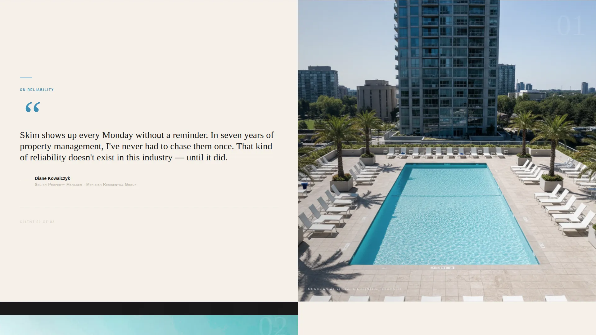
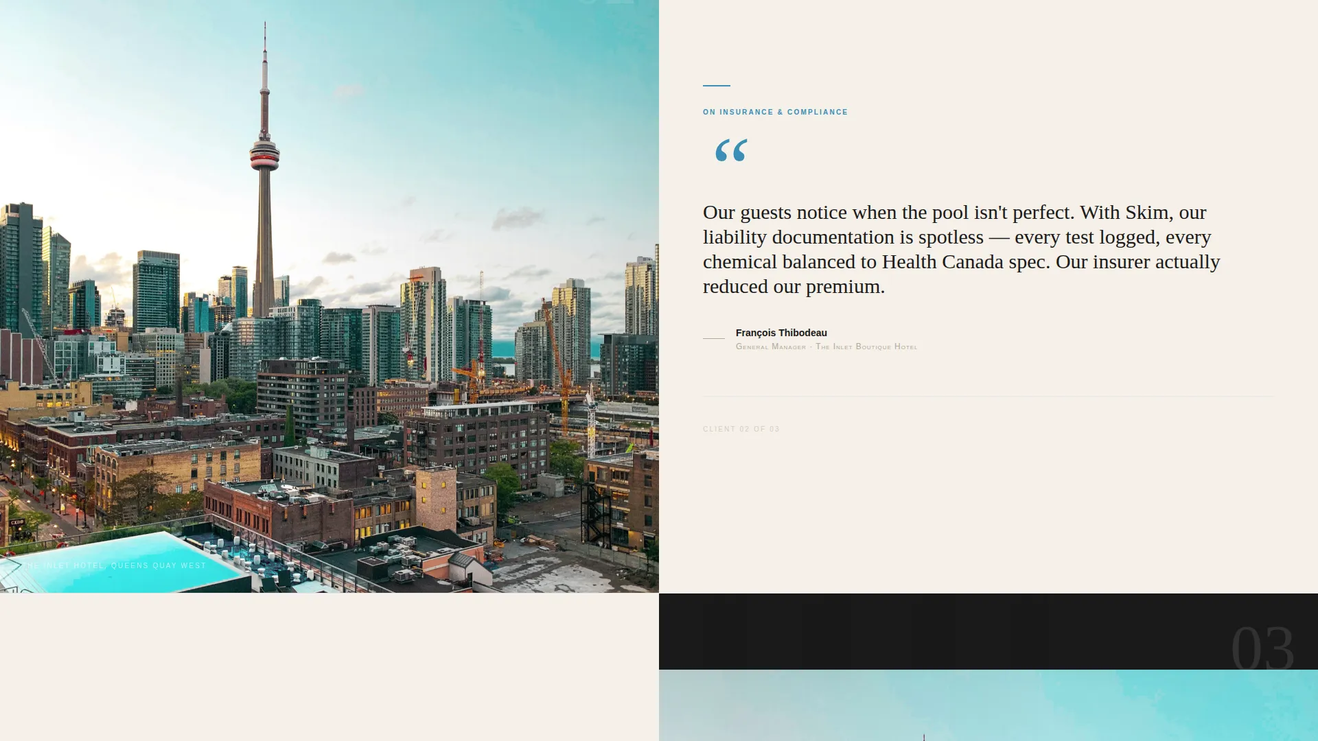
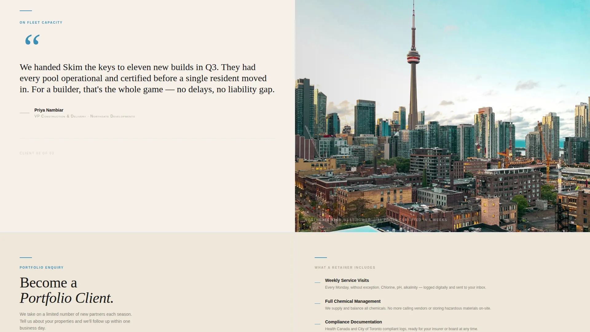
- Objections around reliability, insurance coverage, and fleet capacity are each addressed by a real testimonial in sequence
- There is no hard sales pitch early in the page; social proof leads and the form follows only after trust is built
- The editorial visual tone signals professionalism to property managers who expect polished vendor materials
What you get with this template
You get a fully structured editorial landing page with every section pre-built and ready to customize. The layout handles both visual storytelling and lead capture without sacrificing either.
- A split-screen press mentions header, a testimonial mosaic scroll section, and a two-path lead capture form
- Pull-quote styling with oversized quotation marks and small-caps speaker titles already formatted
- A fixed navigation bar with the primary call to action that stays visible as visitors scroll
Feature list
This template is built around five structural capabilities drawn directly from the creative brief.
Split-Screen Editorial Layout
Every section uses a strict 50/50 split. One side holds an editorial photograph; the other holds text, a quote, or form content. The layout alternates sides as the visitor scrolls, creating a page rhythm that feels like turning magazine pages.
Testimonial Mosaic with Escalating Stakes
Three testimonial blocks are pre-structured as pull-quotes. Each quote addresses a progressively harder buyer objection: reliability first, then insurance coverage, then fleet capacity. Speaker titles appear in small caps beneath each quote.
Press Mentions Scroll Bar
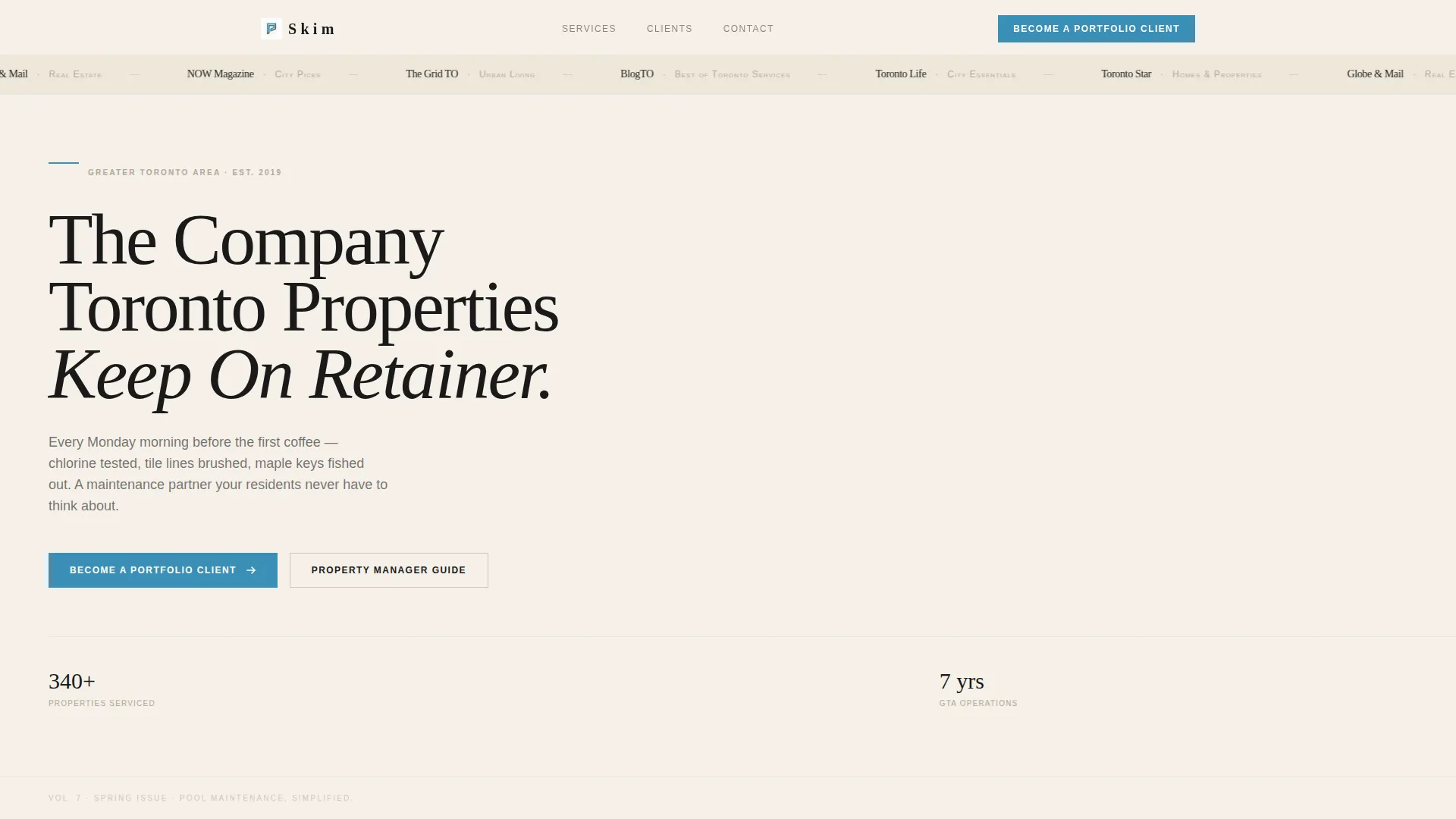
The header includes a horizontal press mentions bar. It displays publication names in small serif type against the cream background field. This bar establishes third-party credibility before the visitor reads a single line of sales copy.
Dual-Path Lead Capture Form
The primary form collects company name, number of properties, pool types (indoor, outdoor, or rooftop), and a preferred contact method toggle between phone and email. A secondary path offers a gated PDF download for leads who are not ready to commit, collecting name and email only.
Fixed Navigation with Primary Call to Action
The navigation bar is designed to stay visible as visitors scroll. The primary call to action, "Become a Portfolio Client," appears first after the third testimonial and then anchors into the fixed nav so it is always reachable.
Ink and Paper Color System
The palette uses four values: deep editorial black (#1A1A1A), warm newsprint cream (#F5F0E8), soft pencil gray (#B0A999), and pool-water cerulean (#3A8FB7). Cerulean is reserved exclusively for links, calls to action, and pull-quote rules to keep visual focus sharp.
Page sections overview
| Section | Purpose |
|---|---|
| Press Mentions Bar | Establishes third-party credibility at first glance |
| Split Hero Header | Anchors the editorial tone and service headline |
| Testimonial Block One | Addresses reliability objection with a property manager quote |
| Testimonial Block Two | Addresses insurance coverage objection with a hotel GM quote |
| Testimonial Block Three | Addresses fleet capacity objection with a commercial quote |
| Primary call to action Form | Captures qualified B2B portfolio leads |
| PDF Gated Download | Captures early-stage leads with a property manager guide |
| Fixed Nav Bar | Keeps the primary call to action visible throughout scroll |
Design & branding system
The visual identity follows an editorial magazine theme. Every design choice reinforces the idea of a high-trust, print-quality vendor presentation. Nothing shouts; everything signals competence.
- Four-color ink-and-paper palette: editorial black, newsprint cream, pencil gray, and pool-water cerulean used only for interactive and accent elements
- Large tracked-out serif headlines paired with small-caps speaker titles and oversized pull-quote marks
- Black-and-white editorial photography on one split side, with full-bleed property images in the testimonial mosaic
Mobile & speed optimization
The split-screen layout is designed to reflow cleanly for smaller screens. Each section is self-contained, so the reading experience remains coherent at any viewport width.
- Each 50/50 panel stacks vertically on mobile so images and text read in the correct sequence
- The fixed navigation with the call to action remains accessible on mobile without obscuring content
- The dual-path form is compact enough to complete on a phone without excessive scrolling
How this template helps you convert
This template is engineered to move skeptical B2B buyers toward action at their own pace. The page sequences trust signals before it ever asks for anything.
- The press mentions bar and editorial photography establish credibility in the first viewport, so property managers feel they are looking at a serious vendor before reading a word of copy.
- The testimonial mosaic builds a layered case across three objections, letting real client voices answer the questions a sales page could never answer on its own.
- Two lead capture paths mean visitors who are ready convert through the full portfolio form, while earlier-stage visitors are retained through the gated PDF download rather than lost entirely.
Other information about this template
This template was built for the Greater Toronto Area (GTA) pool maintenance market, where the client base tends to be institutional rather than purely residential. The editorial positioning is intentional for this audience.
- The page tone and structure suit any premium local service business that sells recurring B2B contracts, not just pool maintenance
- The "Property Manager Guide" gated PDF path is a placeholder content hook; the actual PDF asset would need to be created and connected separately
- The template is designed as a single landing page, not a multi-page website, so all conversion paths resolve within one scrollable page
- The creative direction is editorial magazine, which pairs naturally with professional services that need to project authority and restraint rather than urgency
Theme
Editorial Magazine
Creative direction
Stats-First Impact
Color system
Navy Authority
Style
Sidebar Companion
Direction
Content/Resource
Page Sections
Split-screen 50/50 Editorial Layout
Testimonial Mosaic with Escalating Objections
Horizontal Press Mentions Bar
Dual-path B2B Lead Capture
Fixed Navigation with Persistent Call to Action
Ink and Paper Color System
Related questions
Who is the primary audience this landing page is designed to attract?
Can this template be adapted for a pool service business outside Toronto?
What does the dual-path lead form actually collect?
Does the template include the photography or testimonial content?
Why does the primary call to action only appear after the third testimonial?



