Plasterer & Stucco Worker Review Landing Page Template
Skim is an editorial-style landing page template built for plasterers and stucco workers who want their reputation to do the selling. It pairs oversized typographic headlines with a curated review layout, project detail sidecards, and a persistent lead-capture form to turn first-time visitors into qualified estimate requests.
by Rocket studio
Quick summary
Skim is a single-page, lead-generation template designed for plastering and stucco professionals. It presents client reviews as editorial testimony rather than a generic feed, building trust through structured proof. The monochrome steel palette and oversized typography communicate craft authority, while a pinned estimate form converts that trust into actionable leads.
Who this template is for
This template is built for plasterers and stucco workers who compete on quality and need their digital presence to reflect that standard. It works equally well for solo tradespeople and established plastering contractors with a portfolio of commercial and residential projects.
- Plastering professionals targeting general contractors with tight punch-list schedules
- Property managers and facilities teams sourcing reliable repair contractors
- Homeowners who have had poor patch work done before and want to hire with confidence
What problem this template solves
Most trade service pages either look too generic or bury their best social proof beneath clutter. Visitors arrive skeptical and leave without converting because the page gives them no reason to stay. Skim solves this by turning customer reviews into a structured, editorial argument for the plasterer's skill.
- Review pages that feel like raw feed dumps fail to build credible trust
- Generic contact forms placed at the top of the page ask for commitment before delivering proof
- Visitors with no context leave before they reach the evidence that would have converted them
What you get with this template
You get a complete, ready-to-customize landing page that leads with bold typographic authority and backs it up with organized social proof. Every section is designed to hold a skeptical visitor long enough for the evidence to earn the conversion.
- A giant editorial headline section with aggregate star rating display and review count
- Curated review blocks styled as magazine features, each with a project detail sidecard
- Full-width photographic breaks between review sets and a persistent lead-capture form
Feature list
A single focused paragraph introduces the features before each item.
Every component in this template is designed to move a visitor from curiosity to confidence in a single scroll session.
Editorial Review Panel Layout
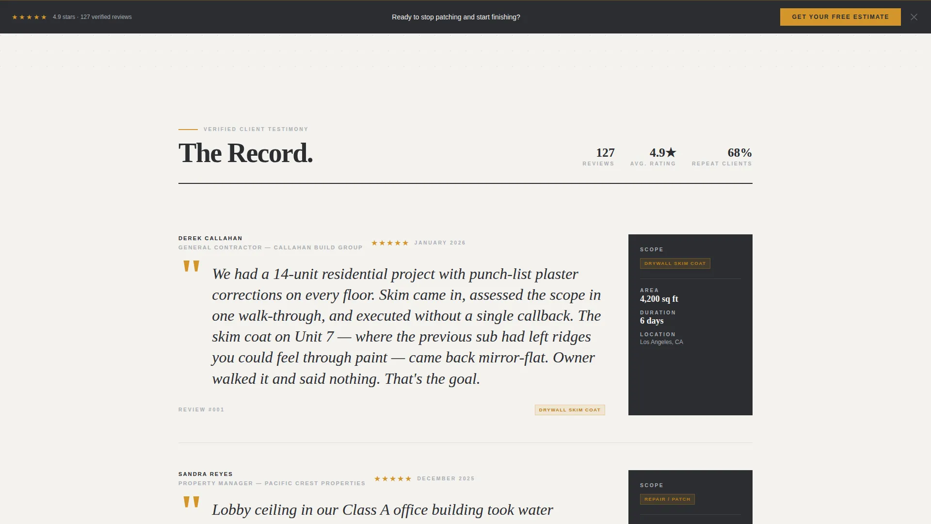
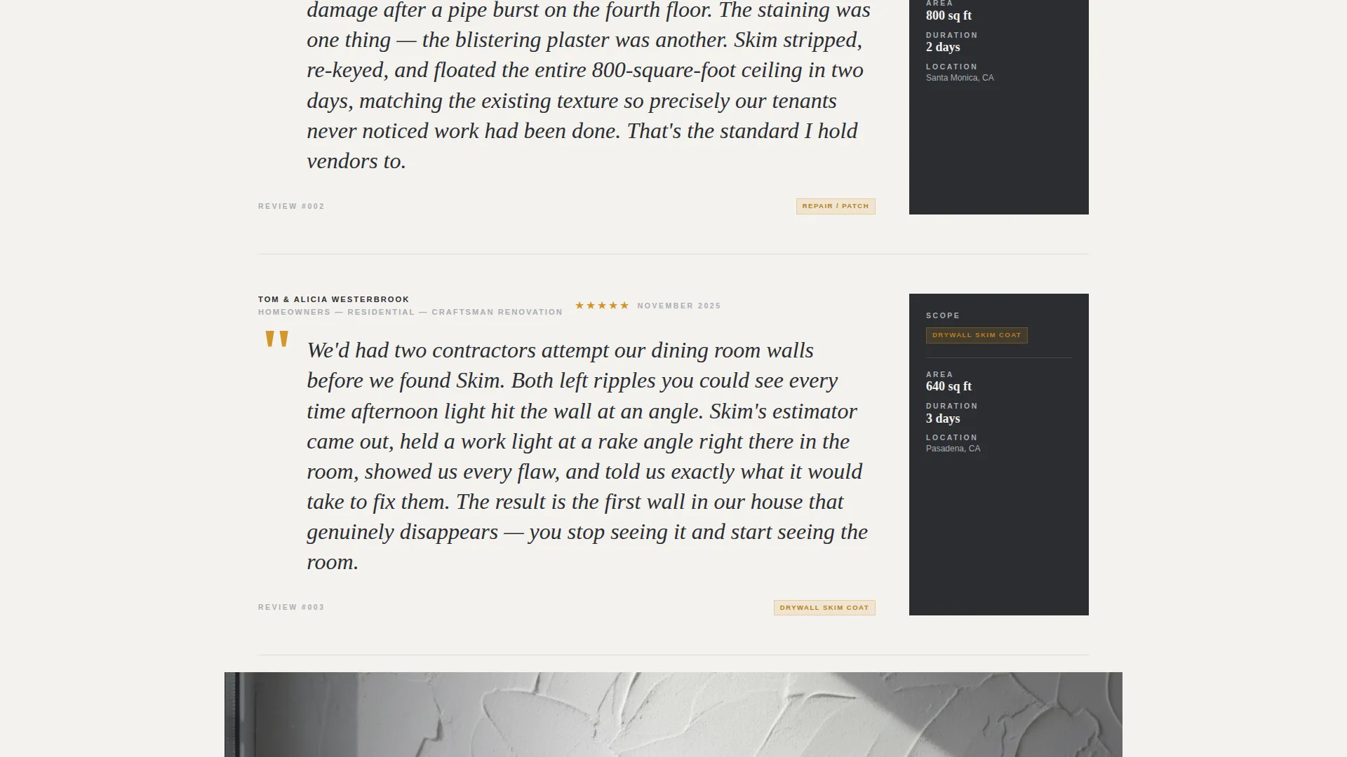
Each customer review is formatted like a magazine feature. The client name and project type appear as a byline. The review text sits in large serif pull-quote styling. A sidecard beside each review lists the scope of work, square footage completed, and project duration.
Giant Headline Header with Rating Block
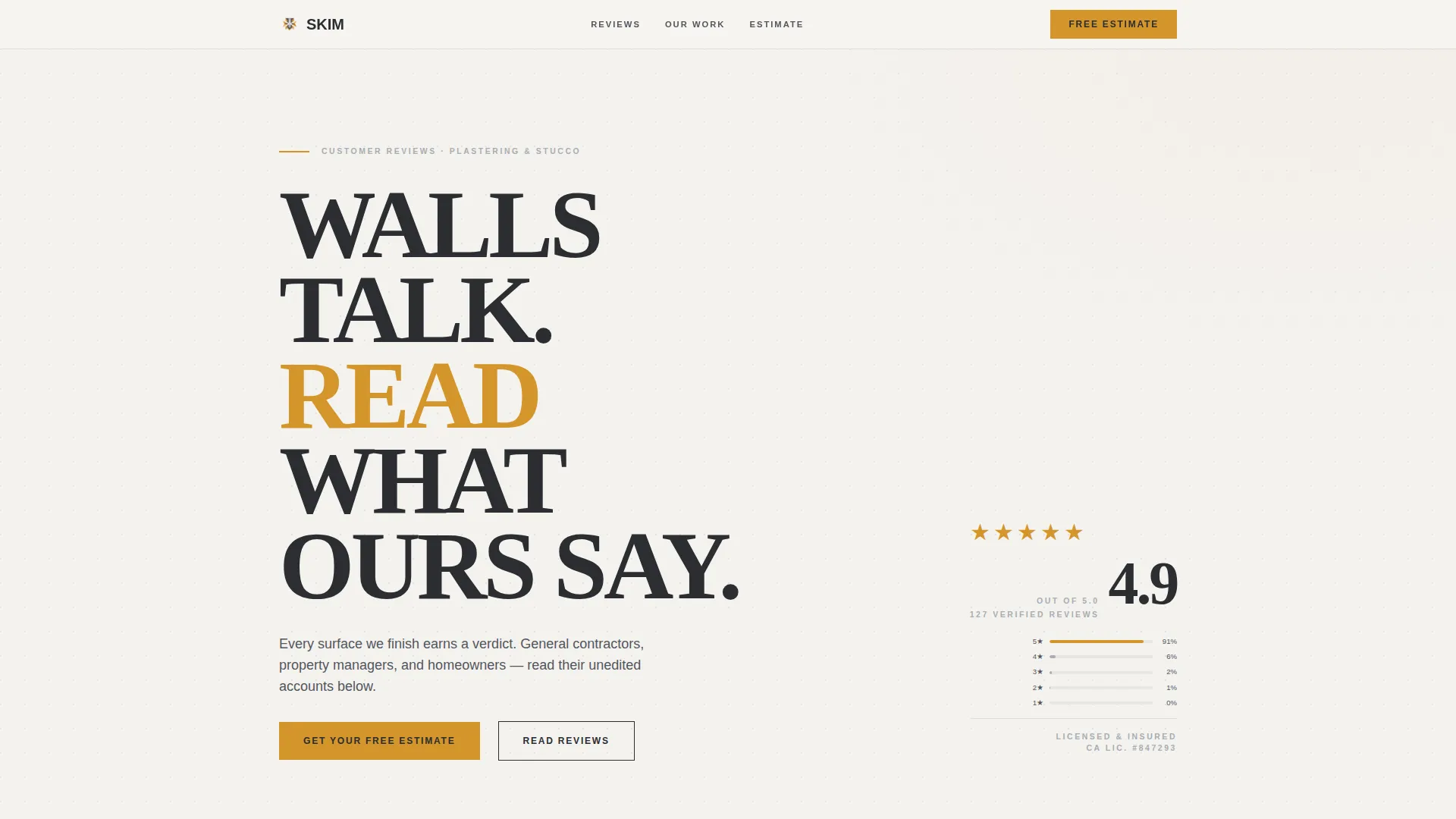
The header opens with flush-left editorial type set at 120px or above, reading "WALLS TALK. READ WHAT OURS SAY." A five-star cluster in amber sits in the right third of the header alongside the aggregate rating score and total review count. No image competes with the typography.
Full-Width Photographic Interrupts
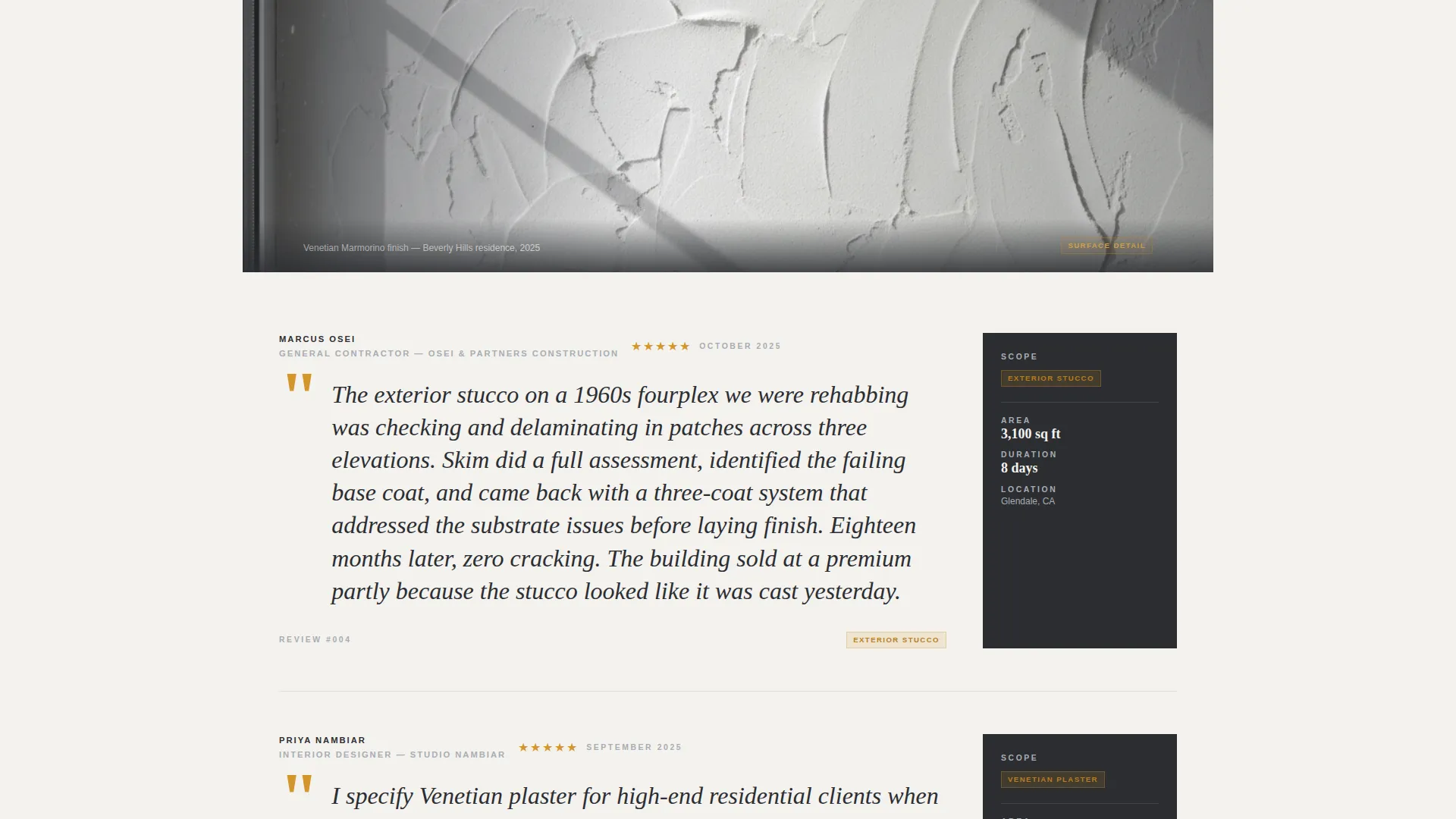
After every third review block, a full-width project photograph breaks the scroll rhythm. Each photo is a tight crop of a finished wall catching raking light. No wide shots. No faces. Just surface.
Persistent Lead Capture Bar
After the third review scroll, a sticky estimate bar pins to the page. The form collects project type first via a dropdown, then square footage estimate, zip code, and finally name and phone number. This low-commitment-to-personal ordering reduces friction.
Progressive Review Loading
A secondary call-to-action labeled "See More Reviews" lets visitors load additional testimony without leaving the page. This keeps skeptical visitors engaged longer and gives the accumulated evidence more time to convert.
Amber Accent Call-to-Action System
The primary call-to-action button reads "Get Your Free Estimate" and uses the safety-tape amber accent color. The same amber is reserved for star ratings and pull-quote marks, creating a consistent visual hierarchy that guides the eye toward the most important actions.
Page sections overview
| Section | Purpose |
|---|---|
| Editorial Header Block | Opens with oversized headline and aggregate star rating |
| Review Block One | First curated client review with project sidecard |
| Review Block Two | Second review with scope, square footage, duration detail |
| Review Block Three | Third review completing the first editorial set |
| Full-Width Photo Break | Raking-light wall crop interrupting scroll rhythm |
| Continued Review Set | Fourth through sixth reviews with sidecards |
| Second Photo Break | Second surface photograph for visual proof |
| Persistent Estimate Bar | Sticky lead form pinned after third review scroll |
| See More Reviews call to action | Secondary trigger loading additional testimony |
Design & branding system
The template uses a Corporate Precision theme built on a Monochrome Steel color system. Every color choice is deliberate. The restraint in the palette communicates the same confidence a skilled plasterer communicates through a seamless finish.
- Structural charcoal (#2B2D31) for primary headlines and body text, trowel-edge silver (#A8ADB3) for secondary details, and fresh plaster white (#F4F2EF) as the page background
- Safety-tape amber (#D4952A) used exclusively for star ratings, call-to-action buttons, and pull-quote marks to create a clear visual hierarchy
- Oversized flush-left editorial typography with negative leading gives the header the weight of print architecture, not a web form
Mobile & speed optimization
The template is structured for clean rendering across screen sizes. The scroll-driven rhythm of alternating review blocks and photographic interrupts translates naturally from desktop to mobile without losing its editorial logic.
- The persistent estimate bar adapts to smaller viewports so the lead form remains accessible throughout the scroll
- Full-width photographic sections maintain their impact on mobile by using tight cropped compositions that do not depend on wide-format display
How this template helps you convert
The page is engineered around a specific conversion psychology. Trust is built before commitment is asked. Every structural choice serves that sequence.
- The header delivers instant authority through scale and aggregate proof before the visitor reads a single word of review copy, reducing the time needed to establish credibility.
- The low-commitment form field order (project type, square footage, zip code, then name and phone) means visitors are already invested in the form before they reach the personal details, which measurably reduces abandonment.
- The "See More Reviews" secondary path keeps undecided visitors on the page and feeding them more evidence rather than losing them to a back-button exit.
Other information about this template
This template is part of a niche-specific library built for plasterer and stucco worker businesses operating in the professional services category. It is designed to serve the intersection of trade craft credibility and digital lead generation with no generic components.
- The template style is Editorial/Magazine, making it distinct from standard service-page layouts common in the trades
- The header concept follows a Giant Headline Left structure, a format borrowed from print editorial design and applied to high-conversion landing page architecture
- The Expert Panel creative direction organizes testimony the way a legal closing argument organizes evidence: voice, then proof, then voice again
- The Corporate Precision theme positions the plasterer as a serious commercial contractor, not a casual handyman, which aligns with the general contractor and property manager buyer profiles described in the brief
Theme
Corporate Precision
Creative direction
Expert Panel
Color system
Monochrome Steel
Style
Editorial/Magazine
Direction
Lead Generation
Page Sections
Editorial Review Panel Layout
Giant Headline Header with Rating Block
Full-width Photographic Interrupts
Persistent Lead Capture Bar
Progressive Review Loading
Amber Accent Call-to-action System
Related questions
Can I customize the review content and project detail sidecards?
Does the form collect leads directly on the page?
Can I add more reviews beyond the default set?
Is the amber accent color locked, or can I update it to match my brand?
Who is this landing page template best suited for?



