Airline & Aviation Booking Website Template
Altitude is a masonry-style commercial airline landing page template built for adventure-focused travel brands. It pairs a full-screen aerial video header with a Pinterest-style destination grid, transparent fare display, and a focused booking search flow. The Alpine Fresh color system, editorial typography, and parallax scroll animations turn the landing page into an immersive travel experience that earns the click before the visitor reaches the search bar.
by Rocket studio
Quick summary
Altitude is a single-page aviation landing page template designed for commercial airlines serving regional and underserved routes. It leads with cinematic aerial video, presents destinations as scrollable fare-tagged postcards in a masonry grid, and guides visitors through a focused booking flow. Every design choice supports one goal: turning a first-time visitor into a confirmed traveler.
Who this template is for
This landing page is built for travel brands that put the destination first and the price right beside it. It fits airlines, regional carriers, and adventure-focused booking platforms that want an immersive, editorial feel without a bloated site structure.
- Founders and marketing teams at boutique or regional airlines launching a booking-focused landing page
- Web designers and developers building a client aviation landing page with a strong visual identity
- Travel business owners who want a high-impact design without writing code from scratch
What problem this template solves
Most aviation landing pages bury the fare, hide route details behind a search wall, and use generic stock photography that could belong to any carrier. Visitors leave without clicking because nothing earns their trust fast enough.
- Fares are hidden or asterisked, forcing visitors to search before they feel confident
- Hero sections use flat imagery that fails to communicate the drama of the destination
- Booking flows ask too many questions too early, killing momentum before conversion
What you get with this template
This landing page template ships as a fully designed, section-complete layout ready for visual customization. Every section is intentional, and the design system is consistent from header to footer.
- A full-screen video hero with a floating route search bar placed above the fold
- A masonry destination grid with fare badges, route codes, and parallax cloud animations
- A trust bar with animated route metrics, a fare alert email capture, a three-step booking explainer, and a single-row footer
Feature list
This landing page template includes a purposeful range of design and interaction features. Each one is grounded in what adventure travel visitors actually need to feel confident and book.
Full-Screen Aerial Video Hero
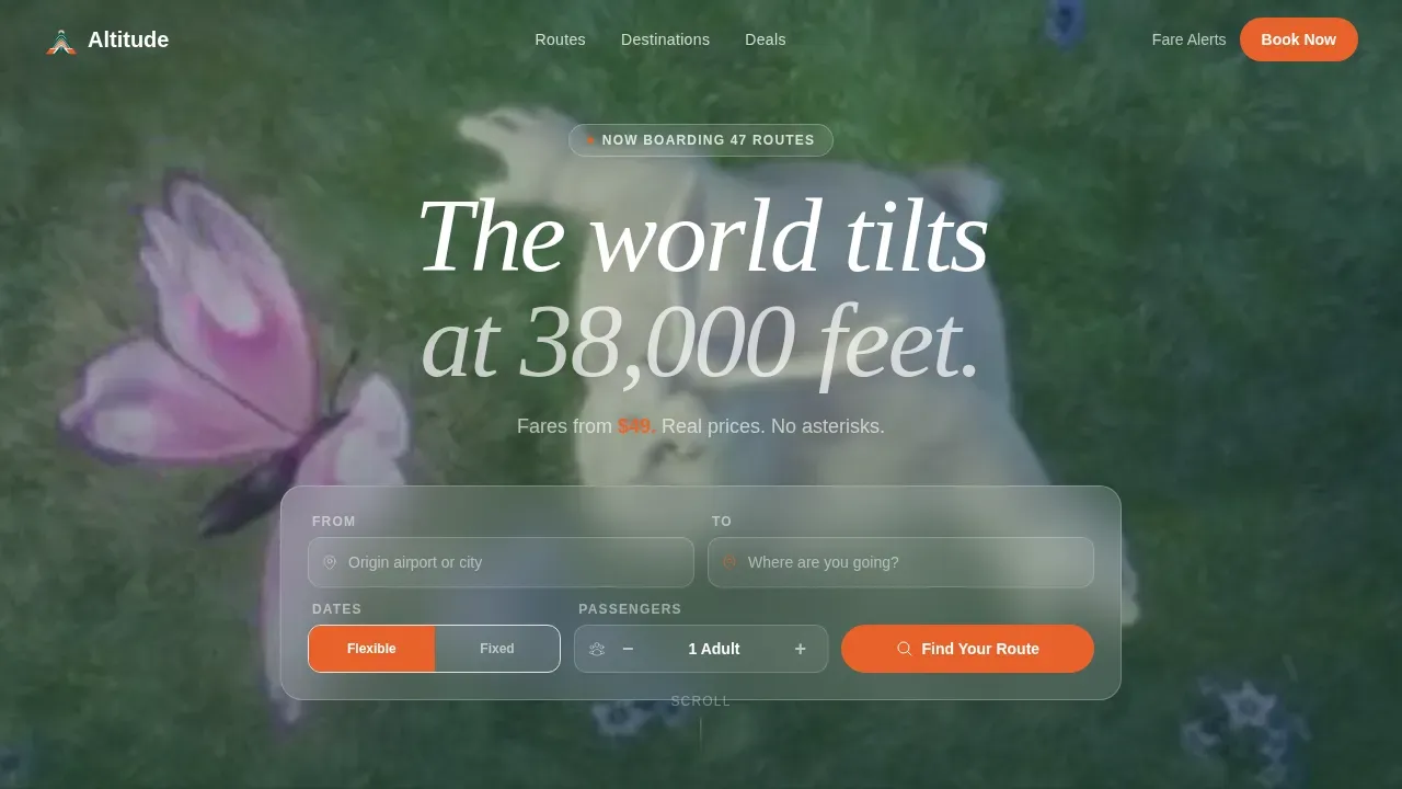
The header fills the entire viewport with aerial footage banking over alpine peaks and descending through cloud cover into open valleys. A translucent route search bar floats center-screen, collecting origin, destination, date, and passenger count. The viewer feels like the aircraft, not a spectator. This immersive visual approach sets the tone for the entire landing page experience.
Masonry Destination Grid with Fare Visibility
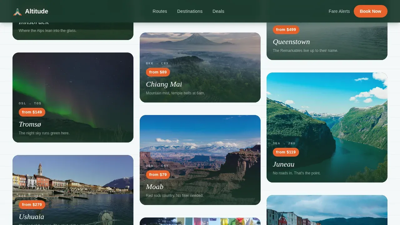
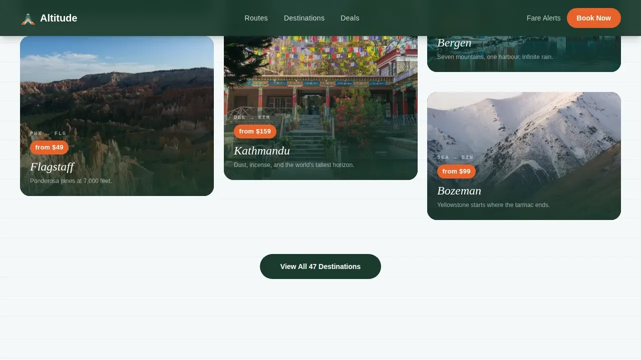
Staggered destination cards of varying heights display dramatic landscape photography alongside a route code, a fare starting price, and a single evocative line of copy per card. Fares are never hidden. Parallax micro-animations make clouds drift across tile edges as the visitor scrolls. The visual rhythm shifts from alpine to coastal to desert to urban as the page descends, warming in color temperature throughout.
Focused Booking Search Flow
The search bar asks for origin first, with smart autofill from nearby airports, then destination, then a flexible date toggle or fixed calendar, then passenger count. A secondary path offers a fare alert for undecided browsers. This flow is repeated as a sticky bottom bar on mobile, keeping the primary call to action always within reach.
Animated Route Trust Bar
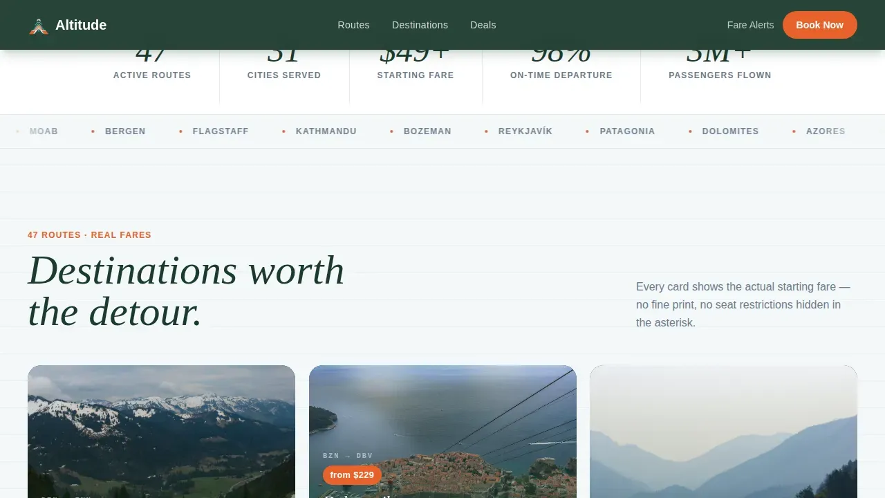
An animated metrics strip displays route count, cities served, and average fare figures. A destination marquee scrolls continuously across the bar. These social proof signals build immediate credibility without requiring lengthy testimonial sections. Trust signals like this are a recognized element of effective adventure landing pages.
Alpine Fresh Design System
The color palette uses glacier white, deep pine, summit stone, and trail-marker orange. Typography pairs Fraunces italic serif headlines with DM Sans for body text and interface elements. The combination feels like an editorial travel journal, not a generic booking website. The design system is fully customizable to match a specific airline brand.
Fare Alert Email Capture
A minimal email capture form lets undecided browsers set a fare alert for a specific route pair. The form asks only for an email address and a route. This secondary conversion path keeps visitors engaged even when they are not ready to book immediately. It is placed strategically to catch visitors mid-scroll before they leave the page.
Page sections overview
| Section | Purpose |
|---|---|
| Video Hero Header | Aerial video background with floating route search bar above the fold |
| Masonry Destinations Grid | Fare-tagged destination postcards in a staggered Pinterest-style layout |
| Route Stats Trust Bar | Animated metrics and scrolling destination marquee for social proof |
| Fare Alert Capture | Minimal email form for visitors not yet ready to book |
| How It Works | Asymmetric three-step layout explaining the booking process |
| Single-Row Footer | Linear footer with essential links and brand identity |
Design & branding system
The visual identity is built around the Alpine Fresh color system, a palette that reads like a topographic map printed on cold-press paper. Every color choice has a purposeful role in the landing page hierarchy.
- Glacier white (#F4F7F9) as the base background, deep pine (#1B3A2D) for primary text and structure, and summit stone (#6B7B8D) for supporting elements
- Trail-marker orange (#E8622A) reserved exclusively for calls to action, fare badge highlights, and interactive hover states
- Fraunces italic serif for editorial headlines paired with DM Sans for clean, readable body text and interface labels
Mobile & speed optimization
This landing page is designed mobile-first. The sticky bottom search bar on mobile keeps the primary booking action visible at all times. The interaction design and layout adapt cleanly across screen sizes, which is essential for aviation landing pages serving a travel audience with high mobile usage.
- Video background uses lazy autoplay so the page starts loading core content before the video begins
- Masonry tile reveals use an intersection observer approach so cards animate into view only as the visitor scrolls
- GPU-accelerated transforms power the parallax tile animations, keeping the scroll experience smooth on mid-range devices
How this template helps you convert
This landing page is built around a single conversion principle: show the traveler what the adventure costs and what it looks like before asking them to search. By the time the visitor reaches the search bar, they are already sold on the destination.
- Fare visibility in every destination tile removes the biggest drop-off trigger on aviation landing pages. Visitors arrive at the search bar with a price anchor already set, making the booking step feel like confirmation rather than discovery.
- The sticky mobile search bar and the fare alert form provide two conversion paths. Visitors who are ready to book use the search flow. Visitors who are still deciding leave an email instead of leaving the page entirely.
Other information about this template
This template is a practical starting point for a range of aviation and adventure travel business needs. It is built on ideas drawn from effective landing page design research, balancing immersive visual storytelling with focused user interface decisions.
- Customizable airline landing page templates like this one can enhance online presence without starting from zero
- No-code tools allow non-technical users to build and manage their own landing pages, and this template is designed to support that workflow. No-code platforms can significantly reduce the time required to launch a landing page
- Responsive design is essential for building effective aviation landing pages, and this template is built mobile-first to provide accessibility across devices
- Designers and developers can use this template as a foundation, then turn it into a fully branded website by adapting the color system, typography, and destination imagery
- Adventure landing page ideas here include parallax visuals, transparent fare display, and a streamlined booking form above the fold. These elements help provide a clear benefit-driven experience from the first scroll
- The template is born from a specific brief: serve the traveler who wants to leave home and find somewhere worth landing. That purpose is visible in every design decision
Theme
Adventure Terrain
Creative direction
Immersive Visual
Color system
Alpine Fresh
Style
Masonry/Pinterest
Direction
Booking/Scheduling
Page Sections
Full-screen Aerial Video Hero
Masonry Destination Grid with Visible Fares
Focused Multi-step Booking Flow
Animated Route Metrics Trust Bar
Alpine Fresh Editorial Design System
Fare Alert Email Capture Section
Related questions
Can I customize the colors and typography in this template?
Is this template suitable for a non-technical user to edit?
Does the template include the fare alert email capture form?
What kind of aviation business is this landing page best suited for?
Can this landing page be adapted into a full multi-page website?