Bold Brutalist Architect Digital Business Card Landing Page
Slab is a bold brutalist architect digital business card landing page. It uses a single-tap share model to deliver your portfolio, contact details, and design philosophy without paper or PDFs. Built for sole practitioners, studio founders, and project architects, its ink-and-paper palette and layered overlap layout make a first impression as deliberate as your best work.
by Rocket studio
Quick summary
Slab is a single-page digital business card landing page built for architects. It replaces the paper card with a tap-to-share experience that carries your portfolio, contact details, and design philosophy in one focused screen. The design follows a bold brutalist visual language: heavy black type, raw concrete textures, and a restrained red accent used like a markup pen.
Who this template is for
This template is built for architects who want their introduction to feel as considered as their buildings. It suits professionals who network in person and need a fast, impressive alternative to paper cards.
- Sole practitioners handing out cards at planning meetings or client briefings
- Studio founders representing their practice at architecture biennales and industry events
- Project architects who want a card that reflects the quality of their built work
What problem this template solves
Architects consistently lose the first impression moment. A paper card gets lost, a PDF goes unopened, and searching for a LinkedIn profile mid-conversation kills the energy. This template removes all of that friction.
- No printed card to forget, lose, or run out of at a site visit
- No fumbling through apps or links when handing over contact details on the spot
- No disconnect between the quality of your work and the quality of your introduction
What you get with this template
You get a complete, single-page landing page structured around social proof and a clear call to action. Every visual choice reinforces authority before a visitor reads a single word of your bio.
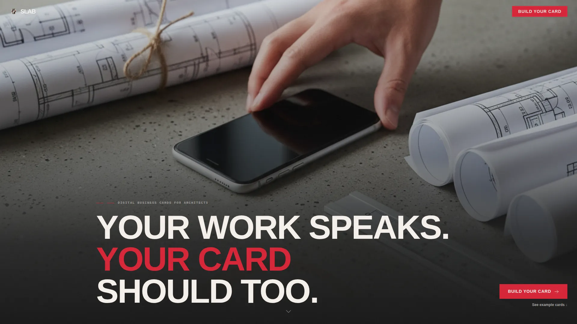
- A full-bleed photographic header with staggered brutalist headline typography
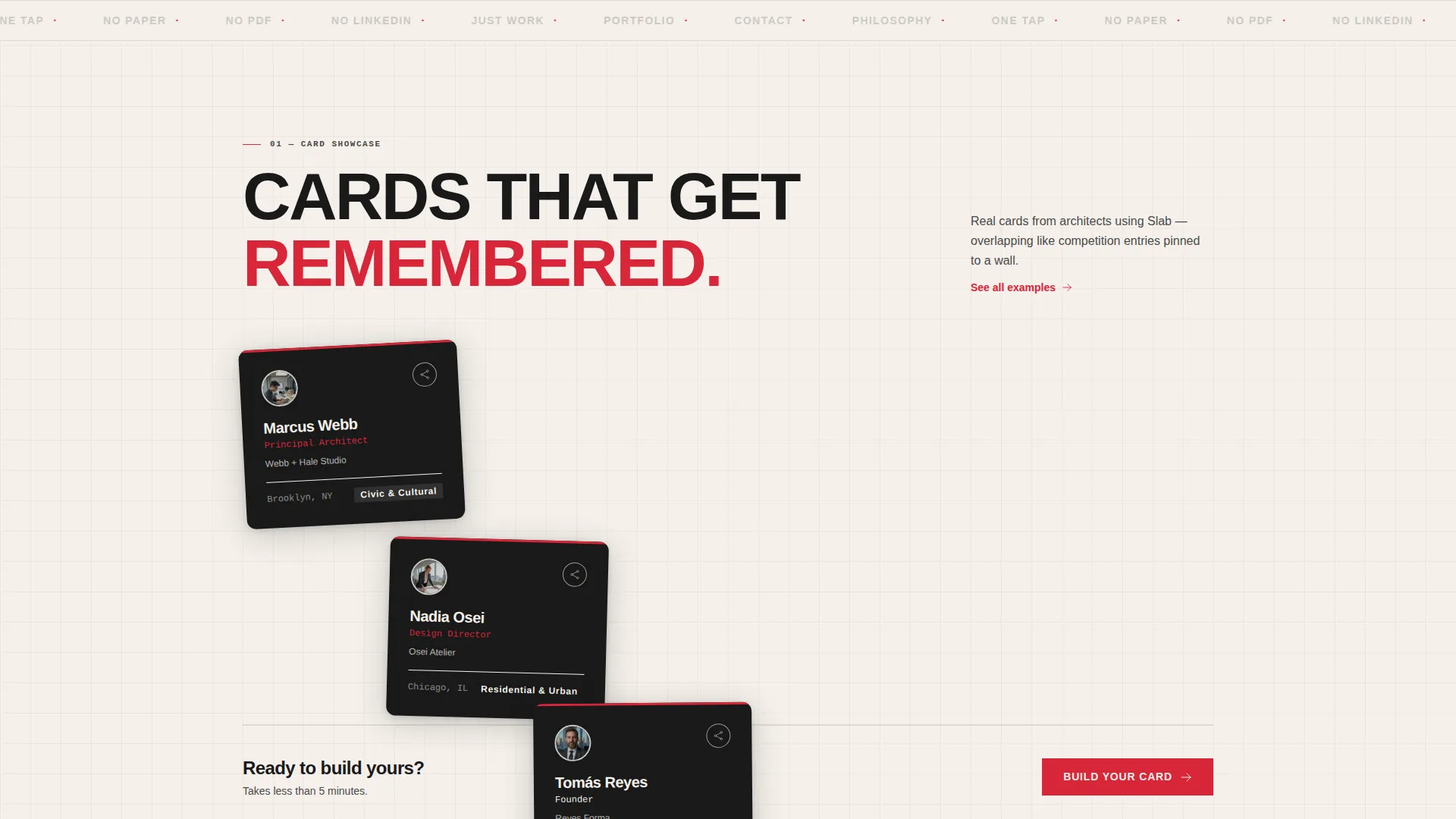
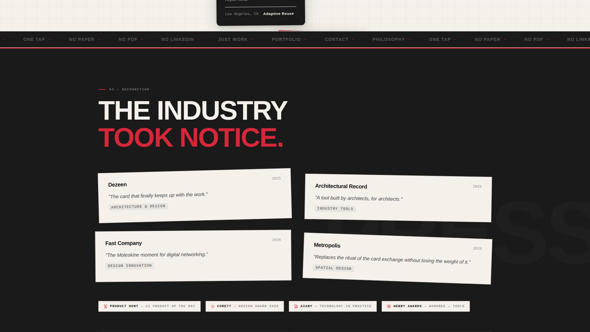
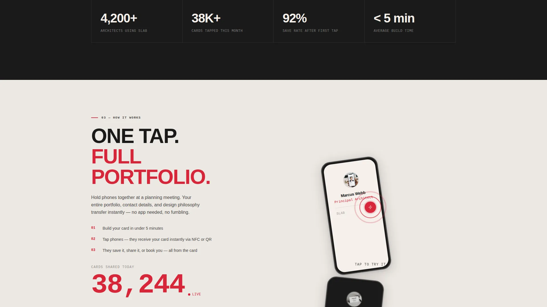
- An overlapping card showcase section, a press and awards panel, and a tap-to-share demonstration counter
- Three strategically placed "Build Your Card" calls to action and a secondary path that scrolls to example cards
Feature list
A brief overview of what drives this template: every component is designed to stack evidence, earn trust, and move a visitor toward building their own card.
Full-Bleed Photo Header
The header opens with a tightly cropped top-down photograph of an architect's hands placing a phone on a raw concrete table. Rolled drawings, a scale rule, and a coffee ring complete the scene. After a beat, oversized brutalist typography slides up from below the fold with the headline: YOUR WORK SPEAKS. YOUR CARD SHOULD TOO.
Layered Overlap Card Showcase
Real digital card examples are displayed in an overlapping stack, presented like competition entries pinned to a wall. Each card slides over the previous one, creating a physical sense of accumulation. By the time a visitor reaches the bottom, they have seen a dozen cards more impressive than anything in their wallet.
Award and Recognition Panels
Press logos and award badges sit on offset panels with visible shadows and distinct edge treatments. These elements build professional authority without requiring text-heavy explanation. The layout positions each accolade as a piece of physical evidence stacked on a desk.
Tap-to-Share Demonstration with Live Counter
A dedicated section shows a card being tapped phone-to-phone, paired with a counter of shares and saves ticking upward. This demonstrates the core product behavior in a concrete, visual way. It answers the "does this actually work?" question before a visitor thinks to ask it.
Three-Point Call-to-Action Placement
The primary call to action, "Build Your Card," appears three times: floating after the header, mid-page after the social proof stack, and anchoring the final panel. No form is required on this page. Each click routes directly to a card builder.
Bold Brutalist Typography System
The type system uses oversized sans-serif headlines that slide into view as the user scrolls. The weight and scale of the type give each section a physical presence, reinforcing the raw concrete aesthetic. Text is treated as a structural element, not decoration.
Page sections overview
| Section | Purpose |
|---|---|
| Full-bleed header | Opens with a concrete-table photo scene |
| Animated headline | Slides up bold brutalist typography |
| Floating call to action button | First "Build Your Card" placement |
| Card showcase stack | Overlapping real card examples |
| Mid-page call to action | Second "Build Your Card" placement |
| Press and awards | Offset panels with logos and badges |
| Tap-to-share demo | Shows phone-to-phone sharing with counter |
| Final anchor panel | Third and closing call to action placement |
Design & branding system
The palette is built around a four-color Ink and Paper system that references a freshly printed architectural monograph. Every color has a specific role and nothing is used casually.
- Deep registration black (#1A1A1A) for primary type and structural elements, uncoated stock white (#F5F0EB) for backgrounds and card surfaces
- Graphite pencil gray (#4A4A4A) for secondary type and supporting panels
- Searing red ink (#D72638) used sparingly for links, calls to action, and hover states, exactly like an architect's markup pen on a set of drawings
Mobile & speed optimization
The overlap and layered layout is designed to translate cleanly to smaller screens. Stacked panels reflow naturally, and the full-bleed header maintains its impact on mobile viewports.
- Layered card panels adjust their offset and shadow depth for touch-screen browsing
- The floating call-to-action button remains accessible as a user scrolls through the page on a phone
- Typography scales down without losing the brutalist weight that defines the visual identity
How this template helps you convert
This template earns the click rather than demanding it. Every section adds a layer of proof before asking a visitor to act.
- The header and animated headline establish a strong visual identity immediately, setting the tone before any text is read.
- The card showcase and social proof panels stack credibility progressively, so the value of the product becomes obvious through demonstration rather than description.
- Three precisely placed calls to action give visitors a clear exit point at every stage of the scroll, reducing friction and capturing intent at the right moment.
Other information about this template
Slab is a ready-to-customize template built for the architect digital business card niche. It ships as a fully designed, overlap-layout single page that a designer or developer can adapt to any individual architect's brand.
- The template style is Overlap and Layered, with visible card shadows and offset edges that suggest physical sheets of heavy stock stacked on a surface
- The creative direction follows an Award and Recognition scroll structure, surfacing a different layer of validation in each section
- The header concept is Full-Bleed Photo, using a concrete-table scene as the opening visual rather than a headline-first layout
- The landing page direction is Click-Through, routing all primary actions to a card builder rather than capturing leads on-page
- Slab is listed under the Personal and Resume category, specifically the Architect Profile subcategory, within the Architect Digital Business Card niche
Theme
Bold Brutalist
Creative direction
Award & Recognition
Color system
Ink & Paper
Style
Overlap/Layered
Direction
Click-Through
Page Sections
Full-bleed Photo Header with Animated Headline
Overlapping Card Showcase Stack
Award and Recognition Proof Panels
Tap-to-share Demo with Share Counter
Three-point Call-to-action Layout
Bold Brutalist Typography System
Related questions
Does this template include a form or lead capture?
Can I use this template if I am not a solo practitioner?
How many times does the call to action appear on the page?
Can the colors and typography be changed to match my personal brand?
What kind of photo works best in the header section?



