Marble Products & Portfolio Website Template
Slab is a hero-dominant landing page template built for marble and natural stone consultancies. It pairs a cinematic 60/40 hero split with a scrolling case study narrative, a Monochrome Steel color system, and a single confident call to action. Designers, developers, and contractors see proof before they ever fill out a form.
by Rocket studio
Quick summary
Slab is a single-page, click-through landing page template designed for high-end stone consultancies. It opens with a bold half-page photo and text hero, then guides visitors through escalating project case studies that build trust with every scroll. The page routes qualified leads to a dedicated consultation flow, keeping the landing page itself clean and persuasive.
Who this template is for
This template is built for professionals who work in the luxury end of the stone industry. The layout speaks to audiences who make high-stakes material decisions on behalf of clients.
- Interior designers sourcing stone for kitchen countertops, islands, and bathroom layout projects
- Hospitality developers cladding lobby walls and specifying stone across large commercial spaces
- General contractors who need a reliable stone supplier and cannot afford costly mistakes on installation
What problem this template solves
When a single mismatched slab can derail a six-figure countertop installation, a generic website does not communicate the required level of care. This template solves the trust gap between a high-value stone consultancy and the clients they need to reach.
- Visitors arrive skeptical and need proof before they will click anything
- There is no obvious way to show material expertise through text alone
- Most templates force a form on arrival, before the visitor has any reason to trust the business
What you get with this template
This template delivers a complete, ready-to-customize landing page structured around narrative proof. Every section has a defined job that moves the visitor closer to a confident consultation request.
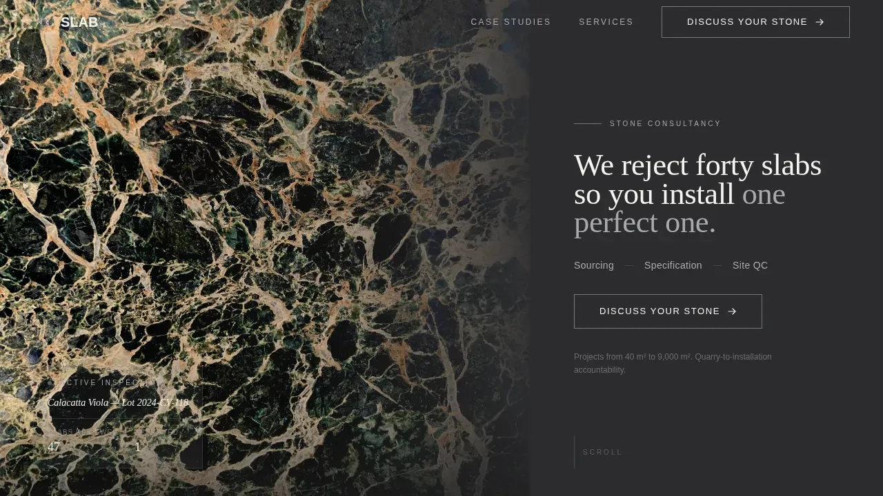
- A 60/40 hero split with a cinematic stone photograph on the left and a stark charcoal text panel on the right
- Three scrolling case study sections that escalate in stakes and demonstrate expertise across project types
- A services and credentials bar, a fixed mobile call-to-action strip, and a minimal single-row footer
Feature list
This template includes purpose-built sections and layout decisions drawn directly from the project brief. Each feature supports the core goal: turning a skeptical professional into a qualified inquiry.
Cinematic Hero Split Layout
The hero occupies the full viewport and divides into two distinct zones. The left sixty percent holds a tightly cropped overhead photograph of a natural stone slab on an inspection table. The right forty percent is a stark polished charcoal panel with a condensed serif headline, a quarry fog subline listing three services, and a brushed-nickel-outlined button.
Scrolling Case Study Narrative Engine
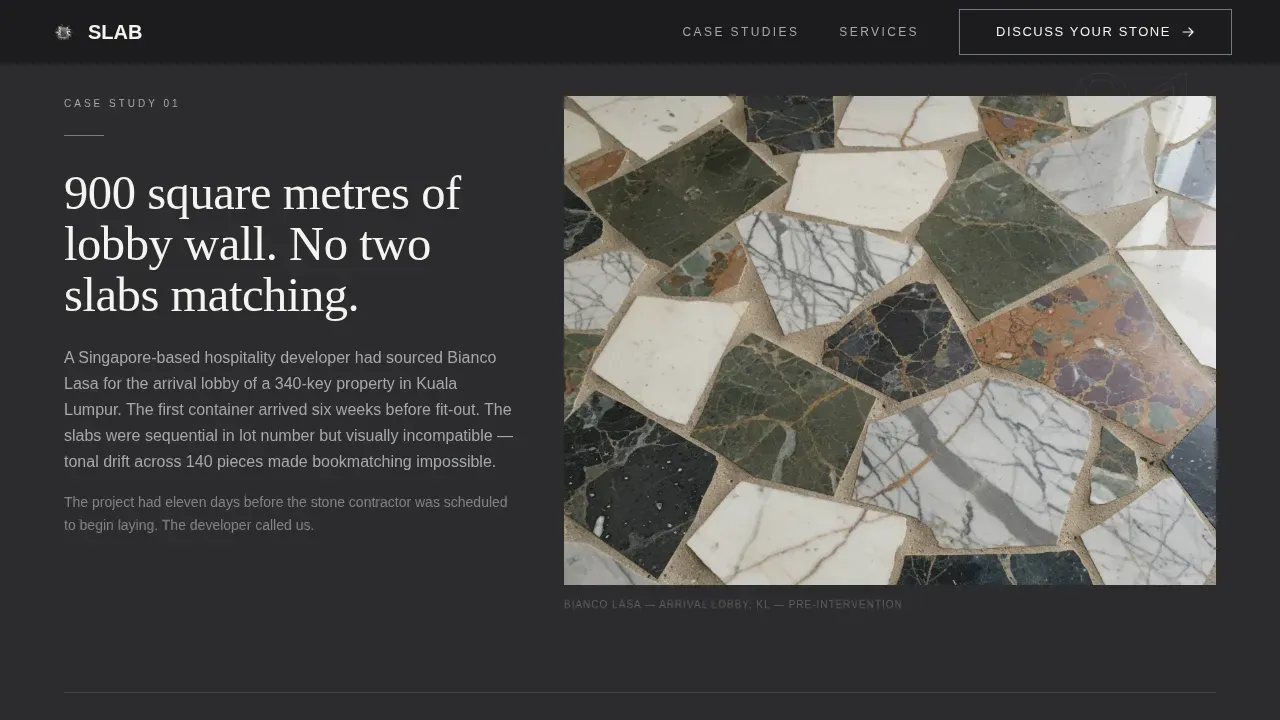
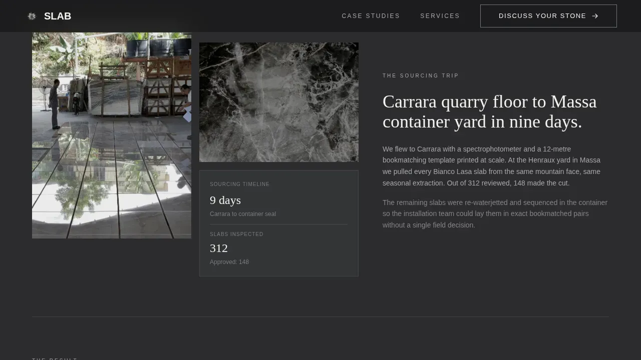
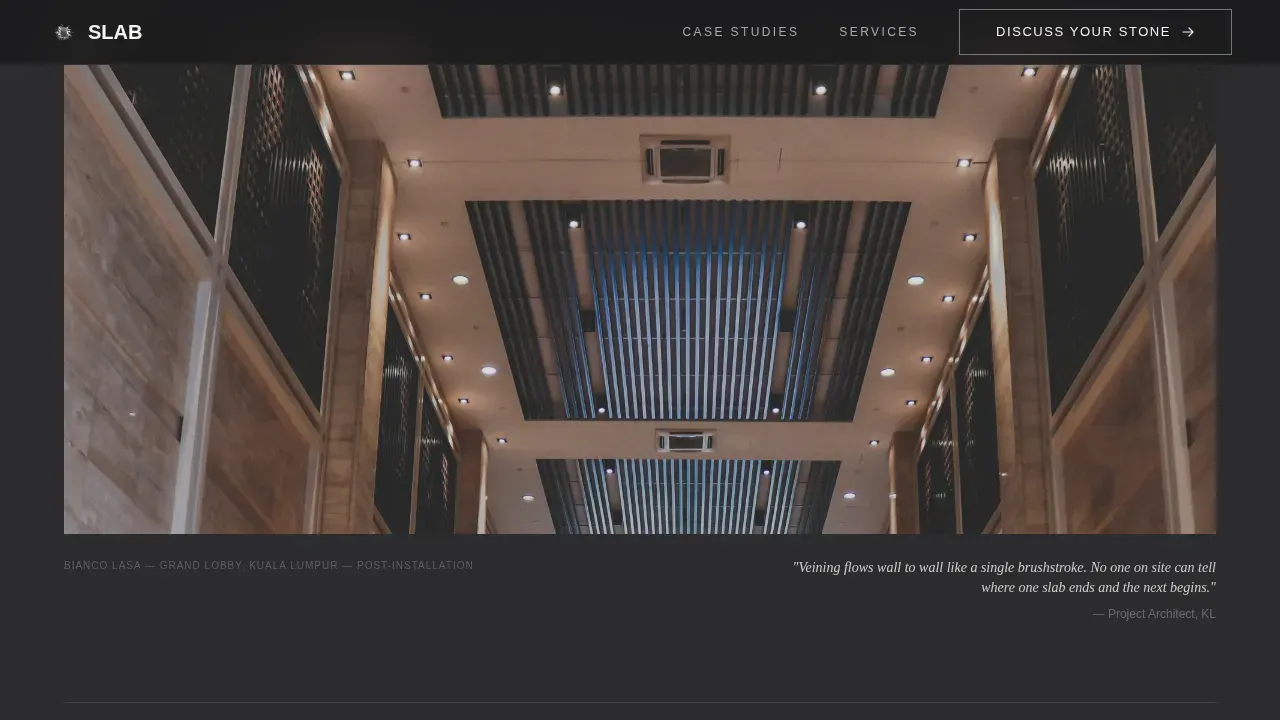
Below the hero, three case study blocks unfold in documentary sequence. Each one follows a problem, sourcing, and result arc. The first covers 900 square meters of lobby walls with unmatched stone. The second covers a yacht interior and hospitality cladding project. The third involves sourcing a material that had not been quarried in four years for a museum atrium.
Repeating Primary Call to Action
The primary call-to-action button, "Discuss Your Stone," appears first in the hero and then resurfaces after each case study. On desktop it appears as an inline button. On mobile it locks as a fixed bar at the bottom of the screen so the action is always reachable without scrolling back up.
Secondary Lead Capture Path
A secondary path, "Download Our Slab Selection Guide," appears once as a plain text link after the second case study. It captures emails from visitors who are researching but not yet project-ready. It is never shown as a modal and never interrupts the reading flow.
Services and Credentials Bar
A dedicated section names the three core services: Sourcing, Specification, and Site Quality Control. This section anchors the consultancy's scope and gives first-time visitors a clear picture of what the engagement covers before they click through.
Minimal Single-Row Footer
The footer follows a GitHub Developer Minimal pattern: one row, no decorative clutter, and only the links that matter. It keeps the page feeling intentional and leaves no visual noise after the final call to action.
Page sections overview
| Section | Purpose |
|---|---|
| Hero Split Panel | Opens with stone photography and headline |
| Case Study One | Lobby wall mismatch problem and resolution |
| Case Study Two | Yacht and hospitality cladding proof |
| Case Study Three | Discontinued stone sourcing for museum |
| Services Credentials Bar | Names scope and builds authority |
| Secondary Capture Link | Email capture for early-stage visitors |
| Single-Row Footer | Closes page with minimal navigation |
Design & branding system
The visual identity follows a Corporate Precision theme built around a Monochrome Steel color palette. Stone photography does all the color work. The typography system pairs a condensed serif for headlines with a clean sans-serif for body text, keeping hierarchy sharp and editorial.
- Polished charcoal (#2C2C2E) and slab white (#F4F3EF) alternate as section backgrounds, with quarry fog (#A8A9AD) used for body text on dark sections
- Brushed nickel (#71797E) appears only on hover states and divider lines, never as a dominant color
- Fraunces condensed serif handles all headlines; DM Sans handles all body copy and labels
Mobile & speed optimization
The template is designed desktop-first, reflecting the reality that interior designers and developers do most of their project planning on larger screens. Mobile behavior is handled with care so nothing is lost for visitors on smaller devices.
- The hero photograph stacks above the charcoal text panel on mobile, preserving the visual weight of the stone image
- The fixed-bottom call-to-action bar on mobile keeps "Discuss Your Stone" always visible without interrupting scroll
- Hero images load as static priority assets; case study photographs use lazy loading to keep the initial experience fast
How this template helps you convert
This template is built around a click-through conversion model. The goal is a confident, educated click after the case studies have done their job. No form lives on the landing page itself.
- The hero establishes credibility immediately with a bold headline and quarry-level photography, so visitors understand the caliber of the consultancy before reading a single word of body copy.
- Each case study block compounds proof on proof, moving the visitor from curious to convinced before the call-to-action reappears, making the final click feel earned rather than pressured.
- The secondary text-link lead capture gives researchers a lower-commitment path without distracting from the primary conversion goal, so no qualified visitor leaves empty-handed.
Other information about this template
This template sits at a specific and intentional intersection within the stone industry. Buyers who use it should understand how the design decisions connect to real-world fabrication and sourcing workflows that their clients already know.
- The case study narrative structure mirrors how countertop fabricators and stone fabricators already communicate project success to clients, making the template feel immediately familiar and credible to that audience
- The template is well suited for consultancies who work alongside a countertop fabricator, a stone supplier, or both, and need a page that reflects that professional-grade positioning
- The templating process that underlies any real stone project, from reading dimensions on site to confirming seam placement and planning cutouts for a sink, faucets, or a cooktop, is the kind of expertise this page positions the consultancy to own
- Countertop templates, whether digital or traditional, require careful preparation: existing countertops must be cleared, cabinets confirmed as level, and all appliances such as the undermount sink or cooktop made available on site before fabrication begins
- A digital template can be transferred directly to cutting equipment, reducing human error and costly mistakes, while traditional templating done by a skilled professional is equally accurate and reliable for almost any project
- The template's editorial tone and high-resolution image zones support the kind of stone photography that showcases granite, marble, quartz, quartzite, and other natural stone materials at their best, letting the material itself do the selling
- Granite is a popular countertop choice for its durability; quartz countertops offer engineered consistency across seams; marble brings elegance but requires careful handling; quartzite delivers hardness with natural veining that rivals marble
- Corrugated plastic and wood are sometimes used in traditional templating as physical pattern materials before the precise template shape is transferred to the stone for cutting
- Fabricators need accurate countertop templates to address every detail before cutting: the edge profile, the exact location of each sink cutout, the corner radius, and whether the run is perfectly square and perfectly straight
- Skipping or rushing the template stage creates costly mistakes downstream; a flawless template ensures new countertops hug every cabinet run and perfectly frame each sink without gaps at the wall or uneven seams across two pieces
- This slab precision stone sourcing landing page template is designed to serve consultancies who operate at the professional end of the market, where installation services carry significant financial and reputational stakes
- For stone businesses looking to manage inventory, job tracking, and client communications in one place, platforms like SlabWare have been specifically designed for the stone industry and address common challenges faced by countertop fabricators
Theme
Corporate Precision
Creative direction
Case Study Narrative
Color system
Monochrome Steel
Style
Hero-Dominant (90/10)
Direction
Click-Through
Page Sections
Cinematic 60/40 Hero Split
Escalating Case Study Narrative
Repeating Click-through Call to Action
Secondary Email Capture Path
Services and Credentials Bar
Minimal Single-row Footer
Related questions
Does this template include a contact form on the landing page?
Can a countertop installation or fabrication business use this template?
How does the secondary email capture work without a modal?
What stone materials does the template showcase best?
Is the template easy to adapt for different regions or project scopes?



