Hardscaping & Patio Contractor Landing Page Template
Slab is a split-screen landing page template built for hardscaping and patio contractors. It pairs raw before photos with finished installation shots, guides visitors through a project site walk section by section, and moves them toward booking with a focused scheduling form. The design feels as grounded as the work itself: matte, mineral, and built to convert.
by Rocket studio
Quick summary
Slab is a single-page template designed for crews that build patios, retaining walls, walkways, and fire pit surrounds. Every section uses a 50/50 split-screen layout to show raw conditions alongside finished installations. The page moves visitors from curiosity to a scheduled site walk with a focused, three-field booking form and a low-commitment secondary path.
Who this template is for
This template is for hardscaping contractors and patio builders who want a landing page that speaks the language of the trade. It suits crews who work with natural stone, poured concrete, and structural pavers, and who win jobs by showing their work rather than describing it.
- Hardscaping companies that rely on before-and-after project photos to earn trust
- Patio and retaining wall contractors ready to replace a generic website with a page built for bookings
- Small crews and owner-operators who want a polished online presence without a custom build
What problem this template solves
Most hardscaping contractors either have no landing page or have one that buries the work under stock photography and vague promises. Homeowners looking at a cracked concrete pad or an eroding hillside want to see proof that the crew knows what they are doing before they hand over a phone number.
- Visitors leave when they cannot quickly connect a contractor's work to their own backyard problem
- Generic contact forms fail to qualify leads or set expectations about project scope
- Flat, single-column layouts do not communicate the before-and-after transformation that sells hardscape work
What you get with this template
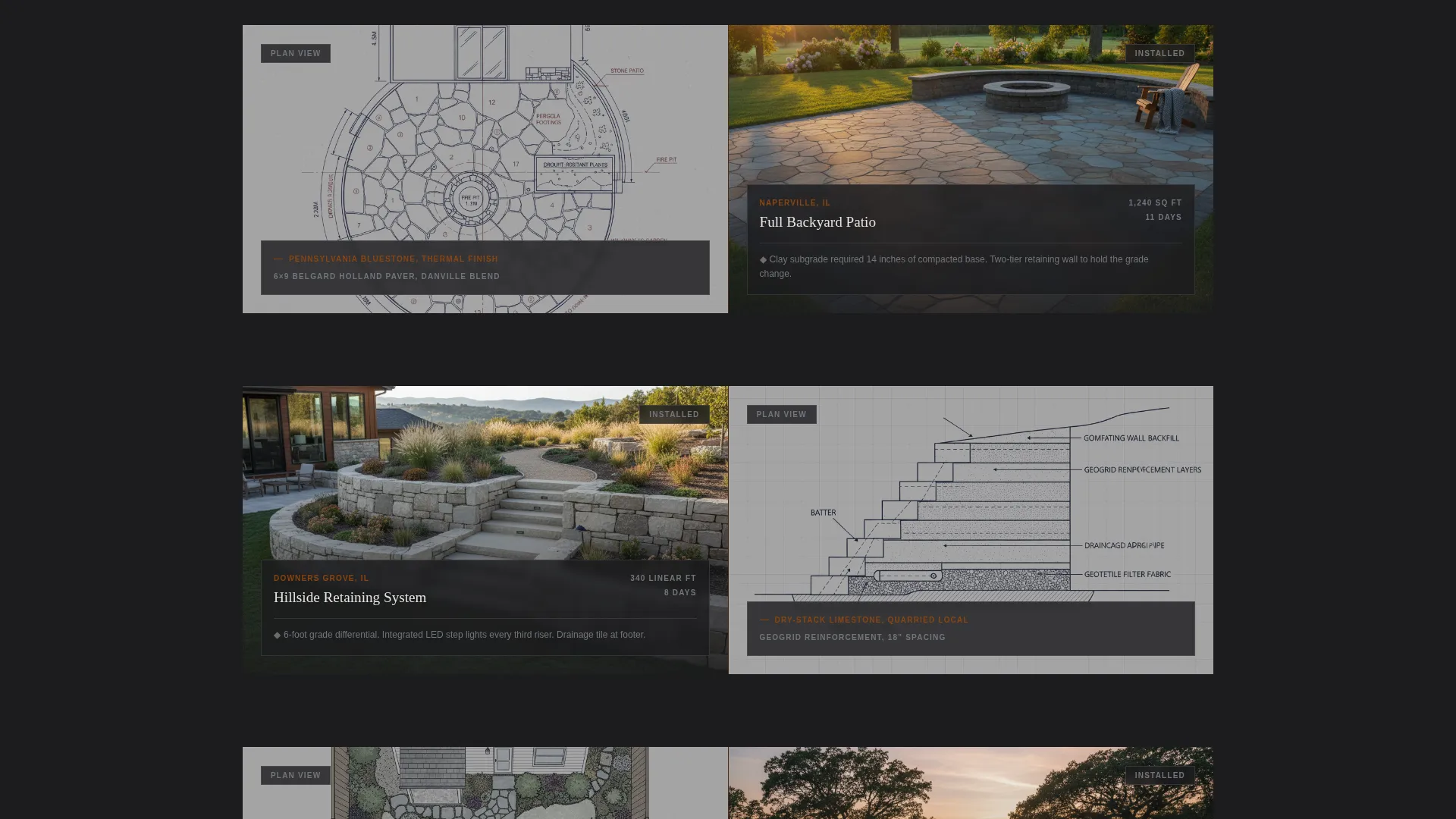
You get a fully structured landing page built around real project documentation. The layout pairs dimensioned plan drawings with finished installation photographs, names materials the way a mason would, and pushes visitors toward a concrete next step.
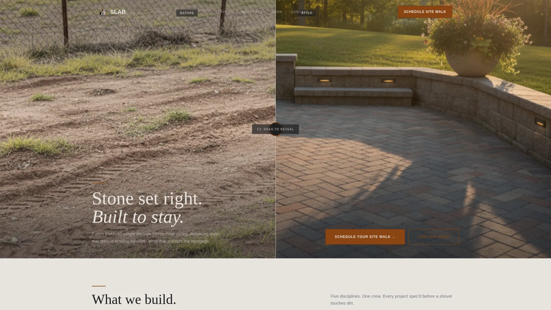
- A draggable before-and-after hero section built on a split viewport at golden-hour framing
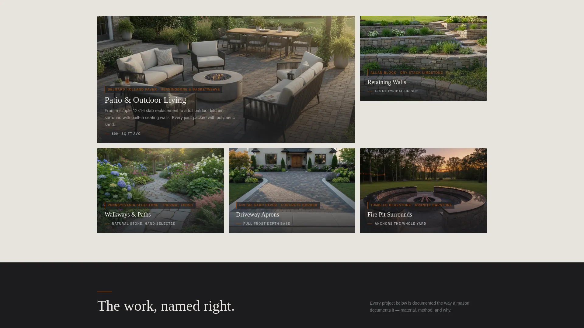
- A spatial scroll sequence that walks visitors from the driveway apron through to the patio and outdoor kitchen surround
- A three-field booking form with project type selector, square footage slider, and date picker, plus a secondary photo-upload path for early-stage leads
Feature list
A well-structured set of built-in components gives this template its focus and personality. Each section below reflects a capability described in the source brief.
Draggable Before-and-After Hero
The header splits the viewport cleanly down the center. The left side shows a raw, unfinished backyard and the right shows the completed hardscape from the identical camera angle and tripod position. A draggable center divider lets visitors slide between states at their own pace, making the transformation immediate and undeniable.
Spatial Scroll Sequence
The scroll experience is structured like a site walk with the foreman. Each section advances deeper into the project: driveway apron, front walkway, side-yard drainage, main patio, then the outdoor kitchen surround. The progression feels deliberate and grounded, not decorative.
Plan Drawing and Photo Pairing
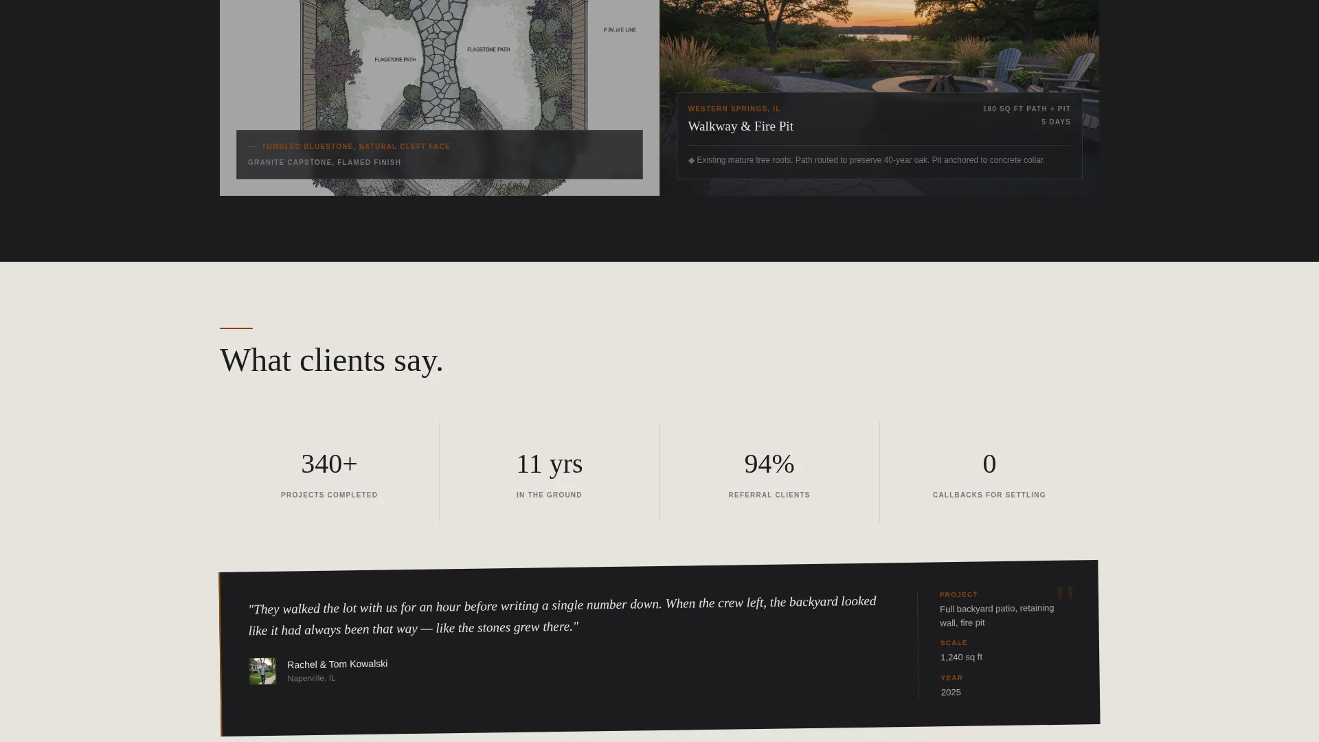
Every scroll section uses the 50/50 split to place a dimensioned plan drawing on one side and the corresponding finished installation photograph on the other. Materials are named directly on screen using trade-level language, such as "Pennsylvania bluestone, thermal finish" or "6x9 Belgard Holland paver, Danville blend."
Three-Field Booking Form
The primary call to action is built around three sequential fields: a project type selector covering patio, retaining wall, walkway, driveway, and full backyard; a square footage slider for approximate sizing; and a date picker that defaults to the next available Saturday morning. The form appears at the fold line and again after the final case study section.
Secondary Photo-Upload Path
Visitors who are not ready to book a calendar slot can use the secondary path instead. A single upload field paired with a phone number field lets them send a photo of their yard and start a conversation without committing to a date.
Agrarian Root Visual System
The color palette and texture language are drawn from the Monochrome Steel system: forge-black, weathered galvanized gray, limestone dust, and an oxidized iron accent used only for buttons, hover states, and section dividers. Backgrounds alternate between limestone dust and forge-black. The palette looks like it was pulled from the ground, not from a screen.
Page sections overview
| Section | Purpose |
|---|---|
| Split-Screen Hero | Show raw versus finished backyard at the fold |
| Primary Booking Form | Capture project type, size, and preferred date |
| Driveway Apron Section | Open the spatial scroll with the first project layer |
| Front Walkway Section | Advance the site walk to the entry path |
| Side-Yard Drainage Section | Show structural problem-solving alongside stone craft |
| Main Patio Section | Present the centerpiece installation with plan and photo |
| Outdoor Kitchen Surround | Close the spatial sequence at the back of the property |
| Secondary call to action Block | Offer the photo-upload path for early-stage visitors |
| Anchored Booking Form | Repeat the scheduling form after the final case study |
Design & branding system
The visual identity follows the Agrarian Root theme through a Monochrome Steel color system. Every color choice and surface treatment is pulled from mineral and metal references, not from digital gradients or gloss.
- Forge-black (#1C1C1E) and limestone dust (#E8E4DF) alternate as section backgrounds, with galvanized gray (#71767C) for body text on light sections and limestone dust on dark ones
- Oxidized iron (#8B4513) appears only on buttons, hover states, and section dividers, used sparingly so every accent lands with the weight of a hand-forged nail
- All surfaces are matte with no gloss finishes, keeping the aesthetic consistent with the tool-rack and stone-mason-shed references in the creative direction
Mobile & speed optimization
The split-screen layout is structured to translate cleanly from a wide desktop viewport to a narrower mobile screen. Section pairings that use side-by-side panels are designed to restack vertically without losing the before-and-after logic.
- The draggable hero divider is built as a touch-friendly interaction, usable by a finger as naturally as a mouse
- The three-field booking form stacks in a single column on small screens, keeping the path to scheduling clear and uncluttered
How this template helps you convert
The page is built with a single conversion goal: getting a homeowner to schedule a site walk or at minimum send a photo of their yard. Every layout decision supports that goal.
- The draggable before-and-after hero builds immediate trust by showing the crew's actual work at the most visible point on the page, before any scrolling is needed.
- The spatial scroll sequence maintains engagement by giving visitors a reason to keep moving through the page, with each section adding another layer of project documentation and craft.
- The two-path conversion structure means visitors who are ready to commit can book a Saturday site walk, while visitors who are not yet ready can still start the conversation with a photo upload, so fewer people leave without taking any action.
Other information about this template
This template is built for the hardscaping and patio niche within the broader landscaping and gardening category. It is category-matched to construction and home improvement services where proof of craft and local trust are the primary purchase drivers.
- The template style is Split Screen (50/50), the header concept is Case Study Before and After, and the landing-page direction is Booking and Scheduling
- The creative direction is Spatial and Architectural, designed to simulate the physical experience of walking a completed project site from street to back fence
- The theme is Agrarian Root and the color system is Monochrome Steel, both chosen to reinforce the material honesty of the trade rather than the polish of a digital agency
- This template is a single landing page, not a multi-page website, and is built to focus all visitor attention on one conversion path
Theme
Agrarian Root
Creative direction
Spatial & Architectural
Color system
Monochrome Steel
Style
Split Screen (50/50)
Direction
Booking/Scheduling
Page Sections
Draggable Before-and-after Hero
Spatial Scroll Site-walk Sequence
Plan Drawing and Photo Pairing
Three-field Scheduling Form
Photo-upload Secondary Path
Monochrome Steel Color System
Related questions
Can I replace the sample project photos with my own work?
What project types does the booking form cover?
Is the secondary photo-upload path a replacement for the main form?
Does this template work for a solo operator or just larger companies?



