Specialist Marble Products Professional Website Template
Slab is a single-column landing page template built for marble fabricators and stone workshops. It walks visitors through every phase of a project, from slab selection to final installation, using timestamped sections, honest copy, and rich stone photography. The result is a page that earns trust before it ever asks for a click.
by Rocket studio
Quick summary
Slab is a single-column landing page template designed for marble fabricators. It uses a transparent, chronological process flow to show homeowners, designers, and contractors exactly what happens between raw stone and a finished countertop. Every section builds confidence. By the time visitors reach the call to action, they already understand what they are paying for.
Who this template is for
This template is built for stone fabrication workshops that sell custom marble work. It speaks directly to clients who arrive with questions and leave with clarity.
- Homeowners mid-renovation who have received mismatched quotes and want to understand what fabrication actually involves
- Interior designers sourcing marble statement pieces for high-end residential installs
- Contractors who need a reliable fabricator and a clear sense of the project timeline
What problem this template solves
Most fabrication businesses lose leads at the quote stage because the process feels opaque. Visitors see a price, not a reason. This template solves that by showing the work before asking for the sale.
- Potential clients arrive confused about pricing and leave with a clear picture of every project phase
- The transparent timeline format removes the mystery that typically causes buyers to stall or shop around endlessly
What you get with this template
You get a fully structured single-column landing page laid out as a chronological project walkthrough. Every section is ready to receive your own copy, stone photography, and project footage.
- A lifestyle-shot header with a headline overlay, timestamped process sections from slab selection through final installation, and two distinct calls to action
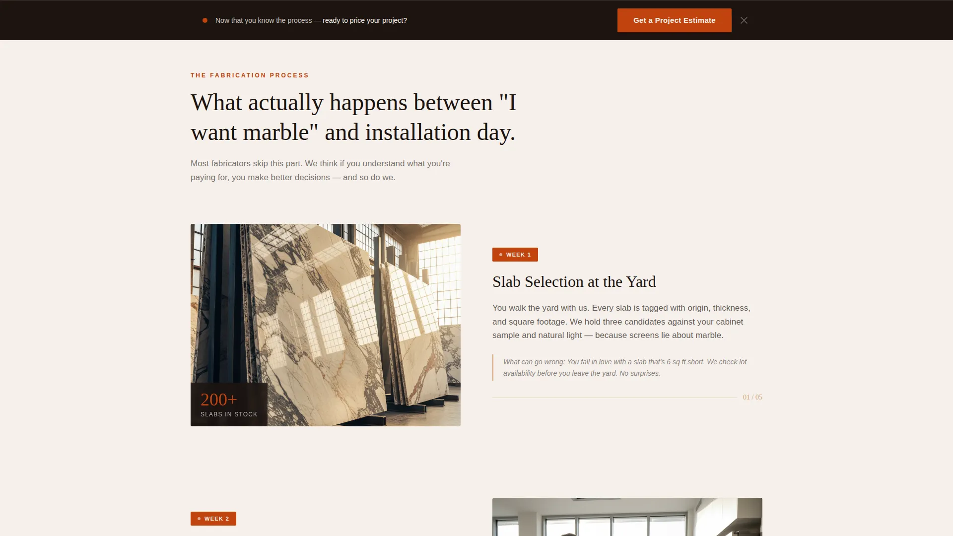
- A sticky secondary call-to-action bar that appears after the third scroll section, keeping the quote form link visible without interrupting the narrative
- A Fire and Earth color system applied across backgrounds, headlines, dividers, and buttons, ready to swap in your own brand assets
Feature list
A paragraph introduces this block: each feature below maps directly to a described layout or design decision in the template brief.
Timestamped Process Timeline
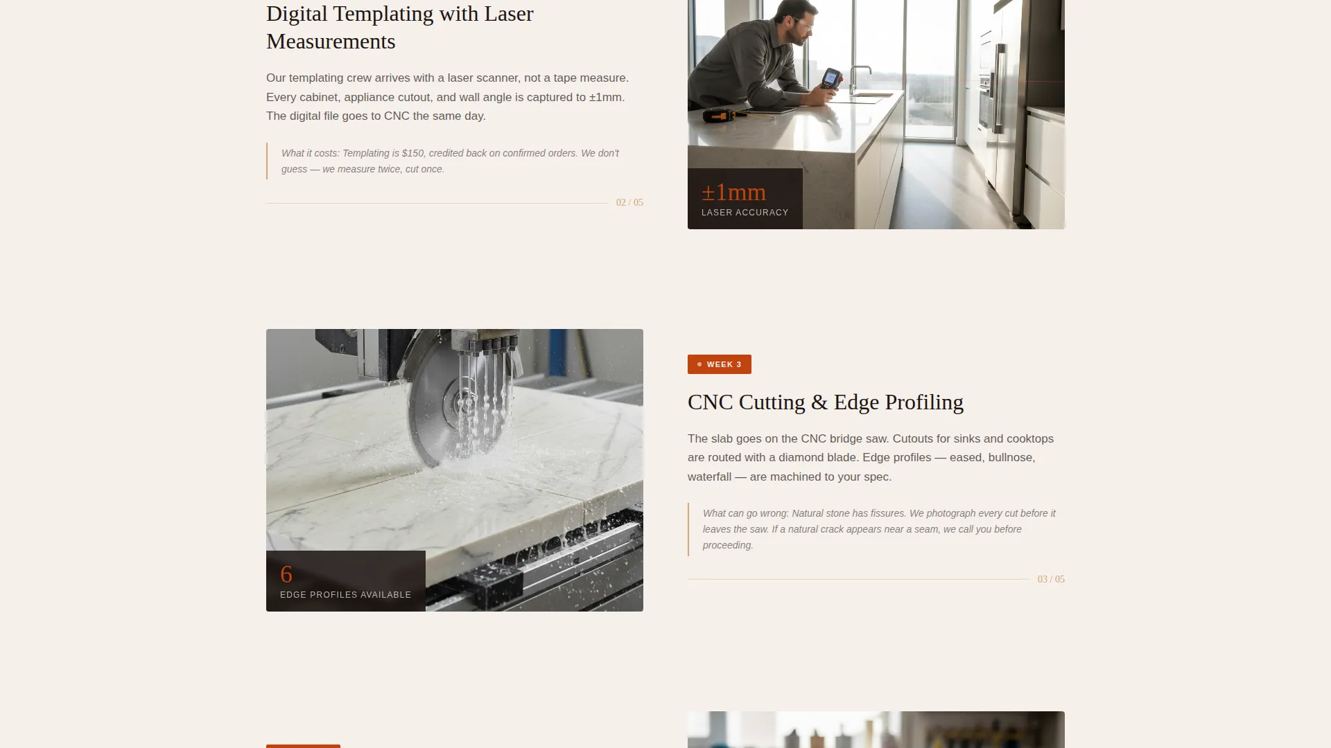
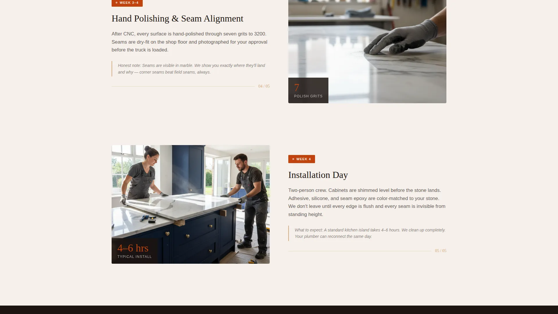
Each section of the page opens with a week-by-week label, for example, "Week 1: Slab Selection", followed by a short, honest paragraph. The timeline covers slab selection, digital templating with laser measurements, cutting, hand-polishing, and final installation. It gives visitors a realistic sense of duration and effort.
Lifestyle Shot Header
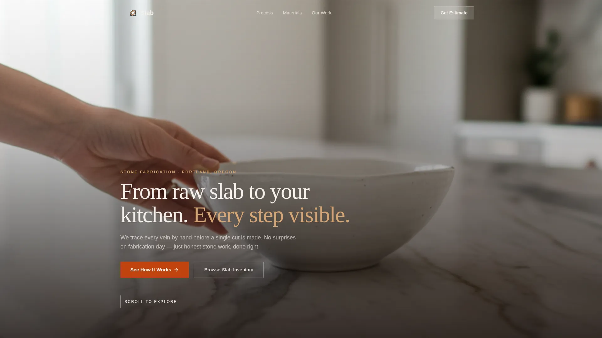
The opening section uses a wide, naturally lit kitchen photograph. A woman's hand places a ceramic bowl on a Calacatta marble island, with the veining running unbroken from waterfall edge to countertop. A headline fades in over the lower third of the image. The stone is the sharpest element in the frame.
Dual Call-to-Action Structure
The primary button, "See Our Slab Inventory," appears after the process timeline and routes visitors to a gallery page. A secondary button, "Get a Project Estimate," floats in a sticky bottom bar after the third scroll section. The two calls to action serve different buyer intents without competing.
Fire and Earth Color System
The palette uses deep espresso for headlines, terracotta ember for buttons and progress indicators, kiln-fired sand for section dividers, and quarry dust white as the primary background. The combination evokes a stone yard at golden hour and gives stone photography room to breathe.
Single Column Scroll Flow
The layout is a single uninterrupted column. Sections build chronologically so the visitor feels like they are moving through a real project. There are no sidebars or competing panels to distract from the narrative.
Process-First Conversion Path
The page is structured as a click-through landing page. It earns the click by demystifying fabrication first. Visitors who reach the call to action have already seen the diamond blade spray, the seam alignment, and the edging options, so choosing a slab feels like the obvious next step.
Page sections overview
| Section | Purpose |
|---|---|
| Lifestyle Shot Header | Opens the page with a polished kitchen image and a fading headline to set tone |
| Week 1: Slab Selection | Explains how stone is chosen at the yard, including cost context |
| Week 2: Digital Templating | Covers laser measurement and what can go wrong at this phase |
| Week 3: CNC Cutting | Shows the cutting process with honest detail about precision and waste |
| Week 4: Hand Polishing | Close-up detail section on finishing, edging options, and surface quality |
| Week 5: Installation | Documents the final fit, seam alignment, and completion walkthrough |
| Primary call to action Section | Presents the "See Our Slab Inventory" button after the full timeline |
| Sticky Estimate Bar | Floats "Get a Project Estimate" after the third scroll section |
Design & branding system
The visual identity follows a Service Utility theme. It feels grounded and material, like the stone yard it references. Every color choice is deliberate and tied to a specific role in the layout.
- Deep espresso anchors headlines, terracotta ember drives calls to action, kiln-fired sand warms section dividers, and quarry dust white gives photography space to breathe
- Shallow depth of field in the header image keeps the stone sharp while softening background elements like copper pendants and open shelving
- The palette and photography style together signal craft, precision, and transparency, qualities that matter most to the target audience
Mobile & speed optimization
The single-column layout adapts naturally to smaller screens. There are no complex grid structures or multi-panel components to reflow. The scroll-driven structure is inherently suited to mobile browsing habits.
- Full-width section blocks and a sticky bottom bar remain legible and tappable at mobile viewport sizes
- Stone photography is framed for impact at full width, so the visual quality holds whether the page loads on a desktop monitor or a phone screen
How this template helps you convert
The page is built around a simple idea: show the work first, then ask for the click. Every structural decision supports that sequence.
- The timestamped process sections build familiarity and trust before any call to action appears, visitors who feel informed are far more likely to take the next step
- The dual call-to-action structure separates browsers from buyers, routing gallery-ready visitors to stone inventory while keeping quote-seekers connected to the estimate form via the sticky bar
Other information about this template
This template sits within the Construction and Home category, specifically targeting marble products and services. It is designed for the marble designer niche, where trust and craft credibility drive purchase decisions more than price alone.
- The Transparent Process creative direction is well suited to any fabrication or custom craft business where the production journey adds perceived value
- The click-through landing page direction means the page itself is not a destination but a qualifier, it prepares visitors so the gallery or quote form converts at a higher rate
- The Service Utility theme keeps the design practical and uncluttered, which suits clients who are already overwhelmed by renovation decisions
- Template style is Single Column Flow, making it straightforward to customize section by section without restructuring the overall layout
Theme
Service Utility
Creative direction
Transparent Process
Color system
Fire & Earth
Style
Single Column Flow
Direction
Click-Through
Page Sections
Timestamped Process Timeline
Lifestyle Shot Header with Headline Overlay
Dual Call-to-action Structure
Fire and Earth Color System
Single Column Scroll Layout
Process-first Conversion Path
Related questions
Who is this landing page template designed for?
What makes this template different from a standard service page?
Can I adapt this template for stone materials other than marble?
How do the two calls to action work together?
What does the sticky bottom bar do?



