Multi-Concept Restaurant Portfolio Comparison Website Template
A single-page restaurant portfolio landing page built around a living comparison table. It presents multiple dining concepts side by side, from cuisine type and average check to seating capacity and press accolades. The Tech Glass visual identity and Industry Report layout give franchise investors, commercial landlords, and hospitality journalists everything they need in one focused scroll.
by Rocket studio
Quick summary
This template turns a restaurateur's full collection of concepts into one structured, scroll-friendly landing page. A frosted Dark Glass Panels header sets the atmosphere, then the page drops into a column-based comparison table where each venue earns its own data story. The Slate and Sky color system keeps everything cool, reflective, and scannable from first glance to final click.
Who this template is for
This template is built for multi-concept restaurant operators who need to present their portfolio as a professional investment document rather than a casual menu page. It speaks the language of the people evaluating it.
- Franchise investors who need unit economics and concept comparisons at a glance
- Commercial landlords assessing tenant quality before committing to a lease
- Hospitality journalists building roundups who need every venue distilled fast
What problem this template solves
Most restaurateurs have no single place to show all their concepts together in a way that reads as credible data. A PDF deck goes stale. A social profile tells no operational story. This template closes that gap.
- Scattered concept information forces investors to request documents before they self-qualify
- No structured comparison leaves landlords and journalists doing manual research
- A brochure tone fails the audience that reads industry reports, not marketing copy
What you get with this template
You get a complete single-page layout designed to feel like a research document and perform like a sales tool. Every section has a defined job, from atmosphere-building header to gated investor action.
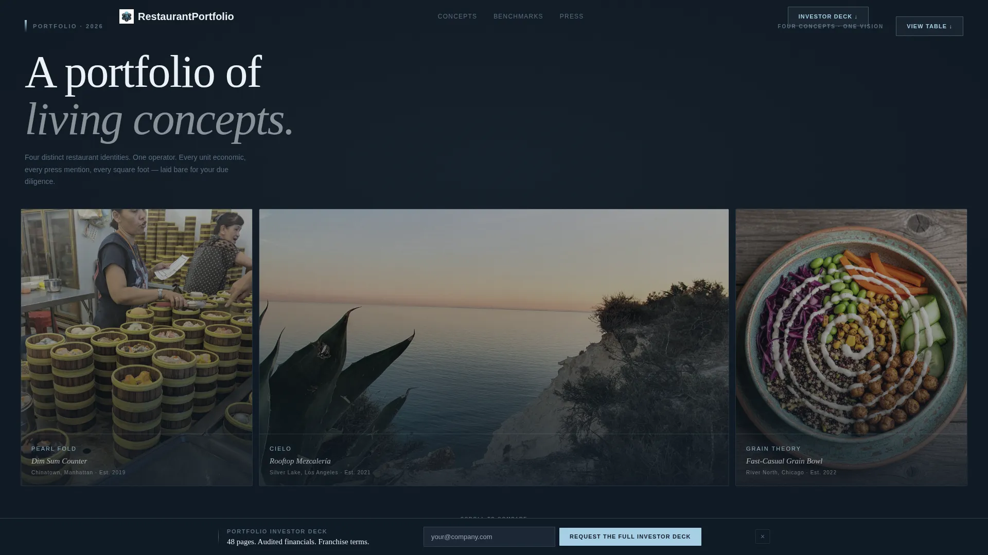
- A frosted Dark Glass Panels header with multiple translucent hero image panels, each holding one concept
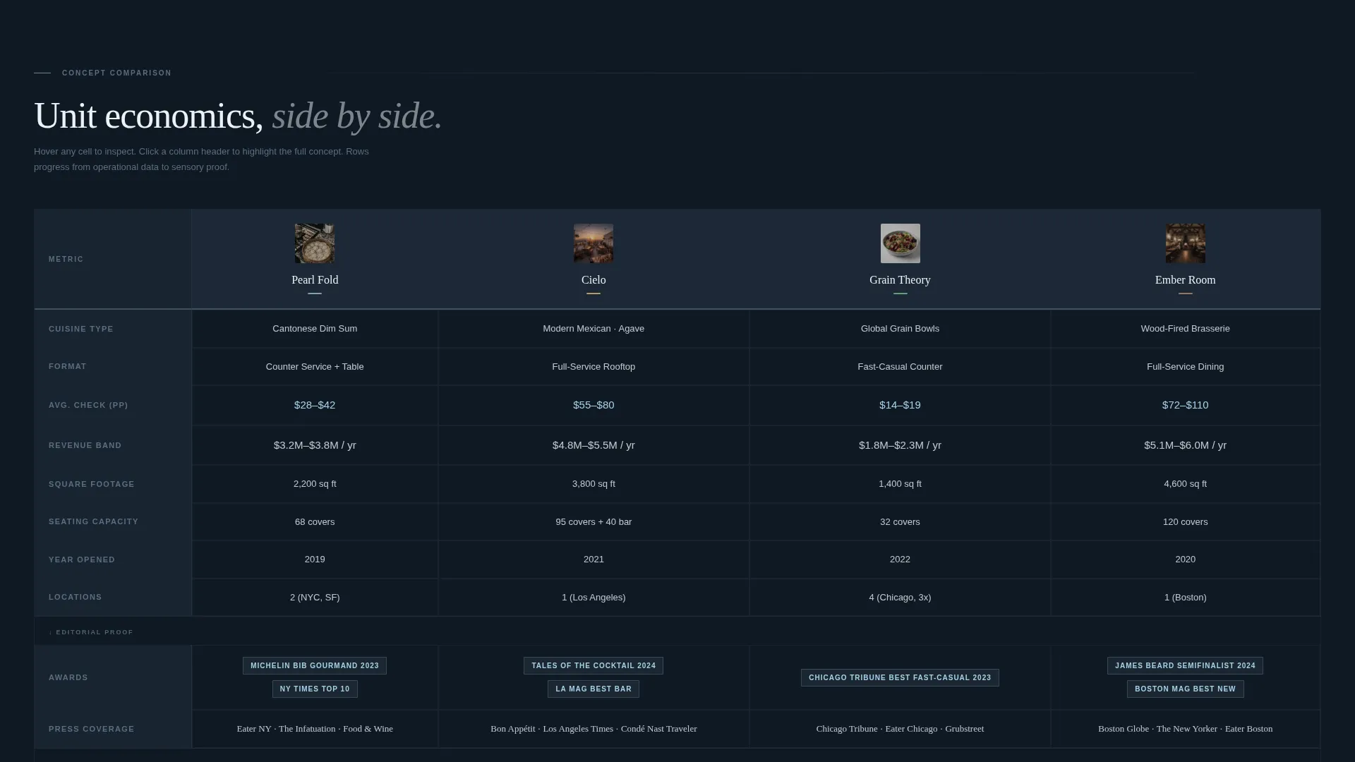
- A full multi-column comparison table covering cuisine type, average check, square footage, seating, year opened, awards, and revenue band
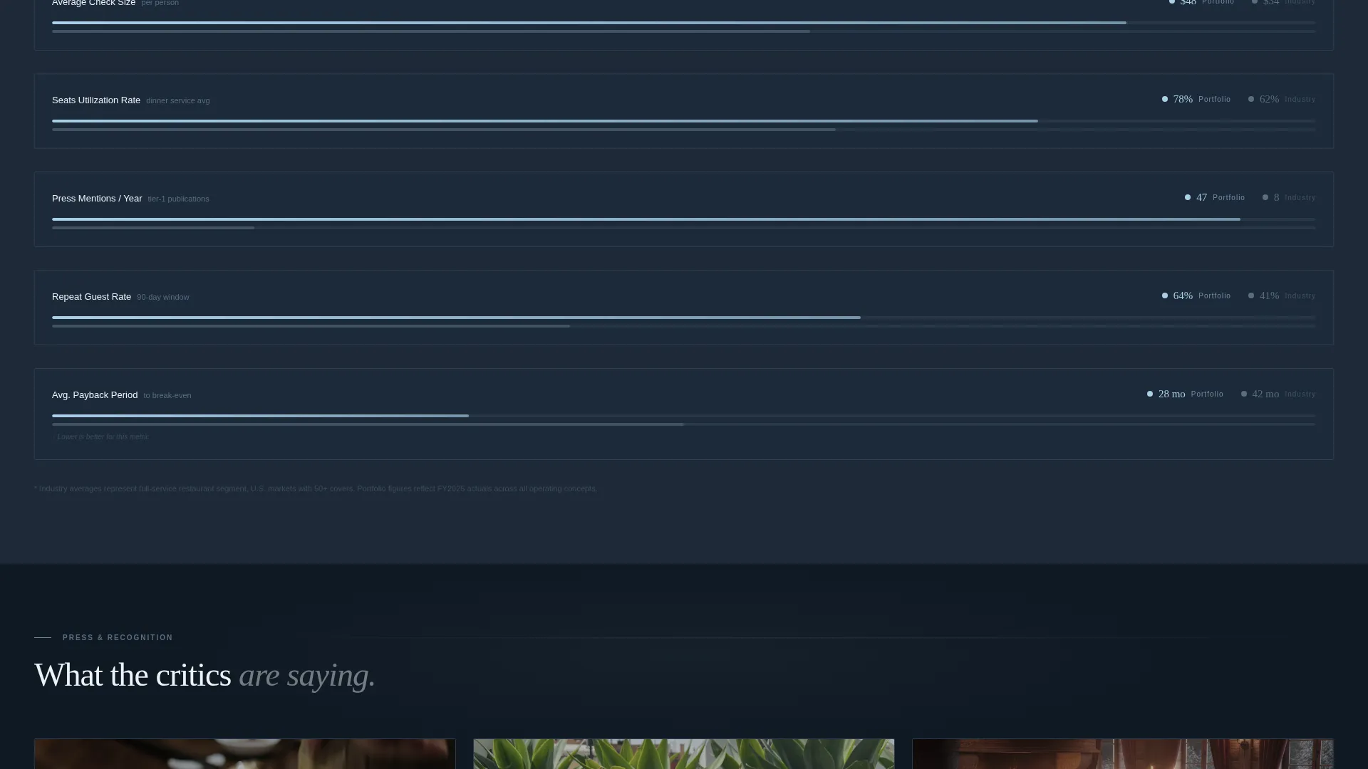
- A benchmarking section comparing portfolio aggregate metrics against industry averages
- Per-concept call-to-action buttons and a persistent floating bar for the investor deck request
Feature list
This section describes the core built-in capabilities of the template as delivered.
Dark Glass Panels Header
The header is composed of three or four frosted-glass rectangles floating against a near-black backdrop. Each panel holds a hero image of a different restaurant concept, shot as if viewed through actual glass with slight refraction. Venue names appear in thin, wide-tracked sans-serif type glowing faintly at each panel's lower edge. No two panels are the same size, giving the composition an editorial, gallery-like feel.
Living Comparison Table
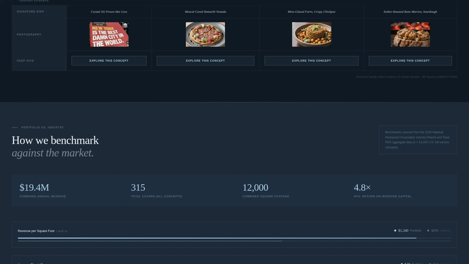
Each restaurant concept occupies its own column inside a structured data table. Rows move from hard operational facts, cuisine type, average check, square footage, seating capacity, year opened, awards, and revenue band, to sensory proof including photography, press quotes, and signature dish close-ups. The scroll progression mirrors an analyst's thought process: numbers first, then context.
Frost and De-Frost Cell Interactions
Individual table cells respond to hover with a frost and de-frost micro-interaction that reinforces the glass visual motif. This keeps the comparison table tactile and engaging without distracting from the data. The effect ties the interactive layer directly to the design system rather than treating animation as decoration.
Portfolio Benchmarking Section
Midway through the page, a dedicated section compares the portfolio's combined metrics against published industry averages. This gives the page the authority of a research document. Investors and landlords can immediately see how the collection performs relative to the broader market without leaving the page.
Per-Concept Call-to-Action Buttons
Every venue column ends with an "Explore This Concept" button styled in sky-blue text against a slate background. Each button routes the visitor to that concept's individual detail page. This structure lets investors move from the portfolio overview directly into deeper due diligence on whichever concept catches their attention.
Persistent Floating Investor Bar
A fixed bar at the bottom of the viewport carries a single portfolio-level action: "Request the Full Investor Deck." One click forwards to a gated PDF download that requires only a business email address. The bar stays visible throughout the scroll, so the primary conversion action is never more than one click away.
Page sections overview
| Section | Purpose |
|---|---|
| Dark Glass Header | Introduce each restaurant concept through frosted panel imagery |
| Comparison Table | Display side-by-side operational and financial data per concept |
| Photography and Quotes | Add sensory and press-credibility context to each column |
| Benchmarking Section | Compare portfolio metrics against industry-average benchmarks |
| Per-Concept calls to action | Route investors to individual venue detail pages |
| Floating Investor Bar | Anchor the portfolio-level deck request throughout the scroll |
Design & branding system
The Slate and Sky color system is built to read like a rain-wet skyline reflected in floor-to-ceiling restaurant glazing. Every color has an assigned role that keeps the page organized and visually consistent.
- Deep gunmetal slate (#1E2A38) dominates backgrounds and primary typography
- Polished chrome mid-tone (#5A6E80) draws table borders and divider lines; high-altitude sky (#A8D0E6) activates on hover states and column highlights
- Signal white (#EDF2F7) fills comparison table cells for breathability and scan ease
Mobile & speed optimization
The template's layout is designed with responsive behavior in mind so that the comparison table and glass panel header remain usable on smaller screens. The structured grid adapts without losing the visual hierarchy that makes the data readable.
- The multi-column comparison table is built to scroll horizontally on mobile, keeping all concept columns accessible
- Glass panel header images restack into a single-column vertical flow on narrow viewports
- The persistent floating investor bar remains anchored at the bottom of the screen across all screen sizes
How this template helps you convert
The page earns the click by letting visitors self-qualify through the data before any sales conversation begins. Every structural choice reduces friction at the decision moment.
- The comparison table lets investors identify the right concept on their own terms, so by the time they reach the per-concept button, they already know the numbers add up
- The benchmarking section adds independent credibility, making the floating "Request the Full Investor Deck" action feel like a logical next step rather than a cold ask
Other information about this template
This template belongs to the Restaurant Website Templates category within the Technology section of the marketplace. It is purpose-built for the restaurant portfolio page niche and scored a strong intersection match for its combination of theme, creative direction, and layout style.
- The Tech Glass theme and Comparison Table layout together create a template style not commonly found in hospitality-focused template libraries
- The Industry Report creative direction distinguishes this page from standard restaurant brochure or menu-showcase templates
- The Click-Through landing-page direction means every design and copy decision serves a defined conversion path, not general brand awareness
- This template is a strong fit for operators running two or more distinct concepts who need a single professional destination for inbound investor and press inquiries
Theme
Tech Glass
Creative direction
Industry Report
Color system
Slate & Sky
Style
Comparison Table
Direction
Click-Through
Page Sections
Dark Glass Panels Header
Multi-column Comparison Table
Frost and De-frost Cell Hover Effect
Portfolio Benchmarking Section
Per-concept Call to Action Buttons
Persistent Floating Investor Bar
Related questions
Who is this landing page designed for?
Can I add or remove restaurant concept columns?
What does the Request the Full Investor Deck button do?
How does the benchmarking section work?
Is this template suitable for a single restaurant concept?



