Medical Tourism & Concierge Booking Website Template
Sleeve is a single-page bariatric surgery tourism landing page built for clinics competing against US hospital pricing. It combines a bold centered headline, a transparent cost comparison table, a named expert panel, and a five-step qualification quiz. The result is a focused, trust-driven experience that turns late-night research into a booked video consultation.
by Rocket studio
Quick summary
Sleeve is a high-converting bariatric surgery tourism landing page designed for clinics serving Americans and Canadians researching weight loss surgery abroad. It leads with radical cost transparency, named surgeon authority, and a personalized five-step quiz. Every section is built to move an anxious, insurance-denied patient from midnight doubt to a confirmed consultation appointment.
Who this template is for
This template is purpose-built for bariatric surgery clinics that attract patients from the United States and Canada. It works best when your clinic holds recognized accreditation, employs board-certified surgeons, and competes on transparent pricing rather than vague promises.
- Medical tourism clinics offering gastric sleeve and bypass procedures to North American patients
- Clinic marketing teams that need a single, high-stakes conversion page rather than a multi-page site
- Practices ready to publish real cost data, surgeon credentials, and outcome metrics side by side
What problem this template solves
Patients researching weight loss surgery abroad carry enormous anxiety. They are comparing clinics across multiple countries, reading forum threads about complications, and often processing years of insurance denials. A generic clinic homepage does nothing to resolve that fear. This template addresses the specific objections that stand between a frightened visitor and a booked appointment.
- It replaces vague reassurances with side-by-side cost and outcome data the patient can verify
- It builds trust through named, credentialed surgeons rather than anonymous brand promises
- It removes decision paralysis by guiding the visitor through a structured qualification quiz that ends with a personalized recommendation
What you get with this template
You get a complete, single-page landing page layout built around five purposeful sections. Each section is designed to carry the visitor one step closer to booking, with no wasted scroll real estate.
- A viewport-dominating hero with an editable headline and interactive BMI and travel-date fields
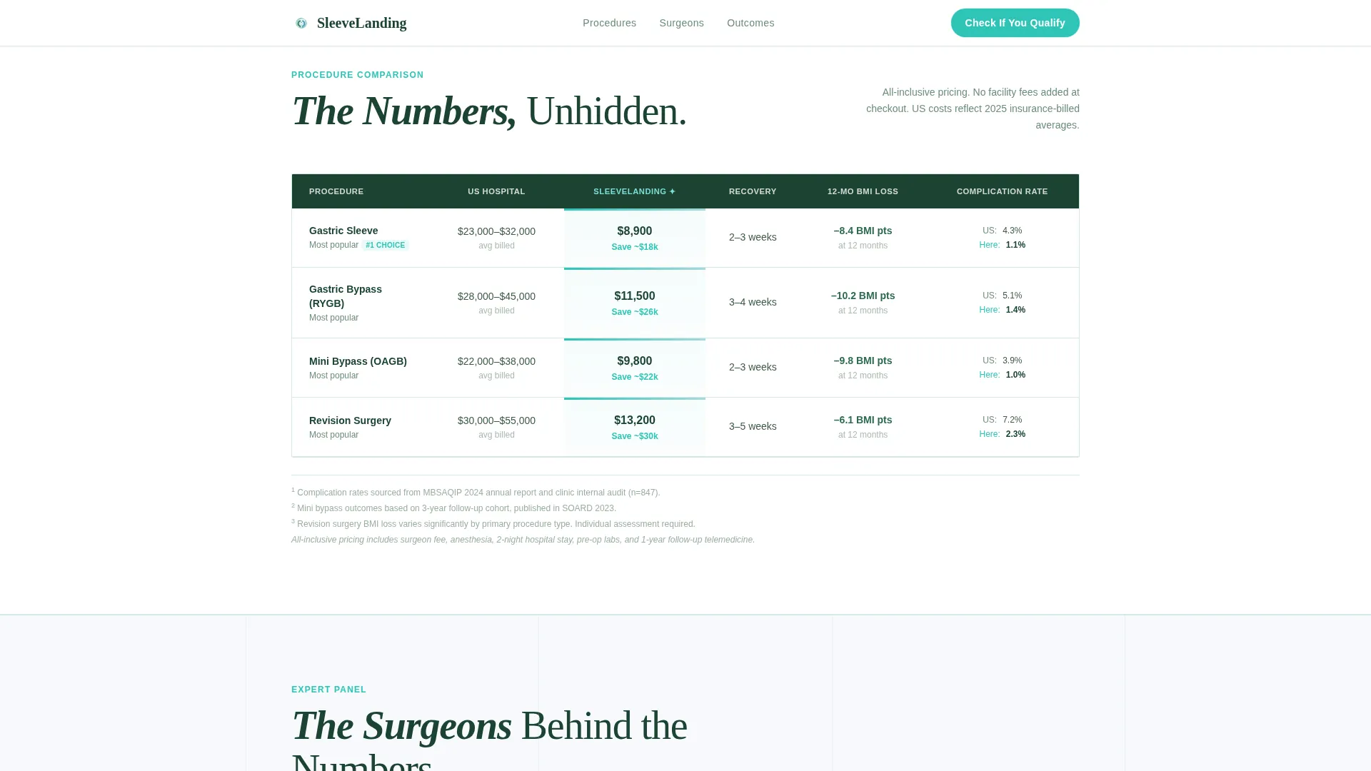
- A four-procedure by six-metric comparison table showing US hospital costs against clinic costs with linked footnotes
- A five-step progressive qualification quiz that returns a personalized procedure match, estimated cost, and a calendar link to a free surgeon consultation
Feature list
This template is built around components that handle the specific conversion challenges of medical tourism. Each feature below is present in the template as described in the source brief.
Interactive Hero Fields
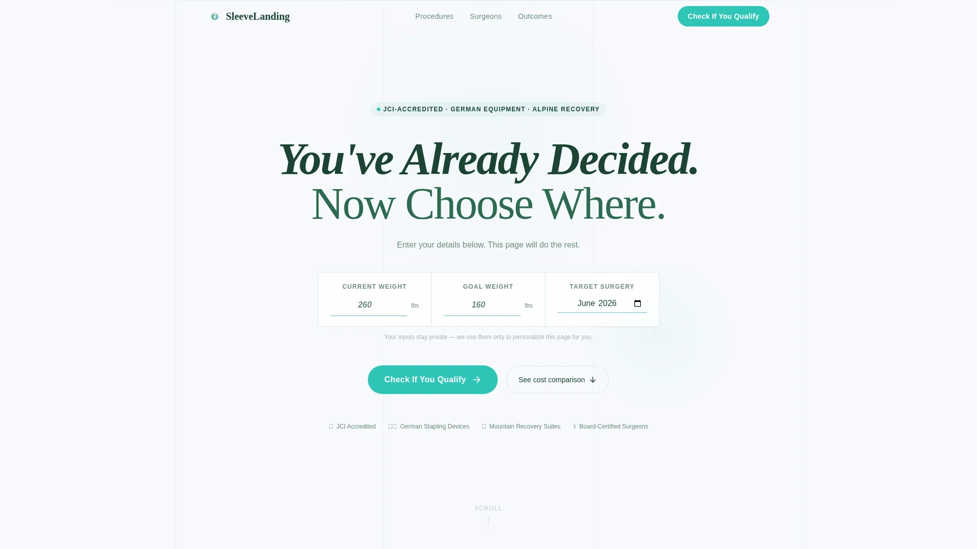
The hero section opens with a single massive centered headline and three editable placeholder fields: current weight, goal weight, and projected surgery date. Visitors interact before they scroll, which creates immediate personal investment in the page.
Side-by-Side Comparison Table
Four procedure types are shown across six metrics: recovery time, average body mass index (BMI) loss at twelve months, complication rates, and cost. The US hospital column sits directly beside the clinic column, with footnotes linked to supporting data. No numbers are hidden.
Named Expert Panel
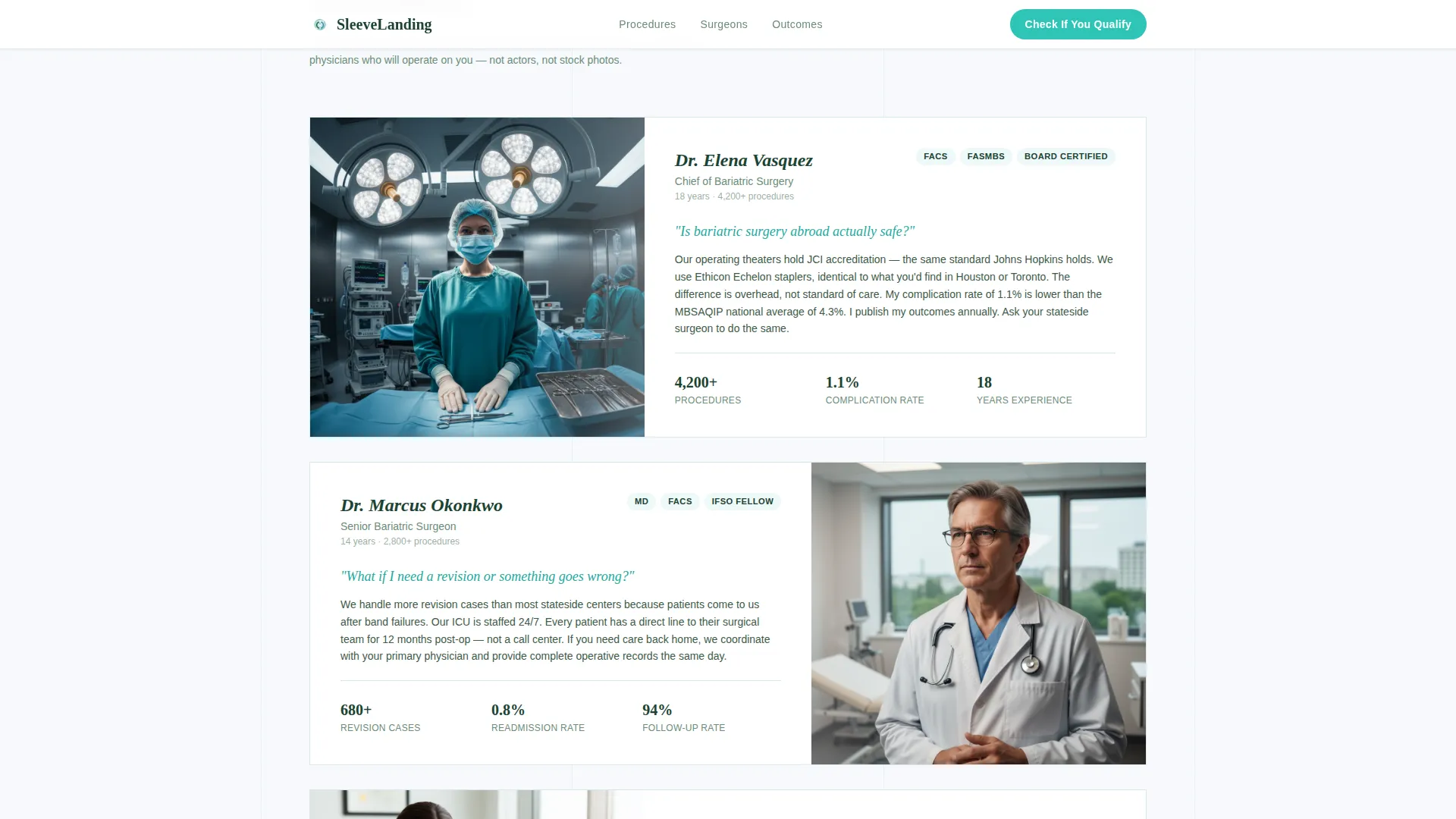
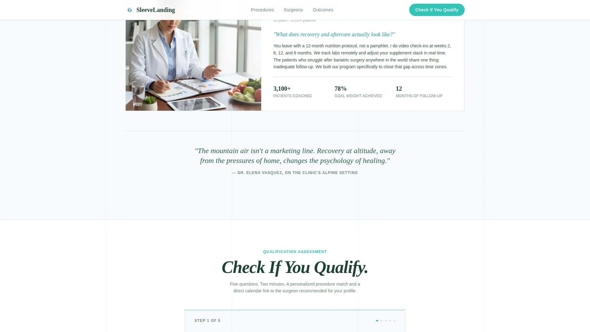
Three surgeons and nutritionists are introduced by name, with credential badges and specialty labels. Each panel member is paired with a sixty-second video answering the exact question that brought the visitor to the page.
Five-Step Qualification Quiz
The primary call to action launches a progressive assessment. Steps cover BMI calculated from height and weight inputs, a comorbidity checklist covering Type 2 diabetes, sleep apnea, and hypertension, previous weight loss attempts, preferred procedure, and travel month. The result screen returns a specific procedure match, an estimated all-inclusive cost, and a calendar link.
Trust and Outcomes Section
This section surfaces the clinic's Joint Commission International (JCI) accreditation badge, complication rate comparisons, and twelve-month patient outcome data. It provides the third-party-verified proof that supports every claim made earlier in the page.
Page sections overview
| Section | Purpose |
|---|---|
| Hero Headline Block | Draws the visitor in immediately with an editable, personalized headline and interactive weight and date fields |
| Procedure Comparison Table | Displays four procedures across six metrics with US versus clinic cost columns and linked footnotes |
| Expert Panel Scroll | Introduces named surgeons with credentials, specialty badges, and sixty-second FAQ video answers |
| Qualification Quiz Steps | Guides the visitor through five progressive steps and returns a personalized procedure and cost recommendation |
| Trust and Outcomes | Displays JCI accreditation, complication statistics, and twelve-month transformation data |
| Footer Row | Single-row linear footer with essential links and contact information |
Design & branding system
The visual identity follows a Medical Clarity theme using an Alpine Fresh color system. The palette is intentionally clinical yet calming, designed to communicate both sterile precision and a sense of open, clean air.
- Clinical white (#F7F9FC) on primary backgrounds, evergreen depth (#1B4332) for headlines and trust-bearing text, glacier blue (#A8DADC) for table headers and divider lines, and decisive teal (#2EC4B6) reserved exclusively for buttons and interactive highlights
- DM Sans handles all body text for clean legibility at reading sizes, while Fraunces drives display headlines with the gravity that a high-stakes decision demands
- The hero section uses deliberate whitespace as a design element, with no hero image, so the headline and interactive fields command the visitor's full attention
Mobile & speed optimization
The template is designed desktop-first, reflecting the reality that most patients research weight loss surgery on a laptop during evening hours. Mobile responsiveness is fully built in so visitors on any device get a complete, readable experience.
- Scroll-reveal animations, counter animations in the outcomes section, and quiz-step transitions are set at a medium intensity to keep the page feeling alive without slowing the initial load
- The five-step quiz state is managed in React, keeping transitions smooth and preventing loss of input between steps
- Dual metric and imperial display is built into the quiz fields and comparison table, serving both US and Canadian patients without requiring a separate version
How this template helps you convert
Every layout decision in this template is pointed at one outcome: turning an anonymous, frightened researcher into a named appointment on a specific surgeon's calendar.
- The editable hero fields create personal investment before the visitor has read a single claim, making the page feel like it was built for them specifically rather than a general audience.
- The comparison table dismantles the primary objection (cost and safety risk) row by row, using the clinic's own numbers alongside US hospital data so the visitor feels informed rather than sold to.
- The qualification quiz replaces an overwhelming set of options with a guided path that ends in a specific, named recommendation and a direct calendar booking link, removing the final moment of hesitation.
Other information about this template
This template is part of a focused set of medical tourism and bariatric surgery landing page layouts built for clinics that compete on transparency and credential-led trust. A few additional details are worth noting for teams evaluating this layout.
- The page is localized for English-speaking North American patients, with USD pricing and dual metric and imperial measurement display throughout the quiz and comparison table
- Animation intensity is set to medium across the template: scroll-reveal entry for each section, counter animations for the outcomes section, and smooth step transitions inside the quiz
- The footer follows a single-row linear pattern, keeping the page exit clean and directing attention back upward toward the call to action rather than dispersing it across a wide footer grid
- The template is structured for React-based quiz state management, meaning step inputs are preserved during the five-step assessment without page reloads
Theme
Medical Clarity
Creative direction
Expert Panel
Color system
Alpine Fresh
Style
Comparison Table
Direction
Quiz/Assessment
Page Sections
Interactive Editable Hero Fields
Four-procedure Comparison Table
Named Surgeon Expert Panel
Five-step Qualification Quiz
Trust and Outcomes Block
Scroll-reveal Animation System
Related questions
Who is this landing page template designed for?
What does the five-step qualification quiz do?
Does the template include actual cost or outcome data?
Can this template be focused on a single procedure like gastric sleeve only?
What makes this template different from a standard medical clinic page?



