Regional & Specialty Restaurant Appointment Booking Website Template
Slurp is a masonry-layout booking landing page built for artisan noodle bars. It pairs a cinematic macro hero photograph with a before/after ingredient reveal grid, a three-step reservation modal, and a Pastoral Calm color system rooted in yuzu yellow, charred lime, and soy caramel. Every section is designed to make visitors feel the warmth of the bowl and reach for the "Reserve a Seat" button.
by Rocket studio
Quick summary
Slurp is a single-page booking template made for counter-seat noodle bars that live and breathe craft. The layout uses a masonry grid, immersive food photography, and a focused three-step reservation flow to turn curious visitors into confirmed guests. It balances high-energy food visuals with a grounded, earthy palette so the page feels alive without feeling loud.
Who this template is for
This template speaks directly to independent noodle bar owners who want a page that matches the care they put into their broth. It works equally well for any specialty food and beverage operator who wants a visually rich booking experience rather than a generic form page.
- Artisan noodle bar owners who want a booking landing page that reflects their craft and story
- Food and beverage operators running a counter-seat or bar-style restaurant in a busy city
- Restaurant founders who want to create a strong first impression without hiring a development team
What problem this template solves
Most restaurant booking pages feel transactional. They ask for a date, take a name, and send a confirmation. They do nothing to make a visitor feel the meal before they arrive. For a noodle bar where the craft is the product, that gap costs reservations. Visitors who do not feel the atmosphere will not bother to book. This template closes that gap by making the page itself part of the dining experience.
- Flat, uninspiring restaurant pages that fail to communicate the craft behind the food and lose curious visitors before they ever book
- Booking forms with too many fields that frustrate mobile users and push them toward competing restaurants
- Layouts that treat the menu items as an afterthought rather than the centrepiece of the visit
What you get with this template
You get a fully structured single-page layout that handles both the storytelling and the conversion in one scroll. Every section has a clear job. The hero draws the visitor in. The masonry grid reveals the craft. The interstitial photos let the page breathe. The reservation flow closes the deal. Nothing is decorative without also being useful.
- A masonry before/after card grid that transforms raw ingredient photos into finished dish photos on hover or tap, walking visitors through the full story of the food from pantry to plate
- A pinned "Reserve a Seat" call-to-action button on mobile and a repeated desktop placement after every third masonry row, keeping the booking path always within reach
- A three-step reservation modal covering party size, date and time slot, and an optional cravings or allergy field, with a secondary "Order for Pickup" text link for returning guests
Feature list
This template is built around a specific set of design and interaction features. Each one comes directly from the project brief and serves a defined purpose in the booking and discovery flow.
Macro Close-Up Hero Section
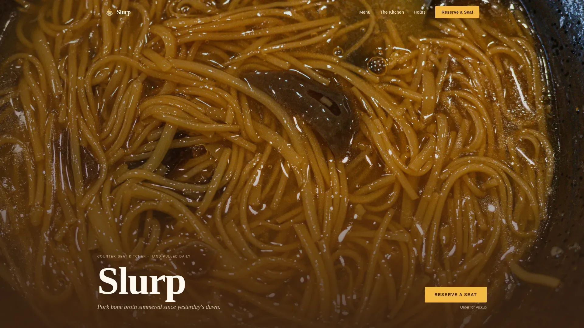
The hero is a razor-thin depth-of-field photograph placed edge to edge across the viewport. It captures a single noodle strand in sharp focus, with chili oil droplets catching the light and a soft steam wisp moving left to right. The restaurant name appears after a short delay in a clean soy-dark serif at the bottom left, small enough to feel confident. This approach is backed by a well-known principle in restaurant web design: the hero section should feature a high-quality, steaming close-up of a signature bowl to immediately communicate the quality of the food and invite the visitor to stay.
Before/After Masonry Grid
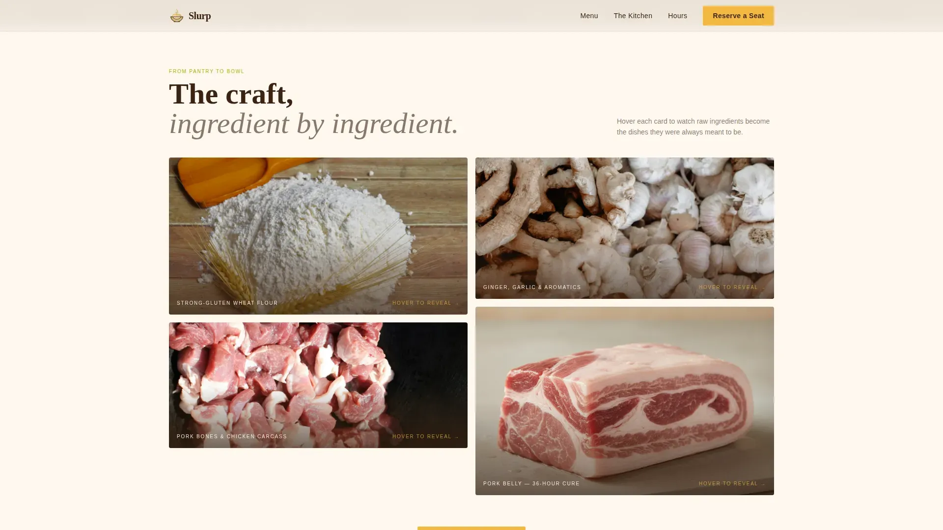
The masonry grid is the creative heart of the page. Each card begins as a raw ingredient photograph and transforms into the finished dish it becomes on hover or tap. Flour becomes hand-pulled la mian mid-stretch. A chicken carcass becomes a golden, cloudy broth. The cards progress from pantry to prep to plating as the visitor scrolls, creating a journey through the kitchen without a single word of explanation. Every transition eases slowly, consistent with the Pastoral Calm theme, so no animation feels rushed or jarring.
Full-Width Interstitial Photos
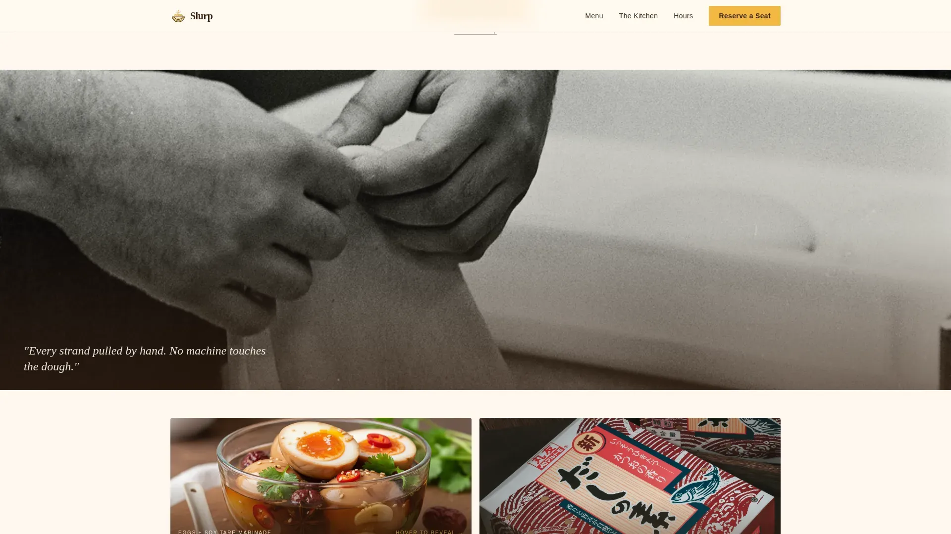
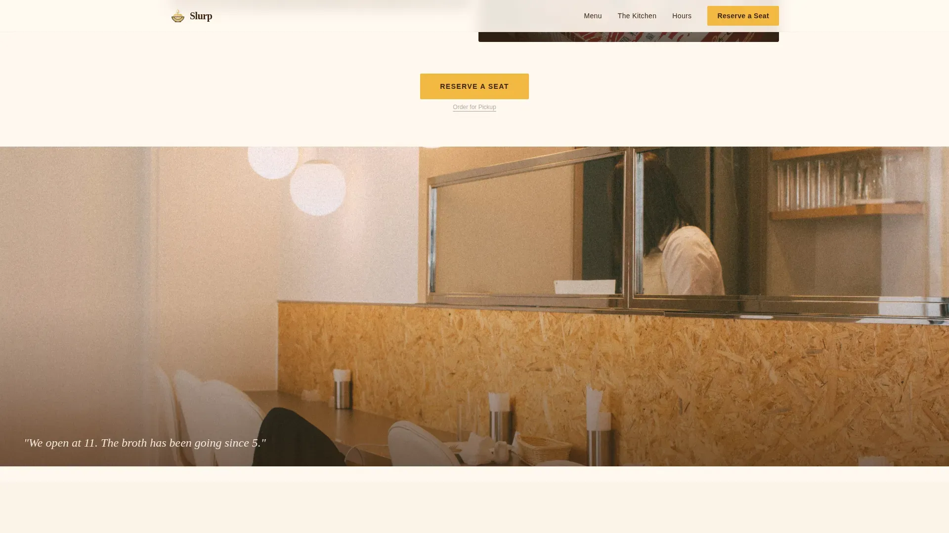
Between card clusters, full-width photographic breaks show the quiet moments of the kitchen. A chef's flour-dusted hands at rest. An empty dining counter at six in the morning. A stack of bowls still warm from the washer. These interstitial photos serve a dual purpose. They give the eye a place to rest between active grid sections and they reinforce the craft narrative through atmosphere rather than text. High-resolution, professional photos of signature dishes and behind-the-scenes moments are a proven tool for building trust with visitors who are still deciding whether to book.
Pinned and Repeated Call-to-Action
The "Reserve a Seat" button is yuzu yellow on soy-dark text. On mobile it is pinned to the bottom of the viewport so it is never more than a thumb-tap away. On desktop it repeats after every third masonry row so the booking path stays present throughout the scroll. A prominent call-to-action button placed above the fold and repeated at regular intervals is one of the most reliable ways to increase reservation conversions on restaurant landing pages.
Three-Step Reservation Modal
Tapping the primary button opens a minimal three-step flow. Step one is party size, from one to six seats since this is a bar-format restaurant. Step two is a date and time slot selector that shows only available windows. Step three is an optional text field labelled "Any cravings or allergies?" The form is intentionally short. The booking form should limit fields to the essentials to avoid friction that reduces conversion rates. A secondary "Order for Pickup" underlined text link sits beneath the main button for regulars who already know what they want.
Menu Strip with Hover Reveals
A dedicated menu strip section presents service categories with hover image reveals. This gives visitors a clear, scannable view of the menu items available without overwhelming the page. A digital, accessible text-based menu display is always preferable to a PDF-linked menu because it keeps visitors on the page and makes the offerings easy to read on any device.
Page sections overview
| Section | Purpose |
|---|---|
| Cinematic Hero | Draw the visitor in with a macro food photograph and a delayed name reveal |
| Before/After Grid | Walk visitors through the craft story from raw ingredient to finished dish |
| Interstitial Quiet Moments | Create breathing space and reinforce kitchen atmosphere between grid clusters |
| Menu Strip | Present service categories and menu items with hover image reveals |
| Reserve Flow | Capture bookings through a minimal three-step modal with an optional notes field |
| Single-Row Footer | Provide essential links and social connections in a clean, linear layout |
Design & branding system
The design follows a Pastoral Calm theme expressed through the Citrus Burst color system. The palette feels like morning light falling across a wooden counter, citrus-bright but grounded by earth tones that make every photo look warm and considered. The typography pairing reinforces the same balance: expressive in display, practical in body text.
- Colors: yuzu peel yellow (#F4B942) for primary actions and highlights, charred lime green (#A8B400) as an accent, warm eggshell (#FFF8F0) across card backgrounds, and deep soy caramel (#3B2312) for all body text and navigation
- Typography: Fraunces serif for display headlines and the restaurant name reveal, DM Sans for body copy, captions, and form labels, creating a contrast that feels both editorial and approachable
- Visual style: Pastoral Calm with Citrus Burst energy, using careful color restraint so the food photography always reads as the most important element on any section of the page
Mobile & speed optimization
This template is built mobile-first, which reflects how most restaurant searches actually happen. A visitor standing in a city street at midday, deciding where to eat, will almost always reach for their phone first. The pinned call-to-action and the condensed three-step modal are both designed with that context in mind. Using a mobile-first approach ensures the booking interface is fully responsive on the devices that matter most.
- The "Reserve a Seat" button is pinned to the bottom of the mobile viewport so it is always visible without scrolling, reducing the distance between intent and action
- Animations use CSS transforms only, avoiding layout-triggering repaints, and the masonry grid uses Intersection Observer for lazy section reveals so images load as the visitor scrolls rather than all at once
- The booking form is kept to its essential fields on all screen sizes so it is fast to complete on a smartphone without pinching or zooming
How this template helps you convert
A visually appealing restaurant booking landing page that also makes the reservation process frictionless is consistently more effective than a page that prioritises one at the expense of the other. This template addresses both. It uses craft storytelling to build desire and a simple booking flow to capture it before the visitor moves on.
- The before/after masonry grid creates a sense of discovery that keeps visitors scrolling and builds genuine appetite for the food, making them more likely to complete a reservation when the call-to-action appears
- The pinned mobile button and the repeated desktop placement mean the booking path is never more than one interaction away, which measurably reduces the number of visitors who intend to book but leave before doing so
- The three-step modal with its optional cravings field adds a personal touch that makes the reservation feel like the beginning of the meal rather than a transaction, which encourages completion and reduces abandoned bookings
Other information about this template
This template was designed with a specific niche in mind: the artisan noodle bar that wants to stand out in a competitive city dining market. The following points cover practical context that will help you decide whether it fits your project.
- The slurp artisan noodle bar booking landing page template is a single-page layout, not a multi-page site, so all content lives within one continuous scroll experience
- The template is well-suited for restaurants where the counter or bar format is part of the identity, places where every seat feels deliberate and every visit feels like a small event in a person's week
- No-code tools allow restaurant owners to create and launch booking systems without programming knowledge, and this template is structured to work within those kinds of no-code platforms where customisation happens through visual editors
- No-code platforms can help streamline restaurant management processes by reducing the time and cost of building a booking-capable page from scratch, and this template gives operators a head start with a design that is already conversion-focused
- The masonry grid is particularly effective for food-led brands because the before/after card format lets the kitchen's history and craft speak visually, which is more persuasive than writing a long description of the process
- The template supports social media link placement in the footer, which can help increase engagement and extend the reach of the restaurant's story beyond the page itself
- Restaurants operating in high-footfall urban areas will find the mobile-first pinned call-to-action especially useful, as most visitors will discover the page during a trip through the city rather than from a desktop
- The Citrus Burst palette is distinctive enough to establish a clear brand identity while remaining warm and inviting, which is important for restaurants that want to feel approachable rather than intimidating
- The template is designed to function as the best place a noodle bar can send a new visitor: one clear page, one clear action, one delicious reason to show up
- Noodle bars on the southern end of a busy dining strip, those tucked into the middle of a market hall, or those situated at the edge of a city neighbourhood will all find the atmospheric photography sections effective for communicating a sense of place
- Restaurants in colder climates benefit from the warm eggshell and soy caramel tones, which feel especially inviting during winter months when diners are drawn to places that promise warmth and good food
- The country of operation does not affect the template structure; the layout, form fields, and content blocks work for any urban noodle bar regardless of location
- Operators who want to add an evening cocktail listing or a spring seasonal menu can do so within the menu strip section without disrupting the overall layout
- Visitors from further afield, whether from the east coast of a large country or from somewhere like Vancouver Island on the west coast, will find the booking flow equally clear and easy to use from any location
- The template's photos and interstitial pictures create a strong visual narrative that makes the page feel alive even before a visitor reads a single word
- Gifts and experiences are an increasingly popular category in urban dining; the template's reservation flow can accommodate group bookings of up to six, which suits celebratory meals and gifted dining experiences
- The template gives food-led brands a way to create a page that reflects the life and energy of their kitchen without needing to invest in a bespoke development project
- Restaurant owners who hope to grow their bookings through a well-designed page will find this template delivers a strong foundation to build on
- The Atlantic Ocean coast dining scene, Vancouver Island's food culture, and other regional specialty restaurant markets all share one thing: guests who care deeply about what they eat and want the page to reflect that care before they arrive
Theme
Pastoral Calm
Creative direction
Before/After Reveal
Color system
Citrus Burst
Style
Masonry/Pinterest
Direction
Booking/Scheduling
Page Sections
Macro Close-up Hero with Delayed Name Reveal
Before/after Masonry Card Grid
Full-width Interstitial Photography
Pinned and Repeated Reserve Button
Three-step Reservation Modal
Menu Strip with Hover Image Reveals
Related questions
Can I customise the color palette and typography?
Does the three-step reservation modal connect to a live booking system?
Is this template suitable for a restaurant that also does pickup orders?
How many guests can the reservation form handle?
Can I add or remove sections from the page?