Quick Service & Takeaway Professional Website Template
Smash is a warm artisan burger landing page template built for neighborhood burger joints with a story to tell. It pairs a scrapbook collage hero, a modular card grid layout, and a Citrus Burst color palette to make every visitor feel the heat of the flat-top before they ever tap the menu button. Mobile-first, conversion-focused, and dripping with character.
by Rocket studio
Quick summary
Smash is a single-page, card grid landing page template crafted for artisan burger restaurants that thrive on local loyalty and bold food identity. It brings a collage scrapbook header, overhead burger photography cards, a regulars wall, chalkboard specials, and a neighborhood map together in one scrollable, click-through flow built to send visitors straight to the online menu.
Who this template is for
This template is the perfect starting point for independent burger restaurant owners who want a website presence that feels as real as the food they serve. It works equally well for designers building landing page experiences for food and beverage clients in the quick service and takeaway space.
- Neighborhood burger joints, smash burger spots, and corner fast food counters with a loyal local following
- Food and beverage designers and creative studios building templates for burger restaurant clients
- Burger restaurant owners who want to showcase their menu, story, and regulars without hiring a developer
What problem this template solves
Most fast food and burger restaurant websites look like they were built by a corporate committee. They are generic, slow to communicate personality, and rarely make potential customers feel anything before they bounce. Independent burger joints lose orders every day to chains simply because their online presence does not match the warmth inside their four walls.
- No clear visual identity: generic food website templates fail to communicate the branding of a specific burger joint
- Weak conversion paths: visitors land, scroll once, and leave without clicking to the menu or placing an order
- Poor mobile experience: most fast food searchers are on phones, and a clunky website kills the order before it starts
What you get with this template
This landing page ships as a fully designed, modular card grid page with every section a neighborhood burger restaurant needs to earn the click. The layout is ready to set up and customize without rebuilding anything from scratch.
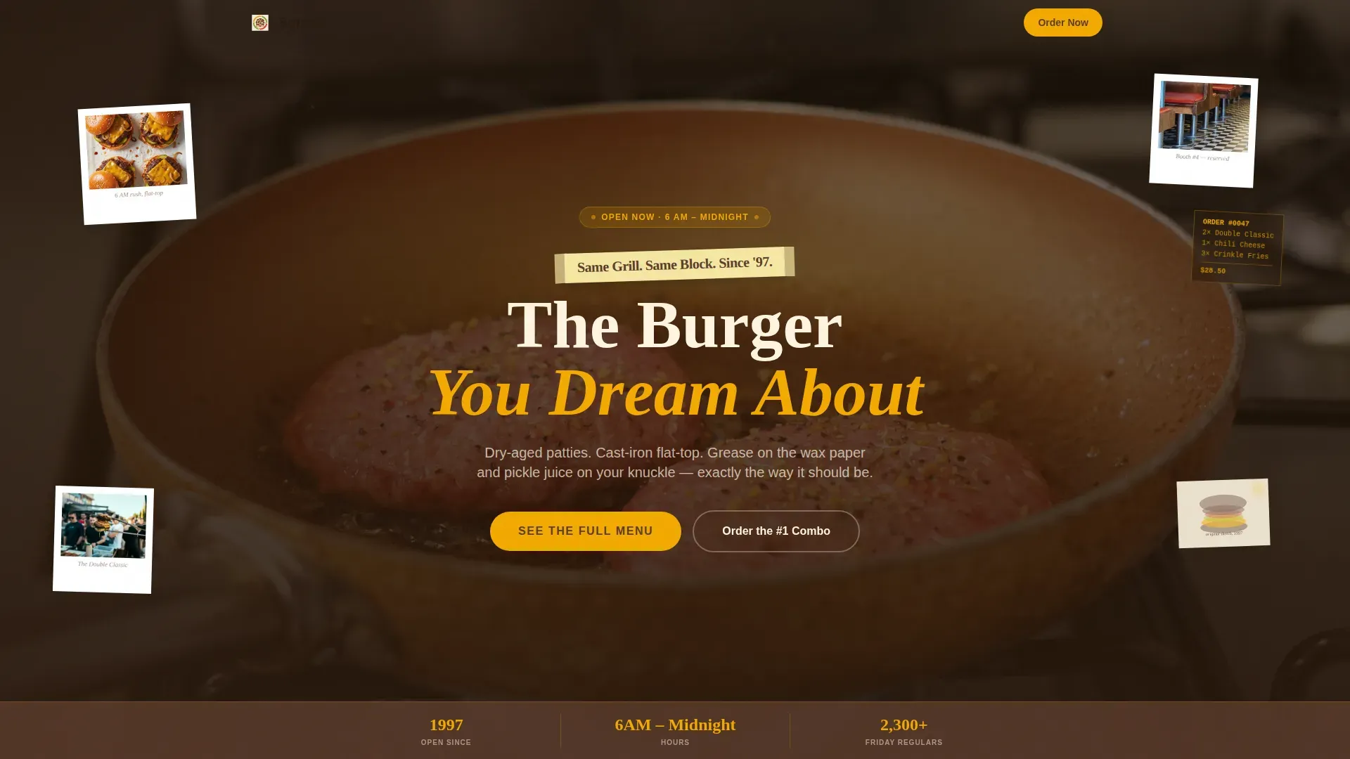
- A collage scrapbook hero with tilted Polaroid overlays, a masking-tape headline, and a floating stats bar
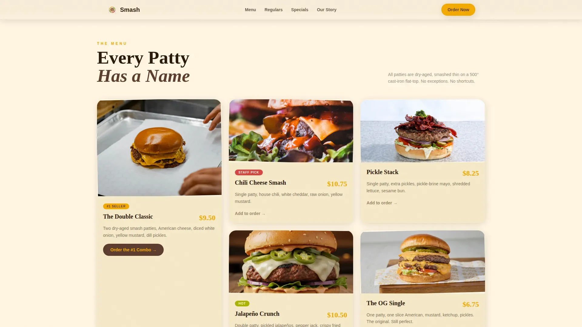
- A modular card grid with an overhead burger photography section, a Wall of Fame regulars grid, a chalkboard specials card, a building origin story card, and a hand-drawn neighborhood delivery map
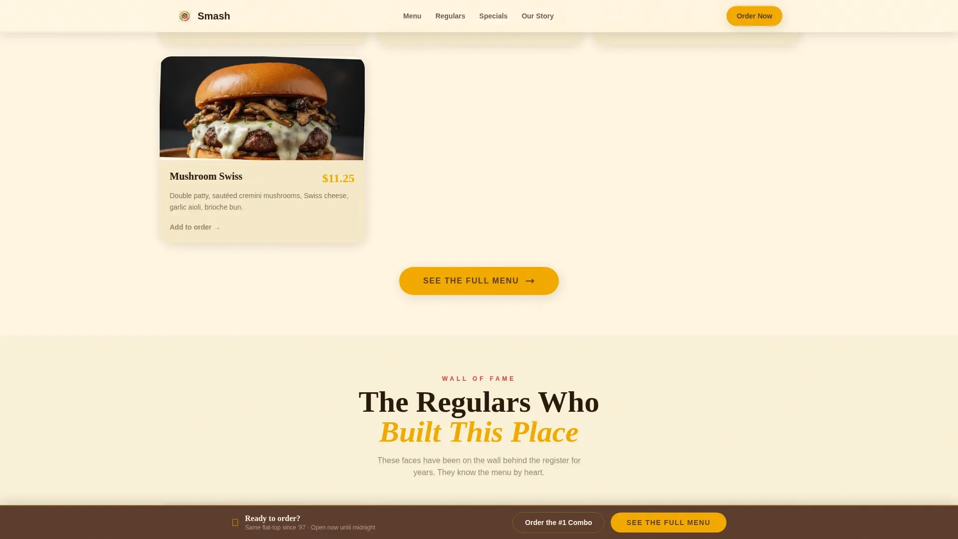
- A sticky bottom call to action bar, a primary "See the Full Menu" button, and a secondary "Order the #1 Combo" path inside the signature burger card
Feature list
This landing page template is built around specific, visible components that make a burger joint feel alive on screen. Every feature below comes directly from the template brief.
Collage Scrapbook Hero Section
The hero lands as a layered mosaic of Polaroid-style snapshots, a grease-stained napkin sketch, and a torn-edge flat-top photo. A hand-lettered headline sits crooked across the center on a masking-tape strip, and a floating stats bar anchors key fast facts below the collage.
Modular Asymmetric Card Grid
Each card in the grid tells a different chapter of the burger joint's story. Tall cards sit next to wide ones in a rhythm that keeps the eye moving. The grid covers the burger menu, the Wall of Fame, weekly specials, the building origin story, and the neighborhood delivery map.
Sticky Bottom Call to Action Bar
After the third card row, a sticky bar locks to the bottom of the viewport with the primary "See the Full Menu" call to action in mustard yellow on bun brown. This keeps the conversion path visible throughout the entire scroll without interrupting the food storytelling.
Wall of Fame Regulars Grid
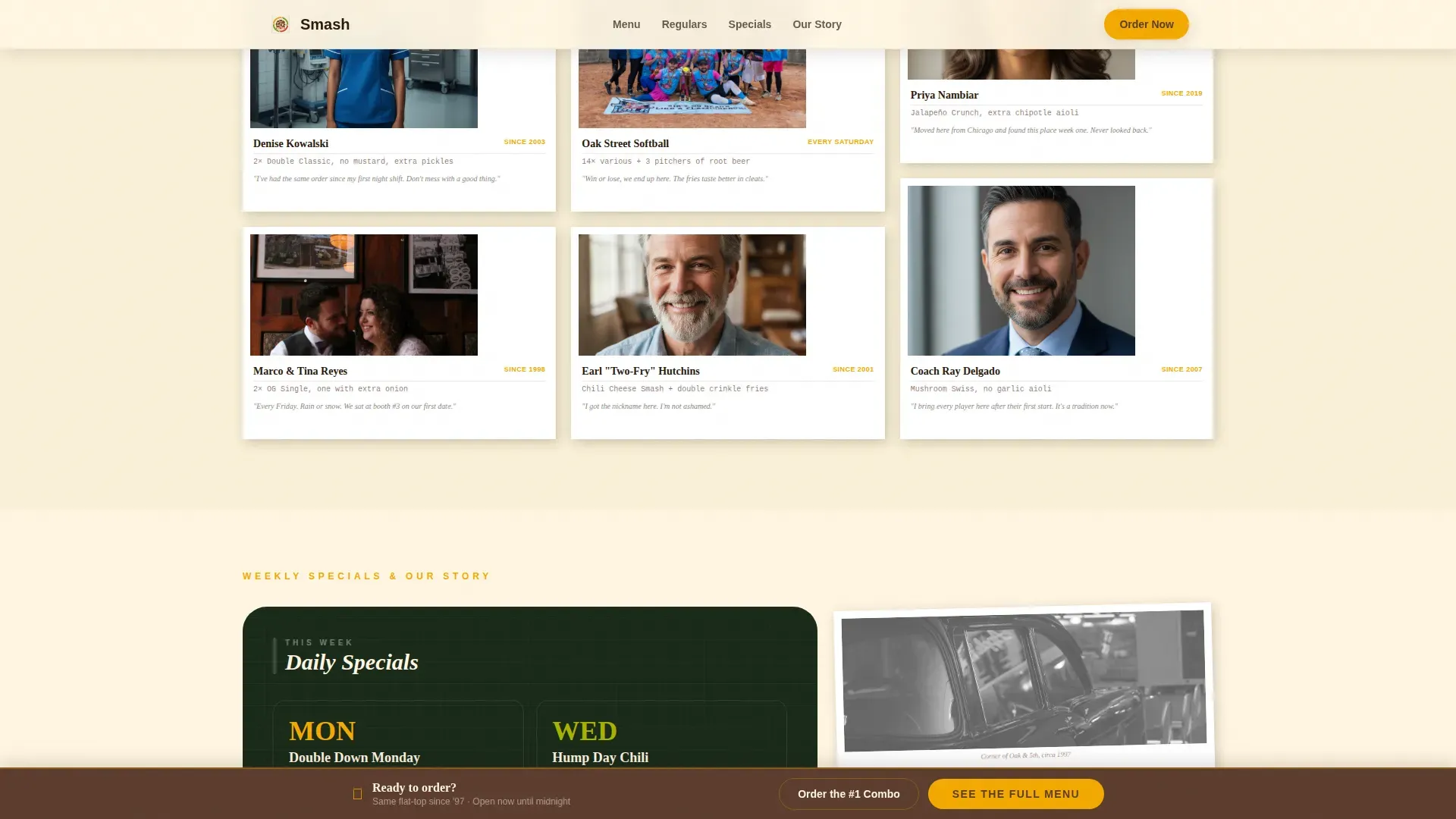
A masonry photo grid shows real regulars with their standing orders displayed beneath each photo. This card functions as social proof, displaying customer faces and loyalty signals that build trust and credibility far faster than a generic star rating widget.
Citrus Burst Color and Typography System
The palette runs on squeeze-bottle mustard yellow, charred sesame bun brown, pickled jalapeño green, and ketchup-cap red against butcher-paper cream. Fraunces handles display headlines and DM Sans carries body copy, giving the template a hand-crafted yet sleek and readable visual hierarchy.
Neighborhood Map Card
A hand-drawn delivery radius map replaces sterile pin markers with illustrated landmarks. This card communicates local identity while surfacing essential information about where the burger restaurant delivers, grounding the page in a specific community.
Page sections overview
| Section | Purpose |
|---|---|
| Hero Collage Header | Introduces brand identity with layered scrapbook visuals and a bold headline |
| Burger Grid Card | Showcases overhead patty shots with hand-written names and prices |
| Wall of Fame | Displays regular customers and their standing orders as social proof |
| Specials and Story | Pairs a chalkboard weekly specials card with a three-sentence building origin story |
| Neighborhood Map | Shows hand-drawn delivery radius with local landmarks |
| Sticky call to action Bar | Keeps the primary menu call to action visible after the third card row |
| Footer | Single-row linear pattern with essential restaurant contact information |
Design & branding system
Strong branding is what makes a burger joint memorable in a crowded fast food market. Logos, color choices, and typography all communicate whether a company is warm and neighborhood-rooted or cold and corporate. This template makes those branding decisions visible and intentional from the first scroll.
- Citrus Burst palette: mustard yellow (#F2A900), bun brown (#5C3D2E), jalapeño green (#A8B400), ketchup red (#D64541) on butcher-paper cream (#FFF5E1), with warm hunger-stimulating tones throughout
- Typography pairing: Fraunces serif for display headlines and DM Sans for body text, with hand-lettered visual accents in the hero collage
- Branding elements including logos, color-coded buttons, and hover states are all set within the Warm Artisan theme, ensuring the food identity feels consistent across every card
Mobile & speed optimization
This template is designed mobile-first because most burger restaurant searches happen on phones, often late at night by someone who already knows what they want. A fast, sleek mobile experience is what turns a search into an order.
- Mobile-first card grid layout that reflows naturally from desktop to phone without losing the asymmetric rhythm
- CSS animation approach with static hero imagery, keeping the page fast and reducing load friction for on-the-go food customers
- Sticky call to action bar remains accessible on small screens, so the menu click is never more than a thumb-tap away
How this template helps you convert
Every design decision in this landing page points toward one outcome: getting the visitor to tap "See the Full Menu" or "Order the #1 Combo" before they second-guess the craving.
- The hero collage leads with a benefit-driven, hand-lettered headline and social credibility signals, placing the primary call to action above the fold with high-contrast mustard yellow on bun brown so it is impossible to miss.
- Each card in the grid adds a sensory detail or a community story, building appetite and trust card by card, so that clicking through to the menu feels less like a transaction and more like walking up to the counter.
- The sticky bottom bar ensures the call to action stays on screen throughout the full scroll, and the secondary "Order the #1 Combo" path inside the signature burger card captures visitors who are already decided and just need one tap to get started.
Other information about this template
This template is part of a broader library of food and beverage landing page templates built for designers and restaurant owners who need to get a professional website live fast. Below are some practical details worth knowing before you get started.
- Logos and brand marks can be swapped into the hero collage and footer without restructuring the layout, since the template is built to support custom logo placement from day one
- The Wall of Fame card can support a rotating carousel of customer reviews or star ratings if you choose to adapt the social proof section for that format
- Templates in this category are free to customize once you have access to the platform, and the full Citrus Burst color set is pre-loaded so designers can sign in and start immediately
- A great burger logo communicates the company's story through color, shape, and other design elements; this template gives logos the visual stage they need to stand out
- Dinevate and similar platforms that offer built-in marketing tools for independent restaurants are a natural complement to this template for burger restaurant owners who want to go further after launch
- Essential information such as hours of operation, an interactive map link, and contact details are set within the footer section using the Pattern 1 linear single-row layout, keeping everything discoverable without clutter
Theme
Warm Artisan
Creative direction
Local & Neighborhood
Color system
Citrus Burst
Style
Card Grid (Modular)
Direction
Click-Through
Page Sections
Collage Scrapbook Hero with Stats Bar
Asymmetric Modular Card Grid
Sticky Bottom Call to Action Bar
Wall of Fame Regulars Section
Citrus Burst Branding System
Hand-drawn Neighborhood Map Card
Related questions
Can I edit the colors and typography to match my burger restaurant's existing branding?
Is this landing page template mobile-friendly?
How does the Wall of Fame section work as social proof?
Can I link this template to an online ordering system?
What sections are included in this landing page template?



