Modern Dental Team & Credentials Showcase Website Template
Chairside is a bento grid dental practice landing page built for modern clinics that want to look as sharp as they operate. A tab-switching header, spec-sheet service tiles, doctor credential cards, and a patient app download flow work together to turn first-time visitors into booked patients, fast, tappable, and shockingly informative.
by Rocket studio
Quick summary
Chairside is a single-page dental practice portfolio template built on a bento grid layout. It uses a Feature Tab Switcher header, Spec Sheet creative direction, and an App Download call to action to serve three very different visitor types at once. The design is sharp, information-dense, and built to earn trust before anyone picks up the phone.
Who this template is for
This template is designed for dental practices that want their online presence to reflect the clinical quality happening inside the building. It works equally well for established multi-provider offices and newer practices trying to stand apart from the beige-and-teal competition.
- General and family dental practices targeting new-move households searching for a local provider
- Multi-specialty clinics offering cosmetic, pediatric, and restorative services under one roof
- Tech-forward practices that have invested in same-day digital dentistry and want patients to know it
What problem this template solves
Most dental practice pages bury the information patients actually need, appointment times, insurance compatibility, technology details, and provider credentials, behind walls of reassuring but vague copy. Visitors leave without booking because they cannot find a direct answer to the question they were too self-conscious to ask.
- New-move families need a fast way to confirm the practice accepts their plan and sees children
- Anxious adults need specific, plain-language explanations of procedures before they will commit
- Office managers comparing providers need credential depth and technology specs, not generic taglines
What you get with this template
You get a fully structured bento grid landing page with every major section already designed and labeled. The layout is organized around three tab views, a scrollable spec-sheet body, and a persistent app download call to action.
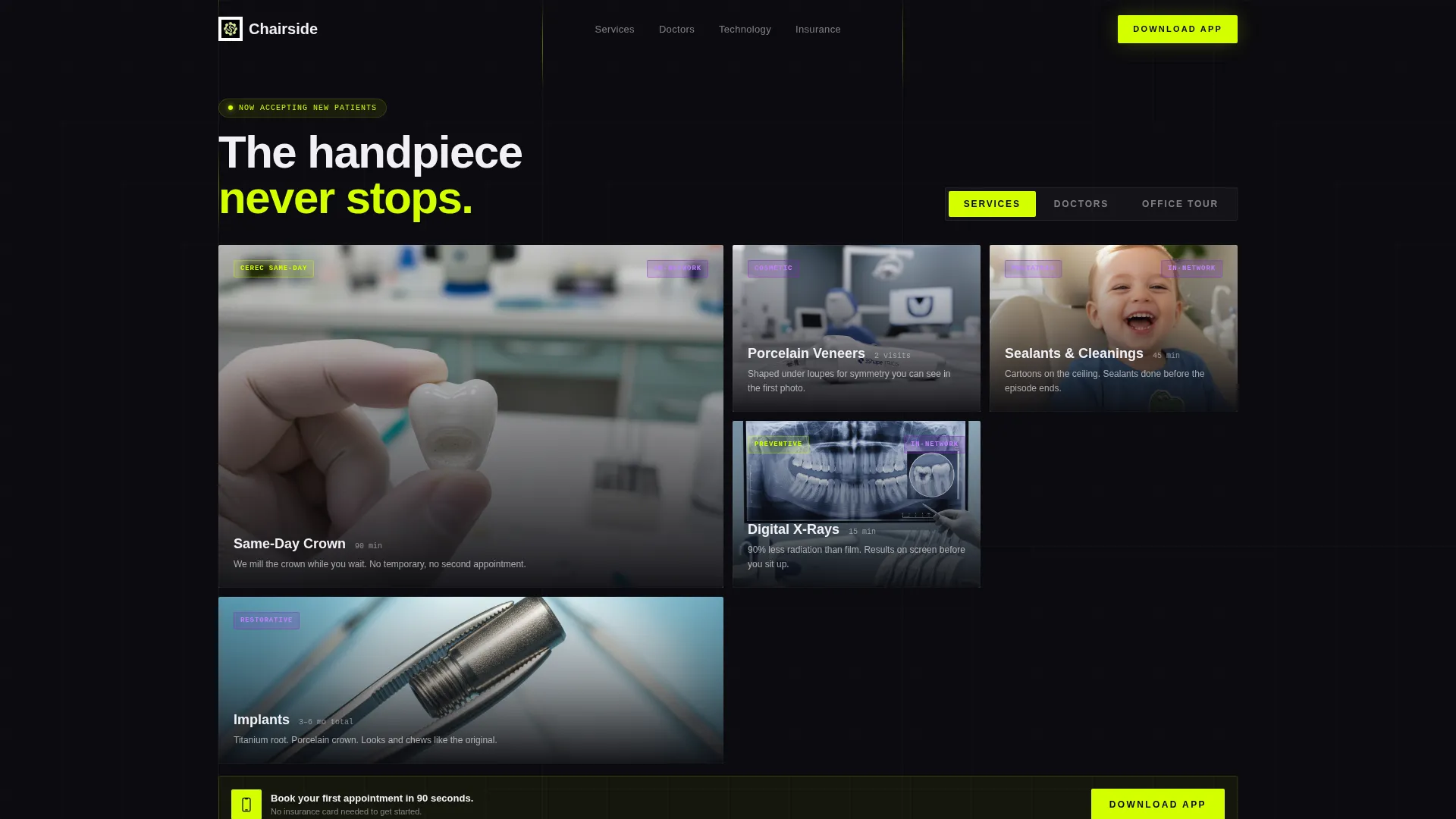
- A Feature Tab Switcher header with three pre-labeled tabs: Services, Doctors, and Office Tour
- Bento grid tile rows for service photography, doctor credential cards, and technology specification panels
- A floating mobile bottom bar and embedded desktop call-to-action blocks tied to the patient app download flow, including an operating-system-detecting modal with app store badges, a phone number field for a direct SMS link, and a three-icon app preview row
Feature list
This template ships with six distinct design and functional building blocks sourced directly from the brief.
Feature Tab Switcher Header
Three clickable tabs, Services, Doctors, and Office Tour, swap the bento grid below into a different tile configuration without a page reload. The default view lands on Services, so first-time visitors immediately see what the practice does.
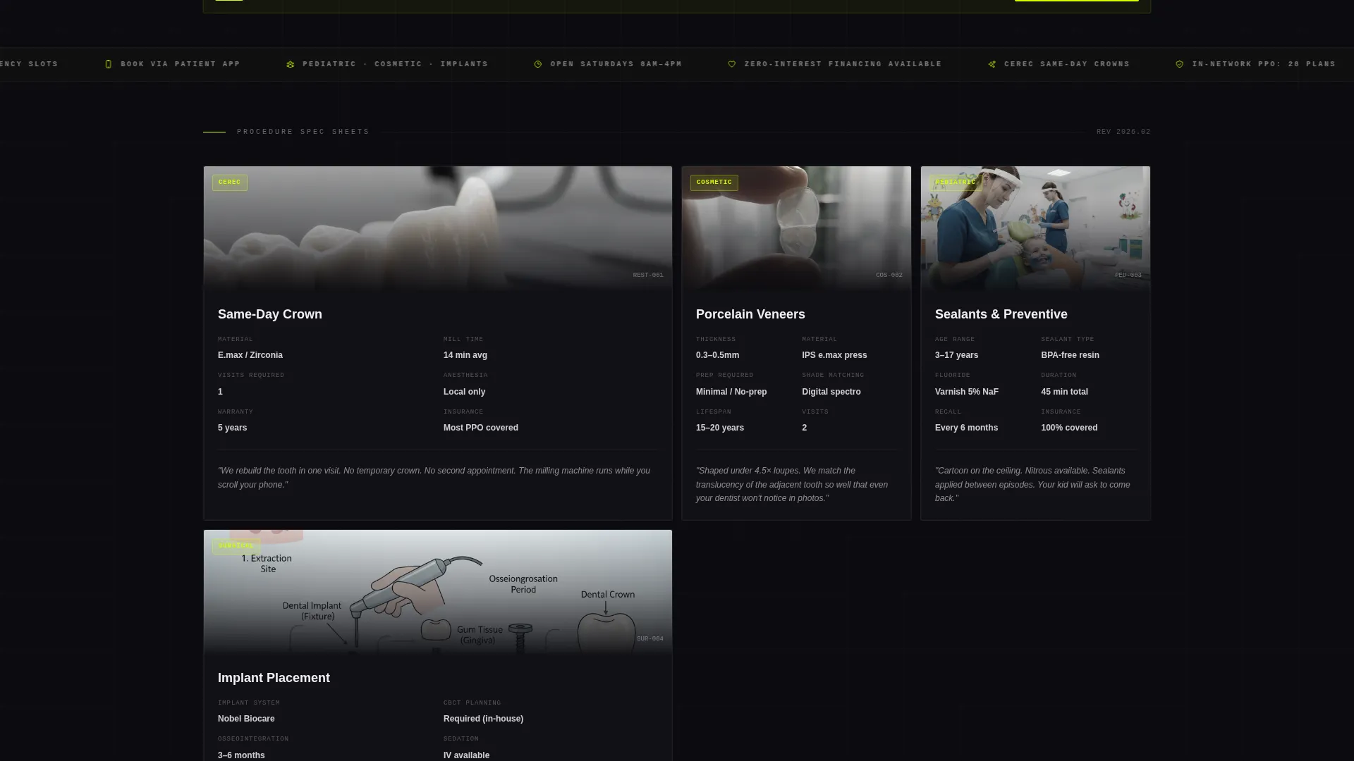
Spec Sheet Service Tiles
Each service tile displays a tightly cropped, high-contrast photograph alongside a structured overlay. The overlay shows the procedure name in bold pixel white, average appointment time, an insurance-friendly badge, and a one-line plain-language description of what happens during the visit.
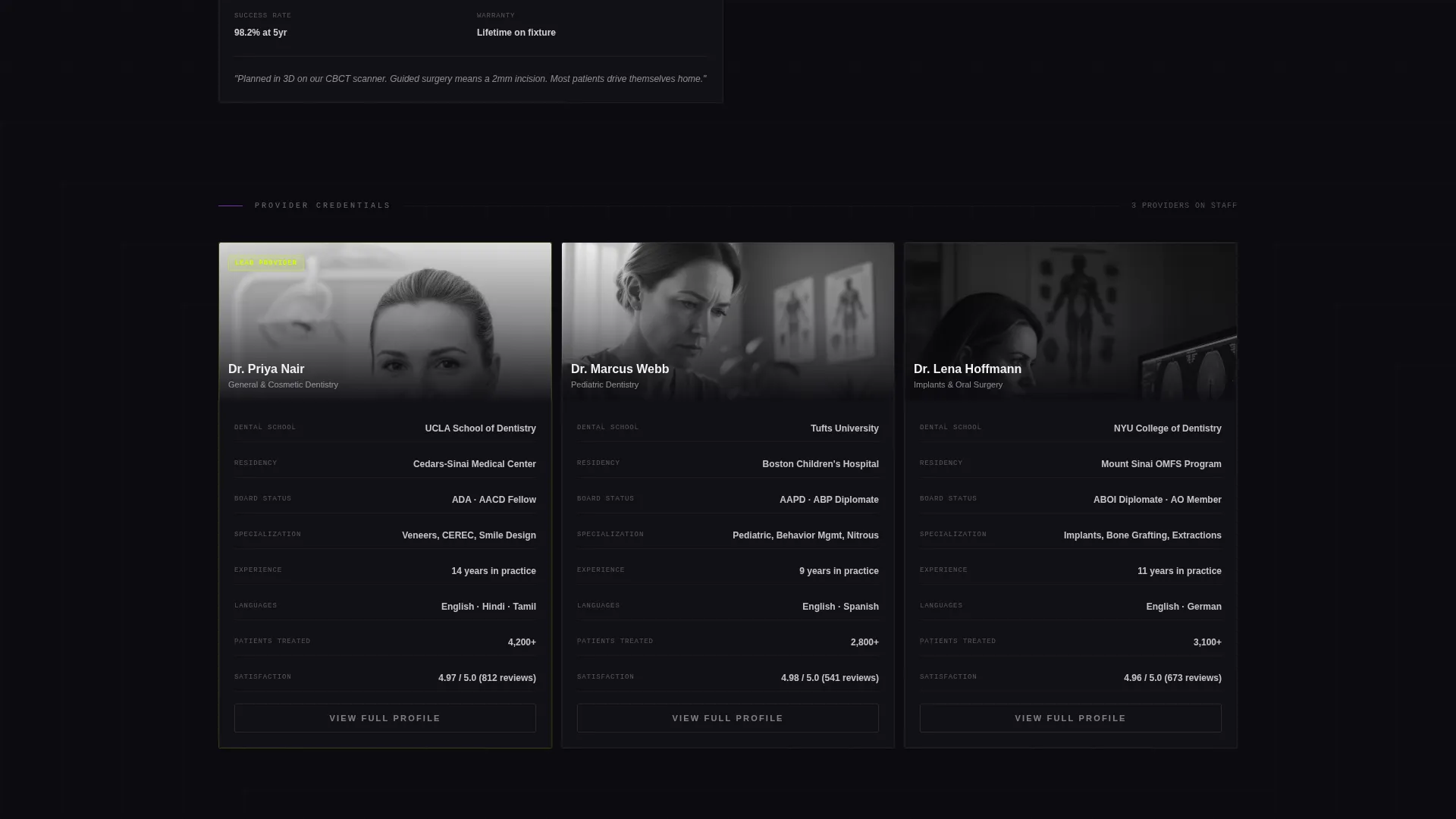
Doctor Credential Cards
Provider bios are replaced with data-field layouts showing board certifications, residency programs, years of experience, and languages spoken. The format feels closer to a professional profile than a personal narrative, which builds trust more efficiently for comparison-minded visitors.
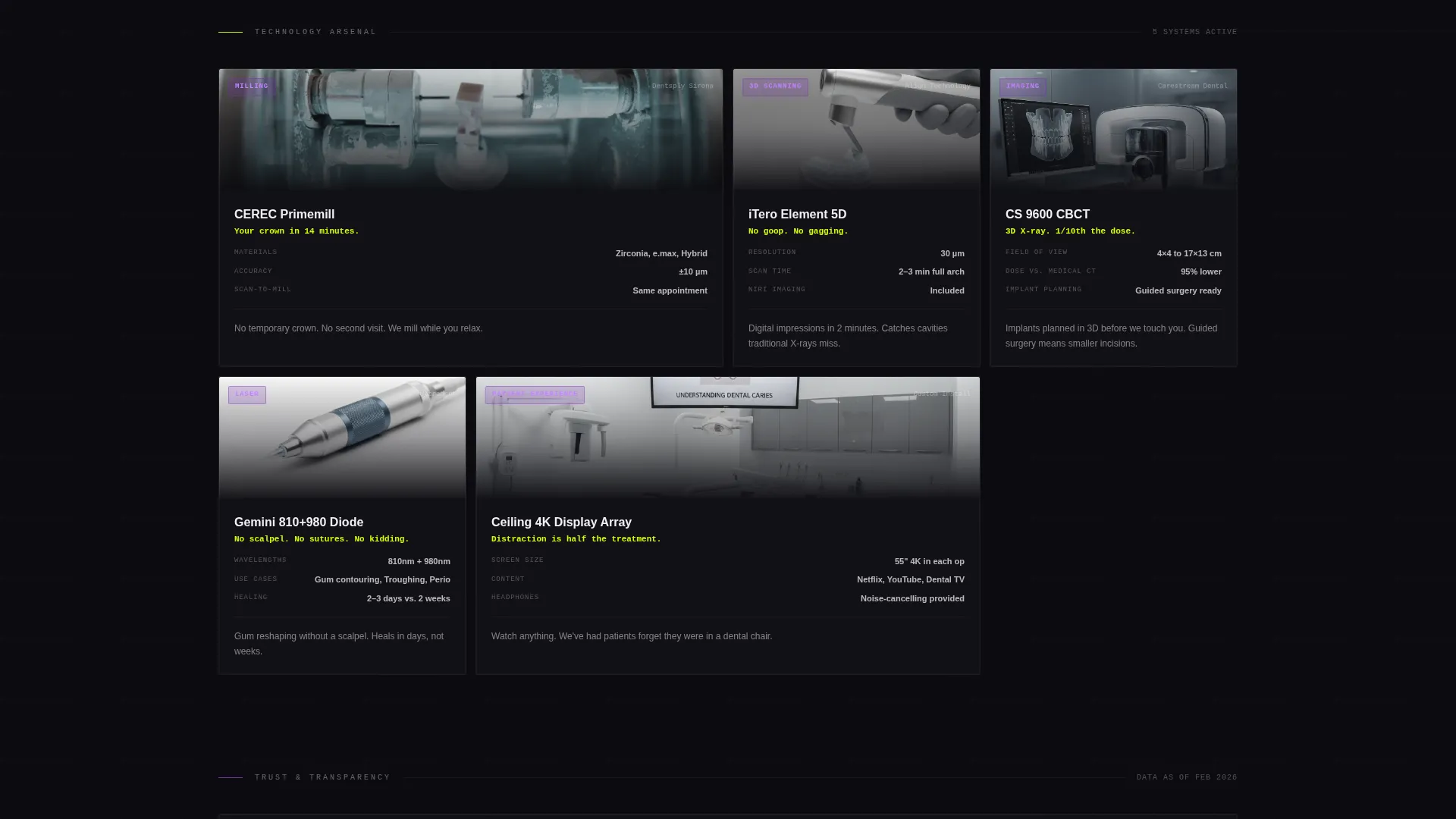
Technology Specification Panels
Each technology tile names the specific equipment, includes a model reference, and adds a single patient-facing sentence explaining what that tool means for their experience. Visitors understand the clinical value without needing a background in dentistry.
App Download Call-to-Action System
The primary call to action is an "Download Our Patient App" button in electric chartreuse on deep black. On mobile it pins to the bottom of the screen as a floating bar. On desktop it appears inside the first and last bento rows. Tapping opens a modal that auto-selects the correct app store, offers an SMS download link via phone number input, and shows a three-icon row covering appointment booking, treatment plan viewing, and direct hygienist messaging.
Progressive Disclosure Scroll
The layout is structured so the further a visitor scrolls, the more granular the information becomes. Early rows handle broad service categories. Later rows reveal sterilization protocol stats, patient satisfaction percentages, and equipment model numbers. Each tile is a discrete, tappable unit designed to reward curious visitors.
Page sections overview
| Section | Purpose |
|---|---|
| Tab Switcher Header | Switches grid between Services, Doctors, and Office Tour views |
| Services Grid | Displays procedure tiles with spec overlays and insurance badges |
| Doctors Grid | Shows credential cards with certifications, residency, and languages |
| Office Tour Grid | Presents practice environment and equipment photography |
| Technology Spec Panels | Details clinical equipment with model references and patient context |
| Doctor Credential Cards | Lays out provider data fields in structured, scannable format |
| Deep Scroll Rows | Reveals sterilization stats and satisfaction data progressively |
| App Download Modal | Detects operating system, shows badges, SMS field, and app preview icons |
| Desktop App call to action Row | Embeds app download call to action in first and last bento rows |
| Mobile Floating Bar | Pins app download button to bottom of screen on mobile devices |
Design & branding system
The visual identity follows an Acid Digital color system applied through a Directory and Discovery theme. Every color decision is intentional: the palette reads like a dental operatory lit by a curing light and a retina display, antiseptic and precise but cracked open by a jolt of neon energy.
- Electric chartreuse (#D4FF00) is used for primary accents, hover states, and the main call-to-action button
- Deep LCD black (#0B0B0F) forms card backgrounds, creating high contrast against white typography
- Clinical UV violet (#7B2FBE) marks category tags and active tab indicators throughout the grid
- Sterile pixel white (#F0F0F5) handles all body typography and divider lines for clean legibility
Mobile & speed optimization
The template is designed with mobile interaction as a first-class concern. The floating bottom bar and the OS-detecting modal are specifically built for the visitor who is browsing at 11 p.m. on a phone and ready to act immediately.
- The floating app download bar stays pinned to the bottom of the mobile viewport throughout the scroll
- Each bento tile is designed as a discrete, tappable unit so the touch experience mirrors the app preview the template is selling
- The tab switcher reconfigures the grid in place, avoiding full page navigation and keeping the mobile session fluid
How this template helps you convert
The layout is structured so that trust-building and action steps arrive in the same scroll, rather than asking visitors to jump between pages.
- The spec-sheet tile format answers the most common patient hesitations, procedure time, insurance compatibility, plain-language procedure explanation, before a visitor has to ask, reducing the friction between landing and booking
- The progressive disclosure scroll rewards the most motivated visitors with increasingly specific data, so the call to action arrives at the exact moment a visitor has convinced themselves the practice is the right choice
- The app download modal closes the loop by making the next step feel like a natural continuation of the grid experience rather than a separate sales push
Other information about this template
This template is categorized under dental practice website templates and is built specifically for the dental practice portfolio page niche. It sits at the intersection of technology category design and discovery-themed layouts.
- The template style is a bento grid, which suits practices that want a portfolio-style presentation rather than a linear scroll
- The creative direction is Spec Sheet, meaning content is formatted like product data rather than marketing copy
- The header concept is a Feature Tab Switcher, a component common in app and software product pages and adapted here for clinical service presentation
- The landing page direction is App Download, making this template a strong fit for practices that already have or are planning to launch a patient-facing mobile application
- The theme is Directory and Discovery, which supports the use case of a new visitor arriving with no prior knowledge of the practice and leaving with a clear picture of services, providers, and technology
Theme
Directory & Discovery
Creative direction
Spec Sheet
Color system
Acid Digital
Style
Bento Grid
Direction
App Download
Page Sections
Feature Tab Switcher Header
Spec Sheet Service Tile Overlays
Doctor Credential Data Cards
Technology Specification Panels
App Download Call to Action with Os-detecting Modal
Progressive Disclosure Scroll Layout
Related questions
Can I use this template without a patient app?
Does the tab switcher require a developer to set up?
Can I add or remove service tiles from the bento grid?
Is this template suitable for a solo practitioner rather than a multi-provider practice?



