Patient Education Landing page Template
A single-page cosmetic dentist patient education landing page built around FAQ-driven comparison tables. It guides prospective patients through porcelain versus composite veneers, in-office versus take-home whitening, and bonding versus crowns. A floating testimonial card opens the page, and a Smile Guide download with a self-assessment quiz closes it. The design uses a Soft Mist palette with navy headings and blush hover states.
by Rocket studio
Quick summary
This landing page helps cosmetic dentistry practices educate prospective patients before the first consultation. It opens with a single patient testimonial card, then walks visitors through three structured comparison tables that answer real pre-consultation questions. A lead capture form and a self-assessment quiz turn that education into action. The result is a page that earns trust before it ever asks for anything.
Who this template is for
This template fits cosmetic dentistry practices that want to convert curious researchers into booked consultations. It works especially well when the practice has patients who need education before they feel ready to commit.
- Cosmetic dentists targeting brides-to-be, executives, and post-braces teenagers
- Practices whose patients ask detailed questions before scheduling
- Dental offices that want a lead magnet strategy built around patient education
What problem this template solves
Most prospective cosmetic dentistry patients do extensive research before calling a practice. They feel anxious, uninformed, and unsure which procedure is right for them. This page meets them at that exact moment.
- Patients arrive at consultations without context, wasting time on basics
- Generic practice websites rarely answer specific procedural questions
- Visitors leave before converting because no clear educational path exists
What you get with this template
You get a fully structured single-page layout designed specifically for cosmetic dentist patient education. Every section has a defined purpose, from the opening testimonial to the closing quiz prompt.
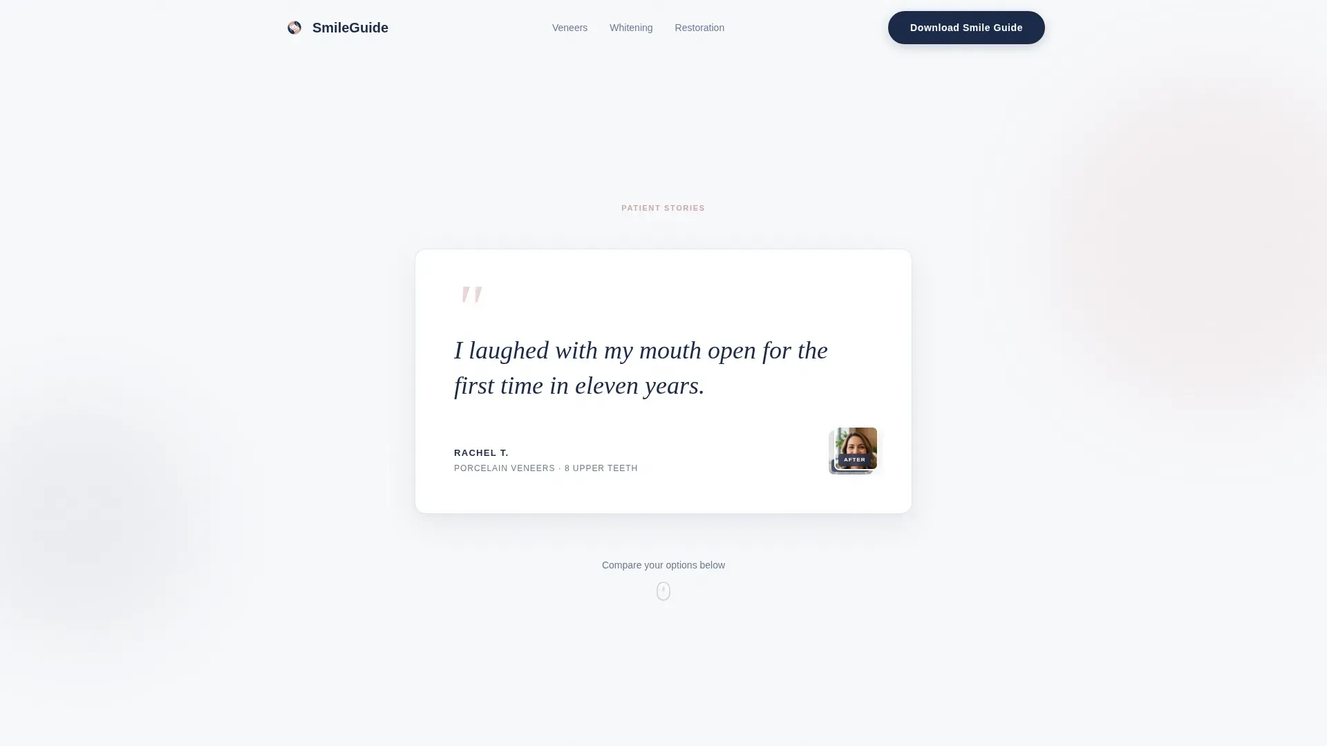
- A floating testimonial hero card with serif quote typography and before-and-after thumbnail placement
- Three FAQ-driven comparison tables covering veneers, whitening, and restorative options
- A lead capture section with a Smile Guide download form and a secondary self-assessment quiz call to action
Feature list
This template includes a focused set of interactive and structural components drawn directly from the design brief.
Floating Testimonial Hero Card
The page opens with a single patient quote set in large serif type. The patient's first name and procedure appear in small caps beneath it. Two small before-and-after thumbnail images anchor the bottom-right corner of the card. There is no hero banner or stock photography.
FAQ-Driven Comparison Tables
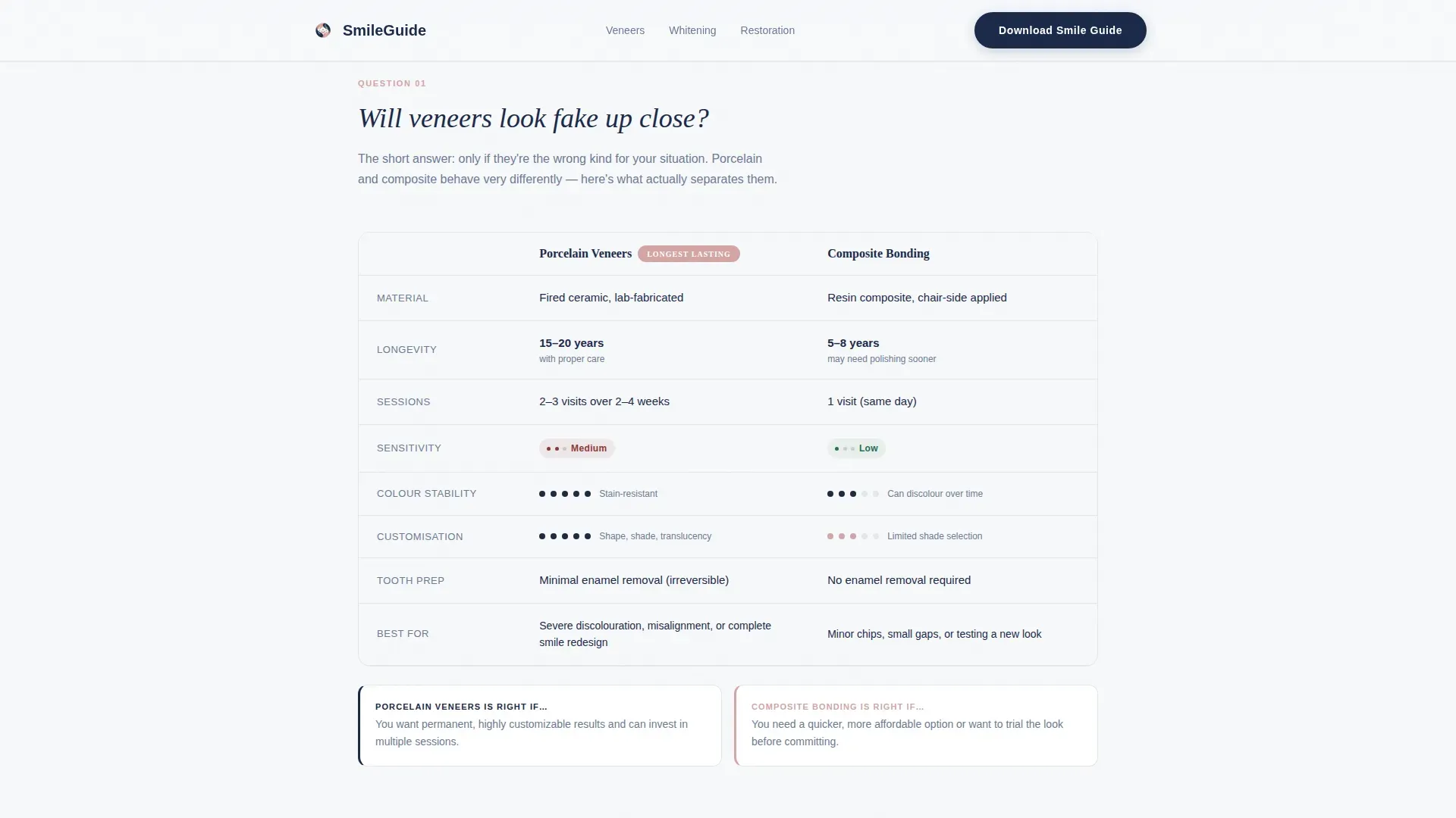
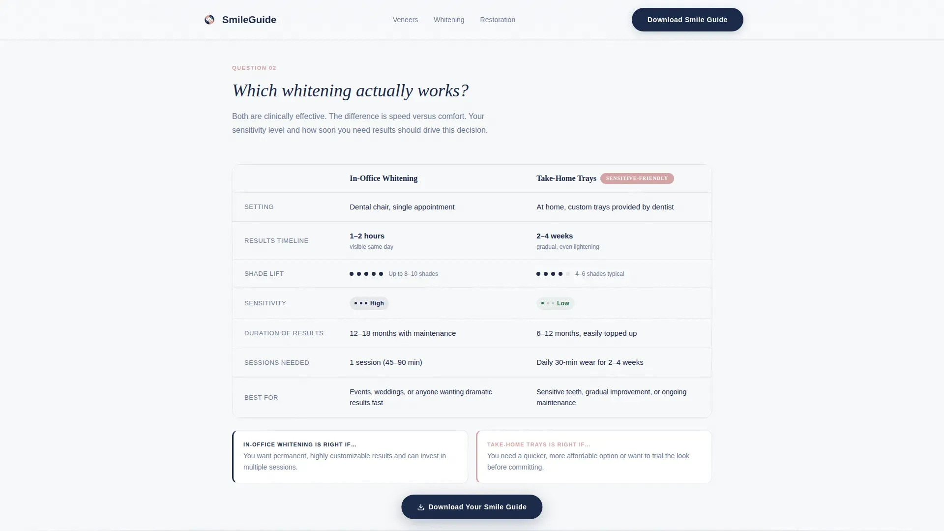
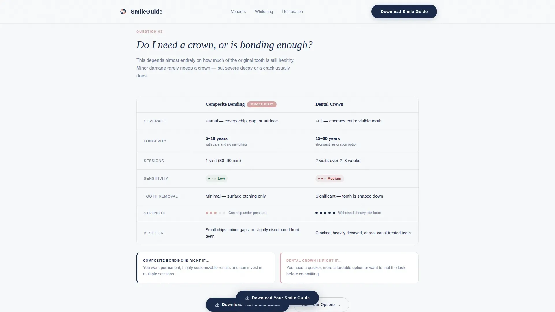
Three full comparison tables answer the questions patients research most. Each table is introduced by a conversational patient question, then compares two treatment options across columns for longevity, average sessions, sensitivity level, and visual suitability rating.
Scroll-Reveal Table Row Animations
Table rows animate into view as the visitor scrolls down the page. This keeps the reading experience progressive and focused rather than overwhelming the visitor with all data at once.
Hover and Active Column Highlights
Comparison table columns highlight on hover using the blush accent color. This micro-interaction draws attention to the option the visitor is actively considering, making the comparison feel interactive rather than static.
Smile Guide Lead Capture Form
After the third comparison table, a simple form asks for a first name and email address in exchange for a downloadable Smile Guide. The placement is intentional: the visitor has already read through all three comparisons and arrives at the form feeling informed rather than pressured.
Self-Assessment Quiz Call to Action
A secondary path labeled "See Your Options" links to a self-assessment quiz. The quiz recommends procedures based on three quick questions about the patient's goals, timeline, and sensitivity. It provides an alternative conversion route for visitors not ready to download.
Page sections overview
| Section | Purpose |
|---|---|
| Testimonial Hero Card | Opens with a real patient voice and before-and-after thumbnails |
| Veneers Comparison Table | Answers "Will veneers look fake?" with porcelain versus. composite data |
| Whitening Comparison Table | Answers "Which whitening works?" with in-office versus. take-home data |
| Bonding versus. Crowns Table | Answers "Do I need a crown?" with bonding versus. crowns comparison |
| Smile Guide Lead Capture | Collects name and email for a downloadable Smile Guide |
| Quiz Call to Action | Offers a self-assessment path via the "See Your Options" prompt |
| Footer | Closes with a horizontal flow pattern layout |
Design & branding system
The visual identity follows a Corporate Precision theme expressed through the Soft Mist color system. The palette feels clinical and clean while staying warm enough to feel welcoming.
- Navy (#1B2A4A) anchors every heading and interactive link; blush (#D4A5A5) appears on hover states and active comparison column highlights only
- Silver (#C9CED6) separates table rows and acts as a structural divider throughout the layout
- Fraunces serif handles headings and the hero testimonial quote; DM Sans handles body copy and interface text
Mobile & speed optimization
The template is built desktop-first with full mobile responsiveness so patients can research on any device. Interactive elements are handled with minimal JavaScript to keep the page light.
- Scroll-reveal animations and hover micro-interactions use minimal scripting to avoid heavy load
- Server Components handle all static content sections, keeping interactivity lean and fast
- Comparison tables reflow cleanly on smaller screens so all columns remain readable
How this template helps you convert
The page is structured so that education builds naturally into action. By the time the visitor reaches the lead capture form, they have already answered their own questions.
- Three escalating comparison tables take the visitor from cosmetic curiosity to clinical confidence, making the Smile Guide download feel like a logical next step rather than a marketing transaction.
- The secondary quiz path captures visitors who prefer a personalized recommendation over a downloadable guide, giving the page two conversion routes without competing for attention.
Other information about this template
This template sits within the Health and Medical category, specifically the Cosmetic Dentist Website subcategory. It is built for a content and resource landing page goal with an FAQ-driven creative direction and a Testimonial Card header concept.
- The template style is Comparison Table, which is the structural foundation for all three educational sections
- The intersection match confirms alignment between the Health and Medical category, the Cosmetic Dentist Website subcategory, and the Cosmetic Dentist Patient Education Hub niche
- Animation intensity is set to medium, balancing visual interest with a calm, clinical page feel appropriate for a healthcare context
Theme
Corporate Precision
Creative direction
FAQ-Driven
Color system
Soft Mist
Style
Comparison Table
Direction
Content/Resource
Page Sections
Floating Testimonial Hero Card
Faq-driven Comparison Tables
Scroll-reveal Table Animations
Hover and Active Column Highlights
Smile Guide Lead Capture Form
Self-assessment Quiz Path
Related questions
What types of procedures do the comparison tables cover?
Who is this landing page template built for?
How does the lead capture section work?
Can the testimonial card be updated with real patient content?
Is this template suited for a single procedure or a multi-procedure practice?



